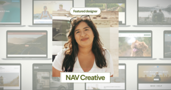
A round of applause is in order because Nav Creative recently celebrated an incredible milestone!…
Material Design by Google ~ Theory, Resources, Tools
Material Design is a unified system that combines theory, resources, and tools for crafting digital experiences. Material Design (codenamed Quantum Paper) is a design language developed in 2014 by Google. Expanding upon the ‘card’ motifs that debuted in Google Now, Material Design makes more liberal use of grid-based layouts, responsive animations and transitions, padding, and depth effects such as lighting and shadows.
Google announced Material Design on June 25, 2014, at the 2014 Google I/O conference. Quantum Paper is the overarching name for a new, unified design framework intended to make experiences consistent across all platforms. According to Google, Material represents Google’s effort to both create (with Google apps) and encourage consistent, beautiful design that delights across all platforms. Quantum Paper is a hugely ambitious project, looking to unify and codify paradigms for visual, motion, and interaction design across all platforms, including web, Android, and iOS.
What is Material?
Material (Design) is a metaphor, a design system for uniting style, branding, interaction, and motion under a consistent set of principles. With Material Google Design Team believes product teams can realize their greatest design potential.
Designer Matías Duarte explained that, ‘unlike real paper, our digital material can expand and reform intelligently. Material has physical surfaces and edges. Seams and shadows provide meaning about what you can touch.’ Google states that Material design language is based on paper and ink.
As of 2015 most of Google’s mobile applications for Android had applied the new design language, including Gmail, YouTube, Google Drive, Google Docs, Sheets and Slides, Google Maps, Inbox, all of the Google Play-branded applications, and to a smaller extent the Chrome browser and Google Keep. The desktop web-interfaces of Google Drive, Docs, Sheets, Slides and Inbox have incorporated Material Design as well.
‘Material’ is the Metaphor
A material metaphor is the unifying theory of a rationalized space and a system of motion. The Material is grounded in tactile reality, inspired by the study of paper and ink, yet technologically advanced and open to imagination and magic.
Surfaces and edges of the material provide visual cues that are grounded in reality. The use of familiar tactile attributes helps users quickly understand affordances. Yet the flexibility of the material creates new affordances that supercede those in the physical world, without breaking the rules of physics.
The fundamentals of light, surface, and movement are key to conveying how objects move, interact, and exist in space and in relation to each other. Realistic lighting shows seams, divides space, and indicates moving parts.
Design is the art of considered creation. Our goal is to satisfy the diverse spectrum of human needs. As those needs evolve, so too must our designs, practices, and philosophies. We challenged ourselves to create a visual language for our users that synthesizes the classic principles of good design with the innovation and possibility of technology and science. This is Material Design.
Bold, graphic, intentional
The foundational elements of print-based design – typography, grids, space, scale, color, and use of imagery – guide visual treatments. These elements do far more than please the eye.
Elements create hierarchy, meaning, and focus. Deliberate color choices, edge-to-edge imagery, large-scale typography, and intentional white space create a bold and graphic interface that immerse the user in the experience. An emphasis on user actions makes core functionality immediately apparent and provides waypoints for the user.
Motion provides meaning
Motion respects and reinforces the user as the prime mover. Primary user actions are inflection points that initiate motion, transforming the whole design.
All action takes place in a single environment. Objects are presented to the user without breaking the continuity of experience even as they transform and reorganize. Motion is meaningful and appropriate, serving to focus attention and maintain continuity. Feedback is subtle yet clear. Transitions are efficient yet coherent.


