Even amongst graphic designers, the question of whether a logo is good can lead to uncertainty. Personal taste is an inevitable factor in the conversation, which can make it seem like an unsolvable riddle. But this is not true. To understand what makes a good logo, you have find a way to think about it objectively—that is, without personal feelings, preferences, or opinions influencing the outcome. You have to ask, what does the logo communicate about the brand? How does it stand the test of time, and can people remember it all after one glance?
We’re here to answer these questions and give a quick overview of the basic functions and qualities of a good logo. This way, you’ll know exactly how to set your logo up for success right from the start of the design process.
The function of a good logo
—
In order to understand what makes a logo good, let’s talk about what a logo is supposed to do.
Great logos are the perfect tools for attracting audiences to brands and creating memorable impressions. They use design to differentiate products and services from their competition and communicate ownership of a brand’s stake in the marketplace.
Though it’s easy to feel overwhelmed by the subjective nature of visual aesthetics in logo design, consider factors you can test when evaluating a logo—that is, how well it is serving its function. At the end of the day, a good logo should look good, but most importantly it should be accomplishing its branding goals and appealing to its target audience.
The visual elements of a good logo
—
Logos are usually comprised of typography, graphics, and color schemes. These are visual design elements, and their quality can be subjective. Even so, good logo designers use brand research and logo design principles to optimize these elements.
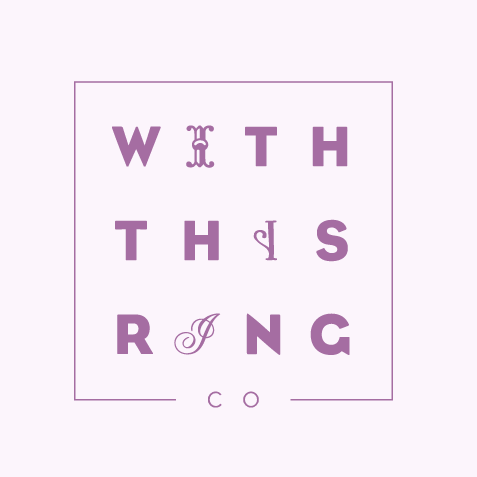
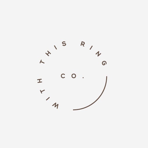
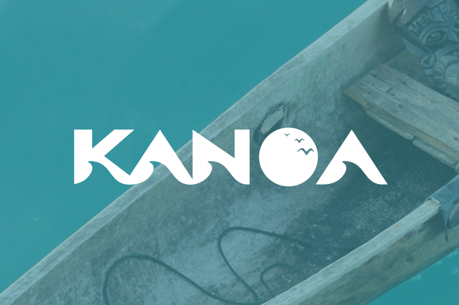
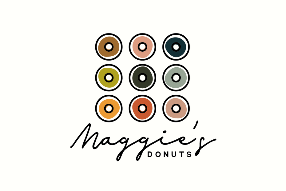
Typefaces communicate more than the actual word they represent. A good logo takes into consideration the common associations fonts have to cultivate a specific atmosphere. Consider the logos above—two takes on the same brand. Though each designer has a different approach, they both use clean sans serif logo fonts (along with some ornate scripts in one case) to convey elegance and modernity. Viewers can translate this immediately even without a description of the company. This doesn’t happen by accident—effective logo designers study their trade.

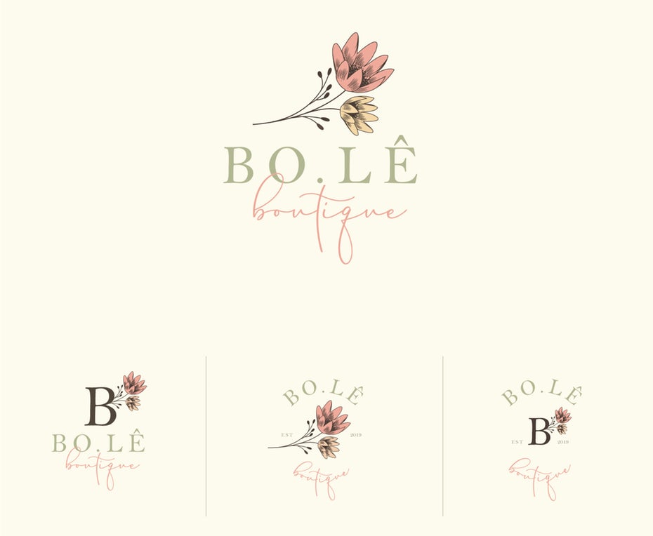
Color has the ability to stimulate primal feelings, and good logos take advantage of this to reach their audiences at the emotional level. The right logo color choices can immediately create feelings of happiness and well-being (as in the logo above) whereas darker colors might make the same logo feel gloomy and edgy. Good logos make smart color choices with the aid of color psychology and color theory and do not forget to consider differences across cultures and traditions.

Graphics in a logo might include elaborately drawn illustrations and icons or simple lines, patterns and textures. When they’re introduced to the branding process, graphics have the potential to be the most dominating force. Think of famous logo icons you associate automatically with a brand, like Apple’s apple or Nike’s swoosh. Good graphics can help elevate a logo to the role of mnemonic device, implanting your branding in the viewer’s memory long after they’ve walked away.
Composition is all about finding the most effective way to bring all visual design elements together in harmony. A well proportioned logo is one where the weight of the various elements is placed in balance. Focal points should have a visual emphasis, where the most important design information stands out immediately. While research has proven that including more white space increases reading comprehension and usability, good logos can use many tried and true grid templates (the rule of thirds, the rule of odds) to maintain visually stunning proportions.
The qualities of a good logo
—
Let’s move onto the more intangible qualities that make up good logo design. While it is important to maximize the efficacy of your logo through the physical design characteristics mentioned above, good logo design has more to do with how well it satisfies the needs of branding.
Though evaluating design quality can be subjective, having clear goals can make the results much more easily measurable. When you are trying to decide on the quality of your logo, consider the following criteria.
Distinction
Your logo should be distinct, designed to stand out from similar brands. Use design elements that fall outside of the current trends in order to create a strong visual impact. The brand should have a unique story, and this will be your guiding light to design a distinct logo for it.


Relevance
Relevance refers to how well your logo design connects with your audience. It’s important to do the audience research to understand who exactly the logo should be speaking to, from broad descriptors like age and education to narrower ones like values and hobbies. Use your knowledge of your community to guide your research into what design elements will best appeal to them. This involves a balancing act with the previous topic above: you want your logo to be distinct, but you don’t want it to be so off-the-wall that target consumers cannot connect with it.
Simplicity
The best logos are simple enough to be understood at a moment’s glance. As designer Jeff Fisher puts it, a logo should “catch the attention of a viewer zipping by signage at 70 miles per hour, on packaging on the crowded shelves of a store, or in any other vehicle used for advertising, marketing and promotion.”
Simplicity is directly linked to memorability. A logo must encapsulate a concise brand message, and this is easily achieved through legible fonts, minimalist shapes, and spared detail (consider how well your design works in monochrome or when scaled down to a small size).
Timelessness
It’s not enough that a logo is good today—it has to stay good for years to come. Though logo redesign is an option now and again, constant changes can interfere with consumers’ ability to associate a logo with a company. That’s why a good logo is designed from the start to be timeless.
For a timeless logo, avoid the hype train or following trends for their own sake. Trends date themselves even faster than the time your audience will give to your logo. Focus on quality based on market research. Think of logos you know that have stood the test of time. While some famous logos update themselves to keep up with the modern era, you can still recognize the brand throughout their iterations.
Adaptivity
Adaptivity refers to how well your logo design holds up in all of the mediums that are digitally and physically possible.
Responsive logos vary in size and complexity, and sometimes even exist in different colors to accommodate varied destinations.
A good logo design should be suitable for mobile and web, for digital and print, for every scale and shape.
Every brand deserves a good logo
—
Now that you know what qualities to look out for, you’re ready to take off and create a logo that you can confidently call good. If you need help with the execution of your logo, consider hiring a professional to translate your vision into a great logo you can be proud of.
Want more logo design tips? Check out our article on how to design a logo.


