A round of applause is in order because Nav Creative recently celebrated an incredible milestone!…
The building blocks of effective website layouts
Effective website layouts are actually puzzles with a bunch of small pieces carefully arranged to bring them all together. With the right parts, you can build a website that will drive conversions, build a relationship with your audience and boost your brand to new heights. Pick the wrong ones or put them together incorrectly, and your site can’t do what you need it to do.
So, let’s take a look at the building blocks of awesome website layouts. When you stack them the right way, the parts of a website can build something great. Like this block recreation of Westeros. Or, you know, a website. Either one is cool.
Start with the building blocks
—
Your layout is the structure of your website. And depending on the type of business and content, different layouts will work better for different things. Mix and match these layouts based on what works suits you and your content.
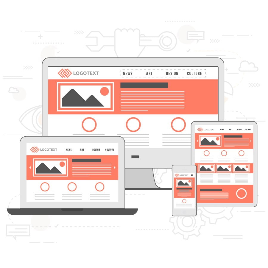
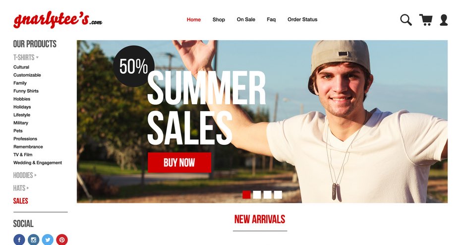
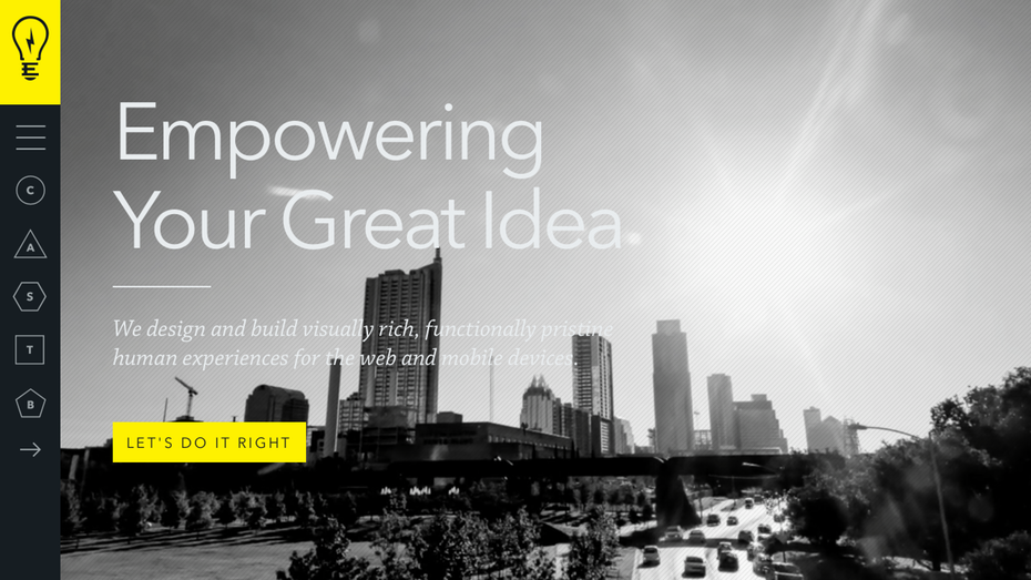
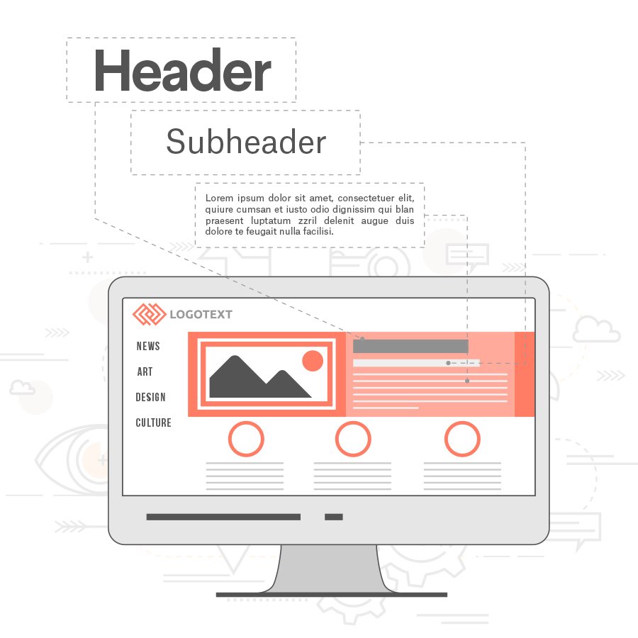
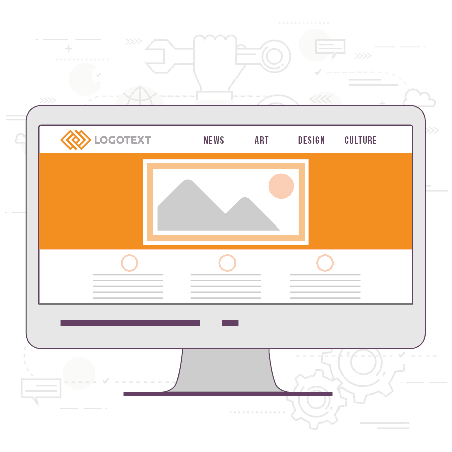
The Featured Image
If your business, organization or project isn’t heavy on the images, the Featured Image layout should be right up your alley. This layout brings attention to one photo or graphic (the featured image… #captainobvious) while keeping the rest of the page simple and text-focused. This is a great fit for folks with fewer visuals and more content.
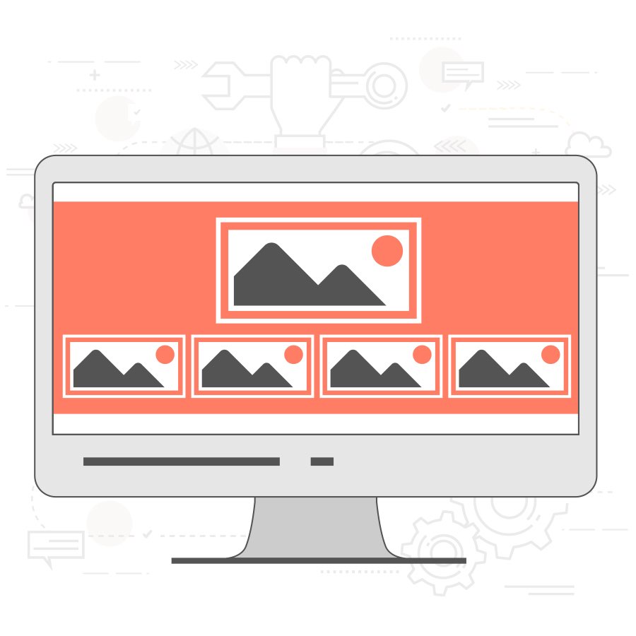
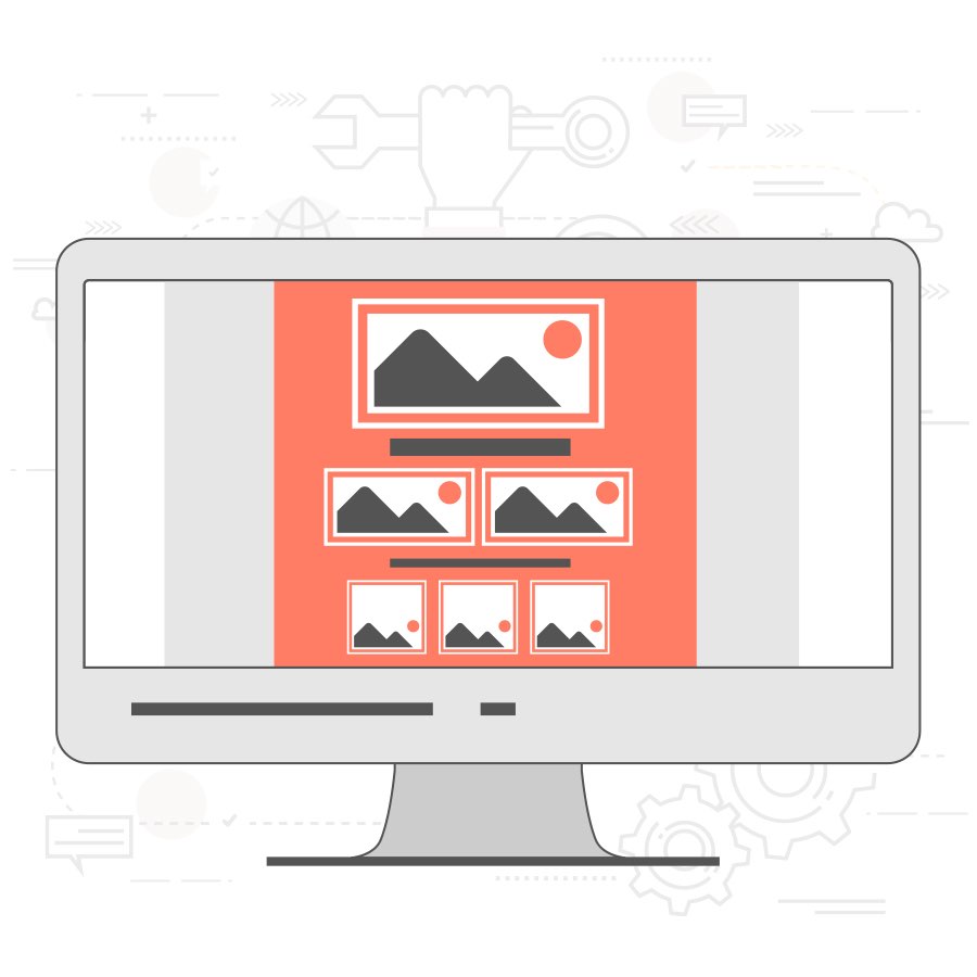
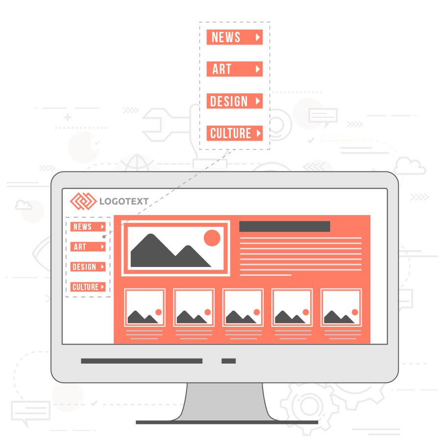
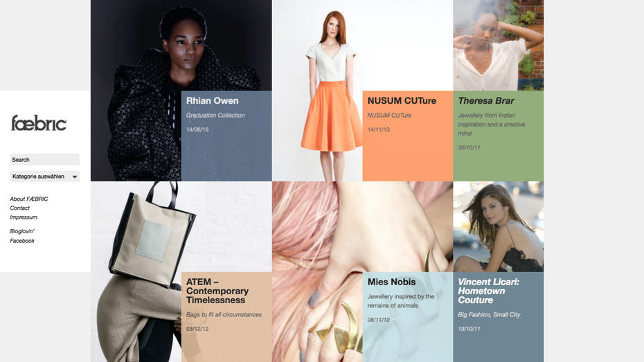
The Grid
Think of The Grid as the advanced version of The Featured Image. This layout features one large graphic area followed by a section separated into multiple blocks of varying shapes and sizes. You can insert any kind of content you want into those boxes—product images, text boxes, featured blog posts, whatever strikes your fancy. This layout works great when a lot of content that needs to be displayed.
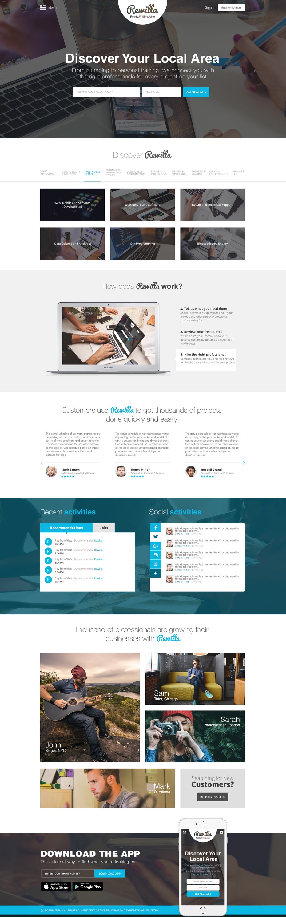
The Power Grid
The Power Grid is The Grid on steroids. This layout incorporates different squares, rectangles, and areas of space within the grid. This layout is an awesome solution if you’ve got tons of different types of content (think video, text, opt-in forms, images… you get the picture) that you need to organize.
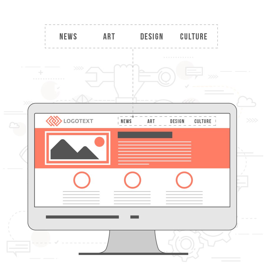
Fixed Sidebar
In all the previous layouts, navigation is typically found on the top of the page. With the Fixed Sidebar layout, you’ll find it on the sidebar along with additional content. Place the sidebar on the left or the right—either way works—and pull elements from other layouts to round out the page.
A Fixed Sidebar layout showcases your navigation no matter where your audience wanders on the site, making it super simple to move from page to page. If you’ve got a particularly tricky site with several different pages to choose from, consider a layout like this.
When you should use these
You can’t have a website without a layout. But you don’t need to use all of these. Mix and match to create something that works for you.
Where you should use these
Use a template to get the layout look you’re after. Or, if you want to go more custom, have your web designer build one from scratch.
Responsive web design
In today’s day and age, the number of people who are looking at your website on an actual computer are dwindling.
In 2016, mobile web use surpassed desktop for the first time in history. That means if you want to create a quality experience, you need to make sure that your website looks just as awesome on an iPhone as it does on a MacBook. And how do you do that? With responsive web design.
When you should use this
Every website platform has responsive themes and any web designer worth their salt can build you a responsive website. If they say they can’t, you’re working with the wrong person.
Where you should use this
The responsiveness of your website has to do with the code, so it’s either going to be implemented automatically within the code of your theme or manually by your web designer. Before you take the site live, make sure you do cross-browser and cross-device testing to make sure your audience will have the same awesome experience no matter how they view your website.
Build out your blocks
—
With your basic framework in place, now it’s time to fill in each layout block with awesome content. Every website will have a mix of the following types of content.
Navigation bar
If your website was a country, your navigation bar (or “nav bar”) would be the map—hence the whole “navigation” thing. Use this tool to show your audience where they can go and how your content is organized. If they get lost, your navigation bar should point them in the right direction.
When you should use this
You need a navigation bar on 100% of websites—literally all of them. If people don’t know where your content lives or how to find it, your website is essentially useless.
Where you should put this
Two locations work really well for a navigation bar: the top of your page or on the left sidebar. Typical nav bars are located on the top of the site, but if you have a lot of pages, consider the left sidebar since there’s more room for vertical categories than horizontal.
Images
No website layout would be complete without well-placed images, which can be used for so many different reasons.
- Images can strengthen an idea from your copy.
- Photos can build an emotional connection with your audience.
- Headshots can introduce your audience to yourself or your team (smile!).
- Artwork can add visual interest.
- Illustrations strengthen your branding.
- Graphics can bring attention to key elements of your website.
When you should use this
When it comes to images, apply the “Three Little Bears” principle: not too much, not too little, but just right. Use enough images to make your website visually interesting, but don’t overdo it. Too many images or images that don’t make sense will take away from your content instead of adding to it.
Where you should use this
There are an endless number of places where you can feature images on your website:
- Featured images for blog posts
- Gallery slider
- Author/bio images
- Header images
- Product pages
When choosing where you want to place your images, try to reverse engineer the process. What are you trying to accomplish by adding this image? Once you know that, you’ll have a better sense of where your image should live. For example, if you want people to read your blog post, using an engaging photo or graphic as a featured image would make sense.
Typography
I don’t care how visual you or your business is. You can’t have a website without text. Period.
Text is an essential part of your website, and you need to do it right. By leveraging typographic hierarchy, you can draw attention to important messaging, make your content more readable and engage your readers.
Here are the basic rules you’ll want to follow to make your text awesome:
- Avoid using too many fonts. One is great. Two is fine. Anything more than two, and you’re giving me a headache.
- Make it big enough to read. If I’m squinting to make out the copy in your blog post, guess what? I’m not reading it. For normal body copy, size 12-14 is a safe bet.
- Keep your font on-brand. If you’re a hardcore action sports company, Comic Sans probably isn’t on-brand font choice. Actually, no matter what kind of company you are, stay away from Comic Sans. Ugh!
- Avoid big blocks of text. They’re visually overwhelming and the design equivalent of a “Do Not Read” sign draped over your copy.
Your text also needs to be organized. Practice using different styles and sizes of text to bring emphasis to key parts of your copy. There are three key sizes you’ll want to utilize:
- Headers: Headers mark your largest sections with headlines or titles to grab your reader’s attention and let them know what your copy is about.
- Subheaders: Subheaders mark smaller sections to make the entire page more scannable for your reader.
- Body: The body of your content is everything else. It’s the meat of your copy.
When you should use this
All the time. There’s never an occasion where you don’t need words on your website.
Where you should use this
Everywhere. Every single page and section of your website should have legible copy that has a clear hierarchy.
Color
Just like Skittles, your website needs to taste the rainbow. Color is an extremely effective design tool and, when used strategically, it can help influence your audience and drive results. For more on how to use color to inspire action for your business, we’ve got a great piece on color psychology.
When you should use this
From day one, you should have an established brand color palette. Use these colors to brand your website and drive the results you want.
Where you should use this
Everywhere, but don’t go crazy. Keep your color palette to three colors or less. More than that and it’ll look like a bag of Starbursts threw up on your website. And don’t forget that a lack of color is sometimes just as powerful. White space is an effective tool for visually separating different areas of your website and bringing attention to important messaging, images or CTAs.
Footer
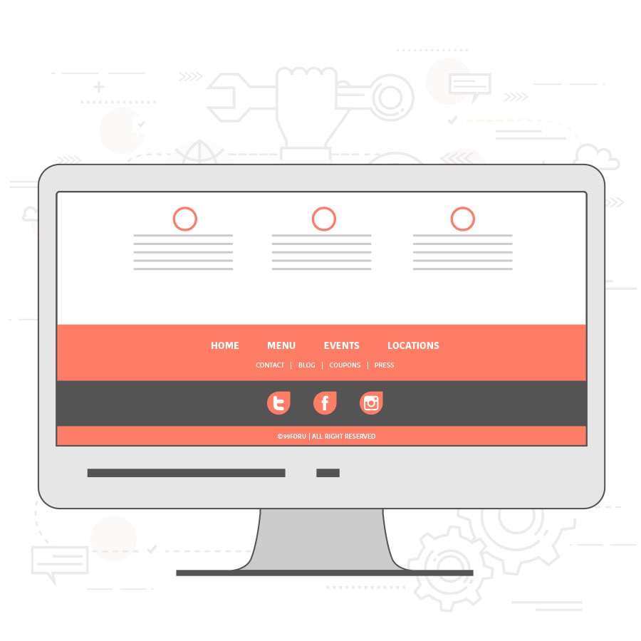
Most people think of the footer as an afterthought, but it’s actually a really important part of your website. Things to highlight in your footer include:
- Links to key pages from your navigation, like “About Us” or “Contact Us”
- Important legal information, like your privacy policy or terms of service
- Address, phone number and a Google Maps link to your office
- Social media buttons
When you should use this
Every website needs a footer. Not only is it a place to house important information, it’s also a visual cue that your website, is in fact, over.
Where you should use this
At the bottom of the page… you know, in the footer section.
Put your content to work
—
With great content in place, you’ve now got the opportunity to engage your audience. Get them clicking, liking, sharing and interacting with your site.
Call-to-action
No website would be complete without is a call-to-action (CTA). Your website’s CTA is your opportunity to drive the results you’re looking for by telling your audiences exactly what you want them to do.
There are 8 different types of CTAs you might want to include on your website:
- Lead generation: “Give me your email address and I’ll give you something in return.”
- Forms: “Fill out this form and I’ll give you something in return.”
- Read more: “Click here to find out more.”
- Product or service discovery: “Learn more about what we do by clicking here.”
- Social sharing: “Like this content? Share it with your friends!”
- Lead nurturing: “You’re already interested, but I’m going to sweeten the deal with this offer.”
- Sale closing: “Buy now!”
- Event promotion: “Register here.”
Which CTA you use depends on what you’re going for. And don’t feel like you need to be limited to just one. It’s totally fine to mix and match CTAs on your website to help maximize your impact. All of them should have a few things in common.
- Grab attention. Getting your users to take action is one of the most important functions on your website. Make your message is easy to spot, and immediately grab the eyes of your visitors.
- Be clear. If your audience is scratching their head as to what you want them to do, your CTA will fail.
- Make it easy. Don’t make your audience jump through hoops and click a button, fill out thirty forms, respond to an email and give you their firstborn child in order to successfully complete your CTA. The more steps, the more people you’ll lose.
When you should use this
Anytime you want your audience to take action and do something.
Where you should use this
Think about adding a CTA on your sales pages. Or at the end of blog posts. Or your sidebar. Or in a pop-up. The list goes on. Test out different locations to see which performs best and gives you the highest conversion rates.
Pop-ups
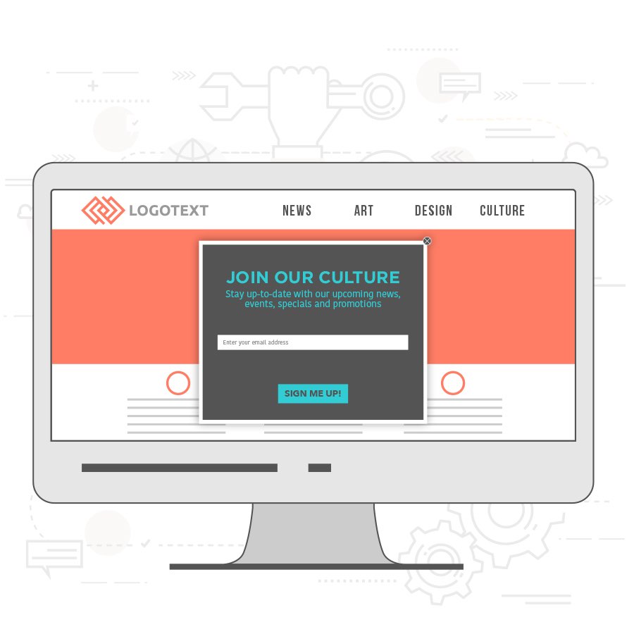
Oh, pop-ups. Think of them as the annoying-little-sister building block of your website. They’re sure to get on some people’s nerves, but they might be perfect for you.
Pop-ups are a fantastic tool for capturing leads and building out your email list. And, let’s be real, that’s just about the most powerful marketing tool you can have in business. These little guys come in several different types:
- Timed pop-ups: Appear at a specified time interval
- Click pop-ups: Appear when a visitor clicks a certain area of your site
- Scroll pop ups: Appear after a visitor scrolls past a certain point on the page
- Entry pop-ups: Appear as soon as your website loads
- Exit pop-ups: Appear when someone tries to click out of your website
Each type is effective in different ways, and the pop-up you choose depends on your messaging and goals. If your pop-up reads: “Wait! Before you go, sign up for our email list to receive this exclusive offer!” then you’ll want to use an exit pop-up.
When you should use this
Here’s the key to successfully leveraging pop-ups to gather email addresses: don’t overdo it. If you have a pop-up coming from all angles every ten seconds, your audience will get frustrated and hightail it out of there. The less intrusive you can be, the better.
Where you should use this
Your pop-ups come from a few different places:
- A pop-up that takes up the whole screen
- An overlay that appears over the center of the page
- A slide-in box that moves onto your page from off-screen
Experiment to see which style and location converts best with your audience and messaging.
Go forth and build awesome website layouts!
—
With these building blocks, you have everything you need to create the website of your dreams. Now get out there and start building!
Got some layout ideas that a designer can bring to life? Start a web design contest on 99designs.
Original article written by Deanna deBara >
[wpseo_map width=”100%” height=”300″ zoom=”-1″ map_style=”roadmap” scrollable=”0″ draggable=”1″ show_route=”0″ show_state=”1″ show_url=”0″] [wpseo_address hide_address=”1″ show_state=”1″ show_country=”1″ show_phone=”1″ show_phone_2=”0″ show_fax=”0″ show_email=”1″ show_url=”1″ show_logo=”0″ show_opening_hours=”1″]Related Articles


