Good design can sometimes seem magical, like the designer simply stumbled onto a great combination of components that both engage and enlighten the viewer. In actuality, graphic designers use a set of tools, known as the elements of design, to build and hone that perfect design.
Remember that every single piece of design is trying to communicate a message. Design can tell us which emails are unread in our inbox, which brand of socks to buy, or even to be wary of falling rocks. The elements of design are tools a designer uses to craft meaning and bring clarity to a muddled mess of ideas. They will make sure your design is as powerful as it can be.
So, what are the elements of design? Here is an overview of the six basic elements of design you need to know.
The elements of design
—
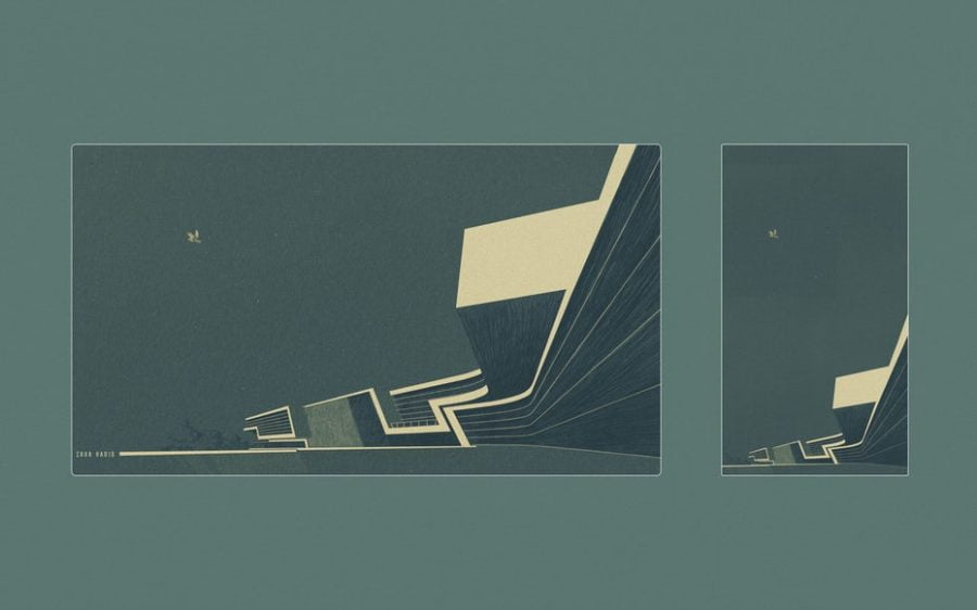
Line

Lines enclose and contain the parts of a design by creating outlines. They can be smooth, rough, continuous, broken, thick or thin.
Lines also send subliminal messages. A diagonal line, for example, has kinetic energy and movement, while a straight line is more ordered and clean.
Lines can be used to emphasize, setting particular information off in a busy composition and drawing the eye to a particular area. They can be formed into shapes or frames (more on both of those a bit further down). The eye will also see lines in other places—think buildings, branches of a tree, a horizon, or a set of train tracks—that offer a natural edge or borders.
Color
Often designs are undone by sloppy, careless or inappropriate color choices. Color is incredibly important and should never be an afterthought. Even a design set entirely in grayscale needs to be balanced and contrasted appropriately.
In addition to hue (red versus blue), consider the saturation and brightness (or “value”) of each color. Learn the basics of color theory to be sure a composition has the right mood, temperature and tone. Finally, consider what color space (CMYK or RGB) is best for the printer or screen where the design will be seen.
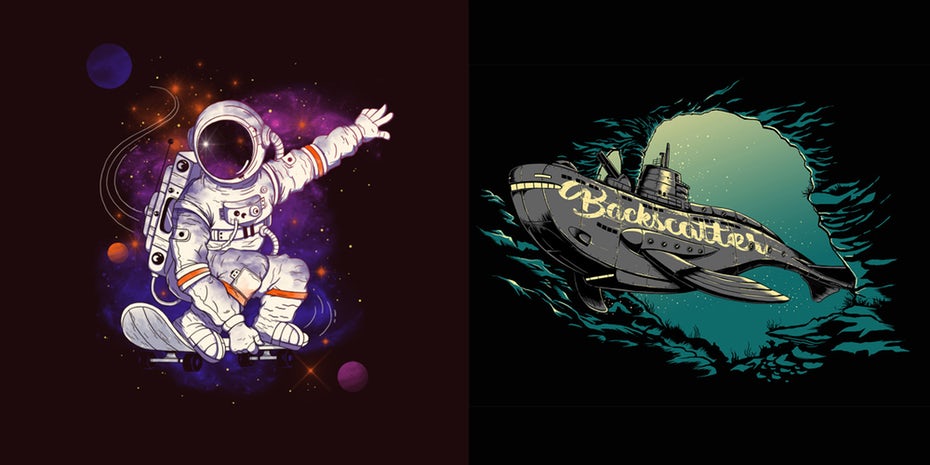
Shape

While our kindergarten teachers all hope we know what a shape is, for our purposes, a shape is any enclosed space defined by lines or in contrast to its surroundings. They can be geometric (squares, ellipses, triangles, etc) or organic (a speech bubble, a blob, those little spiky things that pop on the screen when Batman punches someone).
Other components of a composition, like blocks of text, are also shapes. A designer progresses by leaps and bounds once she sees everything in her design as shapes that need to be ordered and sized based on an invisible grid.
Texture
Texture is everywhere as we navigate the world around us by both sight and touch. While we can’t feel them on websites and printed pages, textures from the outside world can be brought into a composition to give it life.
Want to imply softness, comfort, and coziness? There’s no quicker way than a cotton textile background. On the other hand, if you’re selling building supplies, you’d probably lean toward cement, stone, and brick, with grittier textured text.
More than with any other element, textures serve as a nod to our natural environment.
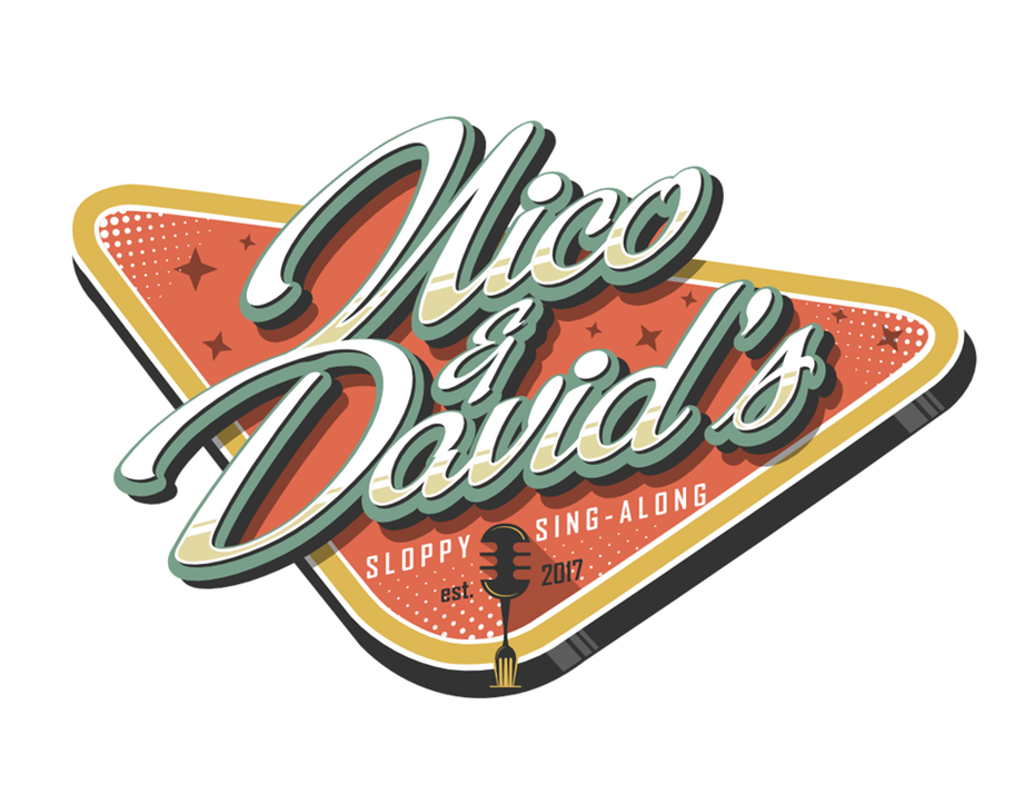
Framing


Frames can be subtle but once you train your eyes to look for them, they’ll start showing up everywhere.
Frames organize information and create hierarchy for the eye and highlight the most important information for the viewer. They can be pretty and decorative or basic and utilitarian. Frames also help define shapes in the blank white space of a page.
Type

Typography is an important element of design because it literally conveys the message you want to communicate. But type can also be more than words: if used in an intentional way, type can also be a striking visual element or a shape, as well as provide structure between the content and the visuals.
Conclusion: Time to experiment!
—
Graphic designers use most or all of these elements of design while being guided by a set of principles, known as the principles of design. If the principles of design are the instructions, the elements are the tools.
The best way to master these elements is to experiment. Once you see that something as simple as making a slight adjustment to the color scheme or adding a shape can be the a-ha! moment that elevates your design, you’ll be on your way to crafting more meaningful and effective compositions.
Want to kick start your graphic design career?
Learn how freelancing on 99designs can help you find more work.
This article was originally written and published in 2017. It’s been updated with new information and examples.


