A round of applause is in order because Nav Creative recently celebrated an incredible milestone!…
Logo trends amongst female-founded, run and funded businesses
We’ve recently been surveying our entrepreneur community to learn more about the ties between gender and entrepreneurship. The TL;DR? Men are 2x more likely to have raised $100k in funding as opposed to their female counterparts. And among mom entrepreneurs, only 19% have been able to secure outside funding as compared to 27% of male parent entrepreneurs. These findings are in line with a recent study by Crunchbase, which found that between 2010-2015, only 15 percent of seed dollars globally went to startups with at least one female founder.
While a funding gap clearly exists, there remain a wealth of woman-led companies that have managed to bridge the gap. We analyzed the logos behind the top 50 female-founded and female-run startups to determine some common threads and themes amongst these trailblazing brands. (You can find the full list of these companies here, along with an infographic about some of the common themes in the list by industry and geography).
Blue reigns supreme
—
We found blue was the color of choice amongst the top 50 female-founded most funded companies, with 32% of the businesses opting for the cool tone as their primary brand color. Blue is the cream of the colorful crop when it comes to logo design, so coming out on top follows wider industry trends.
However, we were surprised to see a huge range of sectors are opting for blue. Beyond the traditionally “blue” branded sectors such as Health Care, Accounting, Technology, Entertainment and Real Estate we are also seeing female-founded companies use blue for their logo design across Advertising, FinTech and BioTech.
So what’s the perfect partner hue for blue? All signs point to white. Vida (#15, secured $24,300,000 total funding) and Everplans (#31, secured $15,558,612 total funding) effectively use white on blue to give a fresh, clean and classic feel. Orange also appears often as a secondary color, with over a fifth (19%) of these blue logos choosing the fruity shade to add a splash of playfulness and youthful character.

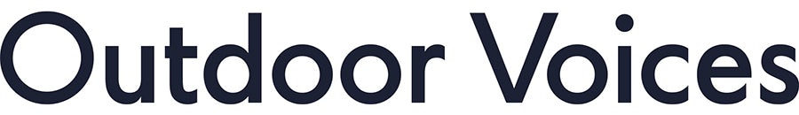
Almost half (44%) of the blue logos we analyzed opted for a dark shade of blue. Both Outdoor Voices (ranked #19 on the list, secured $21,100,000 in total funding) and Havenly (ranked #41, secured $13,320,000 in funding) use an almost black-blue for their brand identity. Moving the trusty, classic shade of blue towards black, which shouts modern luxury, gives these logos a more chic feel but allows them to maintain a sense of affordability. Establishing traits like these before a funding round can help crystallize your brand in the eyes of venture capitalists.
Combination marks are a go-to
—
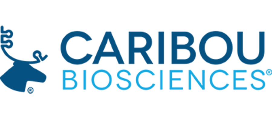
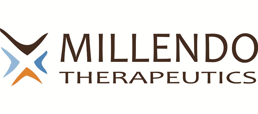
The majority (68%) of the logos we analyzed used a combination mark, which is a pictorial, abstract or symbolic element used alongside a typographical wordmark. (Think Burger King or Lacoste.) The most-funded company on our list, Millendo Therapeutics (#1, secured $86,522,872 in total funding), has opted for this type of logo, as has Berkeley-based tech company Caribou Biosciences (ranked #4, secured $44,464,846 in total funding), who use Caribou symbolism to visualize their brand alongside their wordmark.
What’s interesting is that none of the logos from the top 50 most funded companies in our list went for a stand-alone pictorial mark (like Apple). We also found that a sizable percentage (30%) of these female-founded companies opted for a wordmark without an iconographic element. This suggests that name recognition is vitally important in an early-stage businesses. In order to build a reputation you need to constantly be reminding people of who you are.
Flushed tones are perfect for tools and collaboration
—
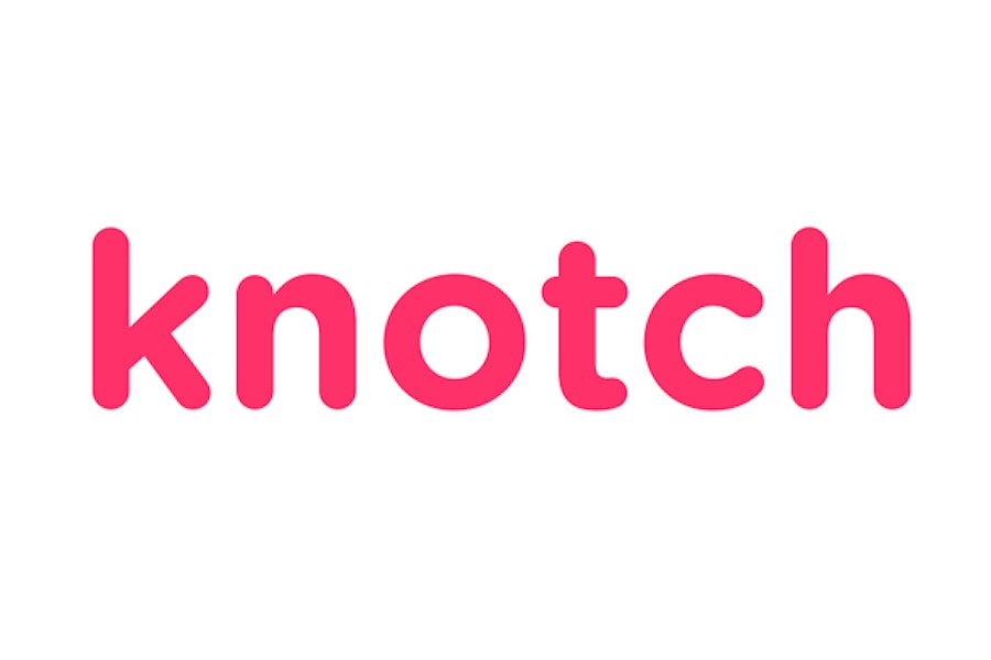
We are seeing shades of pink and red being put to good use by companies who create tools to aid collaboration and better insight. For example, Knotch (#37, raised $13,900,000 in funding) uses a vibrant shade of pink for their logo. The bright hue is attention-grabbing and playful, which is perfect for a marketing intelligence company whose value proposition is to make it “fun, easy and rewarding for your audience to share how they feel about your brand”.
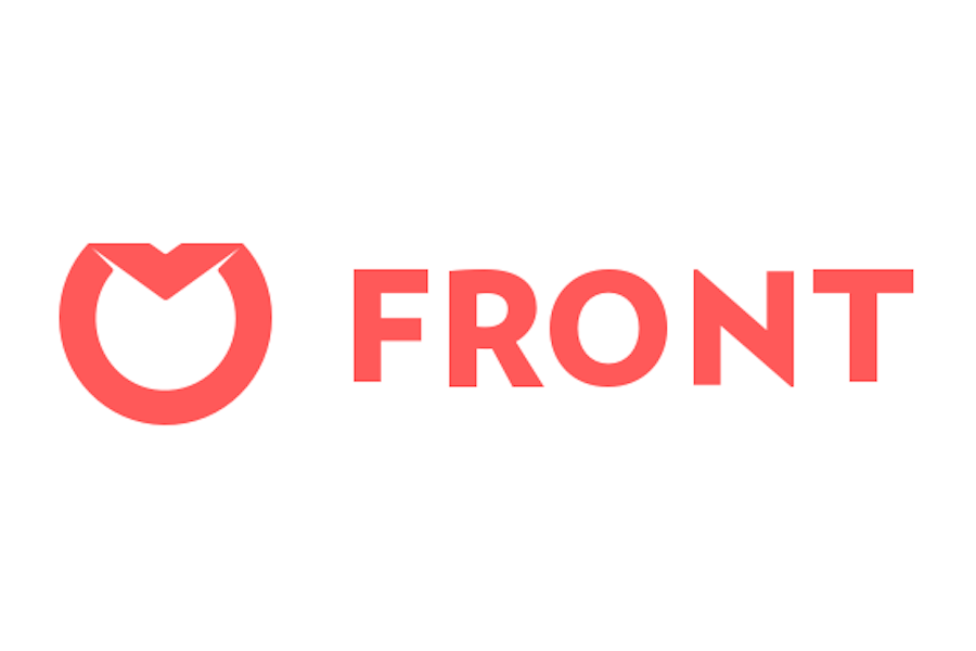
Front App (ranked #42, raised $13,250,000 total funding) is using a shade of coral red, which again gives a playful, youthful and modern character. This works well in conjunction with Front App’s fun, friendly and modern brand which facilitates collaboration with external workers.
Biotechnology brands love pattern and repetition
—
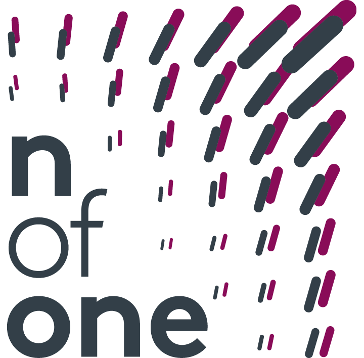
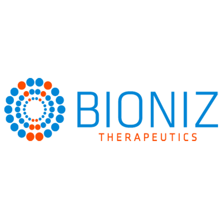
We’re seeing some really clever usage of pattern and repetition, which was a big trend in general for logo design this year, amongst companies who specialize in the biotechnology sector. A great example is company n of one (#46, secured $12,448,955 in total funding), who uses a distinctive dark greyish-blue and burgundy red pattern to signify their specialization in the field of molecular test results. The pattern treatment in their logo relates very literally to their sector while simultaneously giving their brand a fresh and distinctive visual identity. Bioniz (#40, raised $13,599,205 in total funding) are also using a concentric pattern to represent cellular molecules in their logo which also instantly provides a connection to their field of expertise.
Sophisticated, yet accessible, brands choose black
—
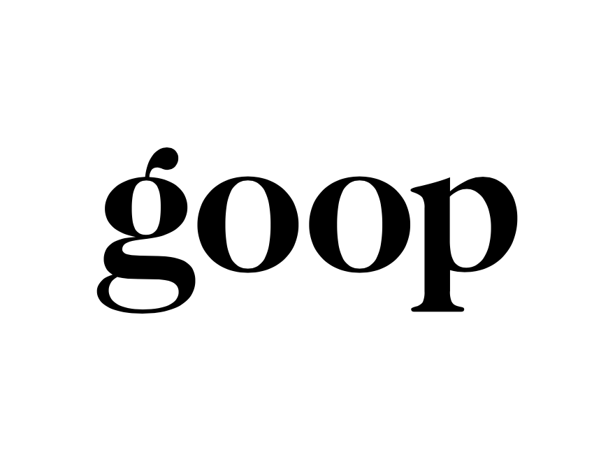
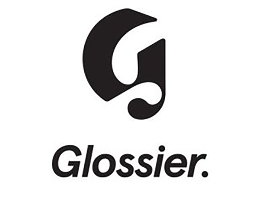
Opting for pure black in your logo speaks volumes. The classic color conveys luxury, modernity and a sense of high-end consumer goods or services. A great example is Gwyneth Paltrow’s kooky and aspirational health community, Goop (#22, secured $20,000,000 total funding), who use a classic black typographic logo on white background. Emily Weiss’ Glossier (ranked #7, raised $34,400,000 in total funding) also uses this dark monochrome approach, which matches Glossier’s “paired-down” philosophy to women’s beauty regimes. While black keeps Glossier’s appearance simple and modern, it also allows them to present themselves as a high quality, aspirational brand.
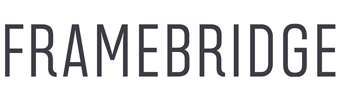
We also love the way online custom framing company Framebridge (ranked #20, secured $20,450,000 in total funding) utilizes a simple black wordmark for their logo. The style exudes a classic maturity, which is perfect for a company who sells the craftsmanship of framing at an affordable price.
Having a clear brand identity is critical to building a defensible business.
“We’ve had two logos in our short history. The first was script and our visual designer, Marcela, developed it. I loved it! A few years into Framebridge, we realized the significance of our business was larger than just decorating—we were helping people surround themselves with things they were proud of. We needed a brand system that let us share a wide range of our customers’ stories and allowed us to fit in it as an enabler.
Our new wordmark is reflective of our brand—crafted, clean and sophisticated—with a few little nods to our actual frame mouldings. We wanted our logo, like our frames, to be a natural fit for whatever we are showing off, so we only considered black and white options that worked well over photography and with strong accompanying type.”
-Susan Tynan, CEO, Framebridge
Cheers to these trailblazing brands
—
Female-founded companies don’t only exist, they thrive. While we’ve seen blue is still a crowd-favorite in the field of logos, it’s exciting to see young, modern brands experimenting with different colors and styles. These are no doubt the businesses of the future, and with such fine leadership we look forward to seeing them achieve even more victories.
Original article written by 99designs Team >
[wpseo_map width=”100%” height=”300″ zoom=”-1″ map_style=”roadmap” scrollable=”0″ draggable=”1″ show_route=”0″ show_state=”1″ show_url=”0″] [wpseo_address hide_address=”1″ show_state=”1″ show_country=”1″ show_phone=”1″ show_phone_2=”0″ show_fax=”0″ show_email=”1″ show_url=”1″ show_logo=”0″ show_opening_hours=”1″]Related Articles


