A round of applause is in order because Nav Creative recently celebrated an incredible milestone!…
How to design a logo: 10 tips for selecting a strong brand mark

Your logo should communicate your company’s story through a simple image. If you want that story to be a memorable one, your logo needs to make an impression. So how do you design a logo that will rock? Check out our logo creation checklist:
1. Communicate your brand values
—
Whether you’re working with an agency or a freelance designer, start by letting them get to know you. (Don’t panic. It’s not like you have to friend them on FB or anything!) Be sure to share your company vision, target audience demographics, and your brand’s obvious and implied benefits. They also need to know your brand-color and any colors associated with your brand. (If you don’t know yet, here’s a great resource for determining what colors your logo should be.) Don’t forget to tell them if you have any preference for fonts, symbols or pictures.
Once the designer has gathered all this information and magically transformed it into a few concepts, (how do they do that?) here’s how to judge what you’re seeing:
2. Match style to industry
—
Is the logo design appropriate for your company or business? For example, a law firm intent on establishing trust and authority would not want to use a shark as a mascot in their logo. (Unless they have an ironic sense of humor.) Make sure your logo reflects your industry, as well as your brand.
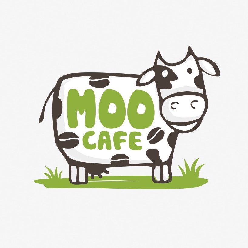
Serving both coffee and ice cream, the Moo Café’s lighthearted logo speaks to the fun atmosphere patrons can expect to find at this establishment. (Also, what could happen if one eats nothing but ice cream.)
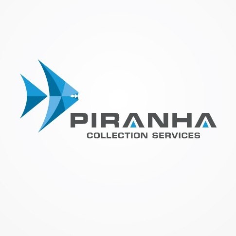
The logo for the Piranha Collection Agency has some teeth…literally. What first appears as an abstract design is actually representational of a piranha, a fish (and by extension, a collection agency) that will pick clean the bones of its prey.
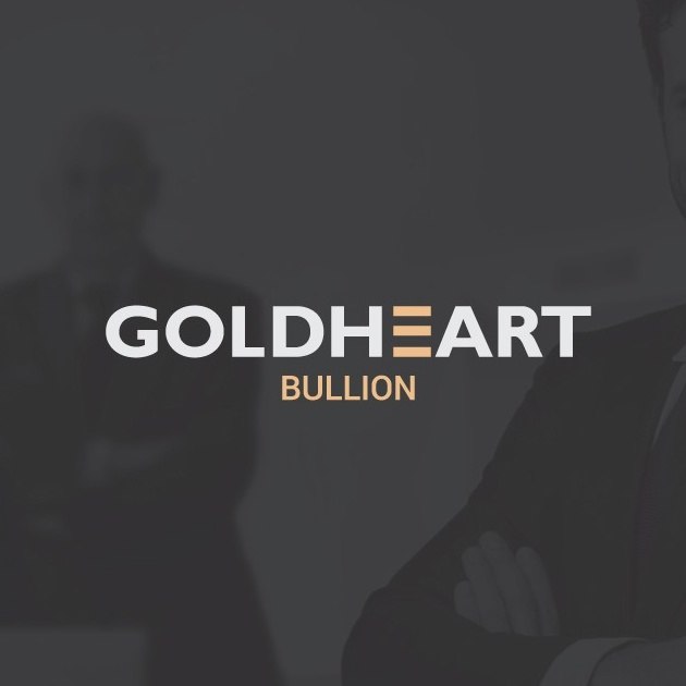
A gold bullion company utilizes a classic wordmark logo that looks distinguished, while the “E” in the company name represents gold bullion bars.
Try researching your competition’s logos to see what you’re up against. Keep in mind that you do want to maintain some of the same design elements as others in your industry, but you don’t want to be so industry-generic that your logo becomes white noise to your audience.
3. Strive for simplicity
Is the design straightforward and clean? Can you instantly identify what the words and images are communicating? Or does the logo look cluttered and chaotic?
Square, a financial, merchant and mobile payment services company, uses a monochromatic design that looks like a push button to convey the ease of using their services. The shape of the logo also physically looks like their product.
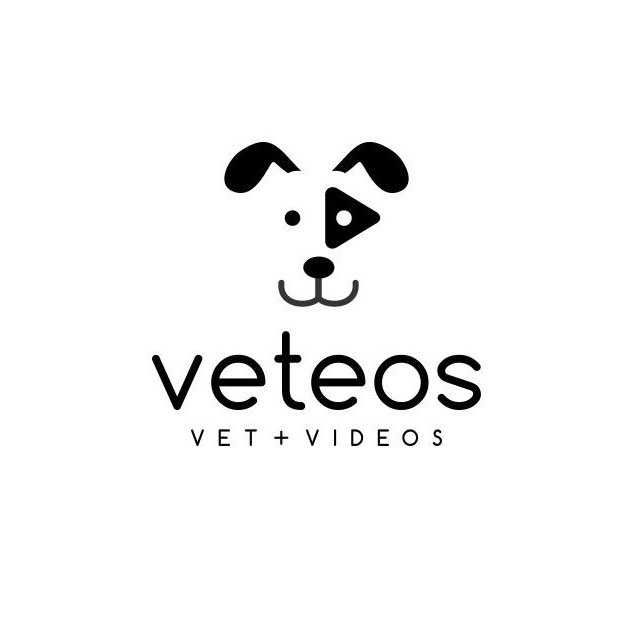
Simplistic with wonderful use of negative space, the Veteos logo tells a story. The dark patch over the dog’s left eye is cleverly suggestive of a video “Play” button.
Medium, the online publishing platform, makes effective use of a lettermark logo. Shifting color gradations across the four planes of the letter “M” symbolize “overlapping strains of conversation. A conversation whose tone and direction shift as the planes come into contact with each other.”
Without complex design or an abundance of text to accompany them, each of these logos instantly communicates a brand story in very basic way .
4. Be unforgettable
—
Does the logo contain graphics, color combinations or symbols that make an impression? If you saw the graphic without the text, would you remember the business associated with the logo? Think McDonald’s golden arches, Nike’s iconic swoosh and Coca Cola’s classic script. According to AdWeek, “Memorable logos are 13 percent more likely to get consumers’ attention, 7 percent more likely to make them want to learn more about the brand, and 6 percent more likely to suggest a company is more unique than others in its category.
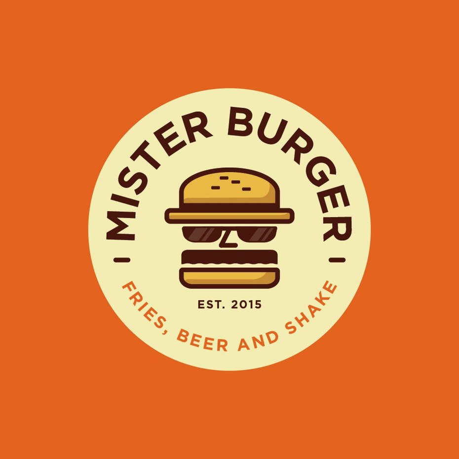
Bold color choices and a fun graphics make the Mr. Burger logo interesting and memorable. A recognizable mascot logo like this works well for branding across a wide range of marketing materials and promotional items.
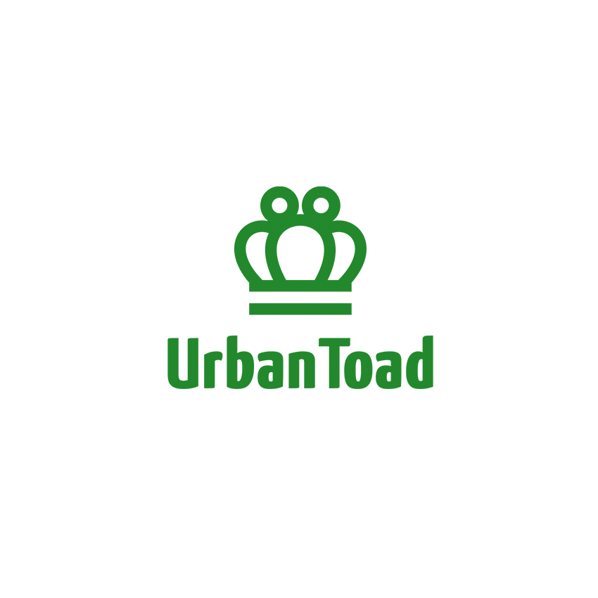
Playful graphics used in the Urban Toad logo successfully merges the symbol of its toad namesake with the imagery of a crown, a symbol of excellence. From apparel to merchandise, the logo’s clean lines and double entendre meaning make it instantly identifiable and unforgettable.
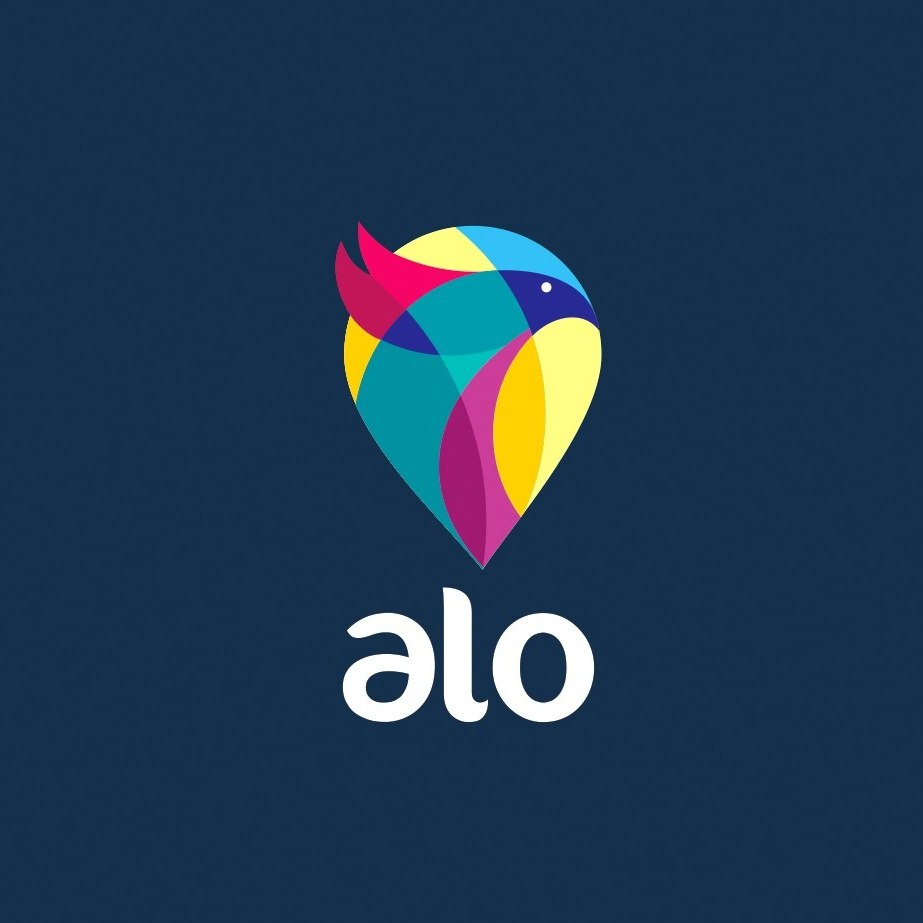
alo’s brightly colored bird logo, with aesthetically pleasing lines and small feathered detail, pops on any background. Bold colors and contrast make for an enduring brand image.
Strong use of color, contrast, symbolism and simplicity work together to create a logo that your target market will not soon forget.
5. Aim for a long logo life
—
Will your logo design endure for decades? Some logos hit the nail so squarely on the head, that they remain the same recognizable brand symbol for generations. However, unless you’re plugged into the psychic network, it’s hard to know if your logo will stand the test of time. Ensuring logo longevity is not an exact science, but sticking with classic designs and avoiding trends goes a long way toward giving your logo a long life.
via Smucker’s
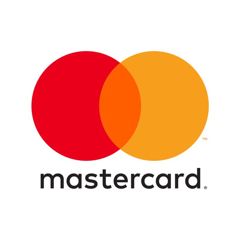
via Mastercard
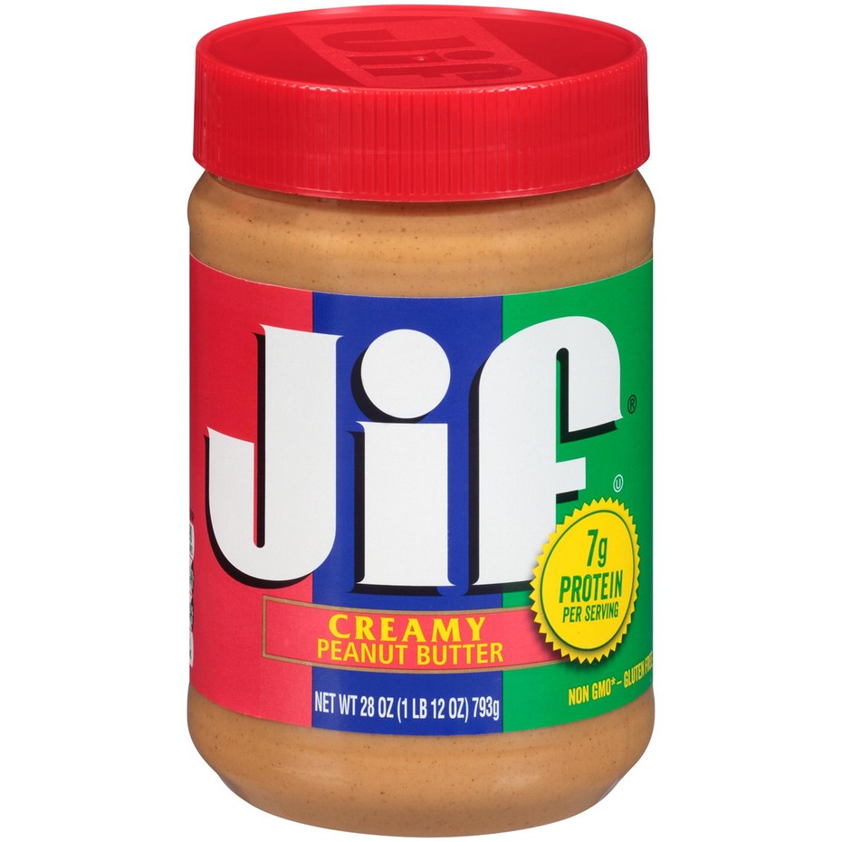
Jif Peanut Butter’s logo design is childlike with bold colors and big letters. Along with its tagline, “Choosy moms, choose Jif,” it has been successful since its creation in 1966.
Even successful, familiar logos long associated with a brand do change. The key to maintaining that important brand association and thus, an enduring logo, lies in keeping core elements the same. After 20 years, Mastercard recently refreshed their logo, preserving the recognizable red and orange overlapping spheres, but moving the text to beneath the symbol and updating the font. (The drop shadow used with the old font was so 1996!)
A timeless logo will stick with your company for a long time. Done right, it’s also something that can be slightly tweaked with the times, keeping its essence but also staying modern and fresh.
6. Make sure the design is flexible
—
Is your logo scalable or does it lose its quality if its enlarged or reduced in size? Can you take the logo from merchandise to marketing? From billboards to labels? Or will the logos message get lost in translation when there are differences in size, resolution, or materials?
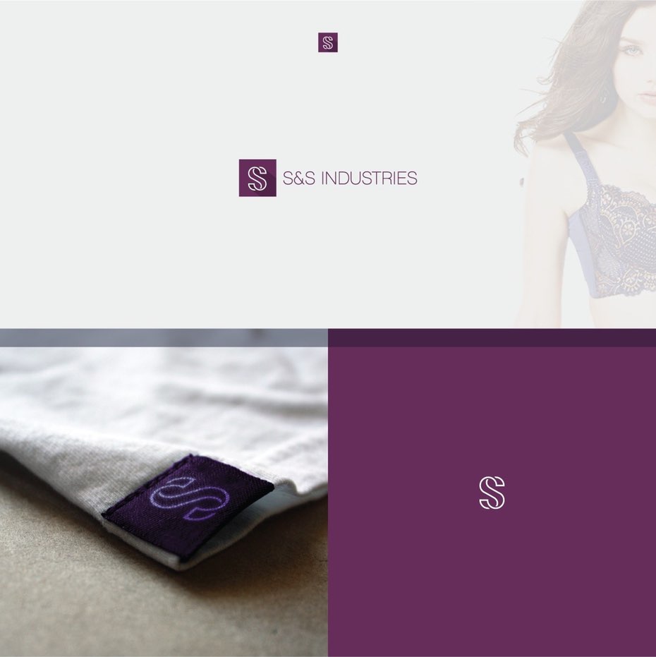
The logo for S&S industries adapts nicely whether positioned vertically or horizontally. It also seamlessly transitions from paper to product. Because of its simplicity, converting the image and text from full-color to a monochromatic line drawing is easy.
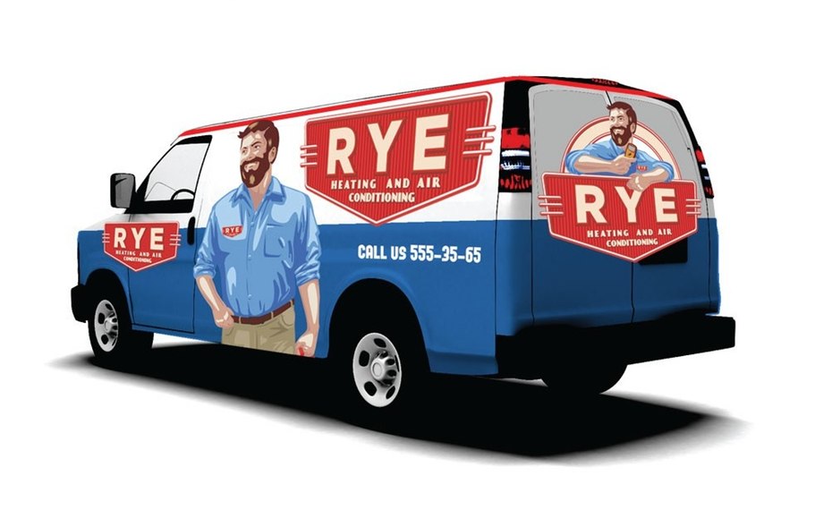
A combination wordmark/mascot logo like the one for Rye HVAC is easy to replicate across a wide spectrum of small to large marketing mediums, from business cards to a truck wrap.
Make sure you consider all the materials and mediums that will carry your logo and how it will adapt to each. A too-complex design may make these transitions problematic. You can always ask your designer for several, slightly modified versions for different purposes.
7. Design for your customer, not for yourself
—
Does your logo click with your target audience? For example, you might be a big, burly, motorcycle-riding mama, but if your target market is comprised of tween girls, you should create a logo for their sensibilities, not yours. Ask yourself if your logo design reflect trends or styles that they might find appealing…or appalling? (Or GROSS!)
All three of these logos are intended to represent eating and drinking establishments, yet all are distinctly different, designed to appeal to their very specific target customers. Who do you think would eat at each place? Pretty easy, right?
Make sure your logo connects with your ideal customer just as seamlessly.
8. Be unique
—
Is the logo original and one of a kind? Nike, Coke, Apple all have unique, and instantly recognizable logos. But more than being recognizable, they’re distinct, and stand out from the competition.
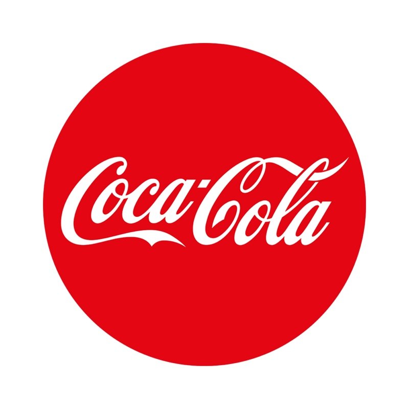
Coca Cola’s classic script wordmark logo and bold red color are truly unique when compared with other busier, multi-colored soft drink logos.
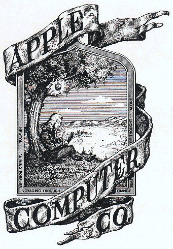
The original Apple, Inc. logo, which featured Issac Newton sitting next to a tree, only lasted a year and was replaced in 1976.
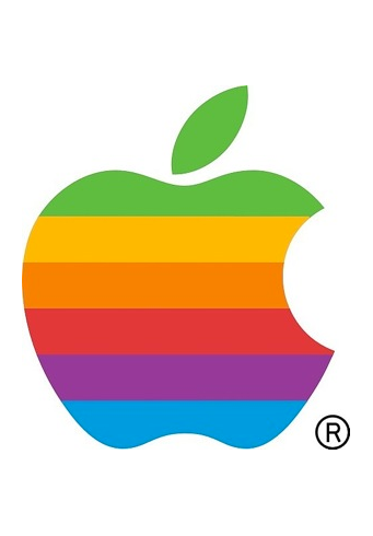
The rainbow apple was Apple, Inc’s logo for over 22 years until Steve Jobs changed to a monochromatic look when returning to the company in 1998.
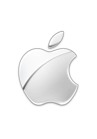
Apple, Inc’s current logo. Apple uses multiple variations of their monochromatic apple, also using black, white and gray.
Similarly, there are about six billion computer companies with some variation of a blue logo. (Well…that might be a wee bit of an exaggeration.) Yet, even with its variation in color throughout the years, the Apple logo remains distinctive and iconic.
And while you do want your logo to be relevant to your industry (see #1) it’s also important that it stand out from the competition. One way to achieve originality is to look for a design trend in an unrelated industry and apply it to your own. For example:
Arg gallery logo by Trails

Real estate logo by Sava Stoic for Illuminate Real Estate
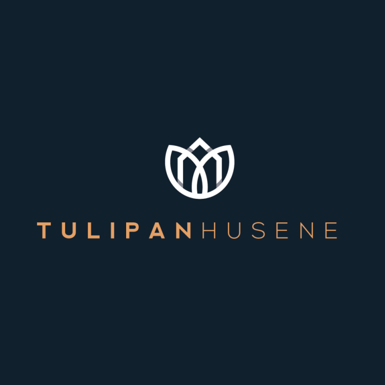
Housing company logo by Arthean for Tulipanhusene
Logos for art galleries are often very creative and abstract. Using that same type of design style for an industry that typically uses more representational imagery (such as real estate or construction) can be an original and distinctive approach.
What creative elements can you take from other industries to help your logo stand out from the competition?
9. Make your message clear
—
Does your logo design convey a clear meaning or message? Does it accurately reflect your brand? Does it represent your company values? The ideal logo is self-explanatory.
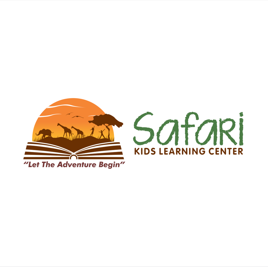
Logo design by Naomi Theresia for Safari Kids Learning Center
Logo design by artsigma
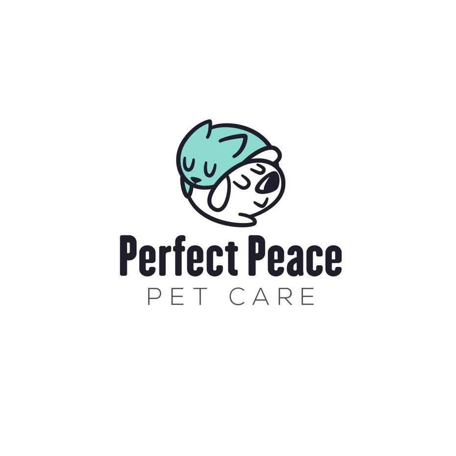
Logo design by Angela Cuellar for Perfect Peace Pet Care Company
The silhouettes of wild animals journeying across the pages of an open book connect with the Safari Kids Learning Center company message about the adventure of learning.
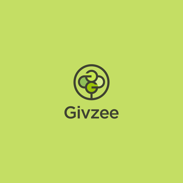
A logo for Givzee, an online platform for charitable donations, uses an abstracted “G” to look like a person’s arms are protectively wrapped around another. The focus on the act of charitable giving and the human element is particularly effective when it mirrors the photo it accompanies.
The image of a sleeping cat and dog in the Perfect Peace Pet Care logo instantly creates the message of peace and contentment this company wants to send.
Each one of these logos are easy to understand because they perfectly reflect their company’s mission and service.
10. Look for eye-catching imagery
—
Attractive, pleasing, beautiful… these are all subjective terms. As you assess your design and try to determine if your logo is visually appealing, there are a few key things too look for:
Use of negative space

Logo design by Cross the Lime
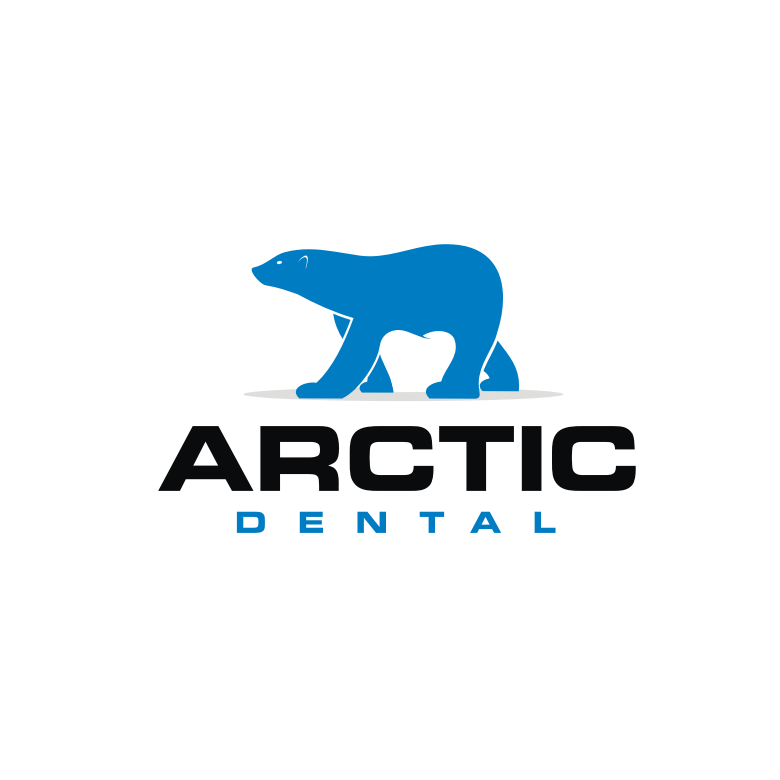
Dental logo by ks_projekt
Negative space (the space around and between the subject) can lend great visual appeal, as the viewer recognizes that what isn’t there is actually part of the picture. Not all logos make use of it, but since it often makes people stop and think about your logo for a moment, it can be an awesome way to get customers to remember your brand.
Color
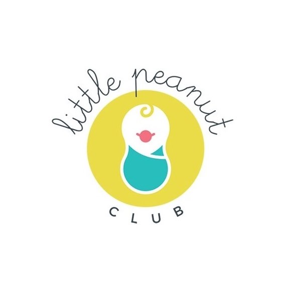
Logo design by Purpleri for Little Peanut Club
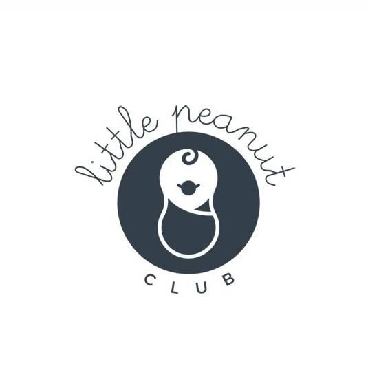
Logo design by Purpleri for Little Peanut Club
People associate colors with a wide range of emotions and stereotypes, so your logo colors should not only reflect your brand’s personality, but the emotion you want it to evoke in your target. The bright colors used in the Little Peanut Club logo are a whimsical and playful choice, perfect for its intended audience. Not only is choosing a hue important, you also want to consider whether your logo works in black and white, as well as full color.
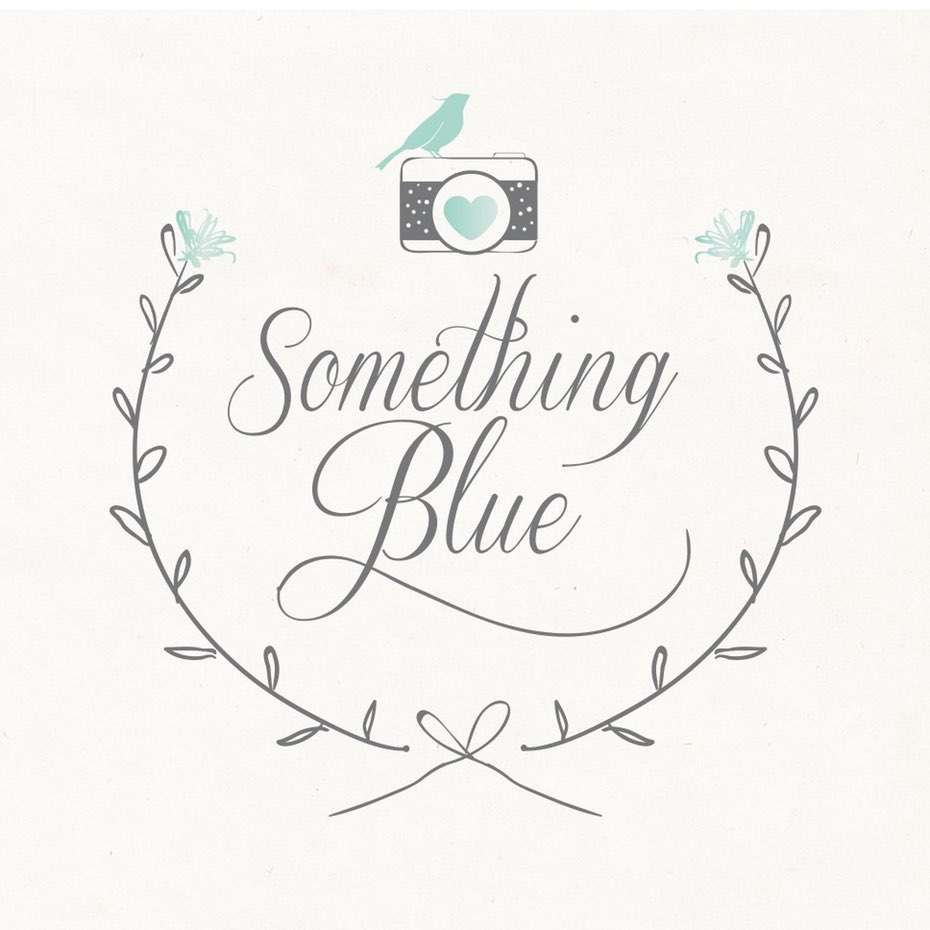
Typography
Fonts, like colors, communicate a message of their own. A logo for Something Blue Wedding Photography contains a script font because it looks elegant and formal.
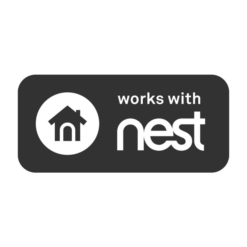
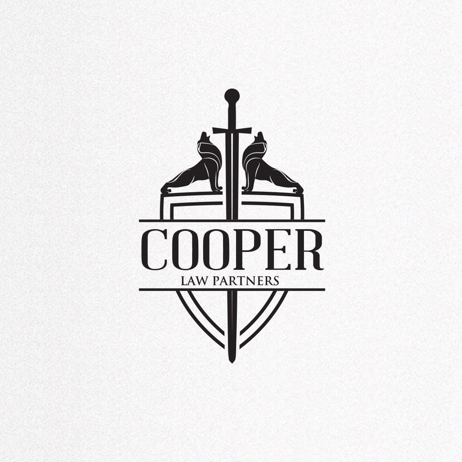
Cooper Law Partners utilizes a more classic serif type to give their logo a business-like appearance.
Nest—a company that offers home security and energy efficiency products—uses the “n” from their wordmark to create a door to the house in their app icon, tying the two images together and beautifully illustrating what they do.
Imagine any of these logos with a Comic Sans font, and you’ll understand why your type choice can literally make or break your design. (Plus, if you ask your designer to use Comic Sans, you’ll probably never hear from them again.)
Cleverness

Never underestimate the impact and appeal of a clever logo. Snapchat, the image messaging mobile app, allows users to share images that are short-lived and self-deleting. What better image to communicate this functionality, than a ghost?
Slack, an instant messaging and collaboration system, plays on pop culture using the ubiquitous hashtag (if you don’t know what that is, ask any 12-year-old to explain it) which also represents what they do: connect people from different teams, allowing them to better communicate and work together.
Now that you know what to look for when judging your design, you too can have a logo that both rocks and rolls!
Ready to design the perfect logo for your business? Why not launch a logo design contest or find an amazing freelance designer to work with?
Original article written by Kris Decker >
[wpseo_map width=”100%” height=”300″ zoom=”-1″ map_style=”roadmap” scrollable=”0″ draggable=”1″ show_route=”0″ show_state=”1″ show_url=”0″] [wpseo_address hide_address=”1″ show_state=”1″ show_country=”1″ show_phone=”1″ show_phone_2=”0″ show_fax=”0″ show_email=”1″ show_url=”1″ show_logo=”0″ show_opening_hours=”1″]Related Articles


