


A round of applause is in order because Nav Creative recently celebrated an incredible milestone!…
15 banner ad design tips to get more clicks
If you’re hoping to boost your online traffic with better ads, you may be asking yourself: what is web banner design? Web banner design focuses on the systematic creation of effective web banner ads through the careful application of basic design guidelines.
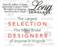
Banner ads are one of the most prolific forms of marketing used in today’s online world. All companies use them in one form or another because they’re an affordable, measurable and effective medium to increase brand awareness. So how can you design and create web banner ads that will bring in those clicks? Below is a list of tips and general guidelines for designing banner ads.
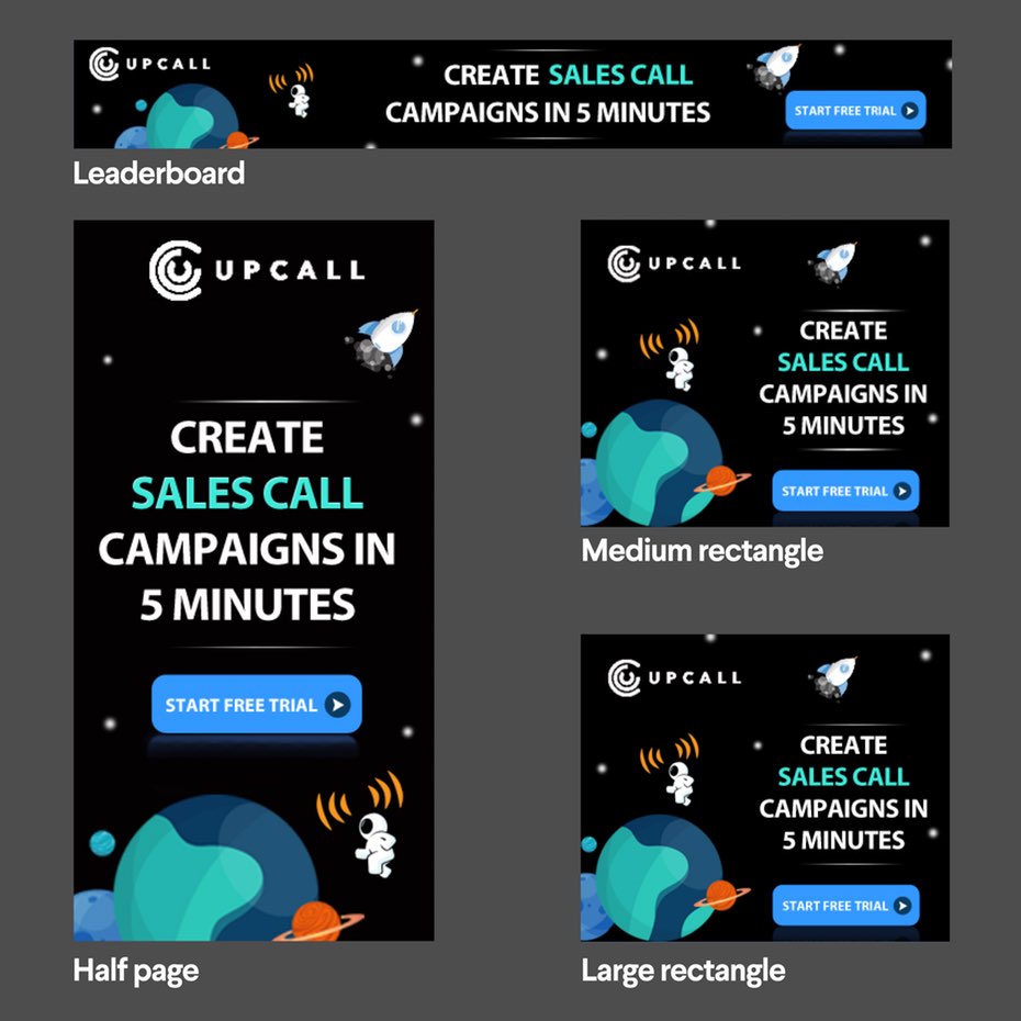
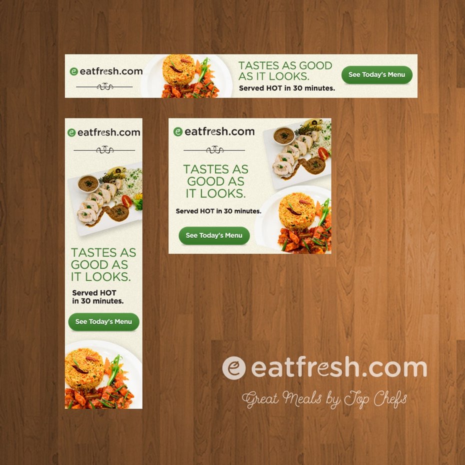
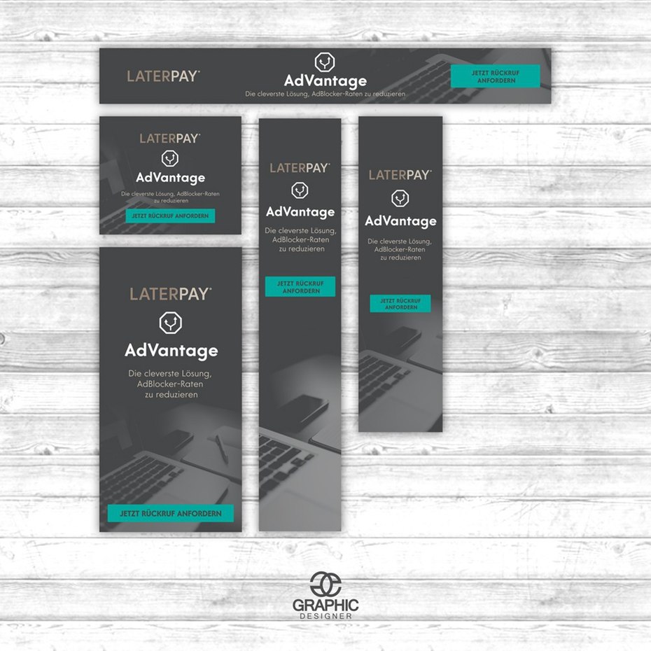
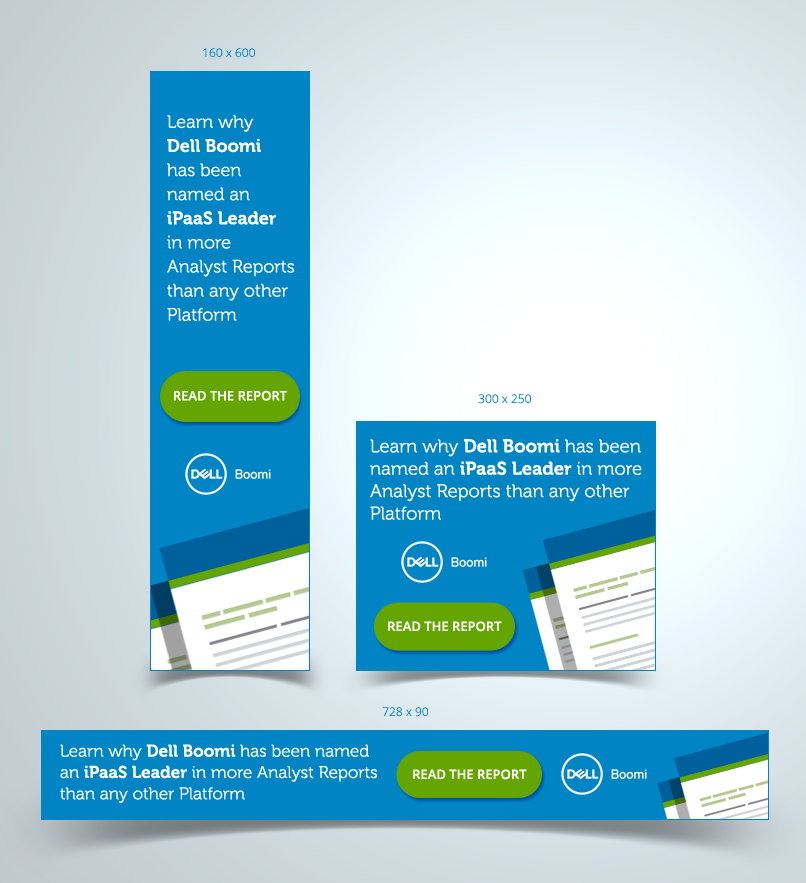
1. Use the most effective, standard banner sizes
—
According to Google Adsense, the most successful standard banner sizes are:
- 728×90px — Leaderboard
- 300×600px — Half Page
- 300×250px — Medium Rectangle
- 336×280px — Large Rectangle
2. Place your banner ads correctly
—
Purchase space on a website where your design will be featured above the fold and close to the main content of a page.
3. Maintain hierarchy
—
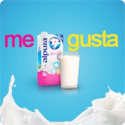
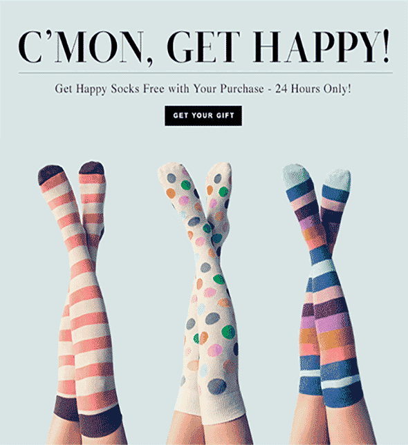
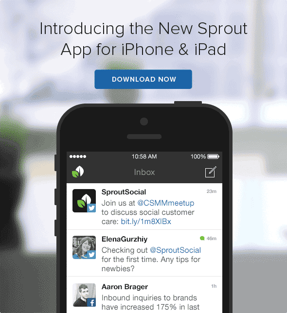
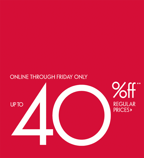
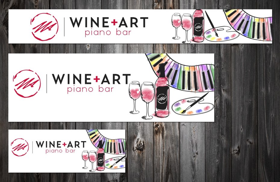
Banner ad design relies upon the right balance within each ad, so watch your hierarchy. Effective banner ads are designed to increase brand awareness and drive traffic to your website. They have three basic components:
Your company logo
Your company logo must be included to build brand awareness. Make sure it’s visually dominant, but not as dominant as the value proposition or the call to action.
The value proposition
The value proposition showcases the service/product you provides and calls attention to itself with attractive offers and prices. Think things like: “High quality” or “50% off” or “Limited time offer.” This should take up the most space in your ad and be the first thing that viewers’ eyes see.
The call to action
The call to action (or CTA) is the text or button that invites users to click. Phrases like “Learn more” or ‘”Get started” or “Watch Now” are great examples. This should be a clear focal point of the ad.
4. Keep it simple
—
Keep content and visuals simple. Viewers are probably only going to glance at your web banner ad for a second.
5. Use buttons appropriately
—
Depending on the type of banner, buttons will often increase the click-through rate (CTR) of your ad. If you’re going to use them, place them after your copy on the lower right side in (tastefully) contrasting colors. Always keep them consistent throughout the set of ads.
6. Have a clearly defined frame
—
People’s eyes are naturally drawn to a subject inside a frame. Effective banner ads have a clearly defined frame with graphics extended to the edges of the box. If your ad is white, it’s a common practice to put a 1 pixel gray border around the ad.
7. Make your text instantly readable
—
Do
Make your headline and body copy different sizes. All copy should be four lines or less.
Don’t
Use cursive/script fonts, extremely thin font weight, all uppercase copy, or font sizes smaller than a 10 pt (unless it’s a disclaimer or copyright notice).
8. Use animation
—
Animated web banner ads usually out-perform static banner ads, and can be very effective in website banner design, but you have to make sure that they don’t distract from the message of your ad.
Use simple animations that last no more than 15 seconds, and make sure that they don’t loop more than 3 times. Consider making the last frame of your animation a clear call to action.
9. Complement, but stand out
—
If your ad visually blends into the sites where it’s featured, you’re more likely to earn your viewers trust. However, don’t make it blend in too much. Banner ads always needs to be visible and clickable.
10. Be consistent with your brand
—
Your banner ad will link to a landing page that includes your offer. Make sure the ad matches your branding and the landing page so potential customers don’t get confused.
11. Instill a sense of urgency
—
Bring a sense of visual urgency to the text by using contrasting, bold colors. Banner ads are not always meant to be subtle.
12. Use imagery well (and only when you need it)
—
Choose relevant graphics and photos that enhance your message and are directly related to your product. No abstract concepts here.
Can’t afford professional photography or supermodels? Buy an affordable license for a stock photo. There are millions of high quality ones out there. Better still, opt for original illustrations or graphics created by a designer.
Remember, it’s not always necessary to use images in your banner ads. Killer copy and nice typography can create equally effective results.
13. Choose appropriate colors
—
Every color has a different association, and it’s important to consider what types of emotions you want to evoke in your audience. Color will be the first thing a user notices in your banner ad.
Colors are also subjective and have different associations in different cultures. Make sure to study your target audience when making your color selections. Below is a list of colors and the emotions they typically evoke in a Western audience.
- Red: Passion, anger, excitement, and love. This powerful color is attractive to most audiences, but use it in moderation. If you’re aiming for a classic, mature, or serious look, avoid red.
- Orange: Playfulness and invigorating feelings. Not as overpowering as red, orange still stands apart from the crowd and exudes energy; it’s a great color for a call to action button.
- Yellow: Cheer, sunshine, and friendliness. Yellow is eye-catching and sends out an energy that is youthful and affordable.
- Green: Health, freshness, wealth, the environment, growth, nurturing, and new beginnings. It’s easy on the eyes, too.
- Blue: Safety, trust, clarity, maturity, serenity, intellect, formality, refreshment, coldness, and masculinity. Blue appears in more than half of all logos.
- Purple: Luxury, royalty, extravagance, wisdom, magic, femininity, and creativity. It has a soothing, calming effect on a viewer.
- Pink: Love, sweetness, femininity, youth, and babies. Pink is typically associated with all things feminine, but has a real range based on brightness and tone.
- Black: Exclusivity, mystery, modernity, power, prestige, luxury, and formality. It’s traditional, and black text on a white background is the most readable color combination.
- White: Purity, cleanliness, modernity, sterility, simplicity, honesty, and innocence. White creates feelings of economic sense and youth.
- Brown: Nature, wood, leather, seriousness, masculinity, toughness, and humility. Brown balances out stronger colors and is good for background colors and textures.
- Gray: Neutrality and practicality. When used as a background, gray intensifies other colors.
14. Keep your file sizes small
—
When it comes to file size, the smaller the better—under 150 kb, according to Google Adwords. Your ad needs to load fast on a page before viewers scroll down and miss it.
15. Use the correct file formats
—
JPG, PNG, GIF or HTML5 files will be your working deliverables. Your designer will typically work in Adobe Illustrator or Photoshop to deliver JPG, PNG, or GIF files, or in Google Web Designer or Adobe Animate for HTML5 files. Remember, Flash ads are pretty much out of date at this point, so opt for these other image file formats.
You’re ready to build better banners!
—
There you have it! These are just some banner ad design guidelines, but it takes a lot more to create truly awesome, high-performing ads. If you’re not a professional designer (or too busy running a business), consider hiring a talented creative to design the perfect, clickable ads just for you.
Ready to improve your ROI? Start a 99designs banner ad contest now.
—
This article was originally written by Rebecca Creger and published in 2013. The current version has been updated with new information and examples.
Original article written by Karla Lant >
[wpseo_map width=”100%” height=”300″ zoom=”-1″ map_style=”roadmap” scrollable=”0″ draggable=”1″ show_route=”0″ show_state=”1″ show_url=”0″] [wpseo_address hide_address=”1″ show_state=”1″ show_country=”1″ show_phone=”1″ show_phone_2=”0″ show_fax=”0″ show_email=”1″ show_url=”1″ show_logo=”0″ show_opening_hours=”1″]Related Articles


