A round of applause is in order because Nav Creative recently celebrated an incredible milestone!…
How cover design can increase book visibility by 50% (or more)
Whether your book is published traditionally, or you’re doing it yourself, unless your name is Steven King or Margaret Atwood, you’re likely going to be doing a lot of self-promotion and marketing. With over one million new books published each year (and that’s new books, never mind the millions already out there) you’re going to have to do something to make yourself standout. Maybe you’ll develop a huge social following. Or build your author brand. Or utilize your mad networking skills to get a bunch of Amazon reviews.
Or maybe you should redesign your book cover.
At 99designs, we believe in the power of design. And not just in the frou-frou, beautiful-things-make-us-happy kind of way. We believe that good design can help authors and entrepreneurs look more professional and make more money.
We also believe in the power of data, so we put our beliefs to the test.
Our methodology
—
We recruited four authors and offered them free book cover design contests in exchange for being our guinea pigs. Our design experts worked with authors to select the most viable cover designs.* We then created two ads for each book: same written copy, same title, same target audience, same everything, except different cover images.
We ran A/B tests to see which version of each ad got more clicks on Facebook. The results surpassed our expectations:
The new, redesigned book covers generated 51% more clicks than the originals.
Overall, every single one of the books tested performed better with a new, professionally designed cover. Improvement in click-through rate ranged from 6% on the low end, to 122% on the high end. Let’s take a look at the individual cover redesigns and see what we can learn.
Miles of Files: 122% more clicks
—
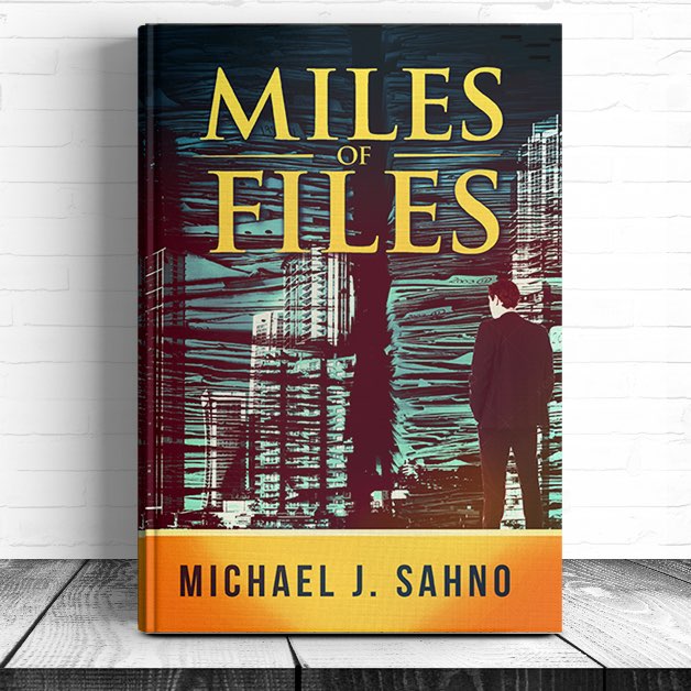
Author: Michael J. Sahno
Genre: Comedic crime thriller
Ads targeted to people who like: crime fiction, crime thrillers, Michael Chabon.
The takeaway
- Book covers need to communicate the correct genre. Choose colors and imagery that let readers know instantaneously whether this is the type of book they would enjoy. Before you decide on your cover, research your competitors and look for trends. Or read our article on designing covers for different genres.
Original cover
The original Miles of Files cover featured a pastel color palette, elongated serif font and what appears to be an endless stretch of empty beach with a large pen fading into the distance. If I had to guess what this book was about, I would say it was a romance novel with a writer as the main character.
I’m going to guess this is not what the original designer intended.
New cover
The cover our design experts chose for Miles of Files uses a bright, complementary color palette of orange and blue. The retro design style also uses high contrast, which is reminiscent of vintage noir. Similarly, the title font still has the feel of a classic serif, but it is much thicker and bolder. These elements create tension in the design, and very clearly let us know this is a crime thriller.
Finally, the designer, Alex Tibio, adds double meaning and gives the cover a whimsical feel by layering images of a city over large stacks of paper. This gives the reader a hint not only at the plot, characters and setting, but also lets us know that there might be humorous elements in the book.
Check out Miles of Files on Amazon.
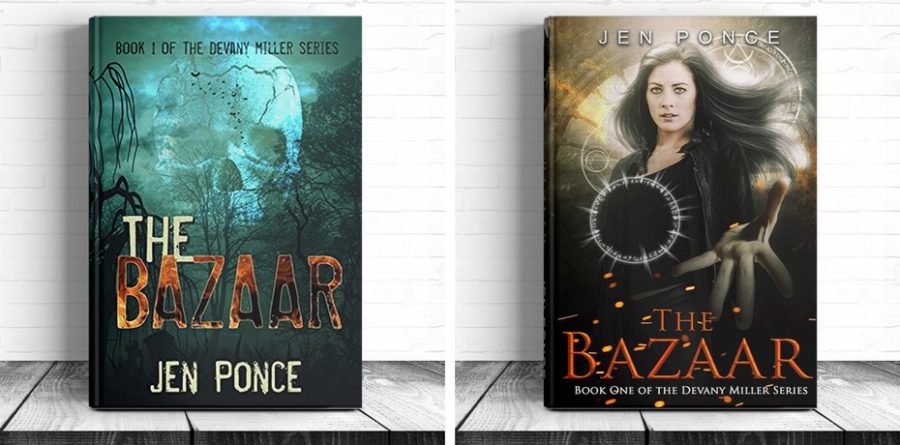
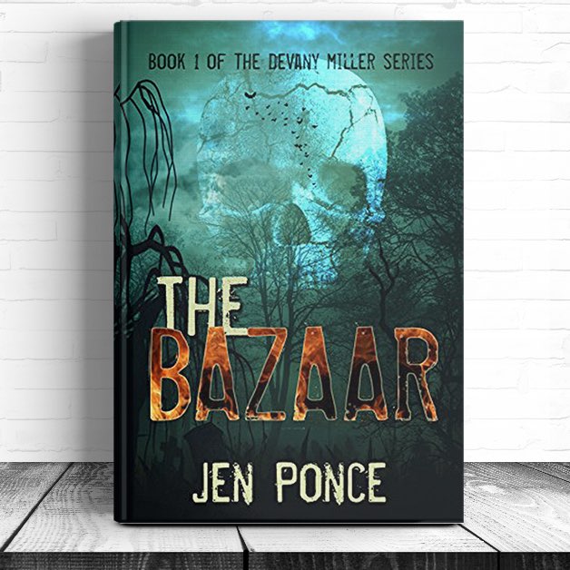
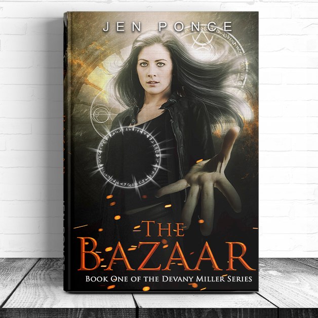
The Bazaar: 51% more clicks
—
Author: Jen Ponce
Genre: Fantasy
Ads targeted to people who like: dark fantasy, Graham Masterton
The takeaways
- Typography is very important! The fonts you use should accentuate the meaning of a book’s title, or build upon important themes or moods, and should be easily readable.
- Imagery that lets the reader know who and what the book is about drives more interest.
Original cover
The tone of The Bazaar’s original cover is certainly creepy, and the skull lets us know that there are some dark, deadly forces at play, but overall the design is busy. The fonts used for the title and author name are difficult to read, and feel dated. (This is particularly true of the title, with a fire background and stroke around the letters.) I got so lost in the texture, the title lost meaning to me.
Overall, the cover is setting a tone, but it’s so dark it may be turning readers off.
New cover
The Bazaar’s new cover maintains the dark, mysterious feel with high contrast and deep shadows. It adds to the tone by layering glowing symbols that appear to be occult, which lets us know that not only is this dark, but there are fantasy elements at play. The title font has been changed to a refined serif, which accentuates its meaning: a bazaar is an exotic market where goods are sold. This makes me curious: what is being sold? What does this have to do with the occult symbols? Instead of focusing on dated design elements, I’m wondering more about the book, which is always a good sign.
The new design also changes the color palette and adds an important element that was missing in the original: the protagonist. Including the image of a woman on the cover allows readers to identify with Devany Miller, which is especially important since this is book one in a series about this character. Finally, the new golden color palette makes it more warm and approachable. This book is more than just a dark fantasy, it tells a human story.
Check out The Bazaar on Amazon.
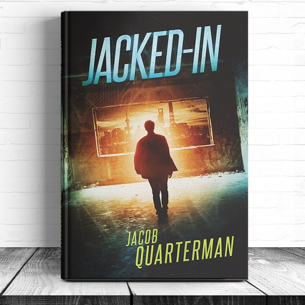
Jacked In: 20% more clicks
—
Author: Jacob Quarterman
Genre: YA science fiction
Ads targeted to people who like: Divergent (novel), Matched trilogy, Condie, Science Fiction Book Club, Hunger Games (novel), The Maze Runner series
The takeaway
- Details indicate quality. Subtle elements—like lighting, image arrangement and treatment—are what make a book cover look professional.
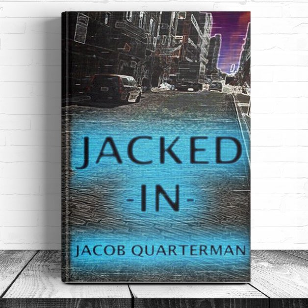
Original cover
The original Jacked In cover has a very homemade feel. Though there is a sense of depth in the image, it’s unclear what the meaning of the main image is—it’s just a generic street, with a Volvo parked in front of a building. The image also been treated with a heavy filter that seems like it came with a 90s design program.
The title is very dominant, and stands out with an eerie teal glow. I know something unusual is happening, but I’m not sure what.
New cover
Again, we see a thriller using contrasting colors to indicate genre. We also get a hint of what the book is about: there’s a city framed in the window, but the room in the foreground is decaying and sparse. We get a silhouette of our protagonist. He is walking forward, towards a glowing orange light. There are also subtle, textured light treatments overlaying the image. This creates mystery and highlights that the gap between the fore and backgrounds. It makes me wonder what is connecting them and gives the cover a distinctly post-apocalyptic feel.
The image is also tilted sideways. This creates a sense of unease. We know something is off in this world.
Finally, the title is a bold, modern serif. It’s stylized and a bit playful. This helps ground the book in the YA (young adult) genre.
Check out Jacked-In (Volume 1) on Amazon.
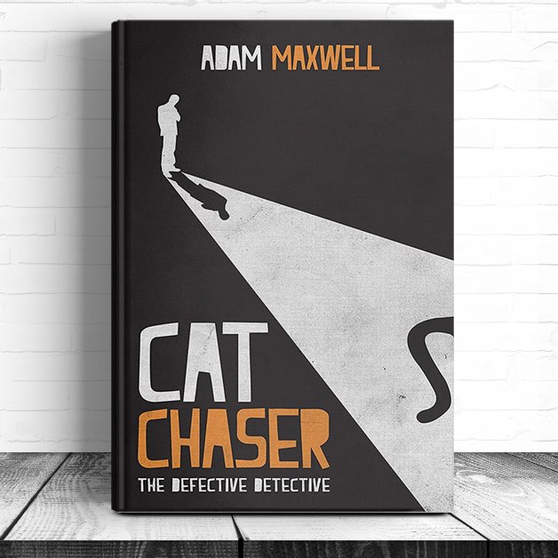
Cat Chaser: 6% more clicks
—
Author: Adam Maxwell
Genre: Humorous mystery / detective novel
Ads targeted to people who like: Agatha Christie, Carl Hiaasen, Sherlock Holmes
The takeaway
- Using a distinct visual style can make your book stand out.
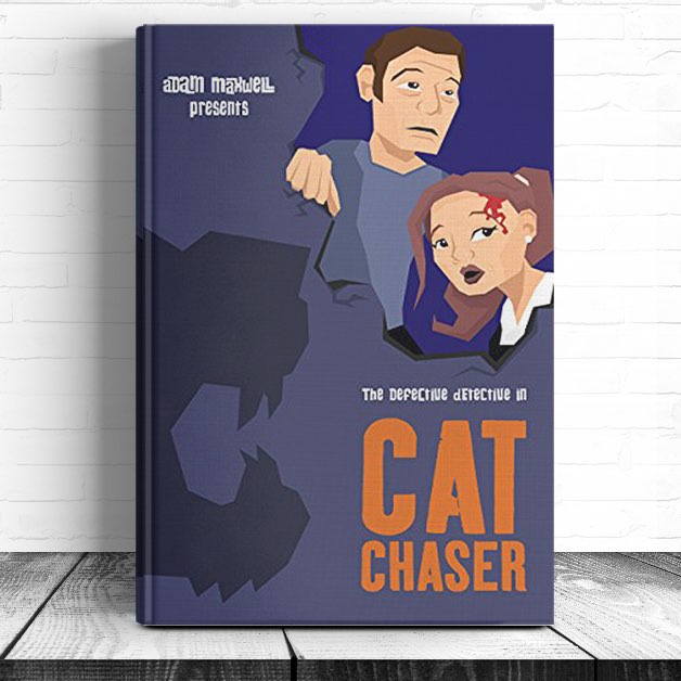
Original cover
The original Cat Chaser cover has cartoonish imagery, a bubbly, bright orange title font, and a exaggerated shadow of a large cat. The humorous elements of the book are definitely there. Unfortunately, it also feels like a children’s book.
New cover
The cover our design experts chose as their favorite for Cat Chaser has the distinct look of a pulpy, noir detective novel, but it also feels modern. It’s like someone has taken the Pink Panther and updated for the 2010s. There is a bold, high-contrast image, with strong lighting that let’s us know this is a detective story. A few details give away the humor: the shadow of a cat’s tail and the playful font.
The minimalist color palette and design make this book stand out from busy covers on bookstore (or eReader) shelves. The design also uses composition to draw our eyes downward from the human figure to the book’s great title. What is a cat chaser? Now I need to know more!
Check out The Defective Detective: Cat Chaser on Amazon.
Getting a cover that sells
—
Your potential readers are going to take a look at your cover and decide instantaneously if it’s something they’re interested in. A well-designed cover:
- lets readers know the book’s genre;
- hints at the plot;
- establishes a connection with a protagonist;
- sets a tone;
- uses the correct colors and typography;
- pays attention to the small details; and
- has a distinct visual style;
All of this creates interest. And the more people that are interested in your book, the more copies you’re likely to sell.
When we started this experiment, we had a hunch that good design sells. And now we have the data to prove it. Getting the right cover for your book, designed by a professional, is going to help it stand out.
Ready to give your book a competitive advantage? Launch a book cover design contest today.
—
* Authors were not obligated to choose the designs selected by our experts as their contest winners. The authors of both Miles of Files and Cat Chaser chose different designs. In both of these cases, the author-selected designs performed basically on-par with the original designs.↩
Original article written by Kelly >
[wpseo_map width=”100%” height=”300″ zoom=”-1″ map_style=”roadmap” scrollable=”0″ draggable=”1″ show_route=”0″ show_state=”1″ show_url=”0″] [wpseo_address hide_address=”1″ show_state=”1″ show_country=”1″ show_phone=”1″ show_phone_2=”0″ show_fax=”0″ show_email=”1″ show_url=”1″ show_logo=”0″ show_opening_hours=”1″]Related Articles


