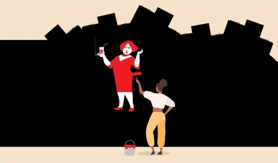
Flat design has been a standard design choice for a while now, and there’s good reason for that. It’s streamlined, it’s modern and perhaps most importantly, it delivers information fast—all while looking clean and fresh. For all the good flat design can do for brands, it’s easy to look at a flat image and think that creating one yourself is simple, that it requires no skill or effort.
But that’s not the case. This trend has a long history, and there’s a great deal of design thinking that goes into giving your flat design substance. That’s where this guide comes in, to help you understand the psychology that gave rise to flat design and how best to apply the aesthetic to your future projects. Here are some tips you don’t want to miss, because in spite of how long flat design has been around, it doesn’t look like it’s going away anytime soon.
What is flat design?
—
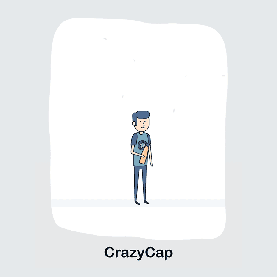
Flat design is what it sounds like: a design style that’s two dimensional and proud of it. There’s no shading, no added-in glare and no highlights to make images look 3D. Rather, flat design embraces a 2D style in order to communicate information quickly.
Effective flat design is unobtrusive by nature, and this means it often incorporates “invisible” design elements, choices on your part that the user won’t notice. Users feel and interact with these elements, but don’t really “see” them—even when they’re part of the visual design. Let’s take a look at a few examples:
- Using a shopping cart icon to communicate where the user has to click to finish their transaction. Yes, the icon is visible, but there’s no “click here” call to action.
- Breaking up information on a page with different background colors. Give each paragraph a separate punch by displaying it over its own color.
- Using specific color combinations to tell the viewer how to relate to certain images and information. When something’s urgent, make it stand out with bright red text.
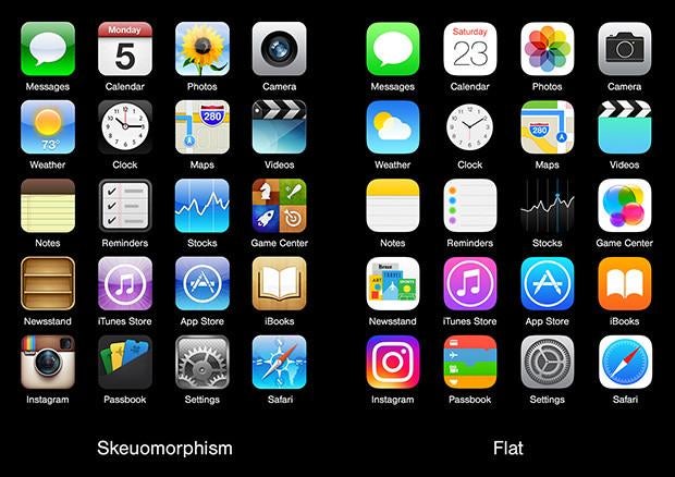
Here’s how flat design works in web design: all web design is crafted to guide the user through the site or app, and flat design approaches this role in a very different way from its predecessor, skeuomorphic design. While skeuomorphic design uses visual and auditory cues to tell the user how it works by comparing it to an analog item that accomplished the same task, flat design takes the user by the hand and guides them through the app/site, making it feel like an immersive, intuitive experience.
The history of flat design
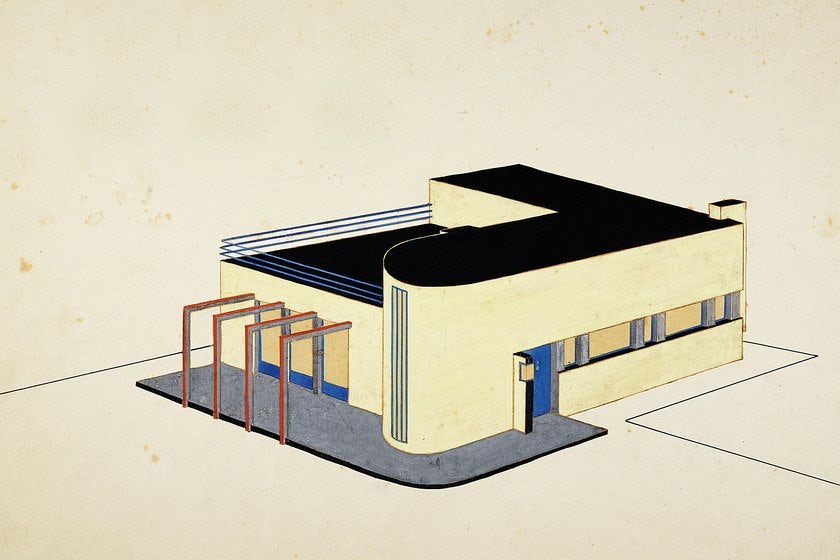
Flat design was created in response to skeuomorphic design, but that’s not the whole story. Like most other design movements, flat design has its roots in other design trends—most notably Swiss style, Modernism and Bauhaus.
Aesthetically, flat design was largely inspired by the Swiss style, also known as international typographic style. Swiss style is bold, in your face and doesn’t include any design elements that aren’t completely necessary. A few design elements flat design lifts directly from Swiss style are:
- High contrast
- Minimalism
- The use of color and contrast to create depth
- Efficient use of space
- Use of symbols, rather than accurate renderings, to convey ideas
Flat design emerged when skeuomorphism stopped being necessary. Skeuomorphism is the design style that uses realistic images of analog objects to show users how programs that approximate these analog objects work. Skeuomorphism can also involve auditory and tactile cues to accomplish this same goal. Two examples of these are a shutter sound programmed into a camera app and the process of highlighting text on a screen by pulling your finger across it like you’re using a highlighter on paper.
Skeuomorphic design makes it easier for people raised in the analog world to navigate the digital world. When you need to discard a file in your computer, you just drag it over to the recycling bin icon—that’s skeuomorphic design doing what it was created to do. When you want to make a phone call, you tap the icon on your phone that looks like an old-fashioned telephone receiver. But by the 2010s, most of us had been using computers for 20+ years. Some of us had never known a world without ubiquitous computers and internet access, and regardless of which of these categories you’re in, you probably don’t need skeuomorphic design to teach you how to use apps anymore. Enter flat design!
Flat design in the digital age
Though the design movements mentioned above laid the groundwork, it took the internet and industry competition to bring flat design into the mainstream.
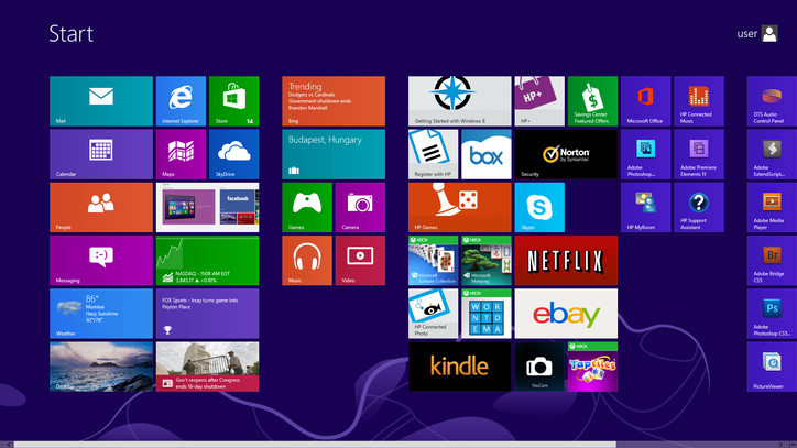
In the past, Apple’s general aesthetic was skeuomorphic, and this prompted Microsoft to lead the way in another direction, starting with the Windows Media Player and Zune interfaces from the early 2000s. By the time Windows 8 premiered with a completely flat interface in 2012, Microsoft had established itself as the leader of the trend.
It was only a matter of time before other brands followed suit and updated their old skeuomorphic designs, like Instagram’s polarizing rebrand. Eventually, even Apple hopped on the flat design train in 2013 with iOS 7, and by the middle of the 2010s, flat design was everywhere.
Nowadays, you see flat design in so many places that you probably don’t even notice it—which is the whole point. The trend has gone beyond interface design to encompass illustration, advertising, logo design and more. Flat design is intrinsically linked with minimalism, which makes it useful for a number of graphic design and branding needs. Take a look at designs you like, and you’ll probably see a bunch of different takes on flat design.
Flat design evolves into semi-flat design
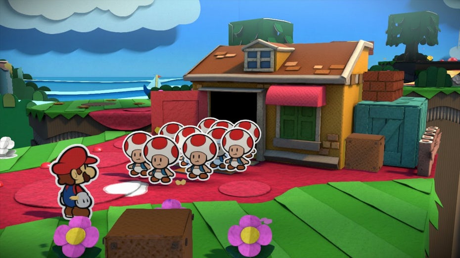
Semi-flat design, also known as flat 2.0, is flat design with a few realistic touches added back in, like shadows. It’s a happy medium between flat and three dimensional design—a choice to make when you like the look of flat design but you just can’t totally commit to nixing all the aesthetic details that make your images pop off the page.
One solid reason you’d use semi-flat design is to get around flat design’s drawbacks, like having to cut down on the amount of information you can communicate because you’re boxed-in by your design and risking users not realizing where to click or scroll because you couldn’t make your cues for them obvious enough.
From a less utilitarian perspective, semi-flat design adds visual interest to the image. Traditional flat design is efficient, but semi-flat design allows designers achieve a similar effect without sacrificing all of the subtleties and special touches that give designs a stylistic flair or allow you to take advantage of trends like color transitions.
When to use flat design
—
Use flat design any time that you have messages you need to communicate efficiently. Messages like “tap here,” “swipe this way,” and “this is how the product works” are all the kinds of messages that flat design communicates well. Here are some common instances:
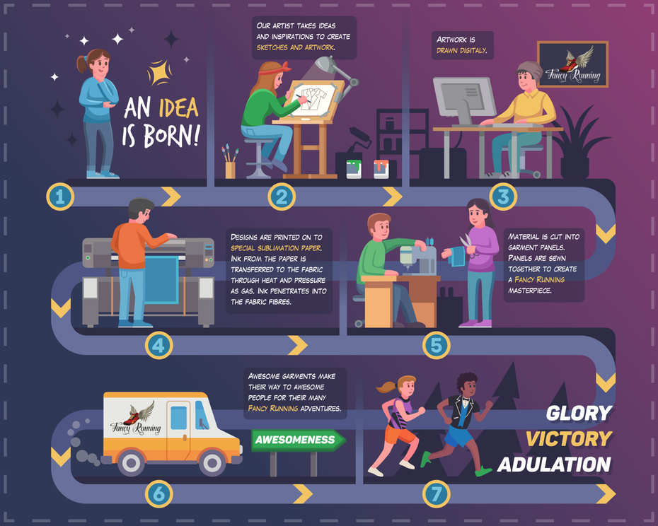
- Infographics, where the goal is to distill a complicated topic into easily digestible examples
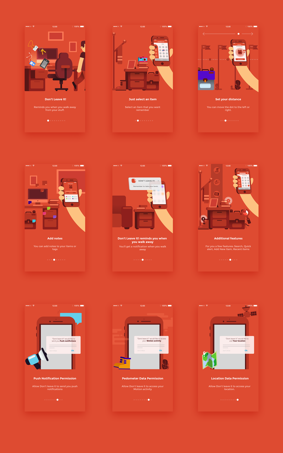
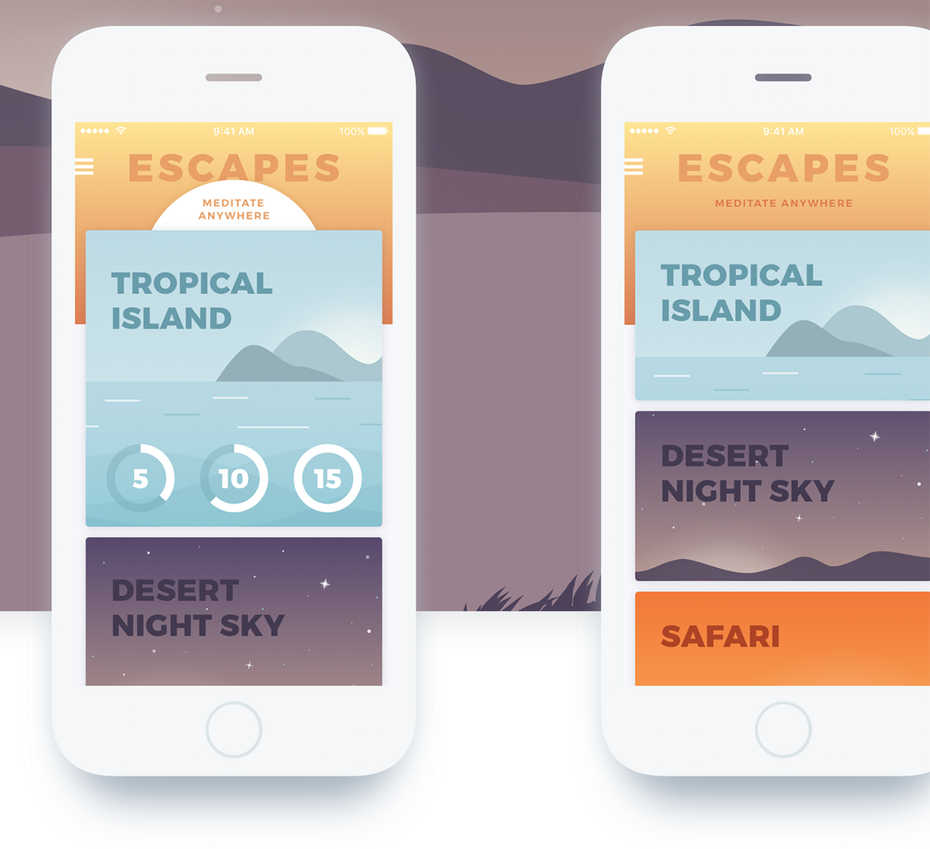
- Manuals and How-it-works pages on websites that walk the user through step-by-step instructions
- Advertising, where the viewer did not seek out the material and definitely does not want to do the extra mental work to understand it
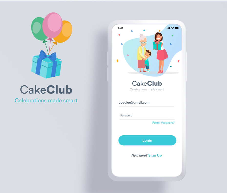
- Logo design and branding where the business concept might be unfamiliar and needs to communicate its vibe immediately
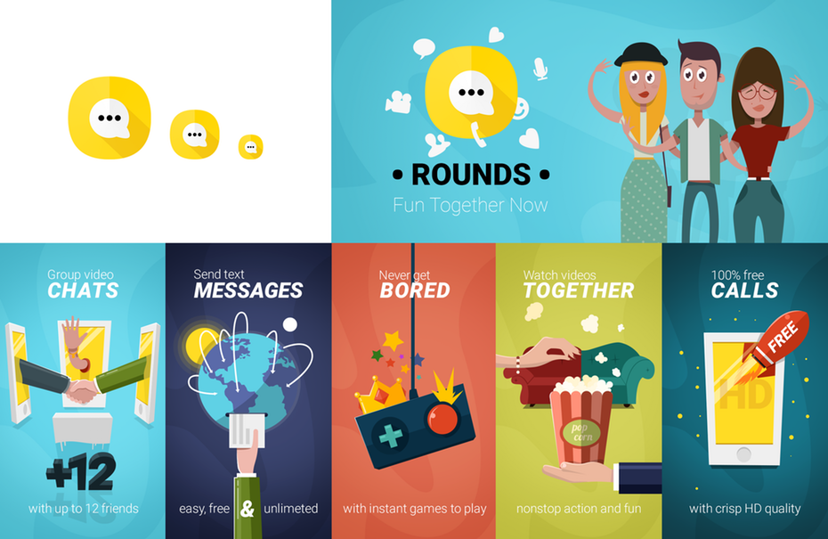
- App icons and other designs that are too small to be overly detailed
- Mobile gaming interfaces where the users tend to be casual gamers looking for a distraction, not some overly complex simulation
- For interfaces where the user needs to know what do next right away. If you’ve got a dense, multi-page website that has a lot of features, flat design might not be for you. But if you’re aiming to be the “Uber of [insert the industry you want to disrupt here],” flat is the way to go
While these are the usual suspects when it comes to flat design, the style has character in its own right, and there’s nothing stopping you from taking advantage of it for purely aesthetic reasons!
When not to use flat design
—
Don’t use flat design when your image is selling realism or when you would rely on details to tell the whole story. Here are some examples:
- Book covers tend to favor more realistic imagery since they are selling fictional worlds and characters. Entrepreneurial and self-help tomes, however, can safely rely on flat design since they tend to be written in a ‘how-to’ format
- Full color T-shirts and apparel designs where purchasers are going to want something detailed that shows off their style
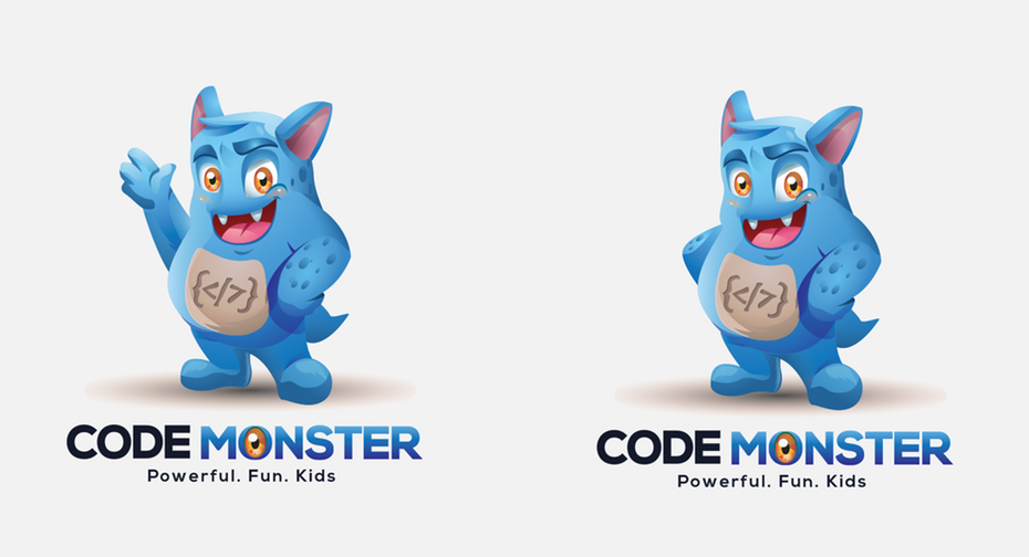
- For mascots and character design, details are often needed to give the character a personality
- Product packaging typically uses more elaborate and eye-popping artwork to compete on the shelves
- Social images and public service websites—this is where you want to highlight humanity and diversity
Get flat design right with these steps
—
So you want to use flat design. Here are a few steps to take if you want to ensure you get it right:
Don’t confuse flat with boring
Flat design is inherently minimalist. But just because a design isn’t detailed doesn’t necessarily mean it is boring. Usually, minimalist designs are easy-to-scan and have a sleek, modern feel. Rather than put you to sleep, they get right to the point. Whether they’re boring or not ultimately depends on the designer.
The key to making a design like this work is to use the white space to guide the viewer’s eye towards the most important elements. In this way, you can build meaning and aesthetic appeal into your flat design without falling, well, flat.
Color, context and contrast are your friends
Choosing a flat look means you will lose some of the key elements that normally make up a design, like shading around a button to indicate that it’s clickable or realistic images that can spark empathy in the viewer. With this more limited toolbox, you have to get creative with the tools you do have like color, contrast, context and scale.
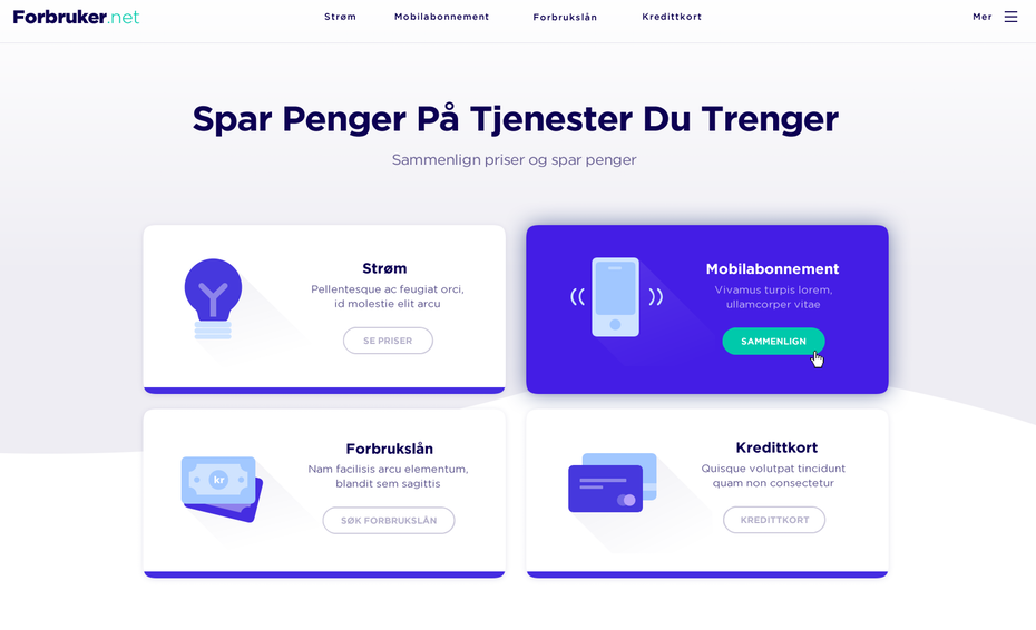
This means using a more saturated hue to emphasize certain text or buttons and giving the user context clues to help them understand how to use certain elements, like placing an arrow on the right and left sides of the page to tell users to swipe right and left for more content or arranging links horizontally in a toolbar-like manner. Deliberate aesthetic choices like these tell the viewer how to use your design in the absence of skeuomorphic design elements.
Liven up your flat design with animation
Animation and flat design are natural friends. This is because detailed drawings require much more work to make the motion convincing (such as redrawing the figure in various poses) whereas flat design can get away with simplified animations.
Though you can use this technique for storytelling or adding some pizzazz to your logo, animating flat design elements can also be a way to make up for what you lose when you eliminate shading and texture. Make the design elements you want to highlight move to show users where to direct their attention.
Choose a flat-friendly font
Because you have less to work with visually, every design choice you make counts even more than it normally would, and typography is one choice you don’t want to overlook.
A good rule to follow when choosing a font is that it should take its cue from flat design—that is, keep it simple and leave out decorative elements like serifs. Though some novelty fonts work in flat, others—like tight fonts and anything that incorporates a lot of small images—can be difficult to render well in a flat design. Some examples of sans serifs that look great with flat design include Telegrafico and Junction.
Flat is where it’s at
—
These days, most people are looking at your design on a flat screen, so instead of pretending the image is something that it’s not, embrace the flatness. Flat design may still be considered a “trend,” but the fact that it’s been around for almost a decade just goes to show how versatile and valuable it is.
If you’re afraid this style will make your design look identical to all the others, don’t cheap out on something generic. Work with a designer whose portfolio is full of unique flat designs that say exactly who they’re for and what their owners do. With the right designer, your flat design might just jump off the screen.