A round of applause is in order because Nav Creative recently celebrated an incredible milestone!…
7 business card design tips that will rock your brand
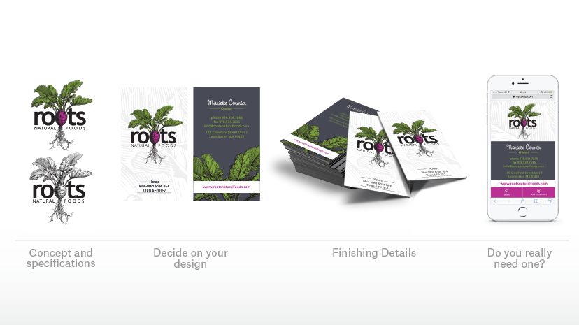
First impressions last. You’ve got seconds to ensure that first and lasting impression is positive. A well designed, unique business card is a fantastic way to make a strong impression. It’s also your emergency way to connect, since real life means unexpectedly meeting a woman in spin class who produces the exact kind of widgets your product needs to be perfect.
Get the perfect card to represent your business, your mission and yourself by adhering to these best practices and business card design tips.
1. Decide on your concept
–
Turn your brand values into a business card design. Do this by thinking about the customer you’re trying to impress, and deciding what would tell the story of your business for that customer. Your images (if you use any), colors and textures should all be consistent with your existing marketing materials, and all of those should be right in line with the brand values that distinguish your business from everyone else.
If your company is all business, your cards should be too; stick to classic designs with minimalist looks and elegant fonts and colors. If your brand is more creative, artistic or playful, you’ve got liberty to use bold images, arresting colors, unusual shapes or humor to get your message across.
2. Figure out your specifications
–
You can’t get started without knowing the basic parameters of your project, so settle on these first. Or at least be aware of what your options are so you know what’s important to you and your budget.
Size
The most common business card size is 84 mm by 55 mm, or 3.5 inches by 2 inches. You can go bigger, but if you do your cards are less likely to be kept. If you go smaller, you have a better shot, as long as they still fit in a typical card folio.
Any non-traditional size is going to cost you more money.
Orientation
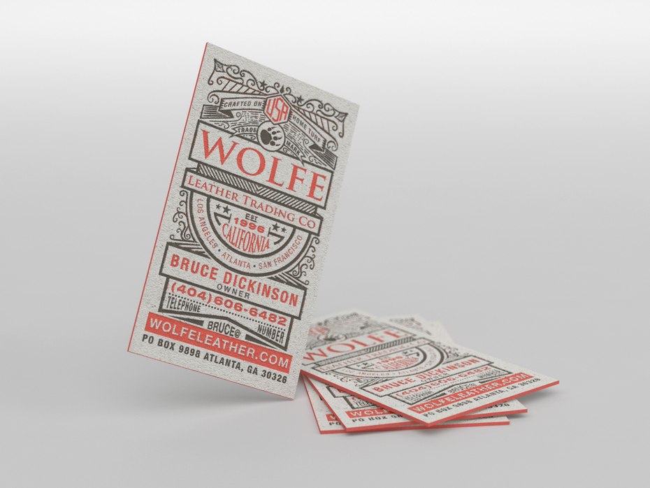
This just means which way people view your cards.
Landscape
Landscape format is more traditional and still the most common orientation. It is easy to read, works well in card holders and can be handled by any printer. However, it is very common, and not as unique as other options.
Portrait
This is a clean and elegant look that’s become more common in recent years (but still stands out). It can be printed by any printer. On the down side, it is hard to read in a card holder.
Square and custom cuts

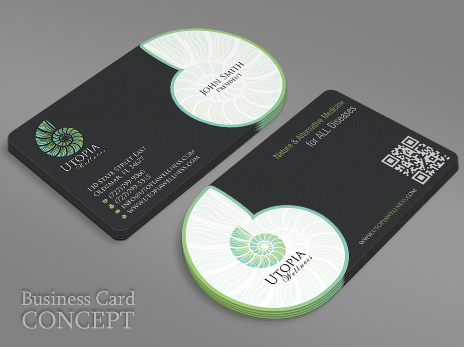
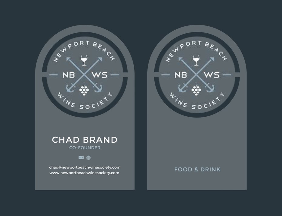
These tend to be unique, but they are also more expensive. They also have the potential to be too gimmicky for your business. When one of these is right for your business, though, it is a powerful choice.
Material
Most cards are paper, although there are lots of other options, from plastic and wood to metal and slate. Assuming you go with paper, you need to choose thickness, coating, color and weight. All of these can affect the price.
3. Select you business card design basics
–
Now we’re getting into the fun part! Once you’re ready to get down to details, these are the design elements you want to pay attention to in order to get the best card for your business.
Color
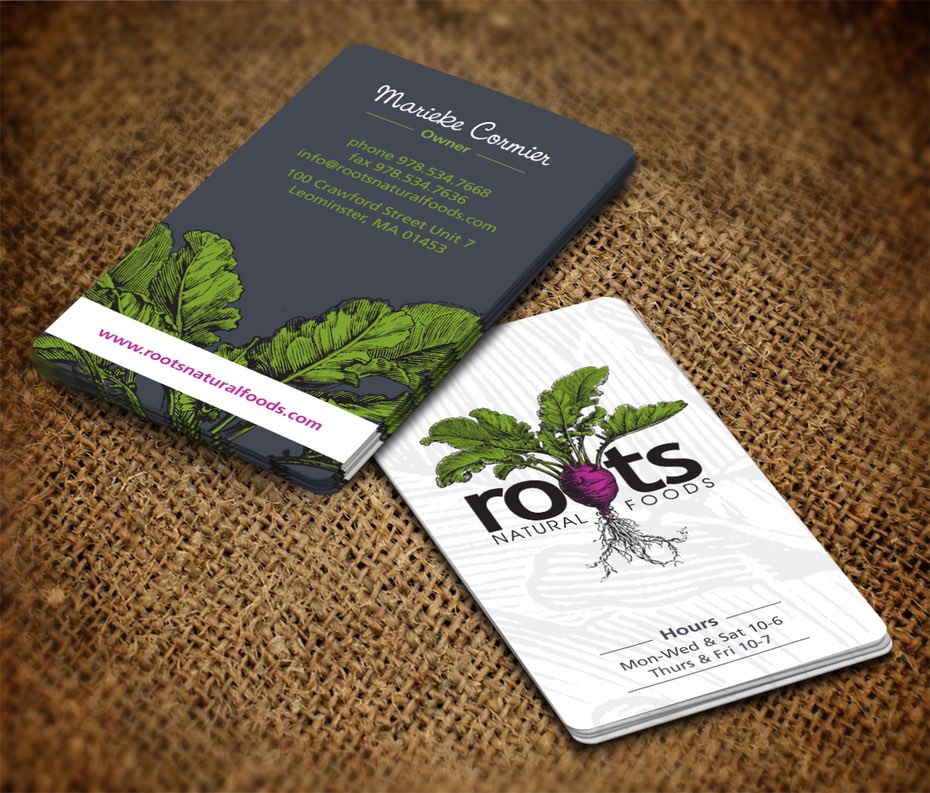
Use colors that work well together and represent your brand.
Full color vs. 1 or 2 color printing
For large orders with small budgets, you can skip CMYK full color mode and print in just 1 or 2 colors for less money—although this is only likely to help you on orders of over 500 pieces. Since business cards are typically printed digitally these days, multiple colors are not the expense they once were.
Font
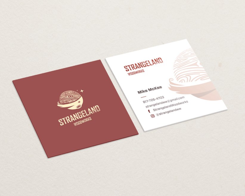
Choosing the right type is critical to giving your card the right feel. Remember these guidelines as you go:
- Make sure you use at least 8 point font so the type is readable.
- Serif fonts tend to give a more classic feel and sans serifs a more modern vibe.
- Use decorative or script fonts sparingly and only as emphasis; you don’t want to compromise readability for cool typography.
- A designer should embed the fonts in the file, rather than creating outlines of the text. This way your design produces higher quality prints and is editable in the future when aspects of your business change, or you add employees.
- You should confirm with your designer what the font licenses are. Some fonts are free to use, but purchased ones often come with restrictions, so checking the license is important.
4. Include the right information in the right place
—
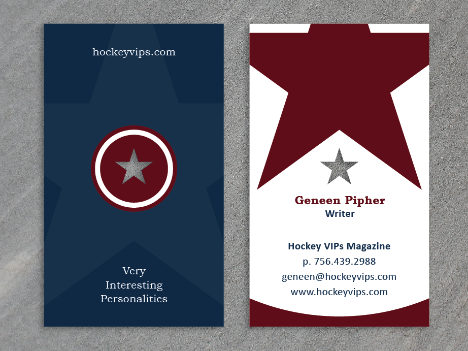
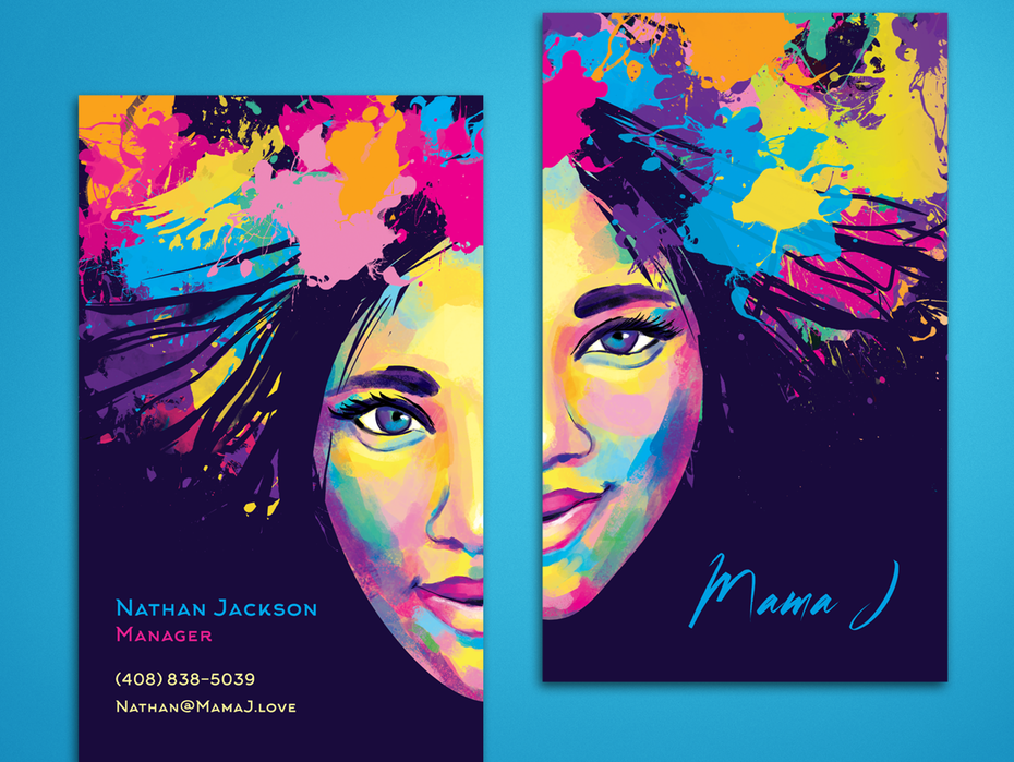
Most people take a business card and—after admiring your awesome design—put it in a folio or rolodex. For this reason, most designers will recommend that include vital information on the front of your card, and use the back to give it the flavor.
What to put on the front of your business card
- The name you want contacts to use
- The organization or business you’re attached to, if any
- What you do (i.e. job title)
- Your contact information—any that people might want. We suggest e-mail and phone number at a minimum, social media profiles and website unless you really have no presence at all, and a work address if that seems relevant.
- Your logo
What to put on the back of your business card
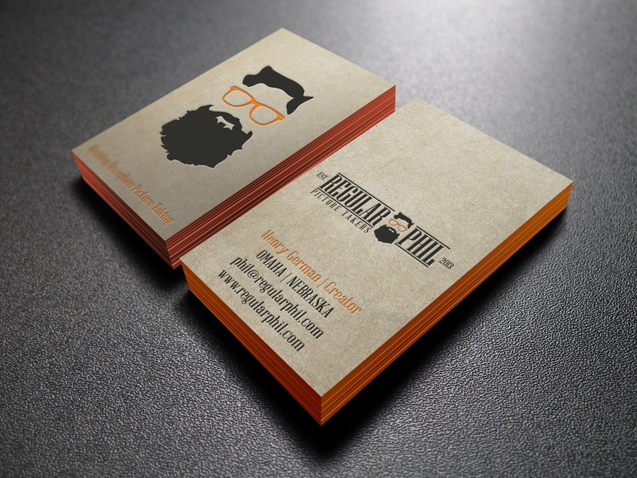
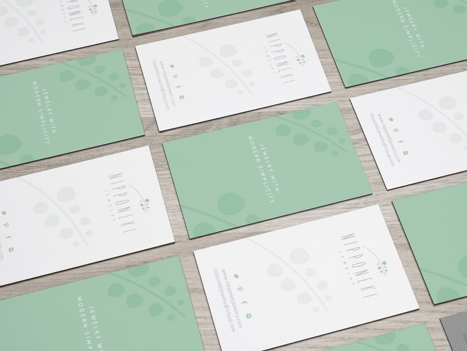
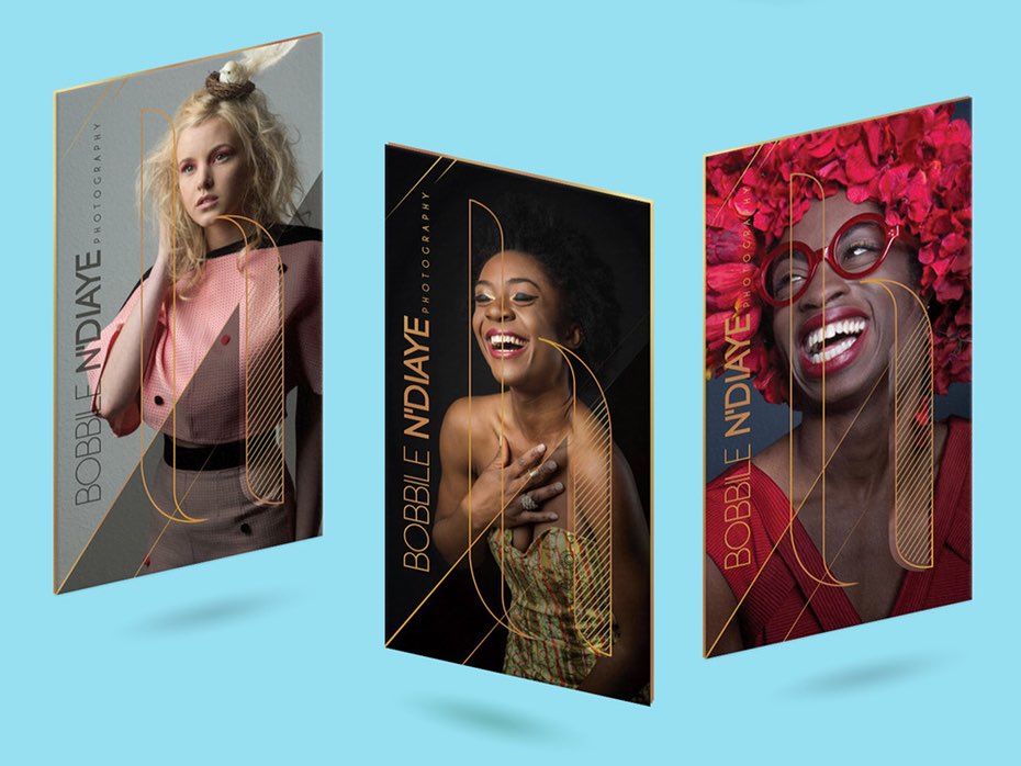
This is where you can let your brand shine! Sophisticated imagery in the form of original artwork or photography is one of the best ways to get a totally unique result, especially for less traditional businesses. This is also a great place to put a large version of your logo.
5. Break away from the usual
–
For many businesses, one of the biggest challenges of designing cards is coming up with something truly original. Fortunately, there are plenty of great ways to break away from the norm and create something truly striking.
Special treatments are like shiny objects (sometimes literally): they can be very exciting and appealing. But don’t let your original excitement make you go overboard. Choosing one two unique elements will let you stand out without being gaudy.
Of course, like many things that sparkle, these treatments are likely going to make your card more expensive.
Special finishes
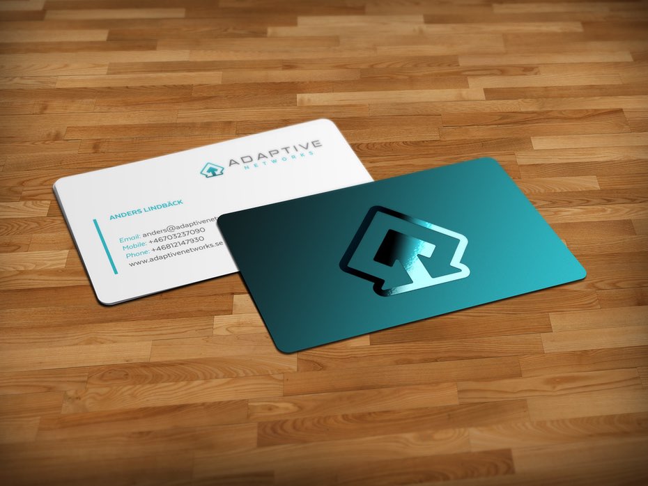
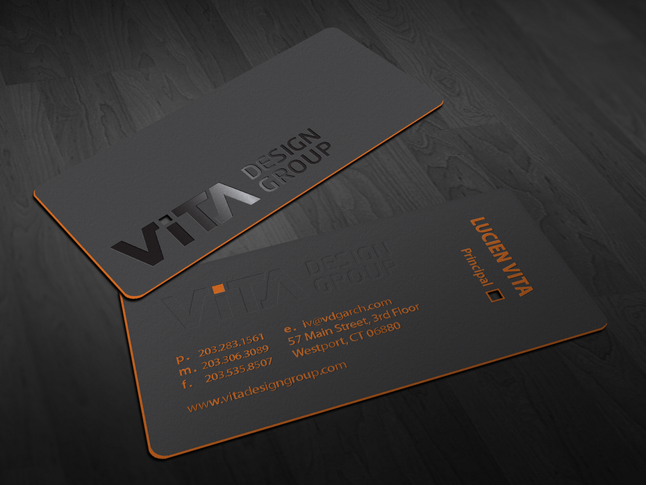
Special finishes can make your cards stand out. Metallic ink, foil blocking, and spot-UV are special finishes that are perfect for helping your cards stand out in a crowd. These details can maintain a simple, classic look but add a level of elegance and memorability to your business cards.
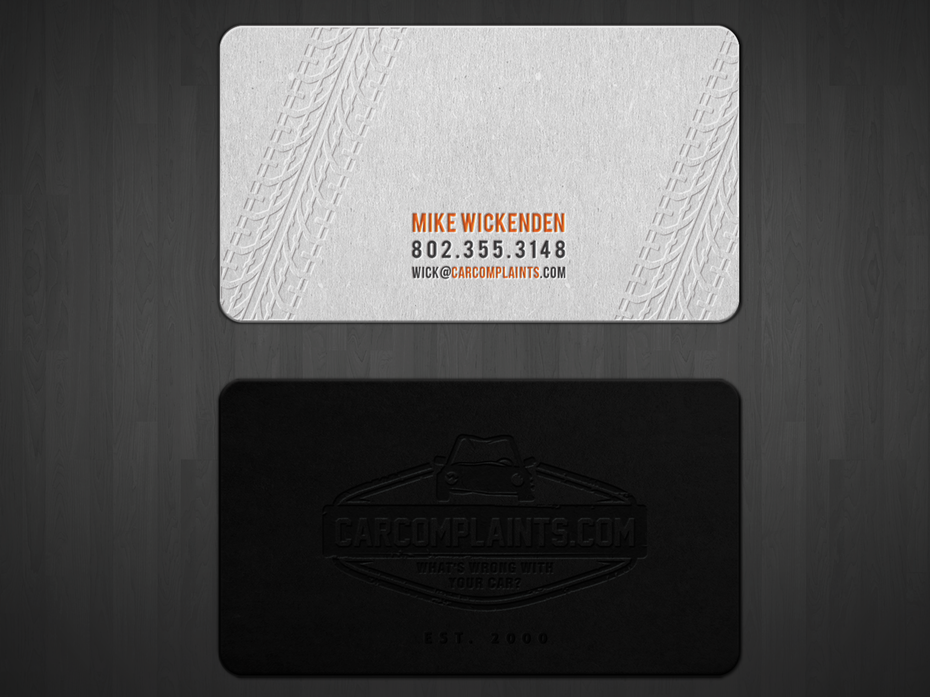
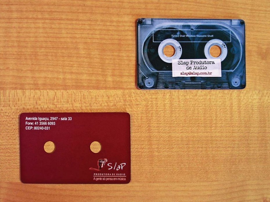
Cut outs, presses, emboss/deboss, folded cards
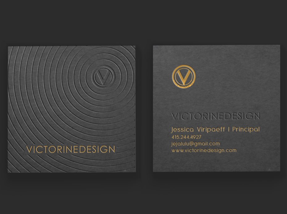
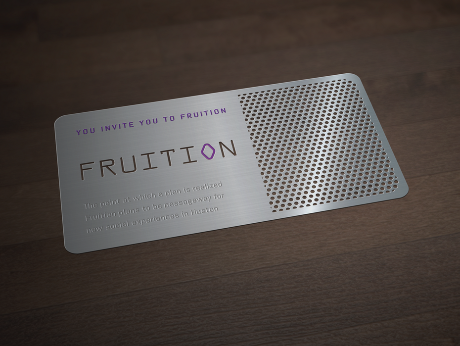
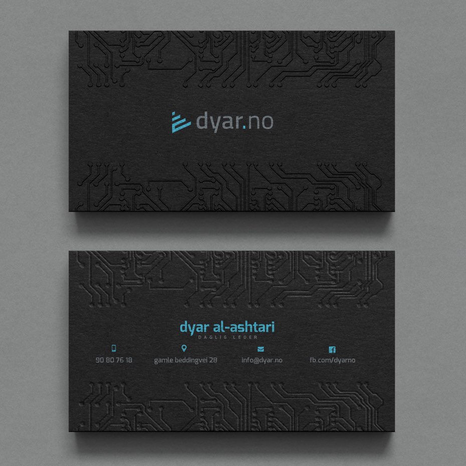
Laser cuts, die cuts and presses can leave a striking void in or pattern on your card. This kind of design can make your card memorable, because it looks and feels one-of-a-kind—just like your business.
Folds give your cards a sophisticated look and also allow you more room for information and design elements.
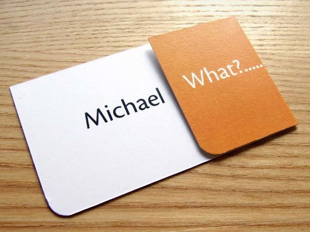
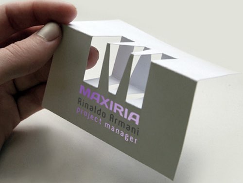
Special materials
Standard business cards are printed on cardstock, but you can opt for wood, slate, plastic or metal. This is another fantastic way to create a business card that will be kept and remembered.
Not every printer offers plastic, wood, or metal business card prints, so if you’re interested in this treatment make sure to source your printer before designing your cards. If you’re using plastic, consider whether you want frosted, opaque or transparent and design accordingly.
Creative concepts
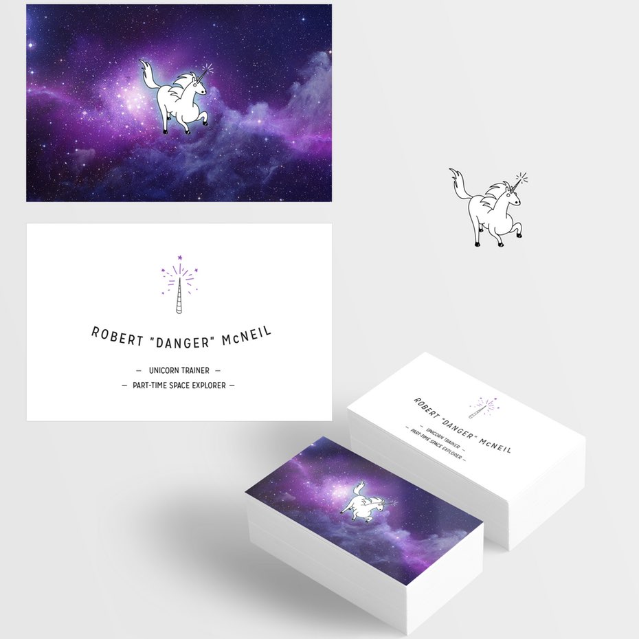
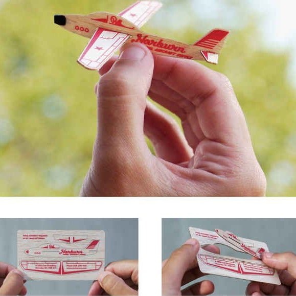
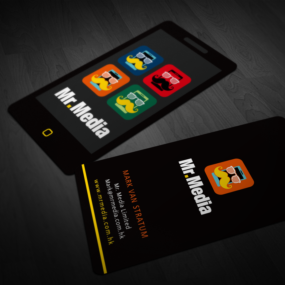
If it makes sense for your business you can choose a really unusual design for your cards. Here are some fun and funky examples.
6. Prepare your business card for print
–
Before printing, double check each and every element of the design and written detail. One typo or oversight turns into 1,000 mistakes when the cards are printed. And this is totally preventable. Here are the things you want to check on before you send the card to the printer:
Check your file settings
The file for your cards should be saved correctly—not just for today, but for when you might need reprints later on. Make sure your designer has the file just right:
File size, type and resolution
The most common card size of 3.5 inches by 2 inches—84 mm x 55 mm in Europe— requires a document size of 1039 x 697 pixels. Any images must be at least 300dpi to have a high enough resolution to look crisp and clean.
For best quality and a crisp look, your design should be saved as a vector-based PDF, not JPEG or PNG. You should also make sure you get an editable file (usually an Illustrator, Photoshop file or editable PDF) so that you can make changes later.
Bleed
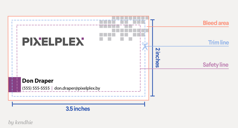
The bleed refers to highlighting an area 3 mm or about 1/10 of an inch thick surrounding the document with the same color as the background to prevent border strips from showing. The background color should go all the way to the edge. All text should stay within the safe area.
Fonts and color settings
All text should be embedded and you should have the correct font licenses. Use CMYK color mode for anything that will be printed, including business cards. Do not use RGB.
7. Ask yourself if you really need a printed business card
–
88 percent of business cards are thrown out within one week of receipt. So do you really need one? Or is a digital card enough?
There are several arguments in favor of physical business cards. First, exchanging information digitally is convenient, but it still feels a bit impersonal. Another reason is that one of the best ways to market your business is still by networking and meeting people face to face—and when you do that a business card is a critical tool.
A well-designed business card is a potent brand symbol to use, too. It can showcase your brand’s style, creativity, and get you noticed and remembered. These are all great reasons to have a card. One final reason to carry cards? Having them on hand shows people that you really do mean business, and that you are always prepared to conduct it.
Ready to rock your brand? Start a business card design contest today!
—
This article was originally published in 2013 and written by Rebecca Creger. It has been updated to include new information and examples.
Original article written by Karla Lant >
[wpseo_map width=”100%” height=”300″ zoom=”-1″ map_style=”roadmap” scrollable=”0″ draggable=”1″ show_route=”0″ show_state=”1″ show_url=”0″] [wpseo_address hide_address=”1″ show_state=”1″ show_country=”1″ show_phone=”1″ show_phone_2=”0″ show_fax=”0″ show_email=”1″ show_url=”1″ show_logo=”0″ show_opening_hours=”1″]


