Whether you’re just starting an ecommerce business or considering a rebrand, one of the most…
Does the Perfect Email Template Exist? We Used Data to Find Out.

“What makes good email good?” This question gets asked all of the time, but it never really gets a concrete answer. Best practices float around, but there’s isn’t a hard set of rules that have proven to always be able to create “good” email. Here at MailChimp, we have millions of customers sending billions of emails, and this led me to believe that if anyone could help suss out this secret set of rules, it could be us.
So, this spring I joined forces with our Data Science team to try to nail down what impact visual design can have on email campaign performance. We wanted to look at accounts that have consistently high-performing campaigns to see if they shared any common design elements.
To get started, we needed to define exactly what a “high-performing” account is. We decided to look at accounts that consistently sent campaigns that got clicks, orders, or revenue that came in above the overall medians for these metrics across all MailChimp accounts. Once we’d chosen those accounts, we looked for trends in visual design elements like color usage, layout, fonts, ratio of text to images, and the use of background images.
I recently spoke about data and email design at Litmus Live in San Francisco, and we thought it’d be cool to share with you what I talked about there. Below, I walk through my talk in greater detail.
Plan vs. reality
Having such a large set of data gave me this grand idea that I was going to be able to create a super template with the exact design principles that would guarantee perfect email engagement.
Of course, this wasn’t the case at all.
Some of the things I wanted to look at we couldn’t even test, and of the things we could measure, some didn’t show us any solid connection to campaign engagement. This soundly killed my dream of a super template, but in the end, it actually proved something that I found to be even more helpful.
Let’s start with the 3 things that seem to be shared by accounts that send really good email:
- They tend to use simple layouts.
- They keep their copy concise.
- They test what they’re sending out.
Use simple layouts
In MailChimp we’ve had as many as 24 different basic layout options to choose from at a time, ranging from 1 to 3 columns, and then combinations of those 3.
Over the years, we’ve seen that our simple 1 column layout gets used the most often, with 48% of sent campaigns utilizing it. The second most-used template is our 1:2 column, and it significantly trails our 1 column layout with only 4.8% usage.

We don’t have an exact reason as to why this is, but we have some suspicions. Simplicity is often tied to the idea that something will be easier to understand. As Techopedia puts it, “systems perform better when they have simple designs rather than complex ones.” The internet is already such a noisy place with other things fighting for your subscriber’s attention, it makes sense that keeping things simple helps subscribers focus on what you’re showing them.
Be concise
We found another data point that seemed to appeal to this idea of simplicity leading to higher engagement: In the relationship between click rate and the ratio of text to images in campaigns, it seems that keeping the amount of copy per image lower tended to result in higher click rates.
In fact, 95% of our high-performing accounts typically sent campaigns with 200 words or less per image. Generally, it seems like the fewer words you use, the more likely people are to click on things.
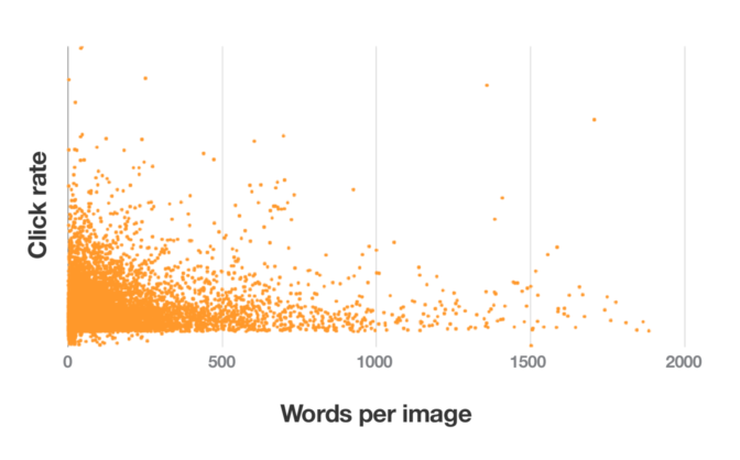
But we also noticed something else: As the number of words per image begins to increase, there’s an initial decrease in overall click rate, which creates a downward slope. But this starts to change when you hit right around 500 words per image. At that point things start to get significantly more scattered. Here’s what that looks like:

We’ve got the click rate on the y-axis and words per image along the x-axis—and click rate, for the most part, is higher the fewer words are used. At first you clearly see this downward slope, with the heavily concentrated triangle in the corner, but at 500 words per image (this first vertical line on the graph), the trend starts to change.
We saw a similar scatter when we narrowed these accounts down to just e-commerce users. With those, we compared the number of orders to words per image and saw that they seemed to have the highest number of orders at around 80 words per image, but past that point, their graph just blew up, too.
So while 200 words per image is a pretty good indicator that a campaign will get a solid click rate, and 80 words per image can lead to a higher number of orders, neither of these things are set in stone. The scatter proves that under the right circumstances, using more words can actually be the right move.
Test, test, test
Now for the most interesting part: In our research we found that campaigns that were A/B tested consistently lead to better engagement. That isn’t a surprise, considering the entire point of testing content is to optimize and get better results. What was surprising was how much better tested campaigns did than regular campaigns.
When looking at campaigns sent by the same account, we saw that A/B tested campaigns did 73% better with open rates, 198% better on click rates, and almost 15% more in sales than regular campaigns. Not only are people learning from testing campaigns, they’re also seeing massive, immediate payoff.
And this isn’t new. We rolled out A/B testing a decade ago, and we’ve seen this as a trend since then. In 2008, we analyzed 1,700 A/B-tested campaigns sent to over 6 million inboxes and found that A/B testing resulted in 11% higher open rates and 17% higher click rates. Last year, we did some research with e-comm accounts and saw that when revenue was used as the test metric, testing typically yielded those accounts 20% more revenue than regular campaigns.
From everything we looked at, testing seemed to be the most consistent indicator of high performance. Accounts willing to experiment consistently saw better subscriber engagement and also picked up money that could have potentially been left on the table.
What does it all mean?
Looking at all this data, my goal was to find the “secret formula”—the common threads that tied together all of these accounts. And I thought that it would be a nice, neat set of design principles.
Instead, we barely got any straight answers, because everything we looked at was scattered.
Then I finally started to put it together. The scatter, the fact that tested campaigns performed way better than regular campaigns, why we couldn’t figure out what the perfect email template looks like: All of this was happening because successful design is completely about context.
There won’t ever be a magical set of design principles that will give you amazing results, and this is actually a really good thing! That means that you can design around context—and figure it out for yourself.
The best thing you can do is learn how to make the most of your own data, and we’ve got some tips to help you do just that.
1. Use your own data.
You could be one of those scattered points at the very end of our charts. Best practices are a good place to start if you get stuck, but we can’t always assume that they work for everyone, and you won’t know what works best for you if you aren’t willing to test it out.
2. Set goals.
Before you get down into the actual testing part, though, it’s important to set goals for your tests. Decide what success is going to look like before you start collecting information. This will determine what exactly you want to test, how you’ll do it, and what pieces of information are relevant.
3. Challenge your assumptions.
Be open to asking yourself or your team where their assumptions come from, because you could be accepting best practices as a final truth or trusting that what used to work for you always will. Remember that just because something works for someone else or even worked for you in the past doesn’t mean it will now or in the future.
4. Make sure that data you’re collecting is helpful.
Not all data is good data. When you’re running tests, it’s important to be cognizant of the way you’re collecting it. It’s essentially doing a science experiment, and that means there are 2 types of variables involved.
When you’re trying to determine a relationship, you’ll have 2 variable types: control and response. The control variable is the thing that doesn’t change. When you’re running a test, this is the thing that remains constant. Then there’s the response variable. This is the thing that’s changing—it’s the outcome and the motivator for change.
In a test, you’re able to say that a response variable had the outcome it did because you were able to measure it against the control variable. But just because you need to have control doesn’t mean that you can only test one thing at a time. In fact, testing sets of changes together has actually been proven to be more effective than testing changes one after another. For example, if you’re wanting to test engagement with a large blue button with white text versus a smaller grey button with black text, you wouldn’t need to test the color and then test the size—you could test the combinations of those things against one another.
Bottom line: Be mindful and intentional about what you’re changing.
5. Leverage what you’ve learned.
You can use it to inform your email strategy and direction, and that’s really the whole point of collecting data: to get a better view into the hearts and minds of your subscribers and customers, and then use those insights to give them more of what they want.
6. Keep testing.
This process never really stops. Testing is something that evolves as your business does. There’s aren’t strict rules around when you need to test, though, but there are some times when it can be useful:
- As your audience grows, because new people may expect new things from you
- When you start sending a new type of campaign or selling a new type of product
- When you stop seeing the engagement that you want
Successful design isn’t about what everyone else is doing: It’s about figuring out what works for you. And you can do that through using your own data to challenge your assumptions and using what you learn to inform how you work. Your tests will be constantly evolving and changing, but they’ll also be the thing that gets you closer to finding your perfect template.
Original article written by Alex >
- Sale
Connect 365/7/24 Hourly Support
Original price was: $120.00.$99.00Current price is: $99.00. - Sale
Connect Auto-Pilot for WordPress Content Management
Original price was: $599.00.$499.00Current price is: $499.00. - Sale
%22%20transform%3D%22translate(1.8%201.8)%20scale(3.63281)%22%20fill-opacity%3D%22.5%22%3E%3Cpath%20fill%3D%22%23c2ffee%22%20d%3D%22M204.4%20130.6l1.2%2072-158%202.8-1.2-72z%22%2F%3E%3Cellipse%20fill%3D%22%23c4ffef%22%20cx%3D%22122%22%20cy%3D%2272%22%20rx%3D%2283%22%20ry%3D%2235%22%2F%3E%3Cellipse%20fill%3D%22%23beffea%22%20cx%3D%2265%22%20cy%3D%22126%22%20rx%3D%2235%22%20ry%3D%2256%22%2F%3E%3Cellipse%20fill%3D%22%2388ccb5%22%20rx%3D%221%22%20ry%3D%221%22%20transform%3D%22matrix(51.92988%20-137.38378%2059.61857%2022.5353%20255%20209.3)%22%2F%3E%3C%2Fg%3E%3C%2Fsvg%3E) Select options This product has multiple variants. The options may be chosen on the product page
Select options This product has multiple variants. The options may be chosen on the product pageConnect WordPress Maintenance Plans
$99.00 – $224.00


