
When it comes to branding, what you see is what you get. At least, that’s how potential customers will feel. They’ll have no reason to give a visually unimpressive brand the benefit of the doubt—it’s up to the brand to earn that kind of trust. In branding, “what you see” is a brand’s visual identity.
Visual identity is how you shape perception and create an impression through the visible elements of your brand. Images are a powerful form of communication, specifically because they do not communicate with words. They speak on a primal, emotional level and are thus more persuasive. But with great power of communication comes great responsibility: you’ll want to be extra cautious that you’re not sending the wrong message.
To make sure your visuals are communicating the way they should, we’ve compiled this guide to all things visual identity—by the end you’ll be prepared to create one that will inspire customers to pay attention.
What is visual identity?
—
Visual identity is all of the imagery and graphical information that expresses who a brand is and differentiates it from all the others. In other words, it describes everything customers can physically see, from the logo to the interior design of a store.
Often, visual identity culminates in the development of a brand style guide which provides consistent instructions on how the brand should be visually represented at all times and in any situation.
The purpose of visual identity is:
- to create an emotional impression on viewers
- to inform viewers about the nature of the brand and services/products offered
- to unify the many different aspects of a business through consistent visuals
Visual identity vs. brand identity
Visual identity has an intrinsic relationship with brand identity.
On the one hand, brand identity is a holistic expression of everything that makes the brand what it is. It includes visual identity along with non-visual elements such as a brand voice, copy editing guides, a mission statement, core values, etc.
At the same time, visual identity is a distinct discipline that involves a different thought process and approach from brand identity as a whole. Though there is overlap, there are usually different professions involved in each. Brand identity is overseen by marketers, and visual identity involves designers and creative directors.
In short, brand identity describes who a brand is on the inside whereas visual identity expresses who a brand is on the outside.
The elements of visual identity
—
Visual identity is essentially a brand’s visual language. As such, its individual elements are, like words, the building blocks that allow the messenger to create meaning. Here, we’ll look at these separate elements that come together to form a cohesive visual identity.
Graphics
Graphics, in the context of visual identity, are picture assets that are drawn or designed. They can be as simple as forms and shapes—consider a Lego block or the Coca-Cola bottle and how these distinctive silhouettes signify their respective brands. Or they can be more complex, such as a logo, icons, or even full-scale illustrations or animations.
Typography
Typography is the shape or styling of the text you use in your branding. There are many different types of fonts and each one can have a different effect on the viewer, including different degrees of legibility. For the purposes of visual identity, you’ll want to consider the wordmark to your logo, a headline font and a body copy font (which should be the most legible).
Color palette
Color is used to identify a brand through a scheme (no more than three colors are generally recommended) of very specific hues, shades and tints. This means brands do not simply use red or green but shiraz and seafoam. When used correctly, colors can generate some of the most powerful emotional responses in the viewer.
Though the color palette often begins with the logo, these colors should be repurposed for all brand materials. Designers will generally need to assign a primary color (the main color for your brand), a secondary color (to be used in the background), and an accent color (for contrast on assets such as a CTA button). Keep in mind that the absence of color, such as black and white, is a perfectly valid color choice as well.

Imagery
Imagery describes photography and video content as well as any spokespeople who act as the living “image” of the brand in advertisements. When it comes to visual identity, designers must curate only those images that are the most representative of the brand’s personality and, most importantly, its customers.
Imagery is the element most related to the target audience because people empathize with faces and naturally want to see themselves reflected in the brands they consume. This means, for example, creating guidelines around whether any stock images or videos used should read as corporate or showcase everyday people, depending on whom your visuals are meant to be speaking to.
Physical brand assets
Physical assets are the material objects that contribute to a brand’s visual identity. Strictly speaking, this may not apply to brands who don’t have a physical presence and the nature of these assets will vary even within businesses that do. But as this is an important element of visual identity for physical brands, it is worth going over.
Physical assets can include the layout and design of a store (think of how all Apple Stores look alike with white interiors and glass storefronts), the uniforms that customer-facing employees wear and the china, cutlery and tablecloths used in restaurants. All of these send a message to consumers, including the lack of consistency.
How graphic design applies visual identity
—
Graphic design is the process that takes visual elements and molds them into a cohesive visual identity. The following are the common instances in which a brand will create visuals, where graphic design will act as a roadmap for keeping them consistent, as well as aesthetically pleasing.
Logo and brand assets
Logo and branding design is at the heart of establishing visual identity. A logo is the foremost symbol for a brand, and it informs many of the graphics, color and typography choices of the visual identity going forward. This category would also include identifying materials such as business cards, letterheads and social avatars/cover images, where the aim is primarily to distinguish the brand.
Business and advertising
Advertising is where businesses use their visuals to actively reach out to customers. This can come in the form of flyers, brochures, billboards, tv/magazine/banner ads and more. Because customers rarely seek advertising, the visual elements must identify the brand while going the extra mile to impress, entertain and persuade viewers.
Web and digital design
Digital design is the space where consumers get to directly interact with your visual identity. Visual identity elements here are often expressed through hero or website images, interface color schemes and layout, social media content, animations, icons, buttons and much more. Because digital tools are made to be used, visual identity here must unobtrusively assist the user towards completing their task.

How to design an outstanding visual identity
—
Define your brand identity
Your brand identity should guide the visuals, not the other way around. After all, your visuals are meant to express who you are, so it would make sense to first figure out what you’re all about.
While you don’t have to have every aspect of your brand figured out (as brands can and should evolve over time), decide on the basics of your brand strategy: what is your mission statement? What are your core values? How does your brand help people? Who are your buyer personas? What is your communication style?
Questions like these, and many more, help you see your brand as a character, what she would look like and sound like if she were a real person. Seeing your brand as a person will make it much easier to recognize which visual “outfits” fit and which don’t when crafting your visual identity.
Familiarize yourself with the elements of design

In order to construct a visual identity that resonates with people, you must first be familiar with how visuals speak. This is where graphic design becomes important—it is also known as “visual communication” for exactly this reason.
Depending on how you implement them, each of the 6 basic elements of design will have built-in associations that customers will make, and only a select few will be appropriate for your particular brand. For example, some brand fonts might read as old-fashioned while others will read as modern. Some color meanings will convey passion while others will express coolness. Graphic design is ultimately a tool for visual expression, and a tool is only as strong as its user. It can make your life easier if you know how to use it, or it can be a hazard if you don’t.
Tell a compelling story
While graphic design is useful for communicating ideas visually, those ideas must come together to tell a captivating story about your brand. Visuals have the power to grab attention, but stories have the power to involve people. They root for the underdog, they scorn the villain, they swoon over the hero.

Good stories are rooted in characters and conflict. Decide who your protagonist is and give them an obstacle to overcome: whether it’s your customers and their pain points or it’s your business and the noise of other brands who are neglecting their needs.
Take, for example, Ezanov’s logo for My Green Heroes. The green shades convey a sense of nature, and the geometric style of the leaf (along with the iPhone photo) show us that the brand is about technology. But it is the way the logo is arranged upright, with the colors transitioning from dark to light, that tells the story of an upward climb against environmental destruction. The photo of a modern man confidently sporting a suit gives us our character, poised to take action.
Above all else, your visual identity must adhere to storytelling’s most cherished rule: show, don’t tell.

Aim for simplicity
Clearly there are a great number of messages, ideas and stories your visual identity can communicate. So many options can be a blessing and curse.
To avoid confusion, it’s best to focus on one message at a time. Consumers will take in visual information within a matter of seconds, and unless they are actively seeking out your brand, they will move on just as quickly.
You have limited time to make an impression, so it’s essential to home in on the single most important takeaway, and focus the visuals around that. In the case of isuk’s poster design, the message is a promise of serenity, which is supported by every visual element—from the calming blue color, to the meditative photo, to the centered alignment.
Balance consistency with contrast
Given the sheer amount of brand collateral that will accumulate over years of business, your visual identity will inevitably involve many moving parts. The challenge is to make sure that every visual element, no matter its specific purpose or medium, looks like part of the same brand. This is where having well documented brand style guidelines can be crucial.

The other challenge that comes with visual consistency is redundancy: a brand that is too predictable can fade to the background. One of the core principles of design that separates design elements from the background is contrast. Look for opportunities to infuse your existing visual brand with new and varied contrast.
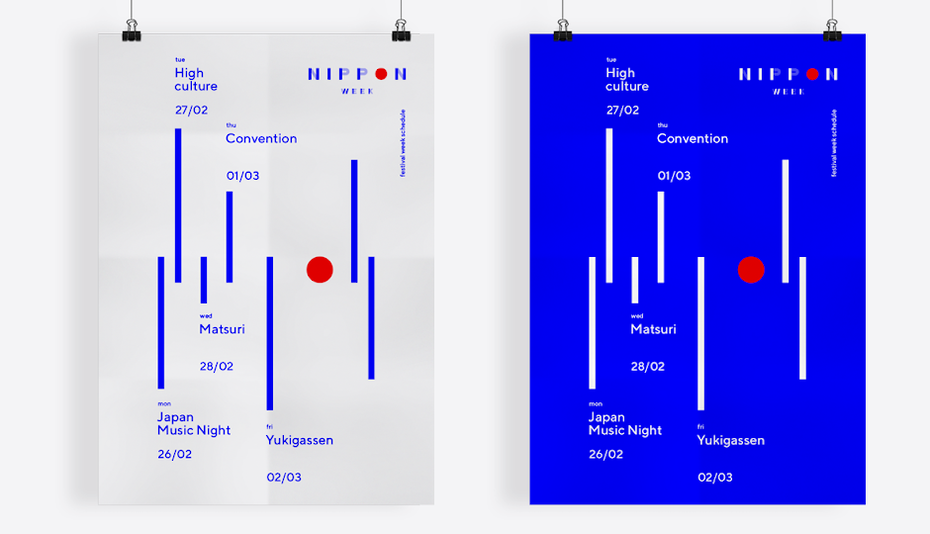
Consider, for example, the way goopanic’s branding design for Nippon Week begins with a logo and goes on to repurpose the shapes, colors, and typography to create brand new visuals from the old.
Know when to step back and when to stand out
You might assume that the purpose of a visual identity is to be noticed at all times. After all, it’s hard to communicate visually if no one is paying attention. But there are times when the best visual identity is one that flies under the radar.
Consider a website that users are trying to navigate or a newsletter where they are looking for information. Having a web background of vibrant yellow might align with your brand color guidelines, but imagine how distracting that would be for a user trying to read your copy. Visual communication often works on an unconscious level, and you can trust that your message is getting across even with a minimal implementation.
On the other hand, sometimes it makes sense to wear your visual identity loud and proud, if you’re attempting to differentiate your product from other products on the same shelf, for example. It’s important to recognize when it’s time to stand out and when it’s time to step back.
Design for the medium
No visual identity exists in a vacuum: once you develop any visual asset, the time will come to send it off into the real, or digital, world.
A visual identity for an online brand will naturally look different from a brick-and-mortar brand, where tactile experiences such as textures and die cuts will go a long way with consumers. Different media can even drastically change how your visual elements come across: colors that appear bright in the digital sphere will be darker when printed.
Similarly, serifs are considered the most legible typeface style in print, but sans serif are more legible on a computer screen. Wherever your visual identity takes you, make sure you’re adequately prepared for the journey.
Picture your own visual identity
—
Visual identity is a powerful tool for telling a brand’s story and connecting with customers. Because it is so effective at communication, the wrong message can have dire consequences. Understanding your own brand identity will guide you on your visual journey, but the best way to make sure you get a visual identity that fits is to work with a great logo and branding designer.


