What’s the best way to create good logo design? Don’t create bad logo design.
That may seem like an oversimplification, but there’s a lot of truth there, too. The best designers are aware of the most common mistakes that can happen when designing a logo—mostly because they’ve made those missteps themselves at one point or another during their career—and are now able to catch poor choices before they make them.
In logo design certain “what not to dos” occur more frequently than others, and seeing these ineffective choices in action can help you sidestep them in your own logo design. Here, we’ve collected the most common mistakes in bad logo design, so you know what to look out for. If you’re already guilty of one of them, don’t worry: we’ll show you how to make it better!
1. Outdated logos
—


A common problem with bad logo designs is that they’re using outdated techniques, visuals and effects. The logos above look like they have been created decades ago—and not in a good way. Back in the 1980s and 90s effects like old-fashioned skeuomorphism, 3D gradients, clip art and certain fonts where used excessively, which now makes these logos look particularly dated.
Solution
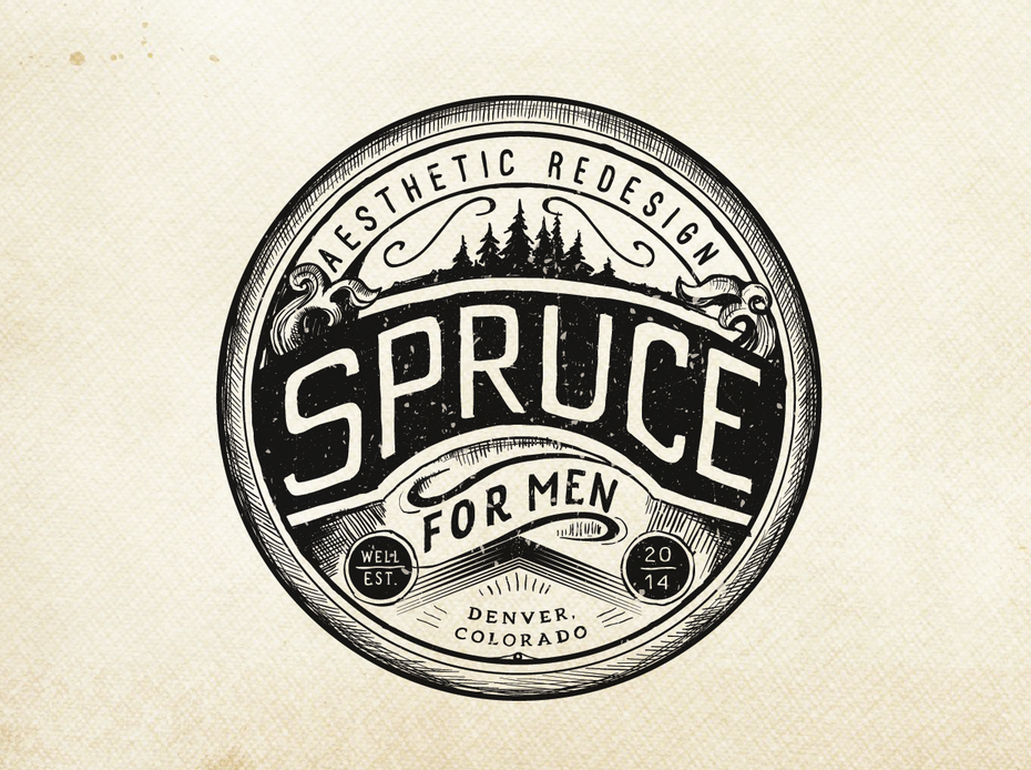
If you’re dealing with an outdated logo, the best solution is to give it a redesign to transport it into the 21st century. Sure, retro design is on trend. But if you want a logo with a retro vibe, do it purposefully and only use vintage design elements that are back in style, like the hand-drawn vintage look in the Spruce logo below.
2. Too detailed
—
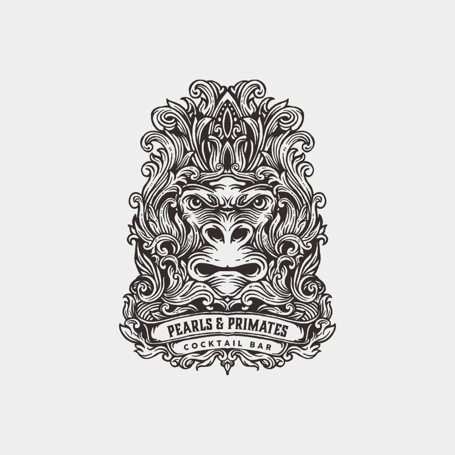
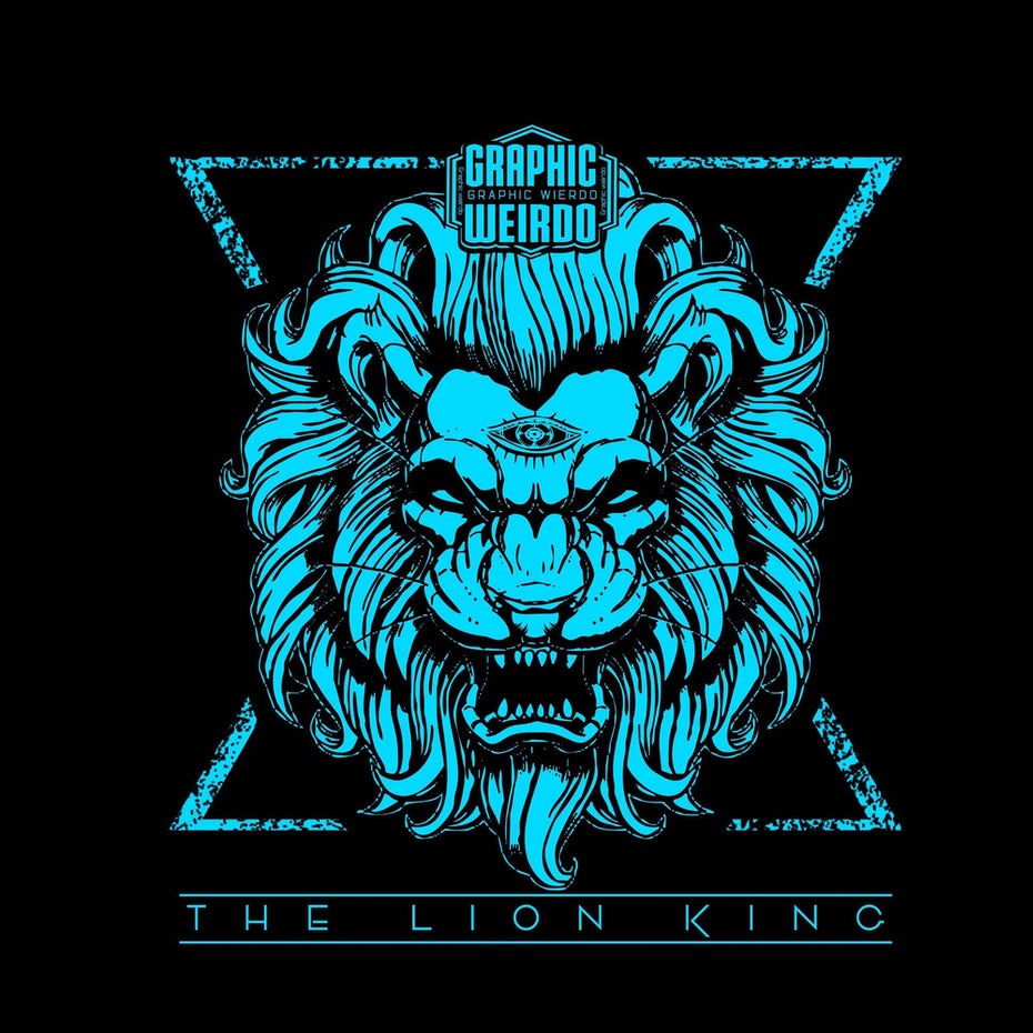
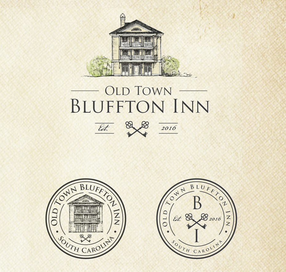
It’s not that detailed logos are bad, per se, they’re just not scalable. For large billboards, murals or vehicle wraps, detailed logos are actually better. If those were the only places you’d display your logo, detailed logos would be the norm, but consider how often your logo appears on much smaller, harder-to-see surfaces.
The problem with detailed logos is that they look terrible on small screens like smartphones, as well as certain swag and merchandise, like pens or even business cards. Sure, the logos above look good and are designed with skill, but those visuals are wasted at small scales, not to mention they sometimes make the logo illegible or indistinguishable.
Solution
If you don’t want to abandon your detailed logo, you don’t have to. A perfectly viable alternative is responsive logos—designing variant logos for smaller sizes. In other words, keep your detailed logo for large placements, and have a different one for small placements. We explain this strategy fully in our guide to responsive logos.
Take the Bluffton Inn logo below. The classic architecture of their building is a strong selling point, and using a detailed sketch is great for a rustic vibe. But when they need to print their logo on small spaces, they use specially designed versions that still look just as good.
3. Irrelevant imagery
—
In other words, “good logos, but badly matched.” These aren’t bad logo designs exactly, just bad for their particular brand. The three logos above look great, but they don’t accurately depict their brands—they look like they’re for companies in other industries.
Above all, your logo should represent your brand. You can use all the expert design principles, but if you don’t design something that echoes the feeling of your own company, it won’t be effective for brand recognition or building customer loyalty.
Solution
Stick with imagery that’s directly connected to your company, reflecting either your company’s name, or what it does. The trick is to be creative. You can still use familiar and iconic imagery without making generic logos.
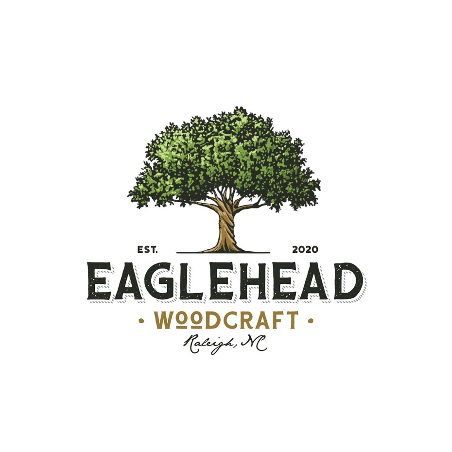
Eaglehead Woodcraft could have gone in a number of different directions with their logo imagery: carpentry, furniture, even eagles. But they smartly chose a tree—directly related to woodworking, but a little more thought-provoking and sentimental than actual images of woodworking.
4. Vague
—
Again, if your logo looks good but doesn’t say anything about your brand, it’s still a bad logo design. One of the goals of logos is to explain who you are and what you do, even if it’s the first time someone sees your logo. That’s not easy, but some particularly bad logo designs offer up no information at all, with ambiguous company names and seemingly random images.
These logos above could all easily work, if they had just a little more description that sheds light into their companies.
Solution
Sometimes the most obvious solution is the best: in this case, just add a description! You don’t have to give your whole elevator speech, in fact, with logos, less text is more, but you can easily add a few words to explain what you can offer to customers, or at the very least your name.
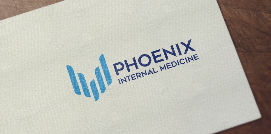
The logo for Phoenix Internal Medicine is simplistic and beautiful, artistically representing the brand’s namesake while employing modern logo trends like minimalism and using a trustworthy blue color. But without the description, it could be quickly misinterpreted, those wings could be buildings for an architecture firm or even piano keys.
5. Conflicting themes
—
Logos can help set the mood for your brand. If you’re a serious brand for serious people, you can use angular shapes and muted colors to appear more professional. If you’re a tech company striving to come across as futuristic, you can use imagery like wire circuits or astral grids to communicate that.
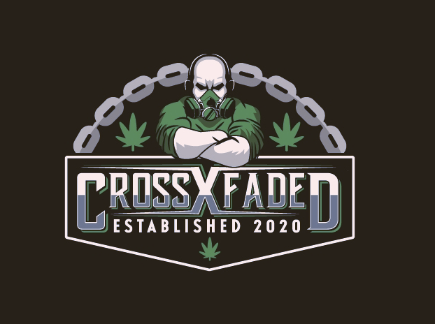
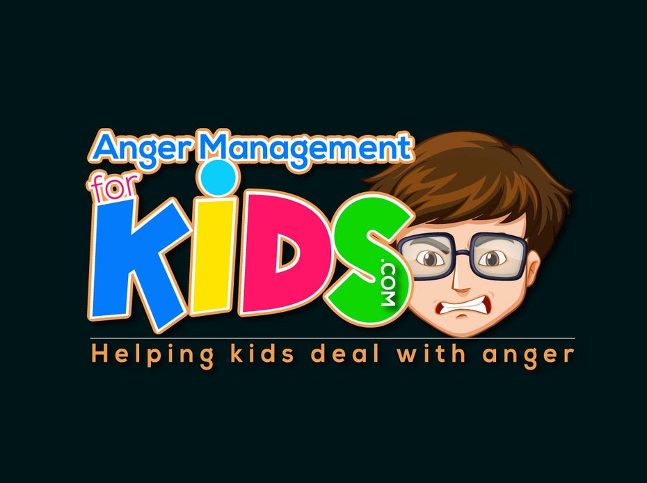
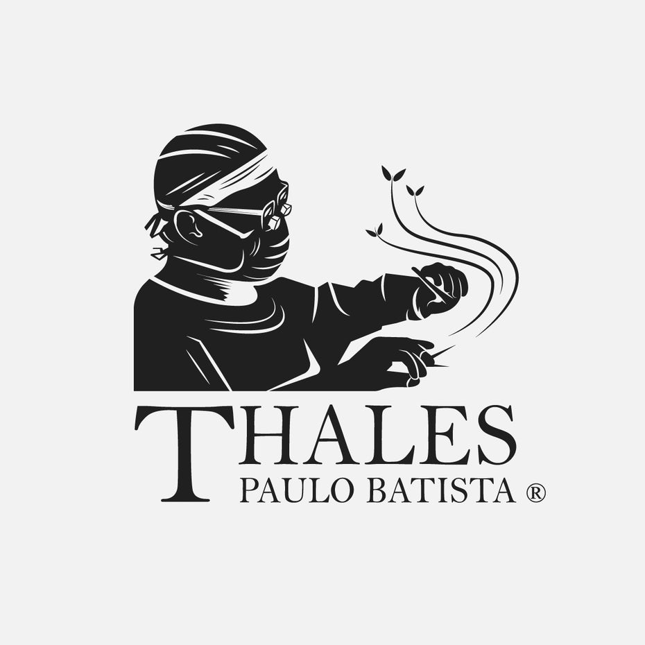
The trouble is when themes are mismatched and you’re building the wrong feeling for your brand. Is a scary-looking man in a gas-mask the best mascot for a 420-friendly gym? Seems they’d want to distance themselves from connotations to smoke inhalation.
Likewise, an angry child might be a literal mascot for a children’s anger management group, but it inadvertently comes across as aggressive. A more welcoming image for newcomers might be the final result: a happy child who can control their anger, to incentive parents and calm troubled kids.
Solution
Both your imagery and your artistic style should echo your branding goals. Using universally-recognized icons and the preferred themes of your clientele is a short-cut to effective communication.
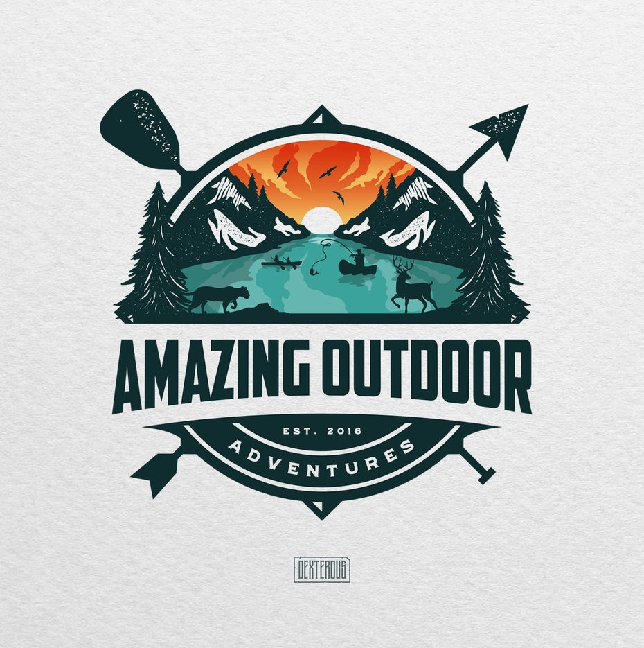
Take the Amazing Outdoor Adventures logo below, clearly designed for nature-lovers (and made by nature-lovers judging from the design). Silhouettes against sunrise/sunset is the perfect artistic style; nature lovers go nuts every time the sun disappears or reappears! The logo also highlights swimming, canoeing and animal-watching, and extends the messaging with additional icons in the frame: an arrow, boating paddle and compass.
6. Generic logos
—


Logos are most effective when they’re memorable, while generic logos, or perpetuating the same trends and styles as everyone else, have the opposite effect. Do what everyone else is doing and there’s a good chance someone will confuse your brand with another.
The thinking behind generic logos seems logical—copy the logos that people already like. But after a few months or years, the market becomes flooded with logos that are all doing the same thing, and logos that were once unique become nothing more than dime-a-dozen.
Be particularly careful to avoid the “V-man,” an ambiguous human figure that started as a creative way to represent the “everyman” or “everywoman,” but ended up an overused logo design cliche. Similarly, using tooth clip art for dentist logos or generic house clip art for real estate businesses is probably the most generic choice possible.

Solution
The best way to safeguard against generic logos is to keep abreast on what everyone else is doing. Check out our guide on generic logos to know which trends are most overused and to-be-avoided.
As we mentioned above, generic logos often start out as good logos, so you may not want to abandon all the trends just yet. Just be sure to add something that stands out.
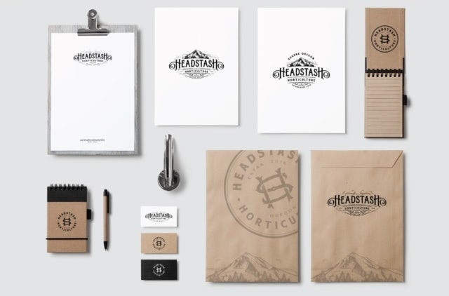
For example, Headstash uses mountain imagery and old-fashioned lettering like many other businesses, but they add elements to set it apart from the others. The composition, the style of illustration used for the mountain and the combination of framing and ornamental aspects of lettering all create a unique look for this logo.
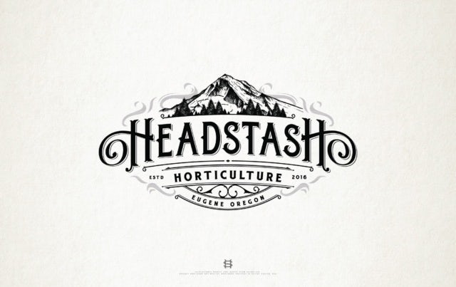
But before you worry that this logo is too detailed, Headstash employs the strategy we recommended in the first section: use variant logos for different locations.
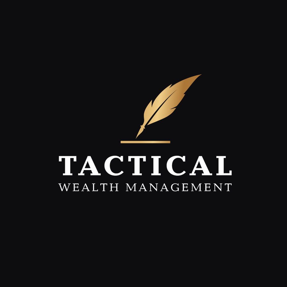
7. Confusing
—
Like logos with irrelevant images or conflicting themes, logos that aesthetically look good can still miss their mark with confusing and unconnected imagery. This is a common problem in any artistic endeavor; what’s in the head of the creator doesn’t always come across to the viewer.
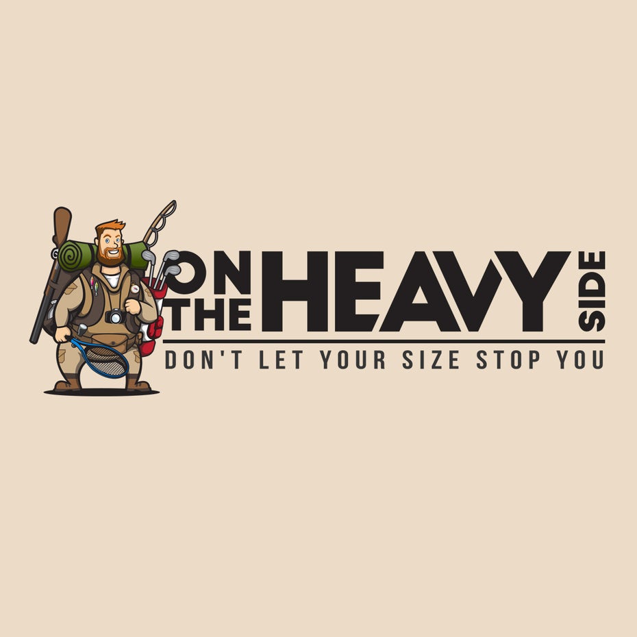
Just look at the On The Heavy Side logo. Do you know what they do? The most prominent image is the camping equipment, but then why is the mascot holding golf clubs and a tennis racket? And the description, “don’t let your size stop you” creates more questions than it answers.
Solution
Opt for clarity above all else. You can use any of the strategies we advise above, such as familiar icons, easily identifiable images and small text descriptions. It’s always a good idea to get a fresh pair of eyes on a design before finalizing it. Creators tend to miss the trees for the forest, so an outside perspective can reveal what doesn’t come across like it should.
Tactical Wealth Management combines iconic imagery with a plain textual description to tell viewers everything they need to know about the brand. Once the basics are established, the designer is free to take some creative liberties with areas like color, typography or the graphics themselves.
8. Just plain ugly
—
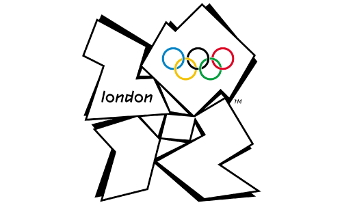
Sometimes, there’s no rhyme or reason about why a logo doesn’t work, it’s just plain ugly. Brands big and small succumb to ugly logo designs, even London, one of the richest cities in the world. Their Olympics logo was panned by nearly everyone, labeled ugly and incoherent.
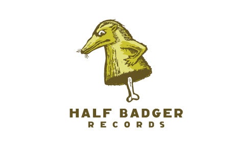
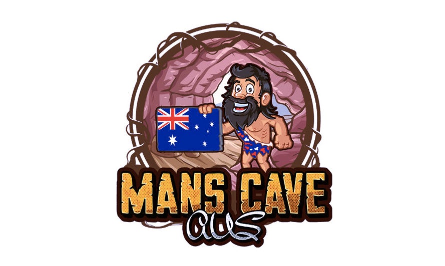
The same can be said of Mans Cave. Let’s forget for a moment the sexual innuendo of “man cave” and the unfortunate pink imagery of the cave walls, you still have a creepily happy caveman holding an anachronistic flag in a logo that explains nothing about what Mans Cave is. Half Badger follow suit, with a odd badger-like creature that doesn’t elict much in the viewer.
Solution
Unlike the other common bad logo design mistakes, there’s no cut-and-dry solution. The only way to avoid ugly logos is to understand the graphic design principles that make good logos.
If you want to learn graphic design yourself, you can always bone up on the best practices with our article on “How to design a logo”. But if you want to ensure that your logo uses the most effective graphic design principles, your best option is to hire someone who already knows them by heart.
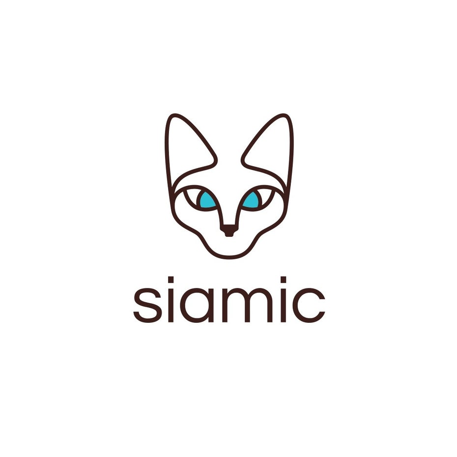
Working with a professional logo designer can make all the difference. They know the best design techniques as well as when to use them. You’re not just paying for their artistic skill, but for their expertise and business-sense as well. Just look at what purpleri came up with for a client who wanted “a Siamese cat somehow incorporated into the logo, and anything else that helps stand out as luxurious.”
Design sinners turn over a new leaf
—
Breaking into design can be difficult, especially with no prior experience. If you don’t want to succumb to the common bad logo design mistakes, avoiding the pitfalls we’ve outlined above is a great first step on your journey to great logo design. Learn more about evaluating logo quality here.
If you need help creating a professional-looking logo, you can always work with an experienced graphic designer who knows what they’re doing.


