Fonts are one of the most important design choices to make when developing your brand identity. The best fonts leave you feeling like you’ve made an instant friend while the worst fonts are like a stranger who won’t leave you alone.
Luckily these days, you’re no longer limited to the fonts preloaded in Microsoft Word. There are thousands of good typefaces available to download online and a world of talented designers creating custom fonts as unique as the brands that use them. Not every font is a good one. In fact, there are a ton of bad typefaces out there that are boring, illegible and just plain ugly. This isn’t just our opinion: there are scientific reasons why some fonts look beautiful and others leave us cringing.
To help you find the perfect font for your project, we’re going to walk through the best fonts and worst fonts along with what makes them effective (or not).
Some of the best fonts
—
- Didot
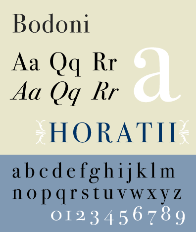
- Bodoni
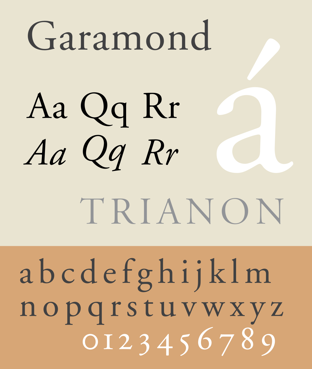
- Garamond
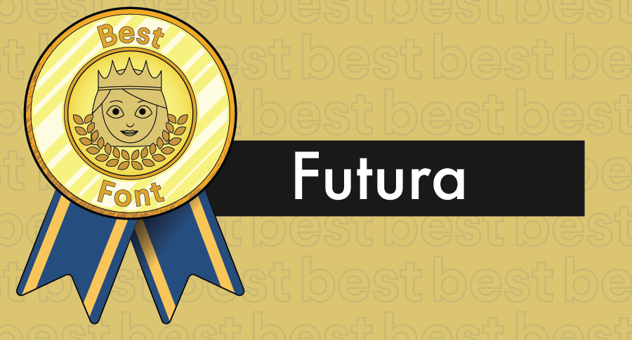
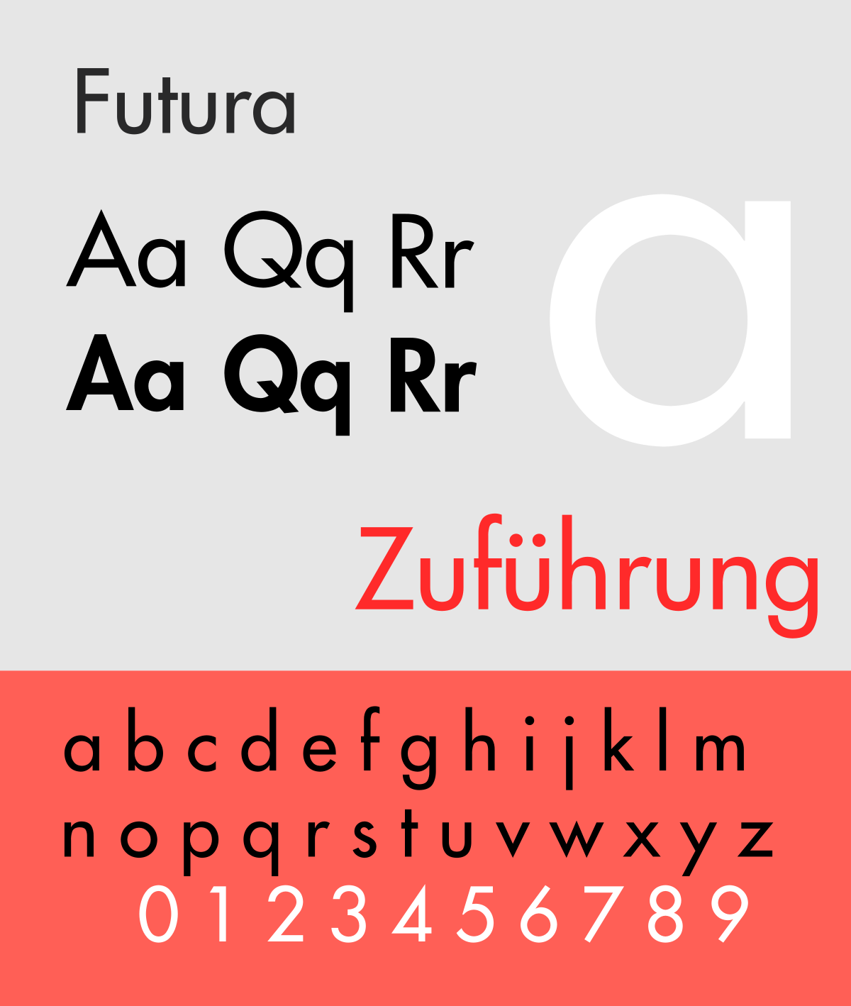
- Futura
- Helvetica
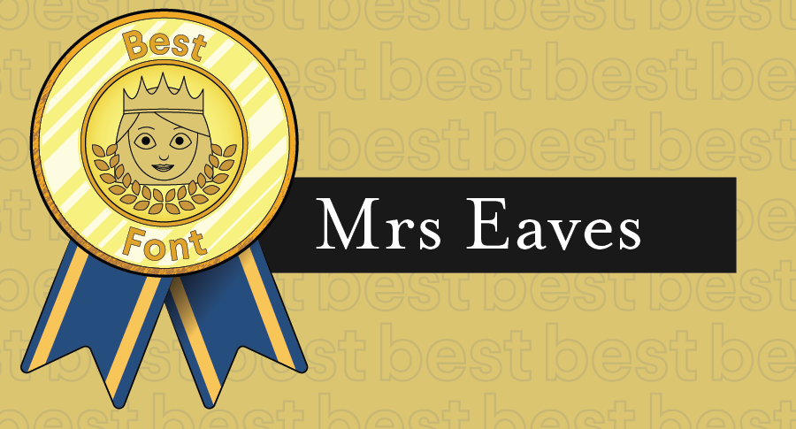
- Mrs Eaves
- Baskerville
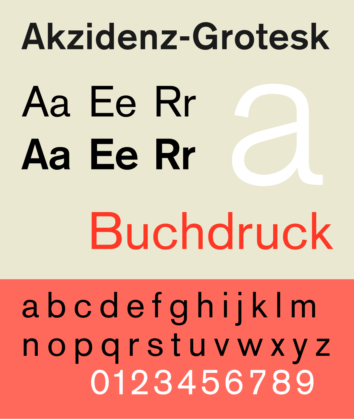
- Akzidenz-Grotesk
- Clarendon
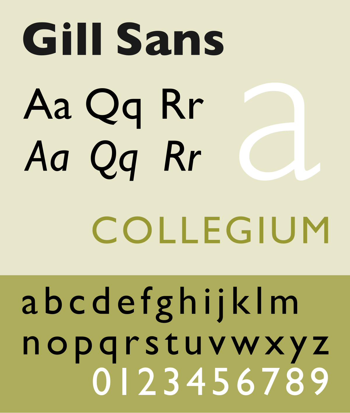
- Gill Sans
- Verdana
- Frutiger
- FF Din
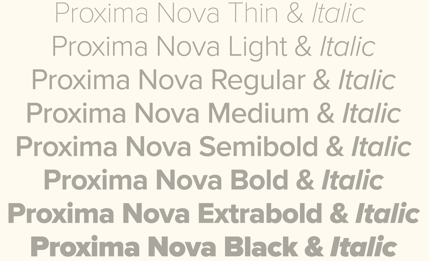
- Proxima Nova
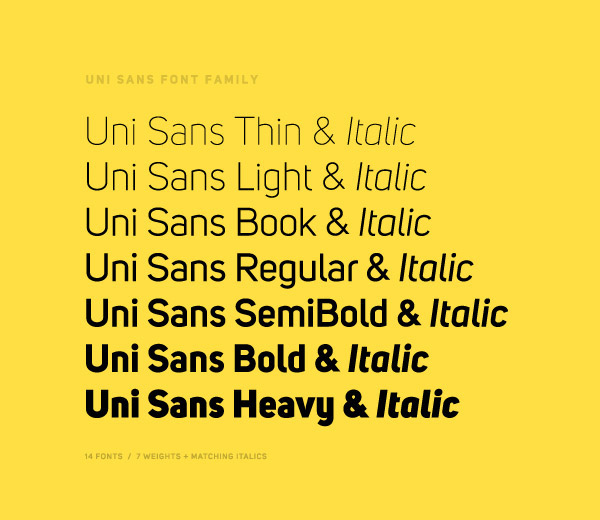
- Uni Sans
What makes a good font?
—

Even though they can look vastly different from each other, the best typefaces have a lot of the same things in common. These include:
- Even kerning
- Consistency
- Balance
- Legibility
Kerning
Kerning is the space between two characters. Too little space, and the font is unreadable because the letters are smushed together. Too much space, and it’s hard to tell whether the space is meant to separate letters or words. Uneven amount of space from letter to letter? It just looks awkward and ugly.
Futura and Helvetica are two examples of fonts that are very easy to read because of their even kerning–whether the letters are bold or skinny, their arrangement gives the reader the sense of clean spacing.
Consistency
Consistency means all the letters, numbers and any other characters used maintain the same look. If a font’s letter “A” has serifs, we expect its B to have serifs too, and so on from there.
Similarly, if a font has thick letters with soft, rounded corners but that style doesn’t extend to its numbers or punctuation, the font feels inconsistent and even incomplete.
Balanced fonts
A balanced blend of thick and thin, heavy and light, is an important component of a good font.
Didot is an excellent font that uses dramatic variations between thick and thin strokes while still managing to maintain balance. Bodoni is another famous example of a well-balanced font with its strong, solid vertical strokes and lighter arches and curves. Its serifs add a small bit of classy flair that also feels like counterweights keeping the letters upright.

Legible fonts
And lastly, a font must be legible. A font you can’t read is like an image that’s so busy you can’t tell what it’s supposed to be a picture of. Check whether a font’s legible by writing a variety of words in it, making sure you use every letter and a bunch of different letter combinations. Scale it up, then scale it down to see if there’s a size at which it becomes difficult to read. If you need text that small, choose a font that works at that size.
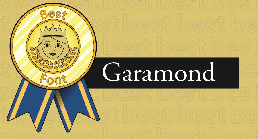
The fonts that have stood the test of time, like Garamond, have remained popular with designers because they’re legible in a variety of sizes, colors and compositions. Sans serifs are particularly good at maintaining legibility no matter the context: hence the endurance of fonts like Helvetica.
Some of the worst fonts
—
- Copperplate Gothic
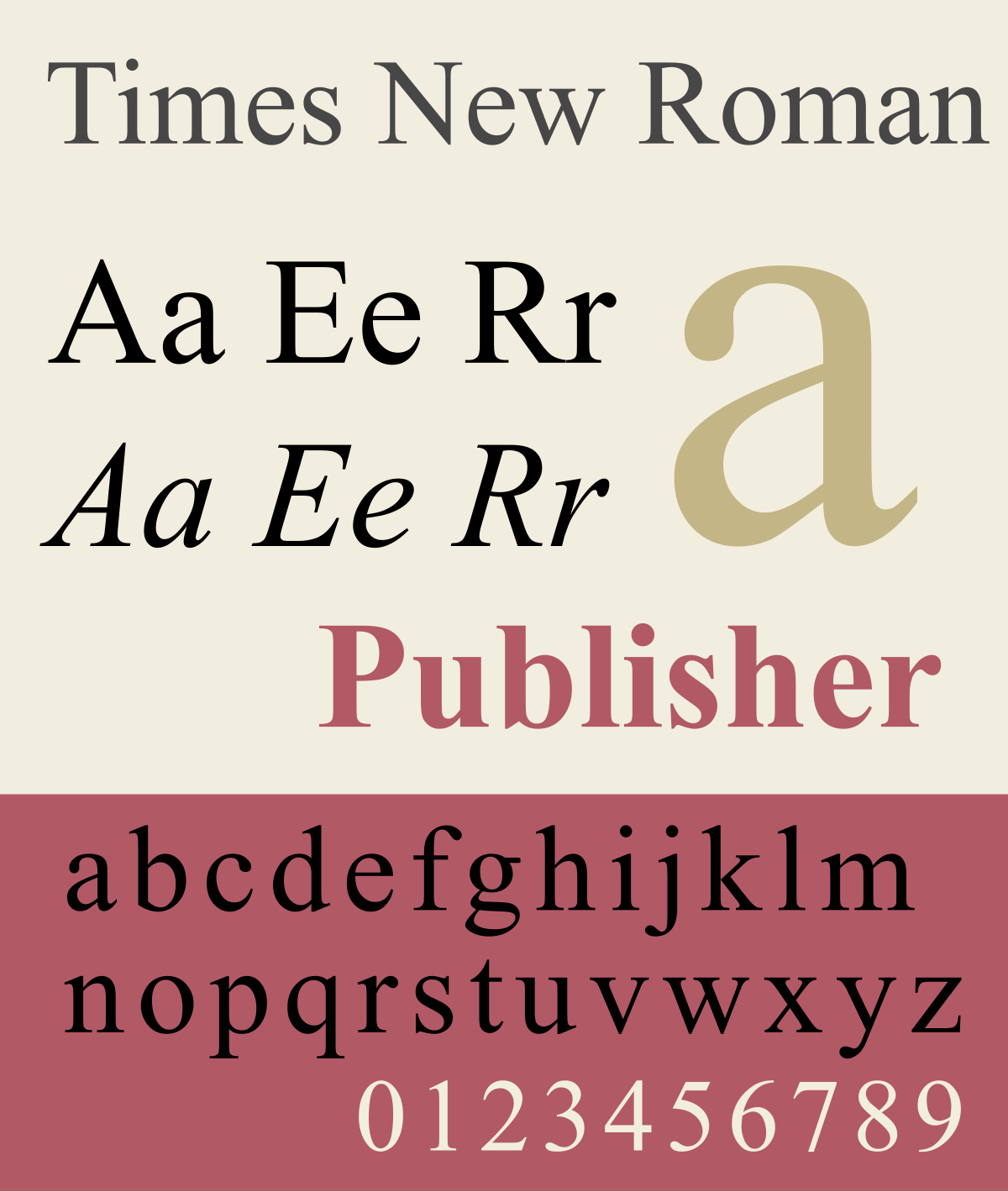
- Times New Roman
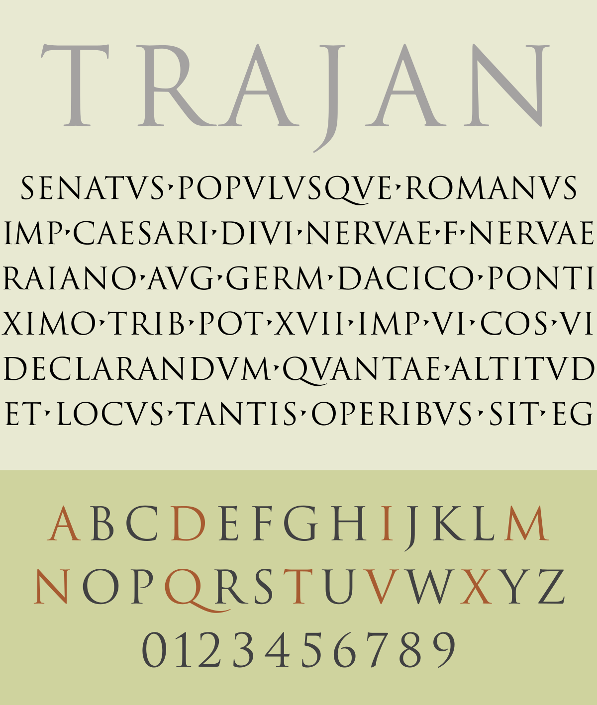
- Trajan Pro
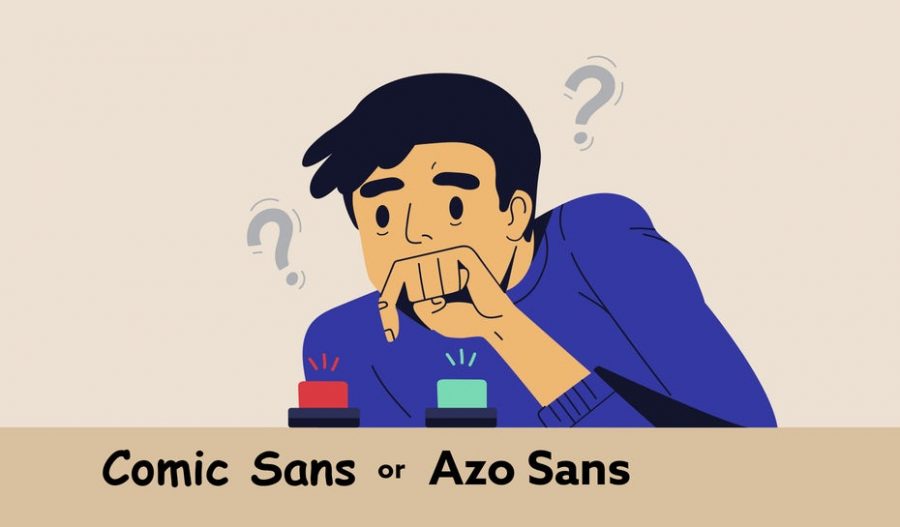
- Comic Sans
- Courier
- Papyrus
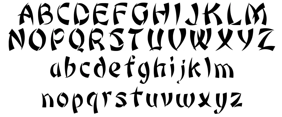
- Bonzai
- Neuland-Inline
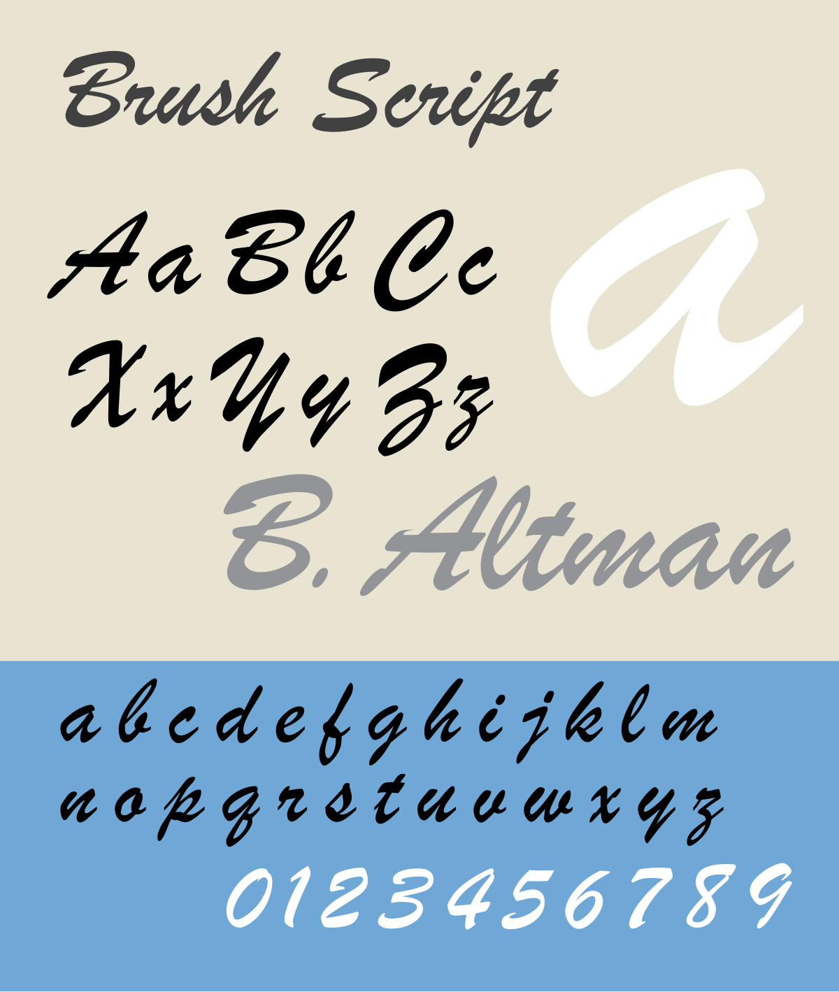
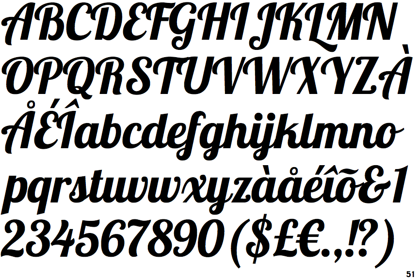
- Brush Script
- Souvenir
- FF Blur
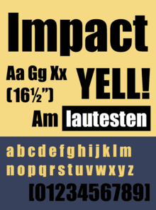
- Impact
- Trajan Pro
- Curlz
- Jokerman
- Lobster
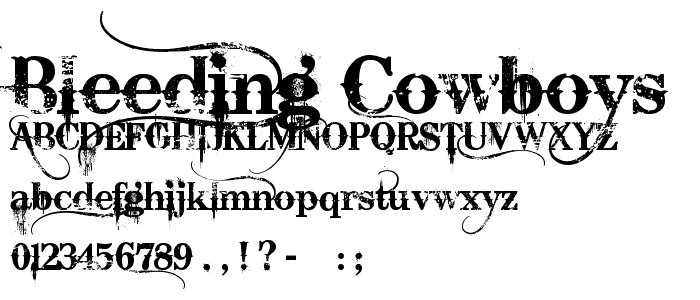
- Bleeding Cowboys
- Arial
What makes a font bad?
—
There are lots of ways a font can be bad. Many popular fonts have been overused to exhaustion. Fonts that don’t mesh with our internal understanding of balance also read as ugly. Still more fonts don’t work because they have too much going on to be legible, while others have the opposite problem: there’s nothing unique about them, so they fail to stand out. And then there’s the fonts that try to look exotic but feel as authentic as Taco Bell’s menu. Let’s break down what the worst fonts look like in detail.
Overused fonts
Some fonts are so overused they’ve become generic. Some famous examples include Copperplate Gothic, Brush Script and Souvenir. Brush Script was hugely popular from the 1940s to the 1960s, to the point that it still feels stale and overused today. Similarly, Souvenir is permanently cemented in our minds as “70s ad font.”

Other overused, retro fonts you should probably stay away from? FF Blur and Trajan Pro. It’s not that they’re bad fonts per se. They’ve just been done so many times that they lose all appeal.
Imbalanced fonts
When a font is balanced, we read it as aesthetically pleasing.

All this means is that the font’s weight—the placement of its thicker lines—is distributed in a way that looks like it wouldn’t go toppling over if it was a tangible object.
Take the three variations of Karloff pictured here, the font typography luminary Peter Bil’ak designed to test his hypothesis that a font’s weight distribution determines whether we find it ugly or beautiful. The worst fonts are imbalanced, which makes them seem ugly.
Unreadable fonts
Some of the worst typefaces, like Jokerman, are nearly universally disliked because they carry a ton of useless flair that distracts viewers from the text they’re trying to read.
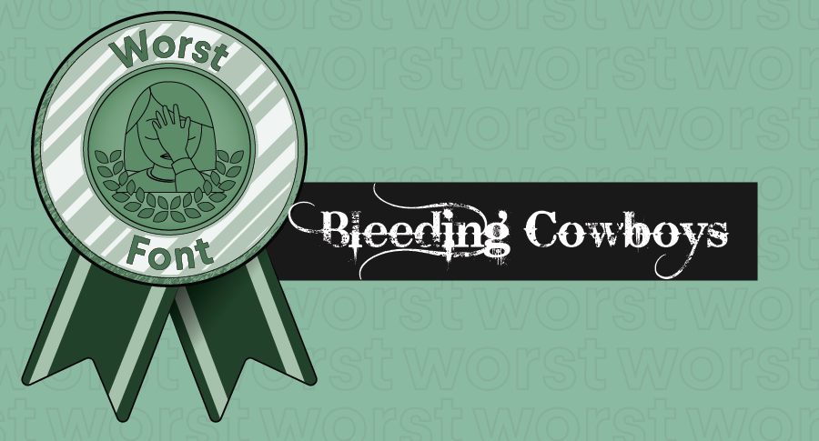
Another famously unpopular, ugly font, Bleeding Cowboys, is disliked by designers because of how busy and unpredictable it is. Random fading on the letters? Where’d that line come from, and where will it go?
Boring fonts
And then there are the fonts that are just dull, which makes them a bad font choice. There’s nothing outstandingly wrong with these fonts because there’s nothing outstanding about them, period.
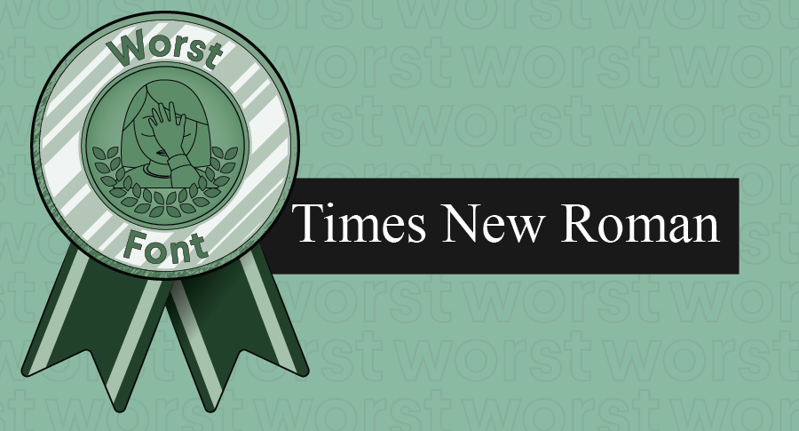
Arial is one example of a font we’ve all seen a million times before. It gets the job done, but that’s about it. It doesn’t add anything to the design, it doesn’t communicate a brand in a meaningful way.
Although there are cases where an unimposing font is exactly what you need, there are plenty of good fonts that can deliver personality while fading to the background (see the best fonts section below). A common font like Times New Roman is so unremarkable that it can actually end up as a distraction.
Fauxotic™ fonts
Some of the worst typefaces make up for their lack of personality with impersonation. Comic Sans, for example, fails to pack the superhero punch of hand-lettered comic books. And unless you’re writing a movie script, Courier isn’t fooling anyone that your opus was composed on a vintage typewriter.
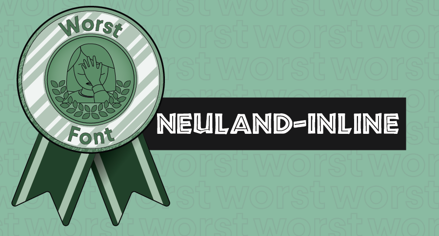
Some fonts are made to feel exotic by imitating design elements associated with specific cultures. Papyrus and Neuland-Inline are some of the most well-known offenders. And Bonzai’s letters mimic brush strokes used in Chinese calligraphy, the handcrafted character of which is lost on a static font. The main issue with these fonts is that they look uniform and feel cheap at best, and they’re culturally insensitive at worst.
Choosing the best font for your design
—
While bad fonts are universally bad choices, a good font isn’t automatically a good choice for your project. The right font for your design project needs to be two things:
- Well-crafted and aesthetically pleasing
- Appropriate for your brand

In Arthean’s design for Planet Diamonds, we see a perfect example of a font that’s an ideal fit for its brand. Planet Diamonds creates lab-grown diamonds for its jewelry line, giving eco-focused consumers another option in the marketplace. With an angular, minimalistic font that matches the company’s geometric logo, the branding communicates Planet Diamonds’ focus on harnessing technology to create flawless diamonds without making a negative impact on the environment.

When you’re trying to decide on the right font for your project, consider what you want the project to convey. Think about how your brand’s persona translates to the different types of font associations.
Typically, serif fonts like Mrs Eaves and Baskerville convey sophistication and timeless luxury, so they’re popular with more upscale brands. On the flipside, more casual, informal brands tend to use sans serif fonts like Akzidenz-Grotesk. If your brand personality calls for a handwritten style, you might be better off getting custom lettering rather than choosing a uniform font that mimics a hand-drawn look (see Fauxoitc above).
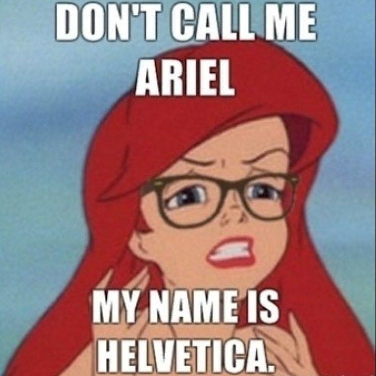
Also think about the associations people make with certain fonts. Love ‘em or hate ‘em, memes are inextricably entwined with Impact, so that’s a font to avoid unless you’re going for that meme-ish feel.
So take a look at each font you’re considering for your design project and ask yourself:
- Can I read it easily?
- Does it fit my brand?
If you answer “yes” to both, you’ve found your font! If not, keep trying other fonts in its place until you find the one that works best for your brand.
The best fonts are worth the effort
—
With all the great fonts out there, there’s no reason to settle for anything less than the perfect font for your brand. Take a look at all the awesome typefaces our designers are working with and how they’re using them now.
This article was originally written by Alex Bigman and published in 2012. It has been updated with new examples and information.


