If you had a thousand words to explain how great your company is, what would you say? Luckily, that’s exactly what your logo characteristics do everyday. So the big question is: What do you want your logo to say?
Logos explain who you are, what you do and how your brand feels—all in just an instant. Colors, shapes, typography and other design elements all influence how your audience experiences your brand. When you do it right, customers fall in love with you at first sight.
So how do you do it right? We’re here to explore the 7 logo characteristics all great logos have in common.
A great logo has the following characteristics…
- The right shape
- The right business cues
- The right colors
- The right tone
- The right typography
- The right trends
- The right sizes
1. The right shape
—
Graphic design is all about visual communication. The art of creating a logo entails both knowing what you want to say and which visuals can say that. Certain emotions and feelings are evoked by certain images and even the shape of the logo itself.
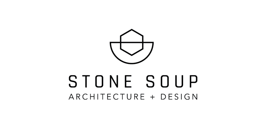
Glossing over the scientific background of graphic design, all you need to know is that each shape represents a different characteristic. Match your logo’s shape to the characteristics you want you brand to display.
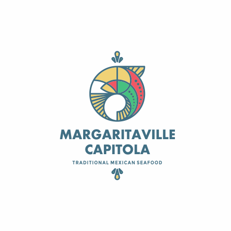
- Circles and ovals: Friendly, casual, inviting
- Curvy lines: Playful, relaxing, intriguing
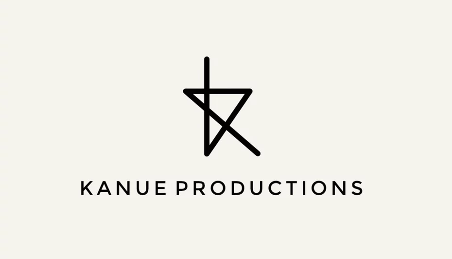
- Triangles: Leadership, authority, dominance
- Squares and rectangles: Efficiency, security, trustworthiness
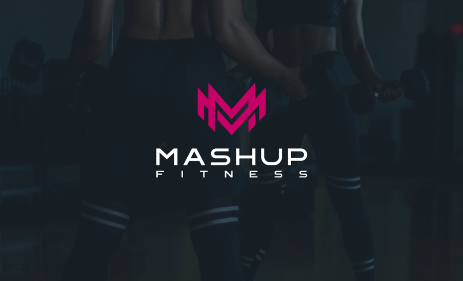
- Sharp angles and spikes: Aggression, edgy, gritty, offbeat
- Horizontal lines: Stability, calm, reliability
- Vertical lines: Prosperity, success, command
Of course, you’re free to create your own original abstract shapes to convey something more unique. You can even mix and match parts of a shape to customize it.
For example, a square with rounded corners still conveys security, but it’s a little friendlier than a square with pointed corners. Or think of the Apple logo; technically it’s an abstract shape, but its rounded edges and curves give it many of the “circle” attributes like warmth and casualness.
2. The right business cues
—
Logos communicate need-to-know information about your brand. They accomplish in a second what press releases, product descriptions and about pages do with paragraph after paragraph of copy.
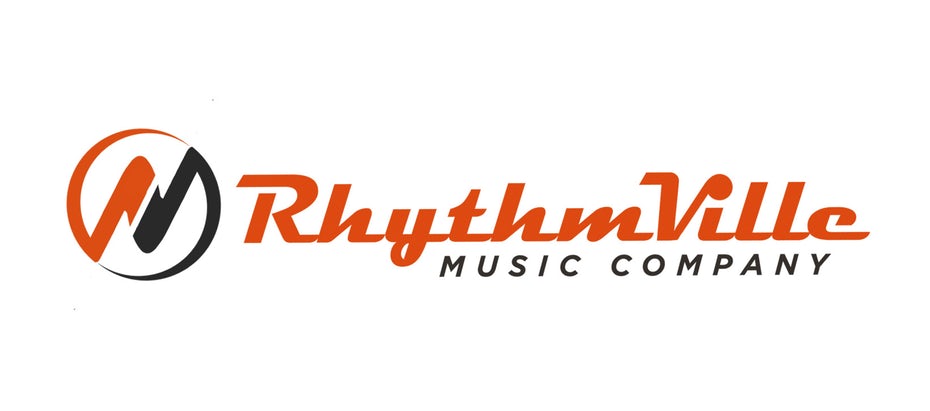
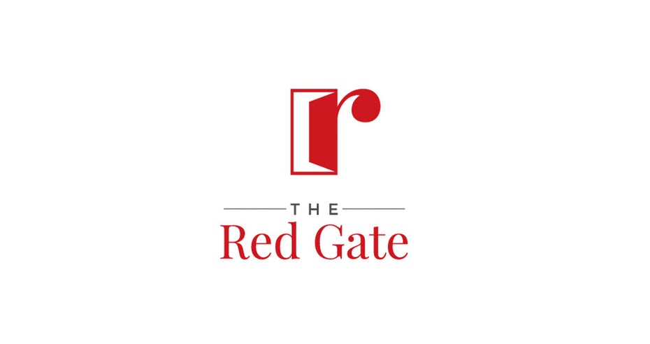
Design cues that relate to your business can help convey information fast, and they can range from easy-to-miss subtley to smack-on-the-head bluntness. On the more nuanced side, you can add “dog whistle” cues that only your target customers understand. For example, the RhythmVille logo uses a familiar font that most musicians will recognize, even if they’re too far away to read the “Music Company” part.
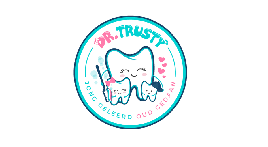
Likewise, you can tell Dr. Trusty is a dentist even though it’s not explicitly mentioned in the logo. The tooth imagery makes it clear exactly which kind of doctor they are.
If you prefer to go a bit more abstract with your logo, you can always add a clear tagline to signal what you do. In logo design, that’s a perfectly acceptable way to have your cake and eat it too.
3. The right colors
—
Just like shapes, each color has its own emotional connotations. Often these meanings are fairly universal because they’re based on things we see in the real world. Red, the color of blood, evokes feelings of urgency and alertness. Brown, the color of trees and wood, evokes nature and land. And it’s a pretty safe bet that people all over the world associate yellow with the warmth of sunshine.
Colors also have certain cultural associations. For example, in the US, green is the color of money, and in Japan, purple often represents evil.

Because of these primal reactions, color is one of the most important logo characteristics. Color alone can define how your brand comes across, even in direct contrast to other traits like shape or typography. Great branding requires a consistent color scheme, so your logo colors should be the same as your website, your in-store decor, your employee uniforms and more.
For more about color theory, check out our guide to logo colors. Or, skip the research and discover the colors that best fit your brand with our interactive logo color generator. We’ll suggest the most suitable color in a snap.
4. The right tone
—
There’s a reason cereals use mascots for logos and law firms don’t. An endorsement from a cartoon tiger doesn’t go very far with alleged felons.
To effectively optimize your logo, outline a solid brand strategy and identify your target audience. Who are you trying to appeal to? What kind of brands do they identify with? The answers to these questions will help you choose the perfect logo characteristics.
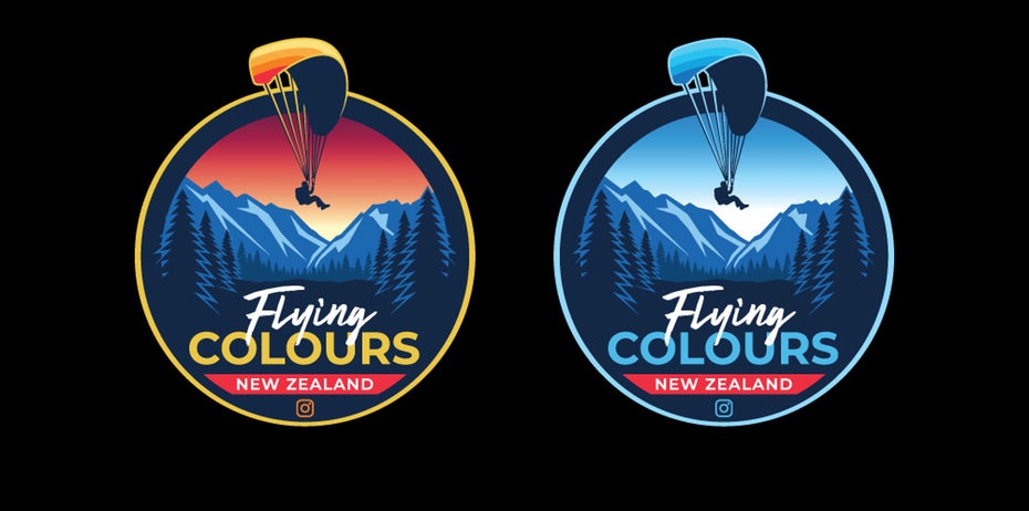
Take a look at the logo for Flying Colours, a paragliding company. Due to the nature of their industry, Flying Colours targets mostly adventure seekers and extreme athletes, groups that tend to appreciate landscapes like the background of the logo.
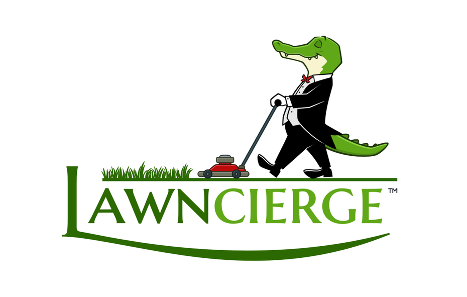
Or if you’re taking a humorous approach to branding, use your logo to double-down on a joke. The company Lawncierge, whose company name is wordplay, matches their sense of humor with a creative and funny butler mascot.
5. The right typography
—
All visuals can influence the mood and vibe of your logo. While that’s obvious for the images in a logo, it also applies to the typography. How your text looks can affect people’s perception of your brand just as much as what it says.
Typography encompasses all visual choices in text: name your font and text size, but also details like serifs, boldness, weight, format, texture and how you extend the bottom of an L and use it to underline the rest of a word.
Fonts are not as clear cut as colors or shapes, although they do follow many of the same guidelines. For example, sharp angles (like the M in Metallica’s logo) still connote edginess and aggression. It’s best to trust your own gut reactions when choosing fonts, but here’s some general basics to get started:
- Serifs are best for more formal or professional brands, while sans serifs are more casual and carefree.
- With all their curves, script fonts are the go-to style for both fancy and fanciful brands alike.
- Add more significance to a word by making it bigger than the others. Use this to stress certain aspects of your company or even accent puns.
- Use different fonts to separate types of text: a flashy, decorative one for your name, and a clear, legible one for secondary text like slogans.
- Handwritten fonts make you seem friendlier, but not as professional.
When choosing typography, remember not to put the cart in front of the horse. First and foremost, typography is about readability and legibility. No matter how cool your font is, if people can’t read it, it’s not worth it.
6. The right trends
—
You can also bring the latest logo trends into your design to communicate that your brand is contemporary and relevant. Trends rely on repeated usage and popularity to be effective, and they change every year, so smart designers stay on top of what’s hot and what’s not.
For example, these geometric logos follows a trend that combines warm colors and friendlier, shape-based compositions to create a design that’s both modern and personal.
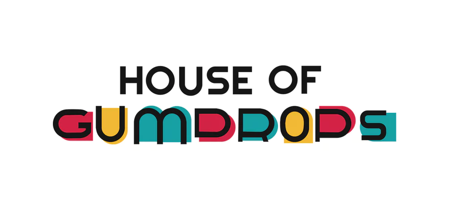
This logo for House of Gumdrops, a greeting card company, uses a trend of intentional, literal color to bring to life a rainbow palette of gumdrops and appeal to a mostly-female demographic.
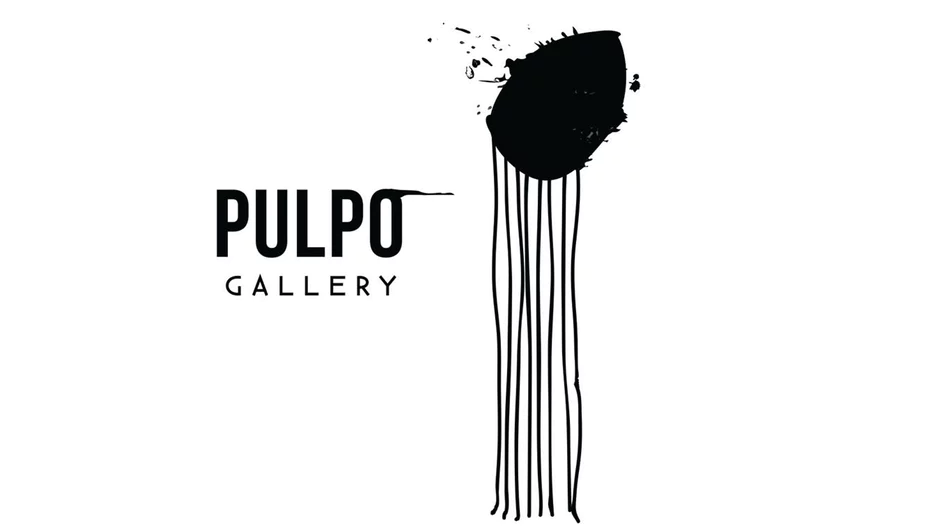
These logos elevate the dominant trend of minimalism by stripping it down even further with abstract shapes. This shift to abstract concepts enhances the effect of minimalist logo designs and makes them more effective.
7. The right sizes
—
Not size, but sizes—plural. In recent years, advertisers and marketers are coming around to the idea that having multiple versions of your logo is the best way to go, known as a responsive logo. That way, you can optimize your logo’s size to wherever it appears, whether a tiny in-app advertisement to a massive highway billboard.
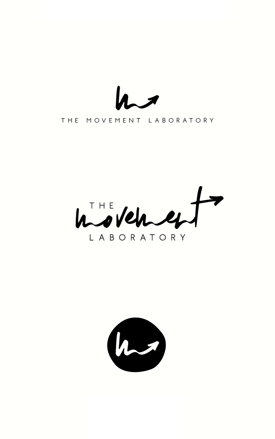
That’s not to say you should have different logos, but rather different sized versions of the same logo. Start with a small logo that’s recognizable with it’s bare minimum elements. Then, scale up with each subsequent iteration. Make things bigger, add more elements or words and use more intricate details.
We recommend creating four different sizes, but make sure their style is all consistent. We can’t stress that enough. All versions of your logo should be recognizable as the same logo, otherwise you undermine one of the greatest benefits a logo brings to your business.
What sizes should you use? Our guide to logo sizes and dimensions outlines the exact pixel count for logos on social media, websites and print.
Make it memorable
—
You know what? We really could have made this a list of one with the single most important logo characteristic of all: memorability. The seven items above all add up to creating more memorable logos, which in-turn makes more memorable brands. And when a person is deciding what to buy or whom to do business with, you’ll be glad when they think of you.
If this all seems too technical and overwhelming, don’t worry. Rather than tackle the intricate world of graphic design yourself, you can always hire a freelance designer to create your logo for you. Professionals already know how logo characteristics can amplify the story of your brand, so all you have to do is explain what kind of brand you want to be, and your designer takes care of the rest.


