A round of applause is in order because Nav Creative recently celebrated an incredible milestone!…
How to design a wine label: the ultimate guide
Think about the last time you went shopping for a bottle of wine: maybe it was for a friend or to bring as gift to someone hosting a dinner party or get-together. What guided your eye through the expansive number of brands now readily available at any local grocery store? Like the other millions of people that have grown the wine industry to a $60 billion industry, you probably checked through some simple and quick mental decisions: red or white, domestically grown or imported and price point. Even after that, you’re probably left holding three or four bottles. It’s impossible to deny that there is a small thing that can make or break the purchase for many people: the label.
Especially when buying a bottle that will eventually be a gift, it’s undeniable that consumers shop with their eyes. Need proof? Last year, Wine.net surveyed 2,000 wine drinkers asking them to choose between three bottles of red wine and three bottles of white wine with only a picture of each bottle to guide them. 80% said their decision was based mostly on the label!
If you’re an independent wine maker, you need to be sure your bottles stack up against the competition.
Read on to learn more about crafting a perfect wine label for your brand and how you can make sure your label leaves your consumers on cloud wine.
Know yourself and your audience
—
A wine label has very little space so every element must be chosen for maximum impact. First things first: who are you and what’s your story? A century-old vineyard in France might want to communicate to a potential customer that they are trusted, historic brand, making them a solid investment. While an upstart winemaker in Oregon might want to sell to younger, more adventurous buyer looking for something unique and new. Figure out how to tell that story in an engaging way in only a sentence or two, while also describing the particulars of that bottle.
Design your wine label
—
Once you have a clear idea of who you are and the audience you’re trying to reach, let that guide the design choices of your label.
Color
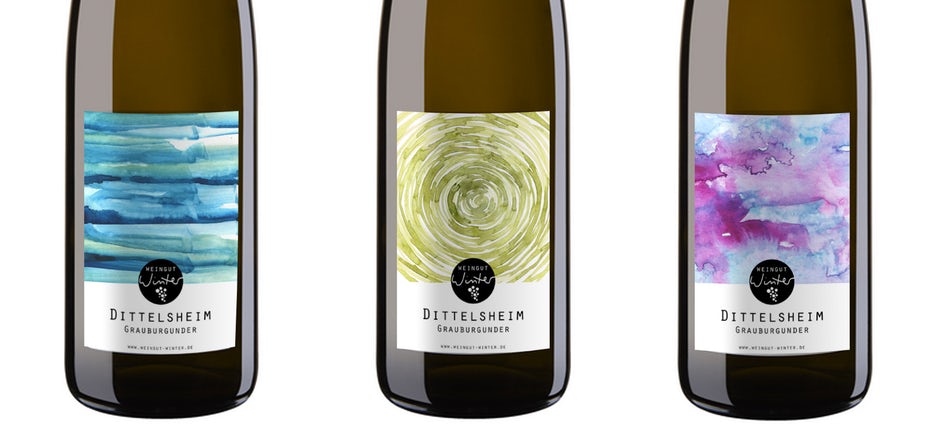
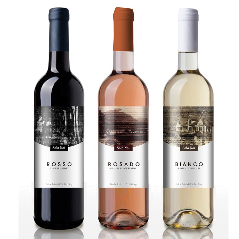
Wine has pretty standard bottle colors: reds are sold in dark green bottles to keep out the sunlight and prevent oxidization, while whites are sold in clear or pale green bottles. The first step to choosing a color scheme for your label is making sure it pops on the bottle the wine will be sold in.
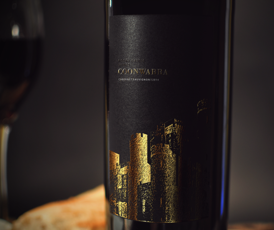
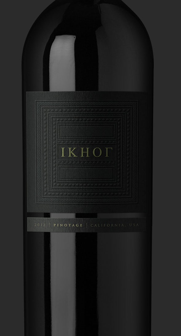
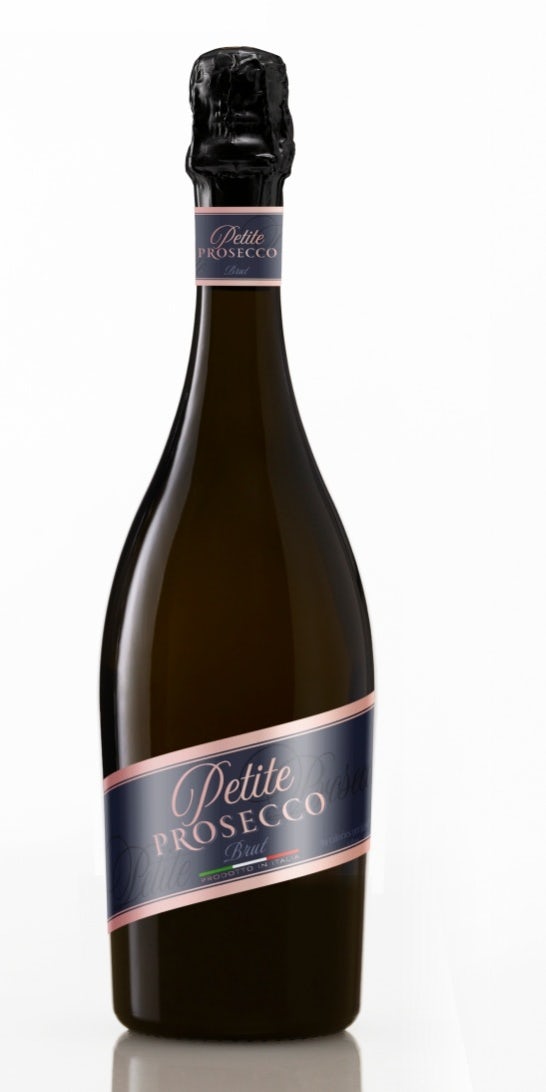
Reds traditionally follow two color schemes: dark, deep colors creating a moody feel, or a white label with rich ink colors (deep reds, blues or golds). White wine labels tend to go for light blues and greens, creating airey or crisp feelings. And whites, golds and pinks reign supreme for sparkling and the super trendy roses.
Of course, traditions are made to be broken. In recent years, vintners have started being more playful with their color schemes, pairing bright or dark labels with whites for a bold, contrasting effect, or choosing a full-spectrum of bright colors to make a red more playful.
Typography
You have your color scheme. Now it’s time to think about type. If you do choose dark label on a red, make sure your typography is strong enough bring contrast to your design. The font you choose for your label will tell the consumer a lot about the what they’ll be uncorking. Traditional wineries use busier typeface styles and design that evoke their history and authenticity. The labels often rely on serifed or script type.
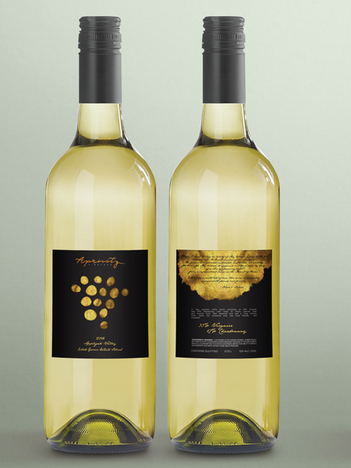
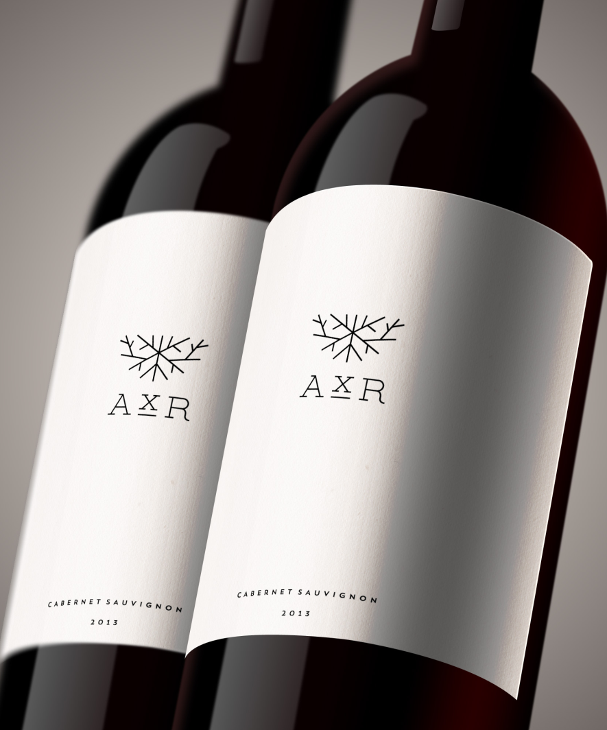
Modern, hip wineries often use bold, sans serif faces to lend a contemporary feel. The labels (like Axr below) are often roomier, with lots of white space. On the other end of the spectrum, instead of putting emphasis on the full winery name, they will often pull one letter or logo mark out and make it large and eye-catching.
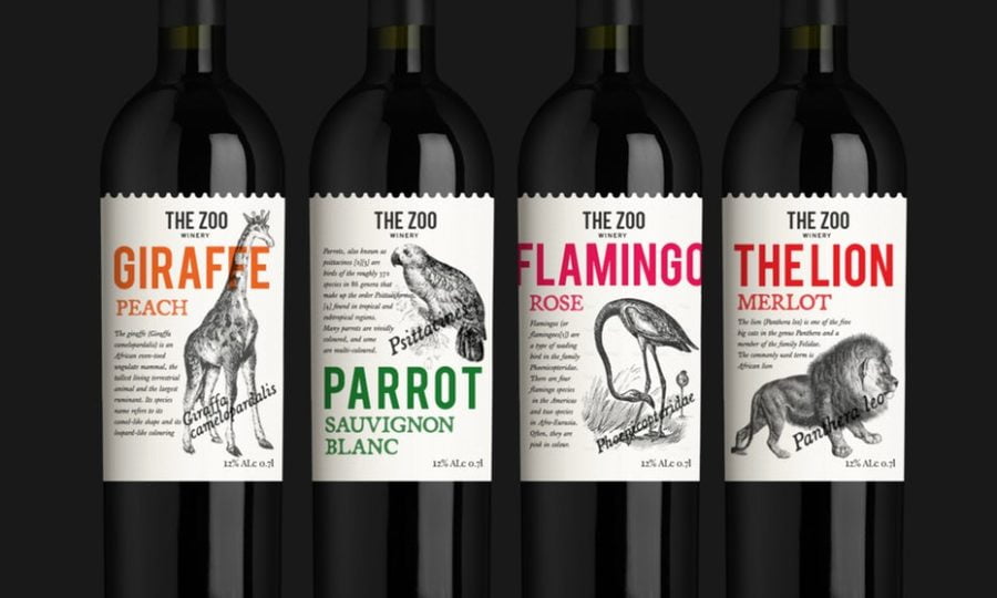
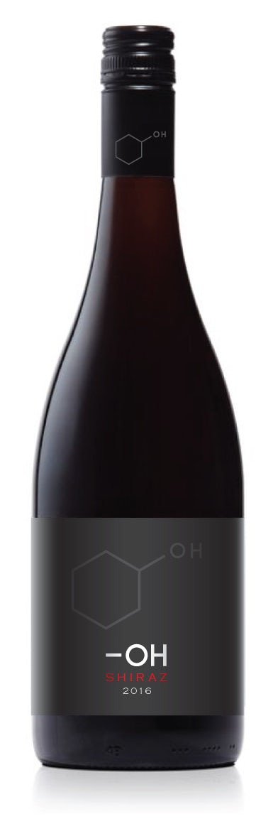
Style and imagery
The most popular styles tend to fall into a couple categories: elegant, bold and modern, minimalist or classic/traditional. Pick yours based on the personality of your wine, your brand, and your drinkers. Going for an older, more sophisticated drinker with a high price point? You might want to stay traditional. Attempting to draw in millennial drinkers who are beginning to collect and develop their palettes? Perhaps you’re better off with something clean and modern.
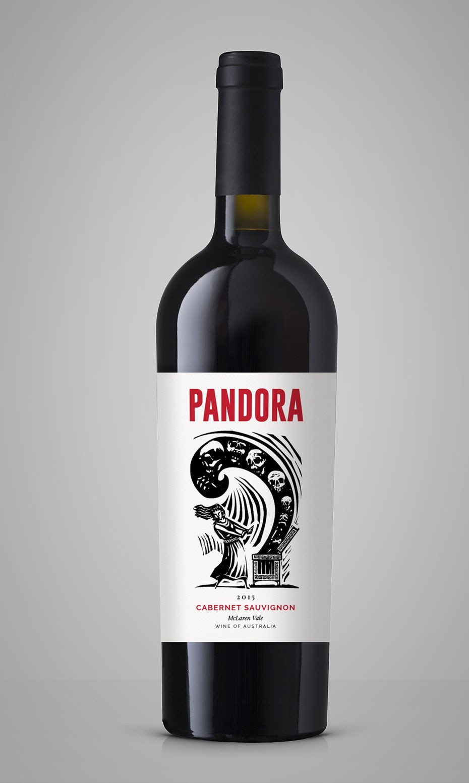
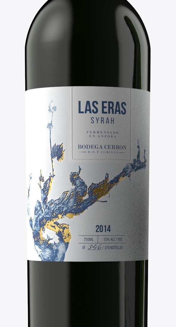
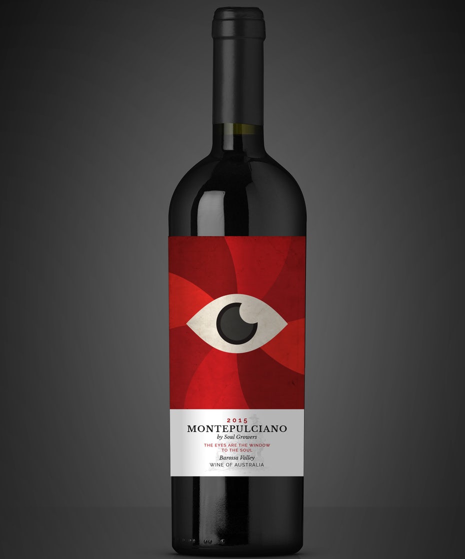
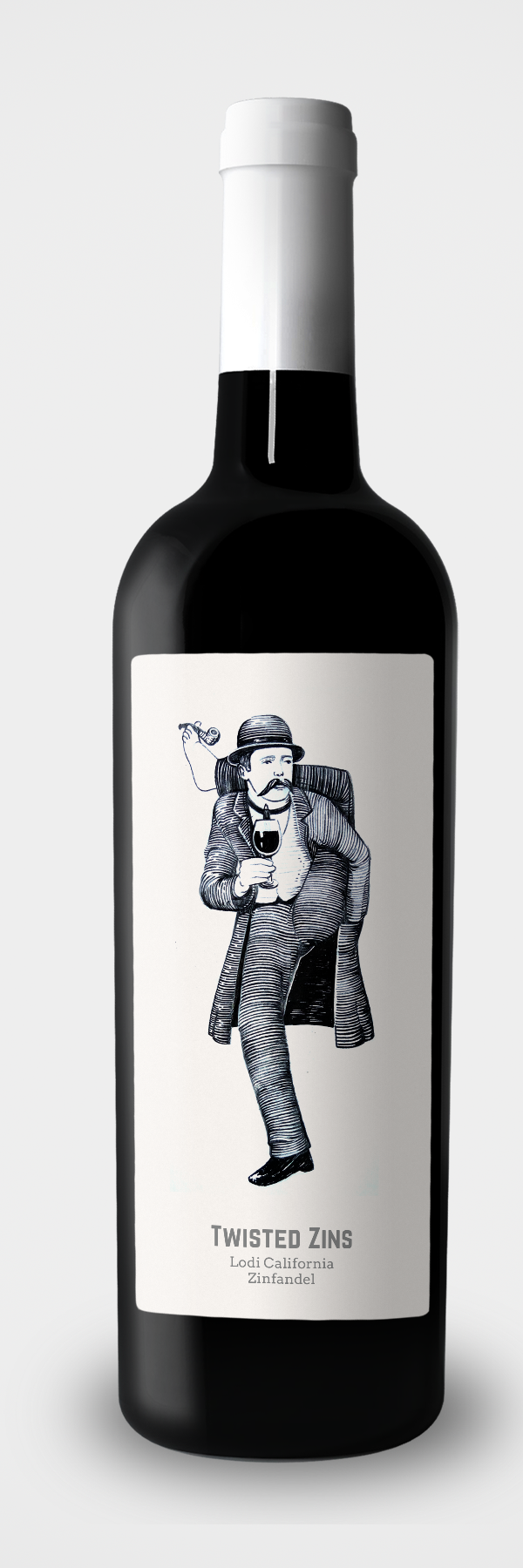
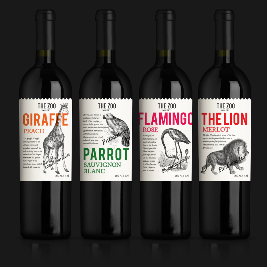
Whichever style you choose to fall into, your label needs eye-catching imagery to draw attention. A traditional choice might be a pencil drawing of the vineyard or estate where the grapes are grown. A minimalist design might show a small character or logo with lots of white space around it. A contemporary label might eschew graphics all together, using large typography to grab the consumer’s eye. Some brave souls are even choosing to push the boundaries even further and use cartoon or highly graphic, amusing designs.
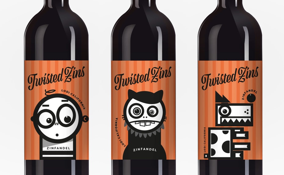
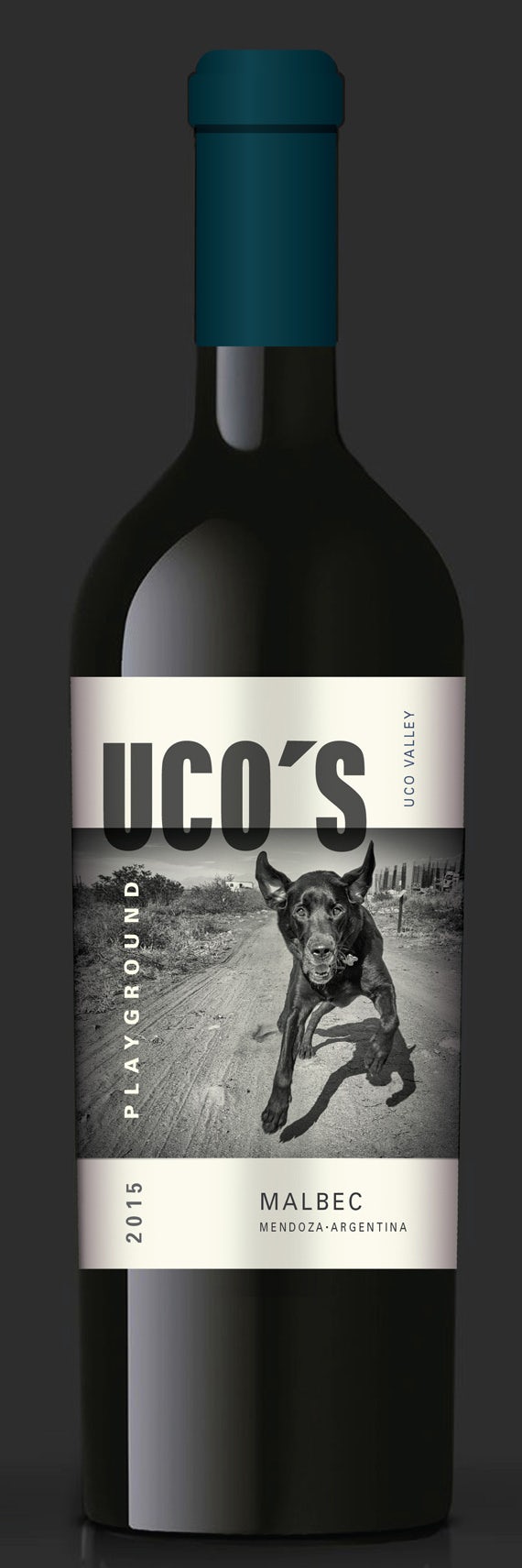
Imagery allows you to really be unique. Think about what sets you apart from other wines—is it your location? A feature of your estate? A fun family trait? A punny name? Find that detail and figure out how to visualize that. Maybe your tasting room is modern and clean—design a label with lots of white space and an elegant sans-serif font to match. Got a dog that loves to play fetch with your visitors? Maybe a fun ink-blog style drawing of her for a whimsical, light wine.
Your label style lets customers know if this is the type of wine for them, your imagery allows you to stand out from the competition and be remembered.
What about the back of your wine label?
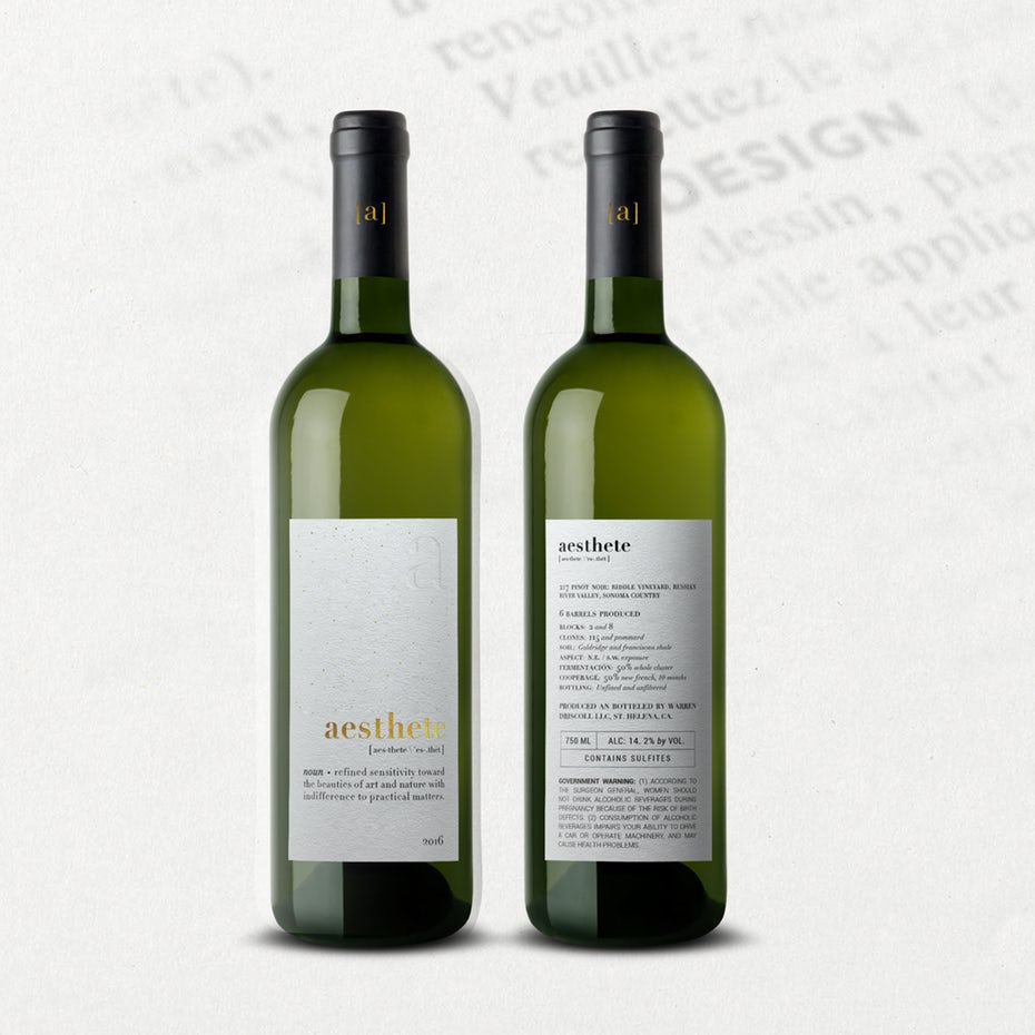
After all this consideration given to the front of the bottle, make sure to include all the relevant information on the back label. While this can be interesting stuff like vineyard history and tasting notes, you must also must include less-fun legal information like government warnings, ABV and UPC codes (if you’re planning on selling in stores). Make sure you research all of these requirements and provide them to your designer.
Wine label materials and production
—
So you’ve made the important decisions about what will be on the label. Now thought must be given to the quality and texture of the paper itself! Wineries have upped their game as of late, bringing high-quality printing elements to what were formerly static labels. A trip down any wine aisle will offer textured papers, decorative foil stamping, embossed letters and other signature touches.
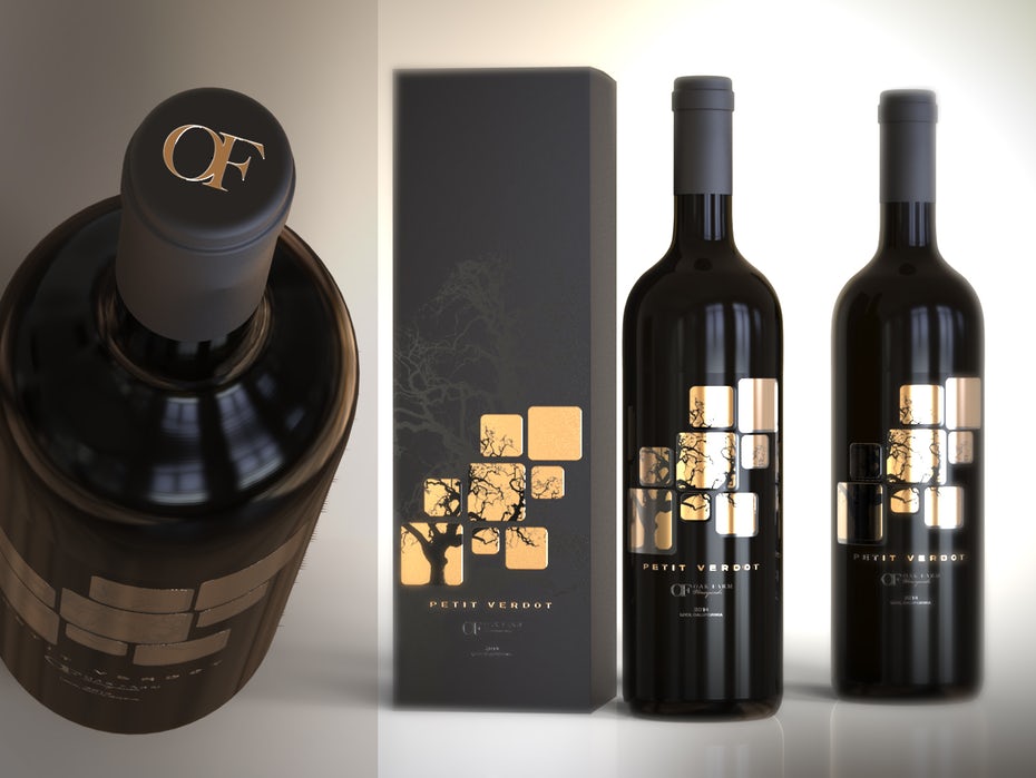
More wineries are embracing the glamor of hot foil stamping, embossing and die-cutting. Long used on bottles of bubbles, foil reflects light beautifully, giving your label an attractive, high-end feel. Embossing is the process of pressing an image onto the label paper, in the process making the image (or parts of the image) rise above the rest of the label. Though embossing can be very subtle, it gives your potential customers a more tactile experience.
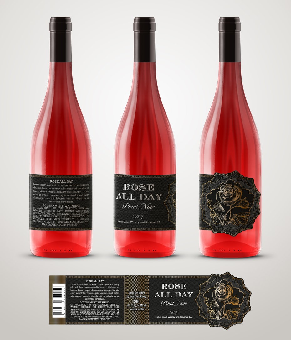
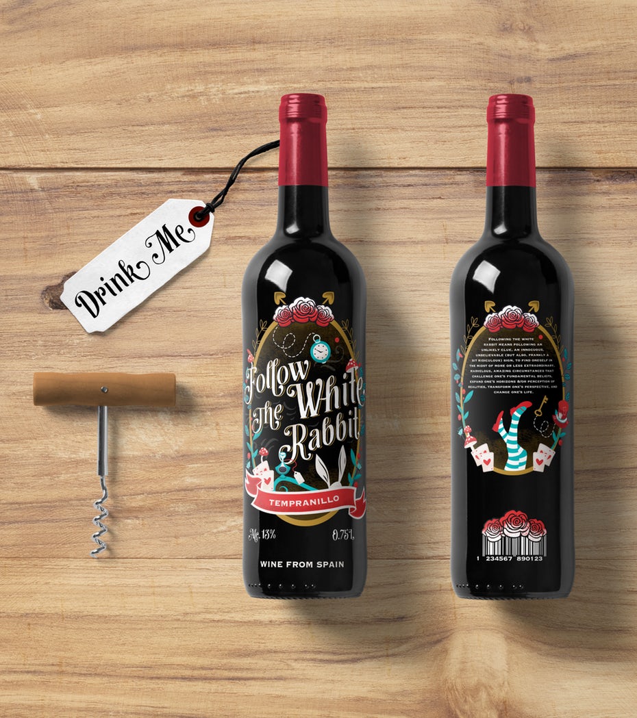
These elements aren’t the only way to make sure your bottle jumps off the shelf: custom-shaped (or die-cut) labels have risen in popularity in recent years. These are creative labels that feature cut-outs and custom designs and offer an alternative to the rectangle we’ve all come to expect. If you’ve spent a lot of time and energy crafting the perfect image or logo for your brand, die-cutting is a great way to make it truly pop. Like the Rose All Day label and Follow the White Rabbit label, which both use ornate die-cuts to make their labels stand out.
While these elements bring undeniable class to your brand, they also offer drawbacks and limitations in the production stage, as well as obvious expense. Keep in mind: these labels usually have to be printed in higher numbers to keep costs down.
Winery brand identity
—
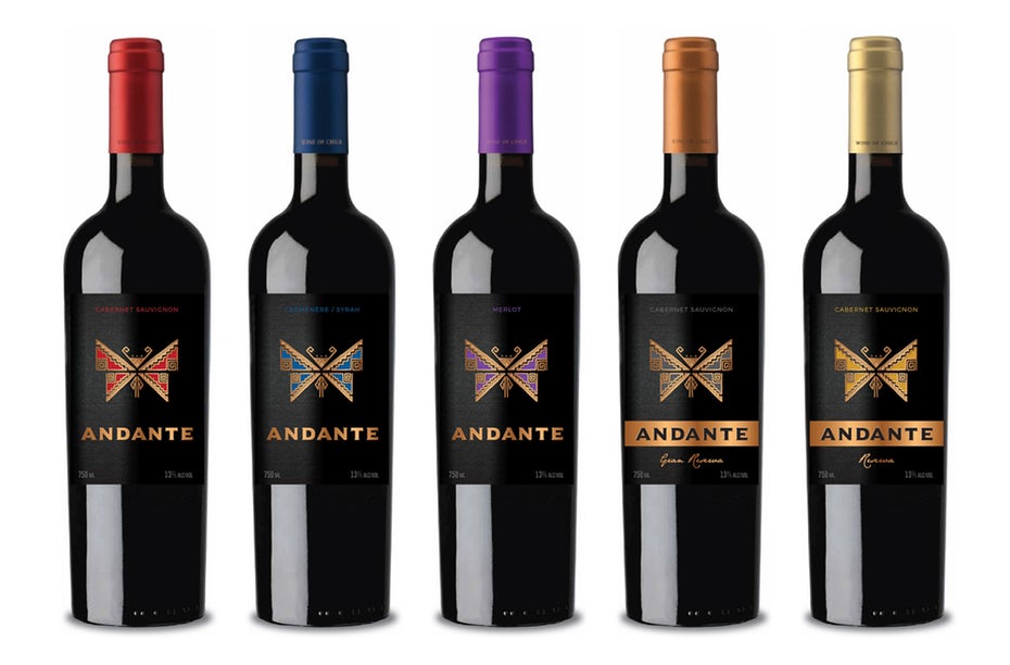
In almost all stores wine is shelved by grape or style. Even within country of origin, the reds and whites are kept in completely different areas. How do you make sure you customers seek out your brand in each section of the store? It’s essential to build continuity in your branding across products, to insure your bottles are linked together throughout the store. This is especially important if your labels change color. A strong, distinctive brand mark is also important: once a customer tries and likes one style, they’ll be excited to see your logo on a wider range of options and will be more likely to branch out.
Find the right wine label designer
—
There are three ways to get your wine label designed: you can do it yourself, hire a freelancer or run a design contest. Large-scale wineries also have the option to work with a full-scale design agency, but this can get very pricey ($10,000+) and is usually out of an independent wine maker’s budget.
While DIY-ing might be tempting, unless you’re a trained designer I don’t recommend it. Which leaves you with two choices: running a contest or hiring a freelancer. There are pros and cons to both, but I can tell you that most wine makers that create a label on 99designs start with a contest, as it gives them a wide range of ideas and styles to choose between. They then move on to working with designers in one-to-one freelance projects to create labels for additional varietals.
A toast to awesome wine labels
—
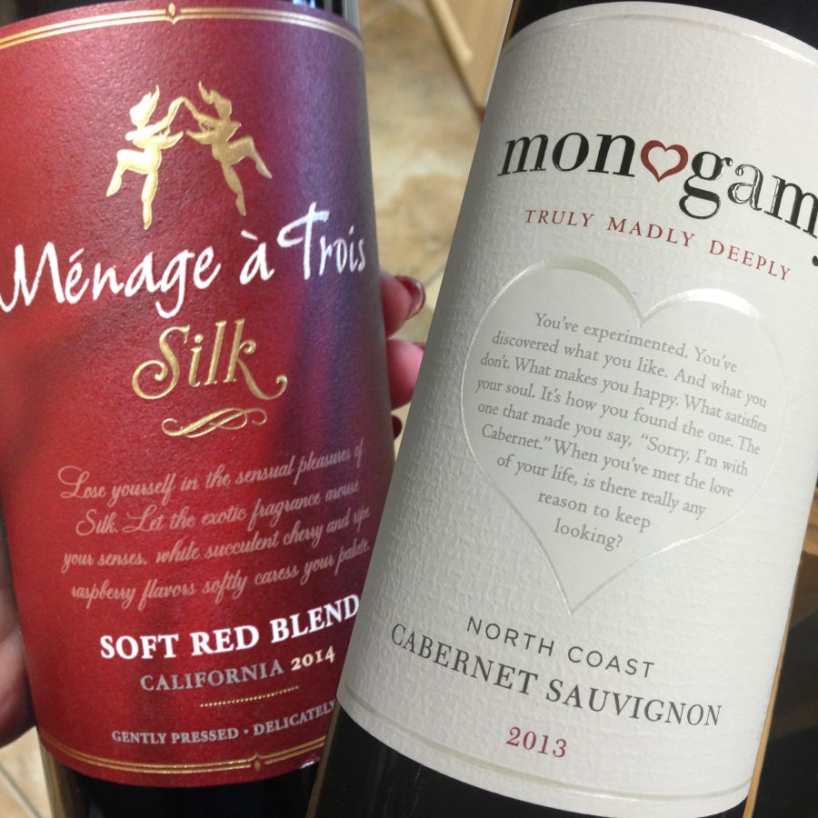
Whether you’re more into Monogamy or prefer a Ménage à Trois, there’s no doubt we’re in a golden age of wine. Nothing is too bold to fly off the shelves. With millennials drinking more wine than any other generation, the wine industry is finally shaking off it’s stodgy, traditional reputation, and wineries have allowed themselves to embrace their cheekier sides and the label design has followed suit. Find the balance between current trends and timeless style and your bottle will be sure to fly off the shelves and into happy consumer’s glasses. Cheers!
Ready to get an awesome label for your wine? Launch a label design contest today!
Original article written by Meg Reid >
[wpseo_map width=”100%” height=”300″ zoom=”-1″ map_style=”roadmap” scrollable=”0″ draggable=”1″ show_route=”0″ show_state=”1″ show_url=”0″] [wpseo_address hide_address=”1″ show_state=”1″ show_country=”1″ show_phone=”1″ show_phone_2=”0″ show_fax=”0″ show_email=”1″ show_url=”1″ show_logo=”0″ show_opening_hours=”1″]Related Articles


