We’ve been told “it’s what’s on the inside that counts,” but what if that’s not completely true? What if the outside counts, too? What if you can judge a book by its cover and what if beauty is much, much more than skin-deep?
If you put the pieces together from various studies on neurology, psychology, usability and even human evolution, you’ll see the true value of appearances—the one the fairy tales don’t want you to see.
Design is more than just pretty packaging. It’s actually one of the main influences on how we perceive value (sometimes even more than what’s actually under the hood). And we’ve got the science to prove it.
Setting your sight high
—
No matter how much you love smooth jazz, it’s what you see that occupies most of your brain’s time—more than all your other senses combined.
While no one has managed to pinpoint an exact number, high estimates say visuals account for 83% of the perceptual data in our brains. Even the lowest estimates cite that over 50% of the surface area of the brain is devoted to processing visual information. Do the math, and you see more neurons are devoted to sight than hearing, taste, touch and smell combined. That must explain why we’re six times more likely to remember something with visuals than without.
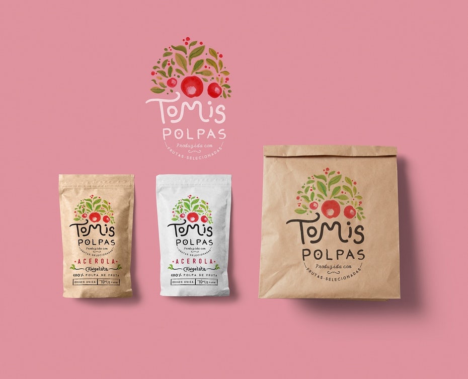
So what does this mean for design? The graphics you create are going to dominate the viewer’s brain activity far more than anything else. If a shopper is holding a product in their hands, the packaging is going to have a much greater impact on their decision to buy than, say, how it feels or what it smells like.
And (we’ll get into this later) our sense of sight can even overpower over our logic. In other words, a well-designed logo can influence people’s perception of a brand more than the company’s financial report or even a news scandal.
For now, just remember that the human brain is wired for sight.
How millions of years of tiger attacks helped modern design
—
Believe it or not, under the right circumstances, visuals can override rational thinking. It’s not a stretch to say that people (some more than others) make decisions emotionally rather than logically. Visuals provide a shortcut to “gut” reactions, so what you see often holds more weight than what you think.
Don Norman, scholar and director at The Design Lab, writes in Emotion & Design: Attractive Things Work Better that our reliance on visual stimuli over rational thought was more of an evolutionary necessity.
Let’s put it this way. You’re a primitive, cave-dwelling human and you’re out strolling through the jungle when you see a tiger. You could calculate how far away the tiger is, scan the grounds for a suitable hiding space or find a rock to defend yourself with… But these all take precious moments in which the tiger would pounce and eat you.
Instead you could simply just run. Sure, it’s not a foolproof plan, but in primitive times, survival favored fast thinking over effective thinking.
So over the millennia, humans evolved to make “gut” decisions based on what they saw to save time. At first, the link between eyesight and emotional response was based on the strongest of motivators: fear. If you saw a tiger, you ran. If you peered over a high cliff, you stepped back.
Over time, visuals permeated into other emotions. The sight of a loved one made you happy. Or the familiar image of home made you relax. Keep in mind, this was in an era when language was still developing, so feelings were more instinctual than anything else.
Flash forward to modern times. Tiger attacks may have stopped, but our emotional gut reactions remain. And that has a huge impact on graphic design.
Take a look at this logo:
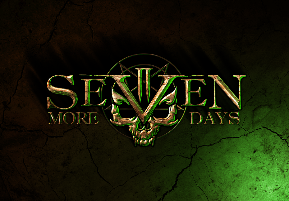
If we told you that Seven More Days was a daycare center, would you believe us? Even if we showed you undeniable proof, you’d still have a hard time swallowing it. That’s because, when what you see comes into conflict with other information, your mind tends to lean towards what you see.
(Seven More Days is a rock band, by the way.)
Though it stemmed from evolutionary purposes, our blind faith in visuals serves goals like marketing, branding, sales and, as we’ll explain later, actual usability of a product.
The first—and only—impression
—
If you’ve ever broken your jeans button, and then trip while walking out of the bathroom, and then your pants fall down because they got caught on a table edge, all a few minutes after meeting your girlfriend’s parents, then you know how damning a bad first impression can be.
But what you may not know is how much of first impressions depend on looks—or how long they truly last.
While much has been said about the science of first impressions, the general consensus is that, at first glance, people assess trustworthiness and competence above all else. This applies to brands, books and products just as much as it does to people, though you can’t hire a designer to improve people’s first impression of your personality.
In human interactions, first impressions are formed largely by nonverbal cues such as facial expressions, grooming and body language (although what people say plays a big part, too). For businesses, they come from brand visuals like logos, websites and product packaging. In other words, graphic design.
Even more significant is how long first impressions last, even despite conflicting evidence. In a Cornell study, researchers showed subjects photographs of people and found that they held on to first-impression judgements of those people up to six months later, even after meeting them and people and seeing that they’re nothing like the photograph.
More bad news, these initial impressions are formed after just 60 seconds — harkening back to the evolutionary development of eyesight in making gut decisions.
Why does this matter? Well it’s definitely incentive to get your branding and marketing designs right the first time instead of redoing a bad design later.
Choose a design that conveys trust and competence using visuals instead of words. It should be simple enough to understand in a few seconds, but memorable enough to last months or even years.
The parable of the ugly ATM
—
After everything we’ve just discussed, would it surprise you to know that a good visual design can actually make a product work better? That’s a bit misleading, but in 1995, a pair of Japanese scientists discovered that graphic design can make people think a product works better.
Two researchers tested a variety of different screen layouts on an ATM, and then later had subjects rate both how it worked and how it looked. In total, they tested 26 layouts ranging from technically efficient but ugly, to aesthetically pleasing but inefficient—and varying degrees in between.
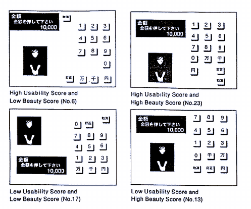
Somewhat surprisingly, the results showed indisputably that better-looking layouts scored higher in usability. What designers can take from this is that great design can actually improve how the product is used or how a brand’s performance is perceived. A good book cover may not be able to save a bad book, but it can make a good book even better!
How does it work? Attractive designs cause pleasure, and the biological response of that pleasure is relaxation. A relaxed brain actually functions better, like improving problem-solving and motor skills. That’s why athletes try to relax before a big game instead of intentionally stressing themselves out.
Just look at how YouTube has improved their user experience just by improving the visual design:
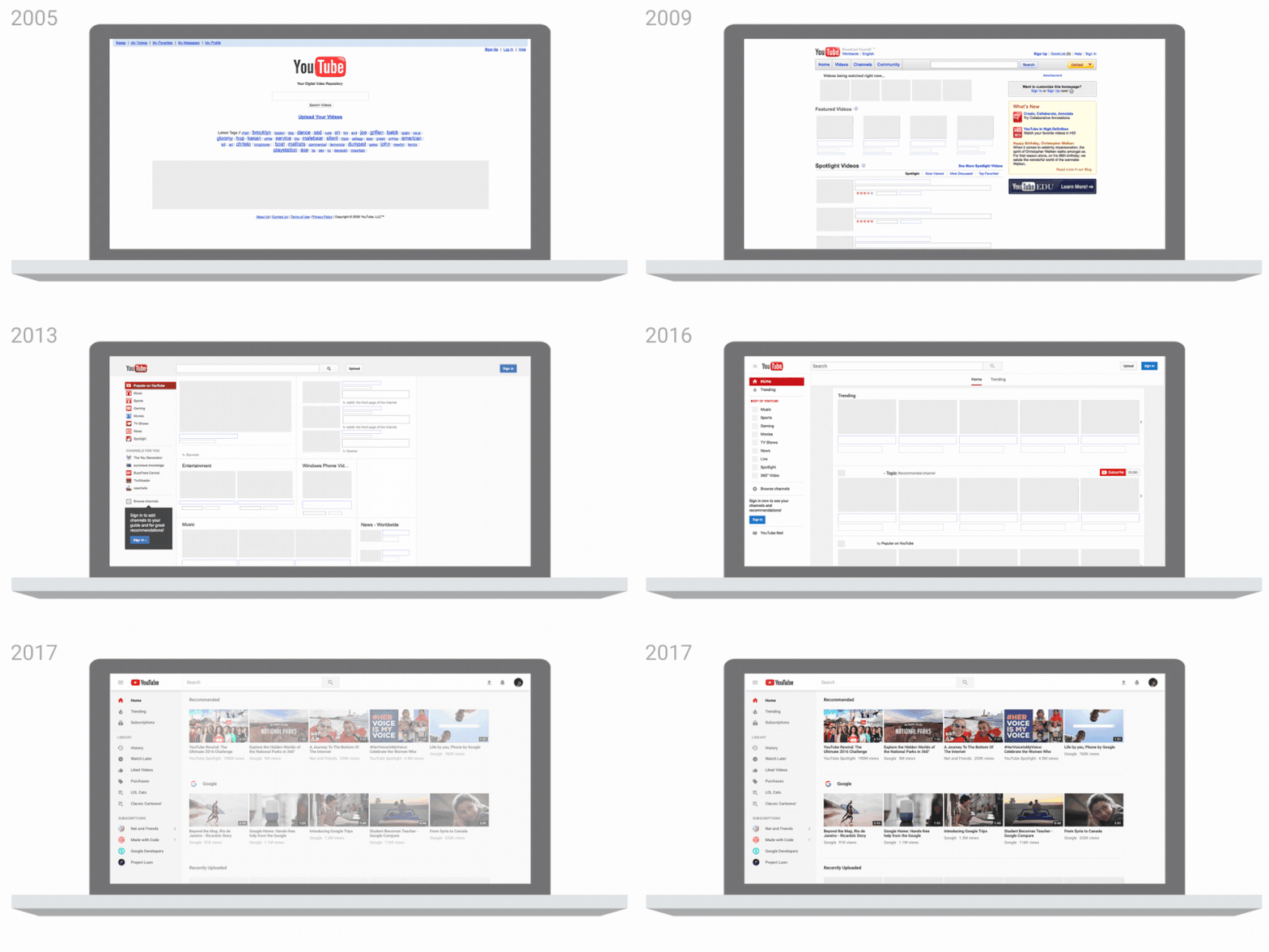
A good design improves brain function. It makes products easier to use, it makes companies seem better or more valuable, it makes people want to engage more with whatever the design is attached too.
Of course, this goes both ways. An unpleasing design causes anxiety, which complicated cognitive processes, which makes the user more likely to err or associate negative feelings with the design.
It’s also worth noting that what makes people happy changes periodically with new design trends. The feeling of something “new” and “cutting edge” is sure to excite its users, so keeping up-to-date with what kind of visuals people want is just one of the many responsibilities of a good designer.
The ugly duckling was bad design. That swan upgrade was a necessary improvement.
—
Design matters. It does more than just look good; it enhances the complete user experience, feeding into empirical business metrics by reducing product returns, increasing brand loyalty, making it more likely for customers to leave reviews and above all maximizing profits.
All that from a pretty picture.

