A round of applause is in order because Nav Creative recently celebrated an incredible milestone!…
A research backed guide to consumer design preferences
If you’re a designer, a product owner or an entrepreneur, chances are you think long and hard about your design choices. Of course you do, that’s one of the reasons you’re here!
But how often are those decisions led by your own preferences, or by the prevailing trends in your profession at the time, rather than by consumer research?
While many feel that great design should be inspired, maverick, artful and uncompromised…if your job is to sell products, not win awards, you might err more on the side of pragmatism.
To help guide with a little more practical consumer insight into how consumers view products with very different design aesthetics, we ran a small test using Attest, a brand and marketing intelligence platform.
Our visual survey was sent to a nationally representative sample of 250 people in the UK in December 2017. We asked a value-driven statement about four common consumer goods, to see which of the designs came out on top, with a particular focus on minimalist designs, which has become almost a ‘default’ approach following the influence of Apple.
Here’s what we found out.
Familiarity is sweet
—
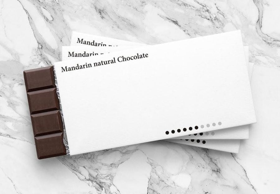
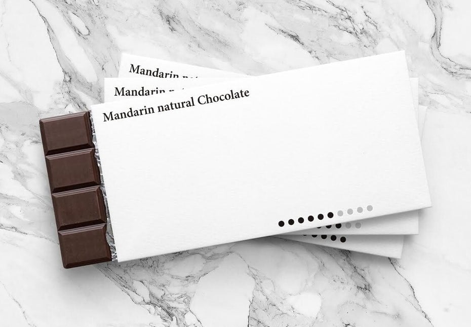
We asked 250 consumers ‘Which of these would you pay most for?’
You might be surprised to see that a plain old Cadbury’s chocolate bar is by far the most likely product that people would pay most for.
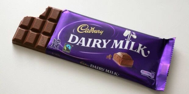
It’s not premium like Godiva, or exotic like Perugina. Neither is it a lauded minimalist design.
Why? Sometimes it pays not to reinvent the wheel, but to tap into familiarity, a long-established brand promise, and even nostalgia.
However, if you dig into the data a little deeper, some interesting segments emerge.
For example, those earning over £50,000 are almost twice as likely to be willing to pay most for the minimalist design, and those living in London are even more likely to pay most for it. This suggest that wealthier urbanites are more drawn to the clean, chic appearance of minimalist design, even for commonplace products.
Minimalism is the wine-r here
—
Next we asked the same 250 consumers ‘Which of these would you want to give as gift?’
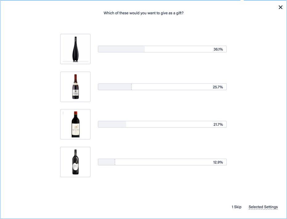
This time the celebrated minimalist (and very contemporary) design easily wins out as a consumer favourite.
This is followed by more traditional, but perhaps less well known wines, and in this case we have the easy-to-recognise mass-market product sitting last.
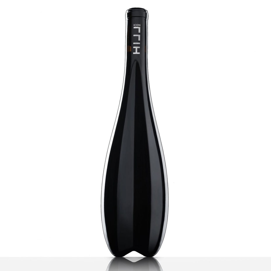
Therefore when the ‘job to be done’ is to seem generous, or impress a friend, an unusual design approach is much more highly favoured than where the ‘job to be done’ is to indulge yourself with a little chocolate.
This is a great lesson for design choices here. To make the right decision, you first need a deeper understanding of your customer’s motives.
In this case, both products are mass-produced and widely available at supermarkets, frequently bought by the individual, for the individual. Yet when the motivation switches – to give a gift – it seems like their evaluation of a product may also change.
Social skin care
—
What happens when your motivation is to share your brand choice publicly, probably to make a statement?
Here we asked the same group ‘Which of these would you be most likely to share on social media?’
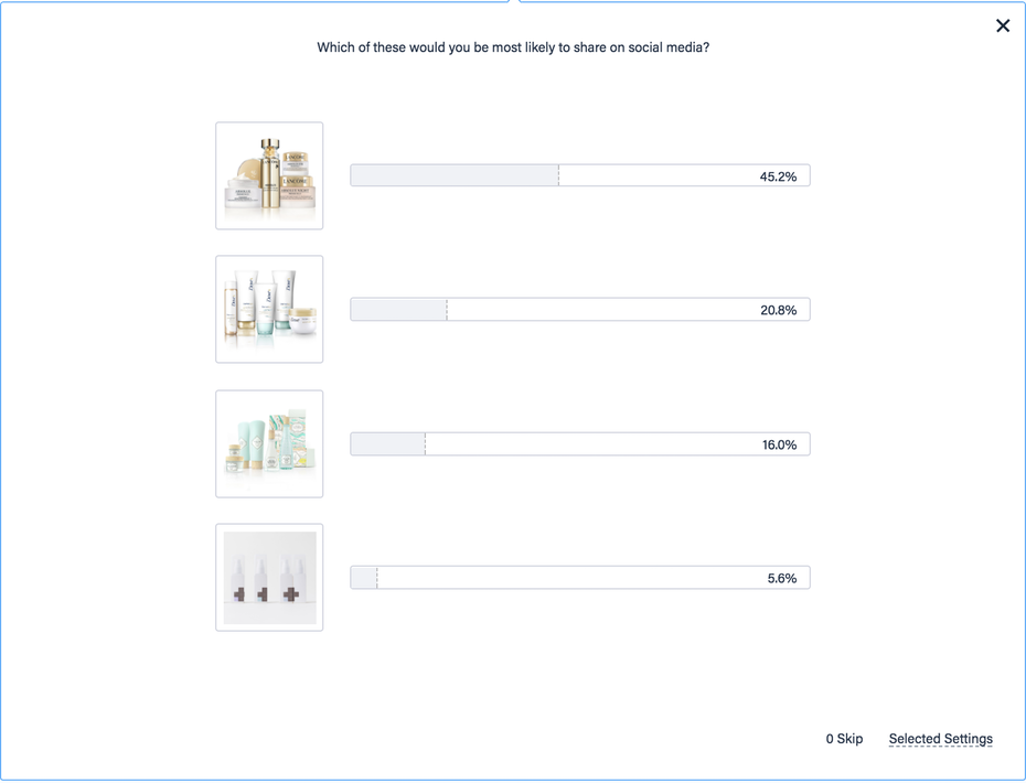
This time the luxury brand comes out on top, beating out the media darling Dove and distinctive, quirky design of benefit. Dead last is our minimalist design representative.
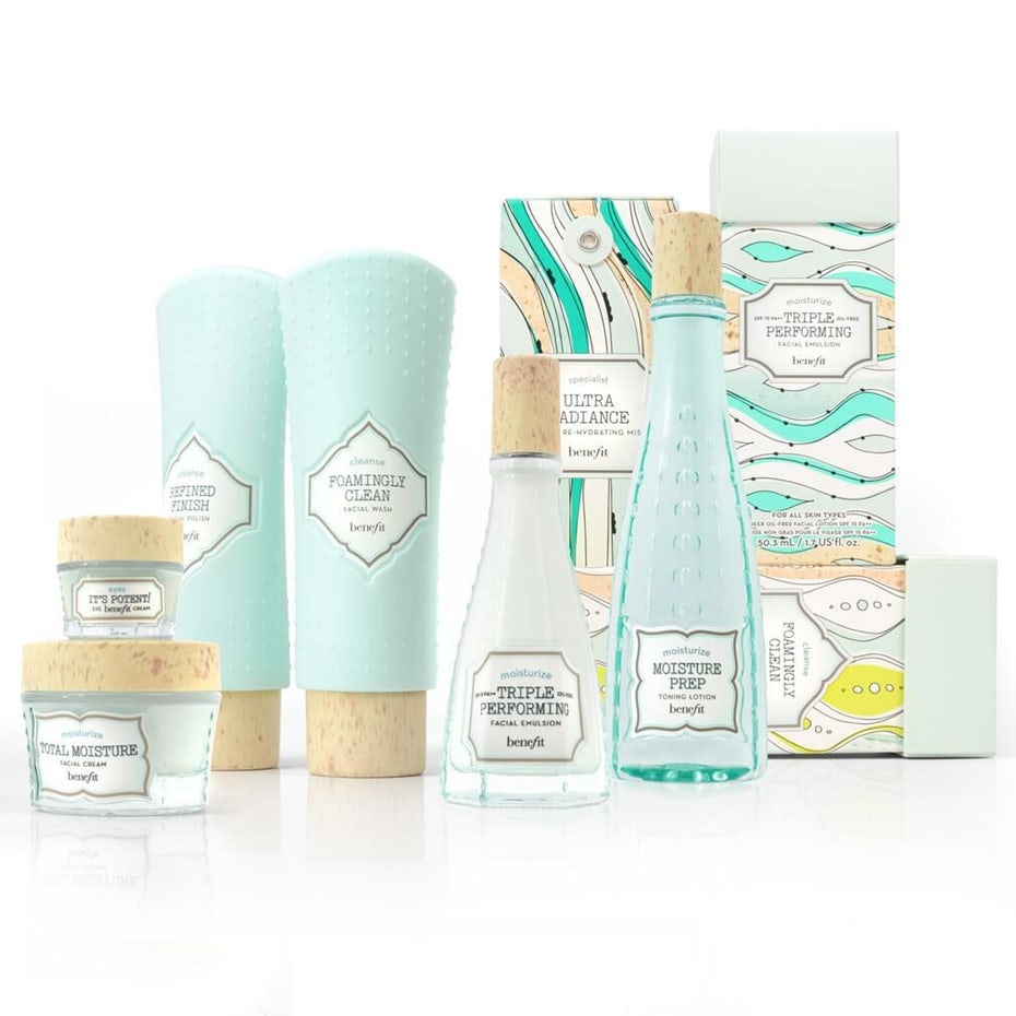
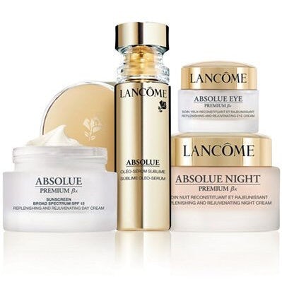
Perhaps it has strayed too far from accepted design norms; or perhaps in this particular case the lack of a discernible brand name makes it less suitable for making a statement on social media.
In an ‘Instagrammable’ world that has led to entire restaurants refitting their interiors just to appeal to social media snappers, it’s important to consider the impact of your design choices on people’s willingness to share.
A display good enough to eat
—
Finally we asked ‘Which of these would you most want displayed at home?’
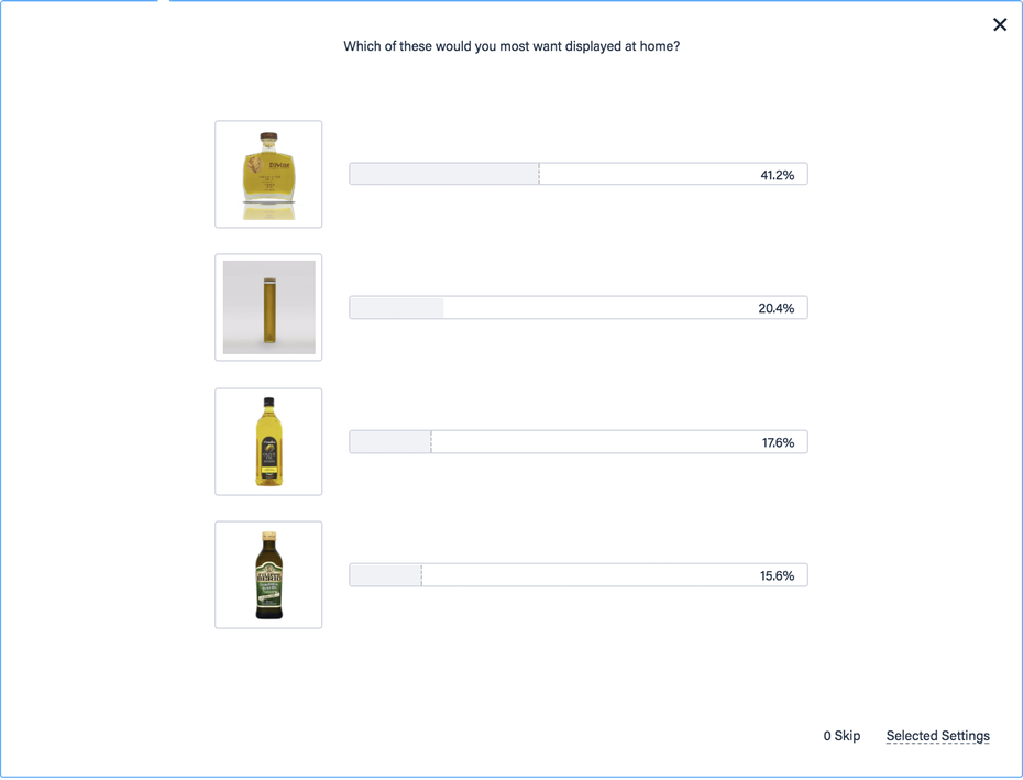
This is almost the personal, intimate version of the previous social media question. While not being transmitted to the world, what you display in your kitchen is often a deliberate statement.
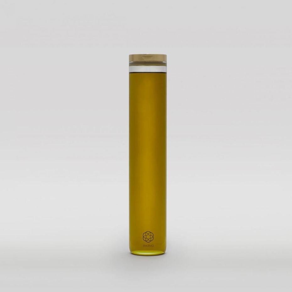
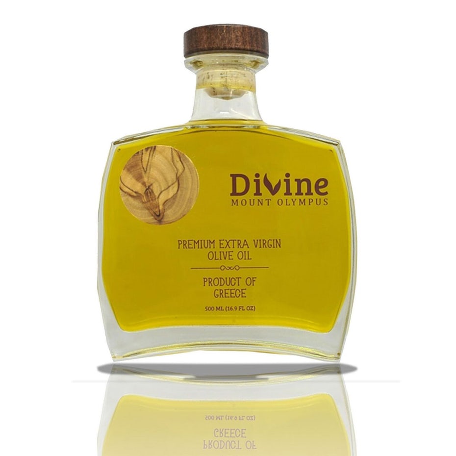
In this case the top choice is a premium-looking olive oil, with unusual, contemporary lines (that actually resemble the winning wine-bottle design from our previous question).
The second most popular choice is also a very modern design – in this case it was our minimalist choice.
As with all of the above results, it’s worth bearing in mind the exact question being asked, which clearly defines the ‘jobs to be done’. In this case, we’re not asking ‘which would you most likely buy in your supermarket shop,’ – that may produce very different results.
We’re asking consumers to pick a statement bottle they would want displayed to guests visiting them…and so they’re obviously picking the stand-out designs.
So ask the question: are you designing a product that’s meant as statement piece, something to be kept out on display, or are you designing for a mass-market? The results will likely be very different.
Consumers on minimalist design
Rather than leave everything to our own interpretation, we also finished up by telling consumers exactly which of the previous products were examples of minimalist design, and then asked them, based on those examples ‘What do you think of ‘minimalist design’?
You view the full results here, but here’s a snapshot of the most interesting responses.
“It’s ok if everything else you have is minimal, personally I prefer the extravagance of an intricate bottle or packaging” – Female, 28, London
“Stylish for the right products – otherwise looks cheap e.g. the chocolate” – Male, 30, London
“Looks classy and very fashionable” – Female, 46, London
“I liked the wine bottle because of the shape but I thought the rest of them were very boring” – Female, 34, South East
“Stylish and eye catching which would catch people’s attention and cause a rise in demand” – Male, 25, London
In conclusion
So there you have it. Minimalism can work wonders – but only when done well, with the right products, and if it’s aligned to the right ‘jobs to be done’ of the consumer.
Otherwise minimalism can come across as cheap, boring and unappealing.
Therefore before you make your next major design decisions, it’s worth asking these questions:
- Do I know my target audience’s ‘jobs to be done’ or purchase motivations?
- Do I need it to meet certain expected category norms (particularly if you need people to share it on social media)?
- Will the design aesthetic I prefer work on this type of product?
- Once I have a mock-up, have I tested if consumers respond to it in the way I would want?
By asking the fundamental, difficult questions up front – and taking the time to get robust, consumer-driven answers to them – you will save yourself a lot of time, money and head scratching at a later stage.

Mark Walker is an experienced B2B marketing leader and award winning content marketer. He is currently the Marketing Director at Attest, a fast-growth Market and Brand Intelligence platform, helping connect businesses to a network of 70 million consumers across 80 different countries. You can also connect with him on Twitter or LinkedIn.
Original article written by Guest Blogger >
[wpseo_map width=”100%” height=”300″ zoom=”-1″ map_style=”roadmap” scrollable=”0″ draggable=”1″ show_route=”0″ show_state=”1″ show_url=”0″] [wpseo_address hide_address=”1″ show_state=”1″ show_country=”1″ show_phone=”1″ show_phone_2=”0″ show_fax=”0″ show_email=”1″ show_url=”1″ show_logo=”0″ show_opening_hours=”1″]Related Articles


