We don’t have to tell you that the interwebs is a cluttered space—and if you want to make an impact on your audience, you need to find a way to break through the chaos and grab their attention. And banner ads are, hands down, one of the best ways to do it.
Banner ads are one of the most effective ways to drive traffic to your website; one Google study found that banner ads increased brand recall by nearly 16% and website visitors who are retargeted with banner ads (which involves tracking website visitors and showing them highly targeted ads after they leave your website) are 70% more likely to convert than visitors without banner retargeting.
But not all banner ads are created equal. If you want your banner ad to drive traffic and conversions, it needs to be impactful, attention-grabbing and (of course) well-designed.
But what, exactly, does that kind of banner ad look like? Let’s take a look at some banner ad inspiration to get your creative juices flowing. You’ll soon be on your way to designing a banner ad that’s going to make a serious impact on your business.
Banner ads that use color to their advantage
—
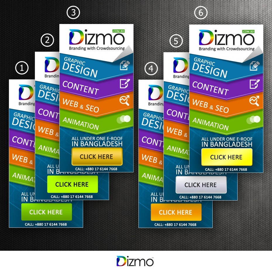
One of the most persuasive tools in your design tool belt is color. If you understand how color works, you can use it to inspire specific thoughts, feelings and actions in your audience—including clicking on your banner ad.
We’re talking about color psychology, and when you understand the psychology behind specific colors, you can design your banner ads in a way that helps you get the most out of your color choices.
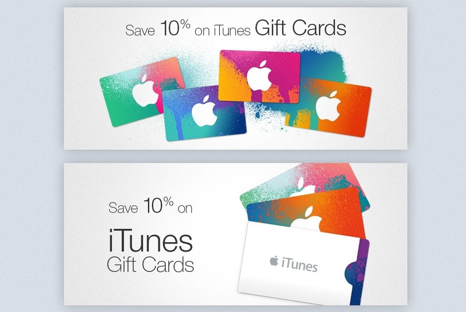
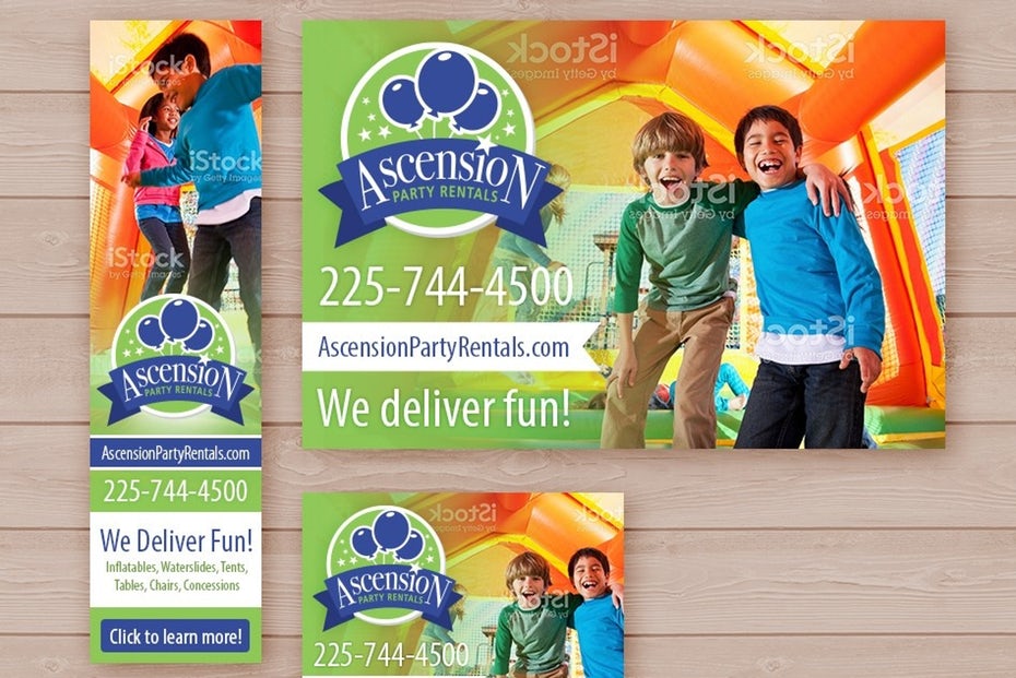
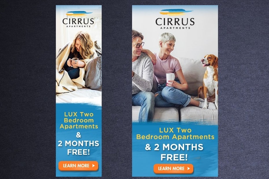
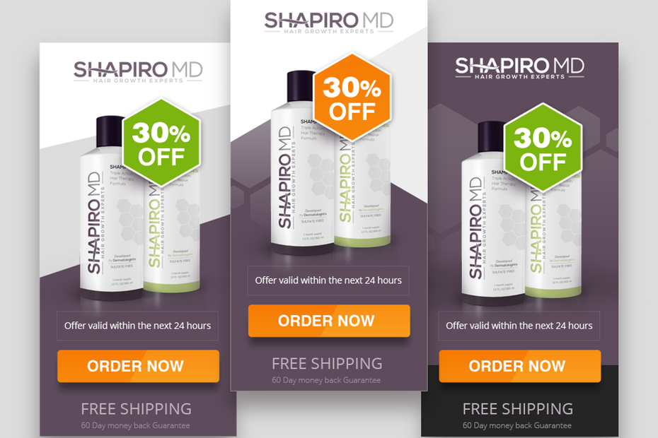
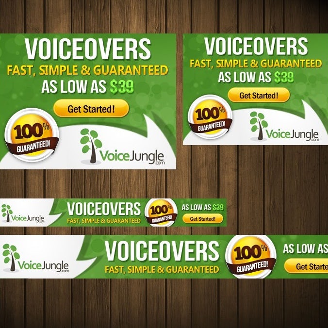
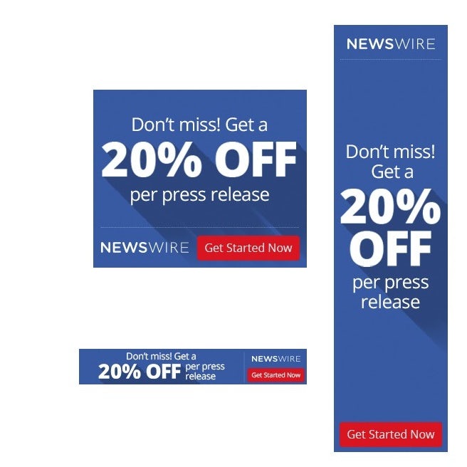
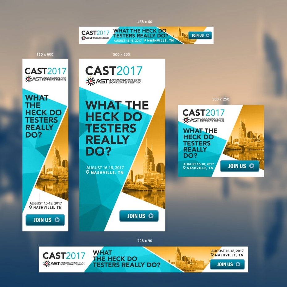
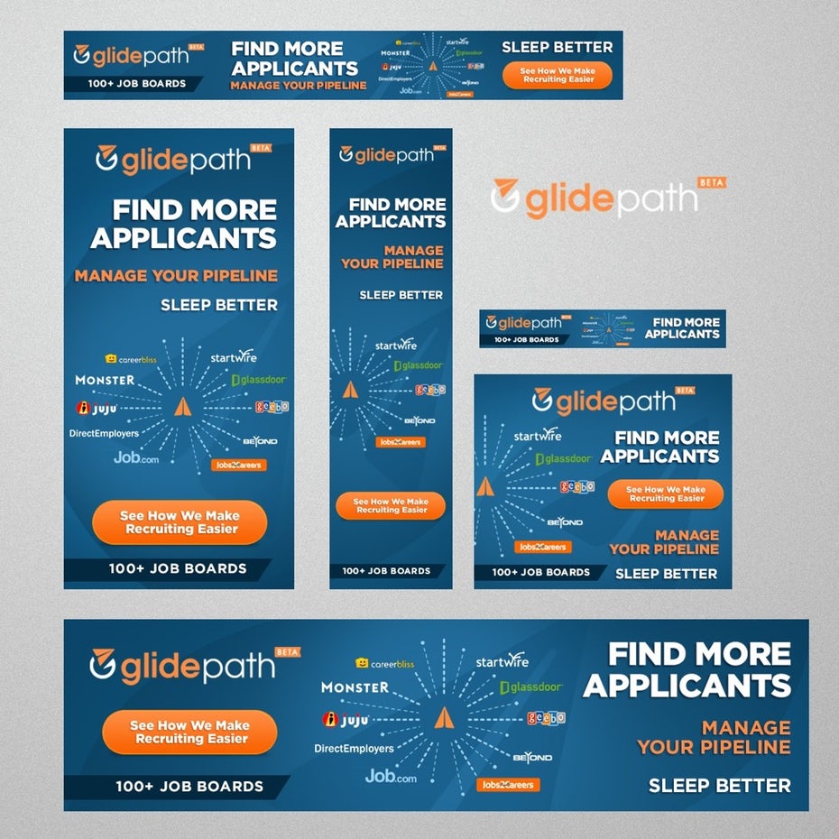
If you want your banner ad to pop, use complementary colors (colors that are opposite each other on the color wheel) like blue and orange. Want to increase clicks on your banner ad? Try incorporating red into your design. Studies show that making a button red can increase conversions by up to 34%. Advertising a kid’s product and want to grab a parent’s attention? Try yellow or orange, which people tend to associate with youthfulness.
Taking a color-specific approach can be a slam dunk for any business that’s trying to inspire a specific emotion, feeling or action with their banner ad design—or, in other words, anyone. No matter what your end goal is with your banner ad, you can benefit from getting a better understanding of color psychology—and incorporating what you learn into your designs.
Banner ads that “come alive” with animations
—


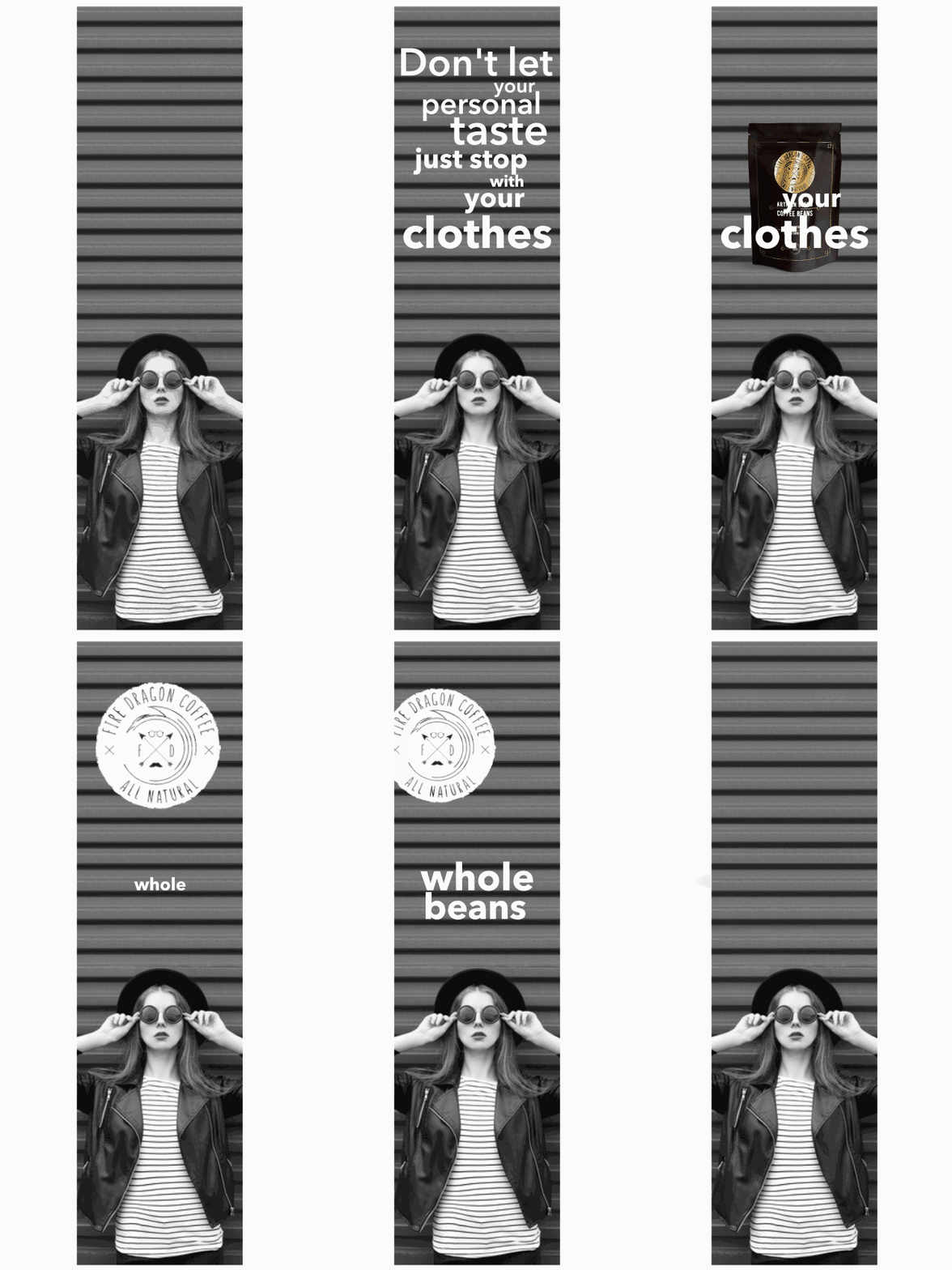

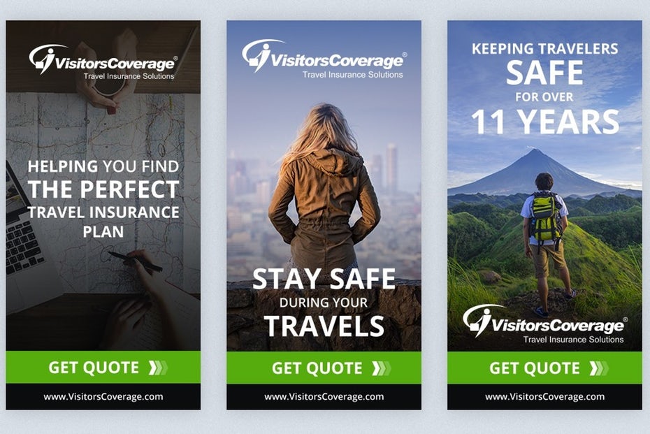
One of the most important aspects of banner ad design is creating something that really jumps off the page and grabs a website visitor’s attention.
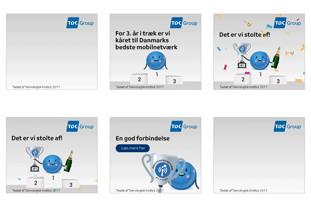
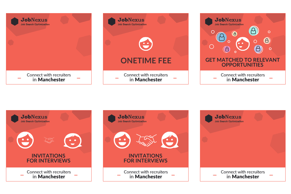
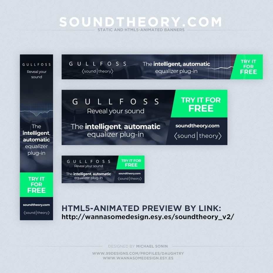
Animated banner ads create a dynamic experience for your audience. There’s no way that an animated ad isn’t going to get attention—especially if it’s on a static website.
If you really want your banner ad—and your business—to stand out, incorporating animations into your design is the way to go. Animated banner ads are also a great fit for any brand focused on children (think Saturday Morning Cartoons!) or any company that wants to show their fun, not-so-serious side.
Banner ads that put photos front and center (literally and figuratively)
—

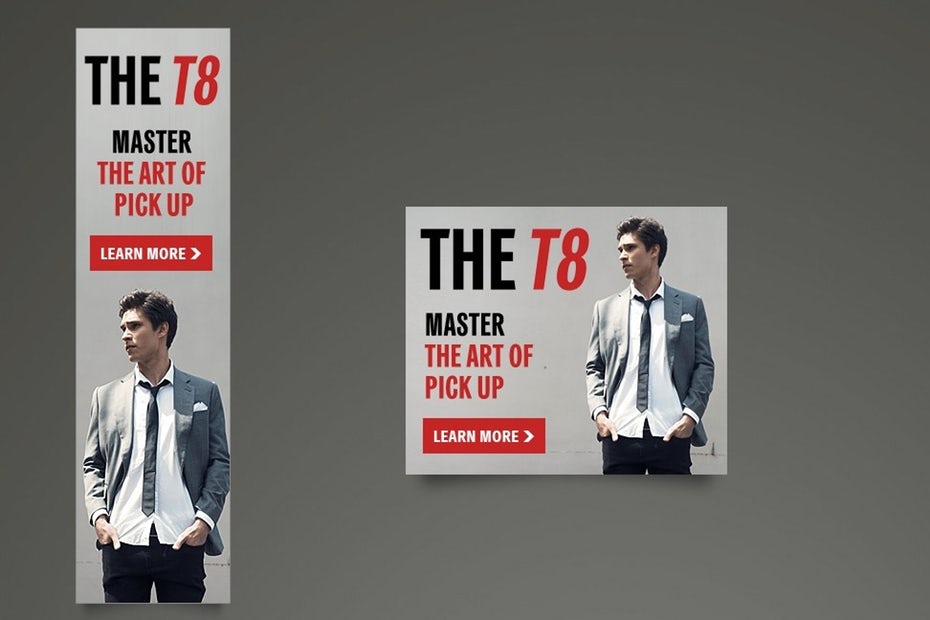
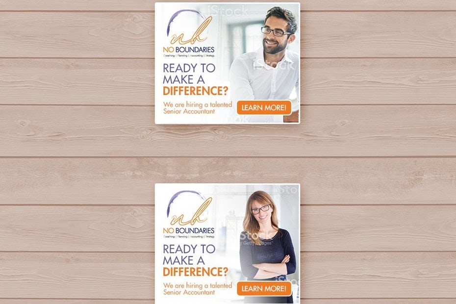
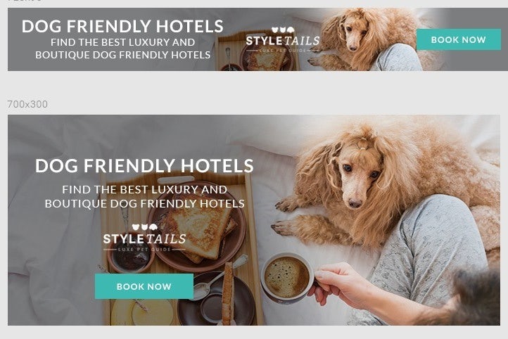
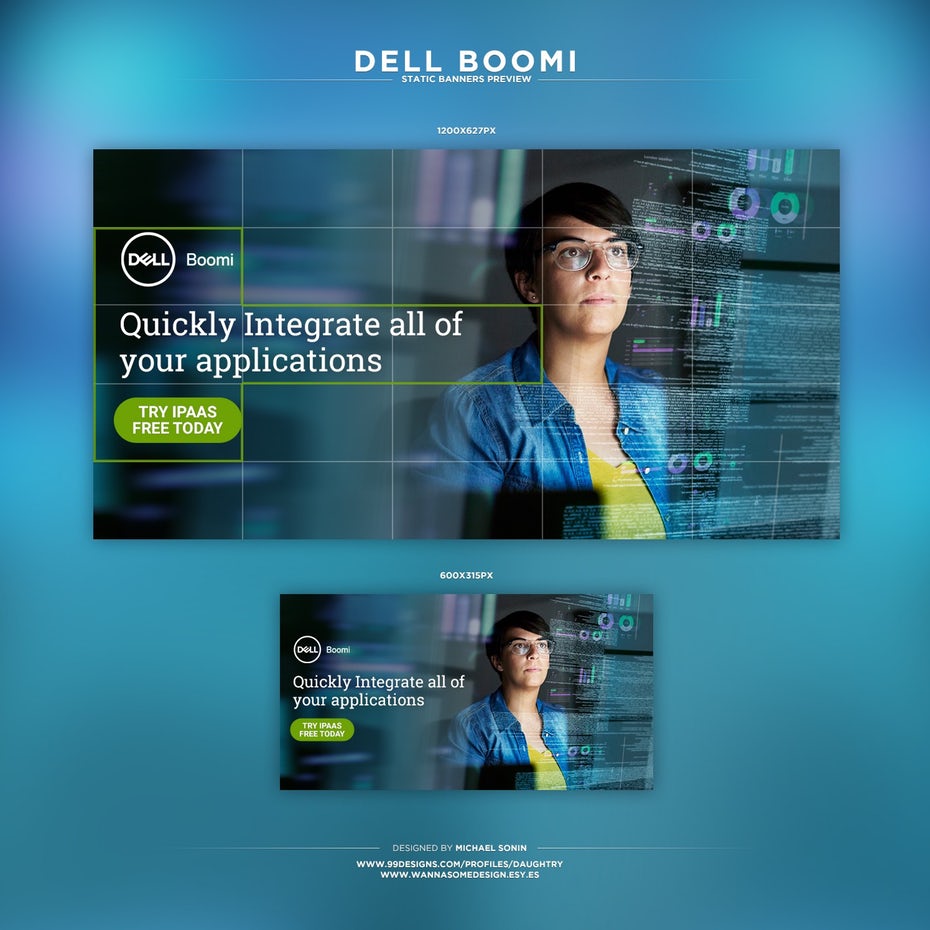
There are few things that the marketing world agrees on, but you’d be hard-pressed to find a marketer that’s not onboard with using photos to increase conversions.
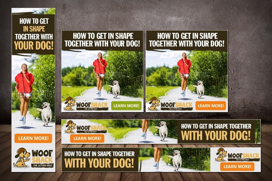
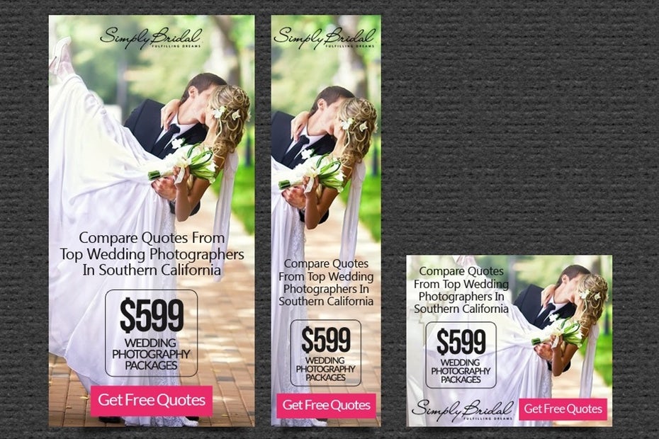
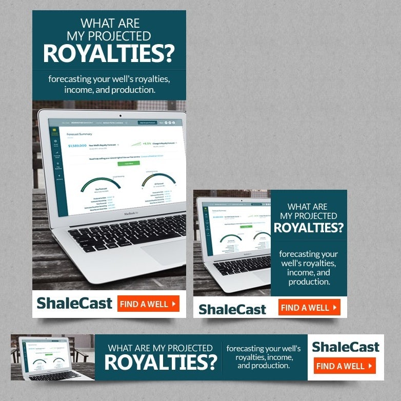
Photos, whether they’re of your product, your people or something else that’s relevant to your business and audience, immediately create a connection with your audience. People don’t want to connect with faceless companies; they want to connect with people. Incorporating images of yourself, your team or your customers can help put a face to your brand.
People also want to see something before they buy it—so if you’re trying to sell a product, including an image of that product is a great way to get people to click on your banner ad.
But keep in mind: not all photos are created equal. If you want your photos to boost your banner ad’s appeal, there are a few best practices to keep in mind.
Photos should be:
- High-quality (no blurry iPhone pics!)
- Relevant to the content of your banner ad—so, for example, if you’re advertising a web hosting service, use a photo of a computer, not of a rabbit riding a skateboard or some generic stock photo (one case study found that adding a relevant image to an ad increased conversions by over 40%)
- Big enough to jump off the page and grab your audience’s attention (avoid making your images too small—one study found that slightly enlarging product photos increased conversions by 9%.)
As long as you’re following these best practices, incorporating photos into your banner ads can be a slam dunk for any kind of business. This is especially true if you’re selling a product—whether that product is hats, headphones or hot sauce—making product photos the focal point of your banner design is never a bad idea.
Banner ads that are all about the text
—
Sometimes, you want a lot of elements in your banner ad design (photos and colors and animations, oh my!). But sometimes, all you need to drive traffic is the right combination of words.
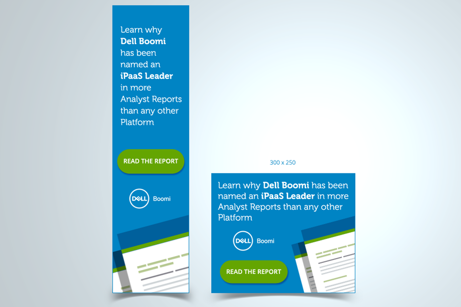
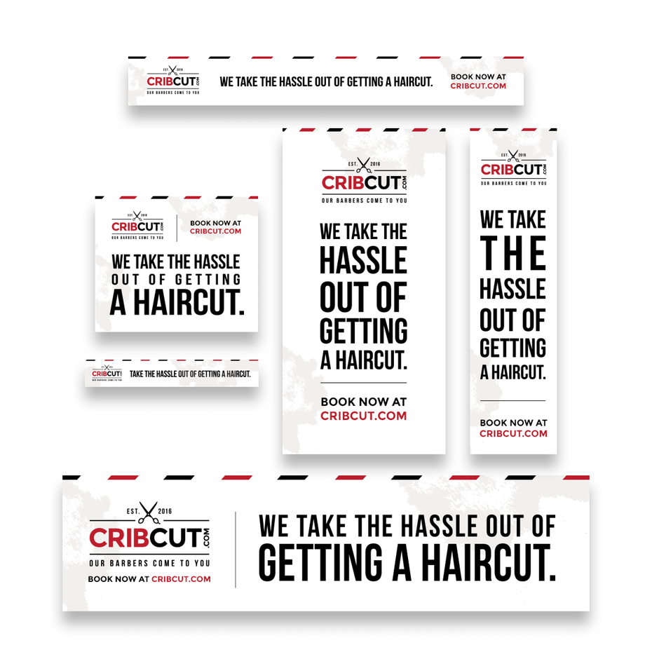
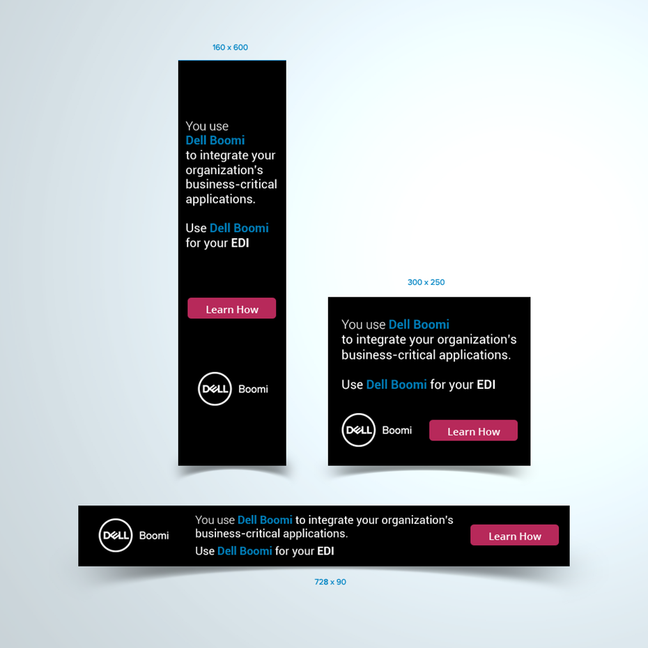
Text-centric ads can be extremely effective in the right situation, especially if you make use of text hierarchy (to call attention to key messaging) and color psychology (to inspire specific reactions and drive clicks).
Text-centric ads are a great choice if you have a snappy slogan, attention-grabbing headline or offer that’s so good, it speaks for itself. These banner ads can also be super effective if you’re advertising on a website that doesn’t have a ton of text (because there’s not a lot of text elsewhere, your text-based banner will jump off the page).
Traditional banner ads
—

You know the saying “if it ain’t broke, don’t fix it?” Well, that saying definitely applies to banner ads.
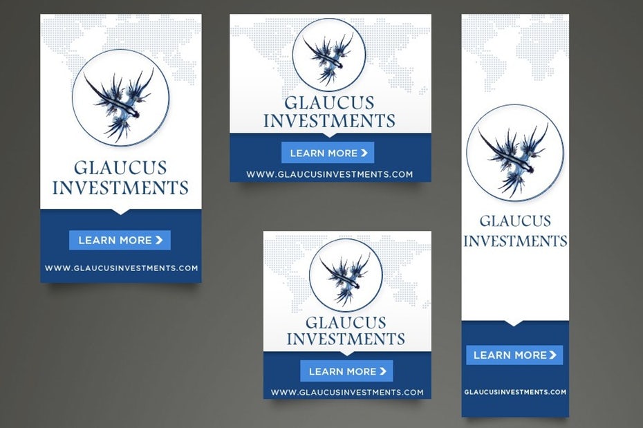
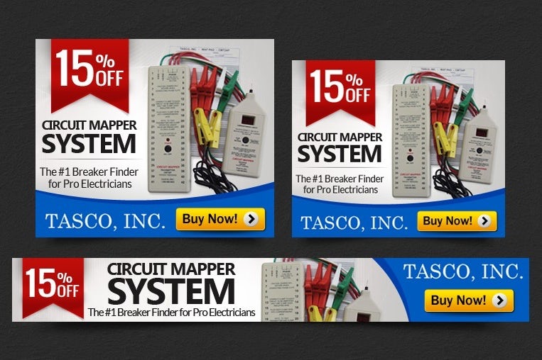
A lot of companies trade traditional banner ad design in favor of being “cool,” “innovative” or “edgy.” But sometimes, playing it safe can actually work to your advantage. Depending on what type of business you’re in, doing something too loud, bright, different or “out there” can actually alienate your target customer. If you’re in a traditional industry, traditional banner ad design is likely the way to go.
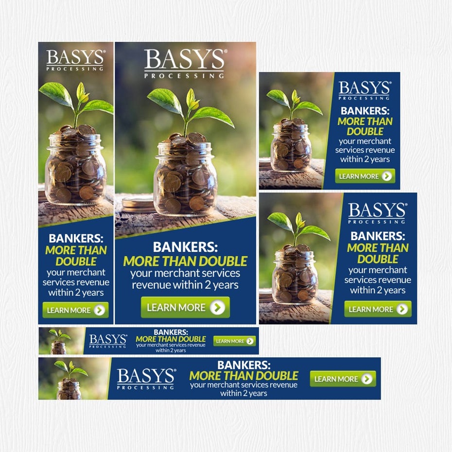
Traditional banner ad design is the best fit for any company in a conservative industry (think law, consulting or financial services) that is looking to create a serious and/or trustworthy brand image.
Fly your banner (ad) high
—
When it comes banner ads, there’s no one-size-fits-all approach to great designs. But now that you’ve got plenty of banner ad ideas to stew over, all that’s left to do is figure out what kind of design is best for you—then get out there, design it and fly your banner (ad) high!

