Whether you’re just starting an ecommerce business or considering a rebrand, one of the most important parts of the process is creating a high-quality, eye-catching logo to communicate your brand’s message. But before you start brainstorming ideas, you need to think about what goes into effective logo design and what logo style will be the best fit for both your brand and your target customers.
In this article, we’ll explore why logos are important, the eight types of logos, plus some of the practical aspects like best practices for designing logos, software options for creating them, and design outsourcing tips.
What is a logo?
While we could be pedantic about the definition of the word “logo”, the term is used most often to describe a concise design made up of words, imagery, or a combination of both to represent a brand or organization.
Why logos are important
Logos are powerful identifiers that people emotionally connect with. They play a crucial role in building a brand identity and creating a lasting impression with consumers.
Your logo can help people quickly and easily recognize your brand whether they’re seeing your posts and ads on social media, browsing search engine results, comparing products in an online marketplace, or shopping directly on your website.
If you want your ecommerce business to stand out among your competitors, having a strong logo is vital. With countless online businesses vying for the attention of customers, you’ll want to use a professional, unique, memorable logo that is a thoughtful reflection of your brand.
A well-crafted logo is also instrumental in establishing credibility. Think of your favorite, trusted brands. Their logos probably immediately come to mind. Even seeing a particular color combination or shape might evoke brand recognition.
Your logo will be an investment in your brand’s success, so take the time and effort to develop one that truly represents your business and speaks to your target audience.
Eight types of logos
Logos usually fall into eight different types:
- Wordmark, logotype
- Brand mark, logomark, or pictorial
- Combination mark
- Dynamic logo
- Emblems
- Letterforms
- Lettermark, monogram
- Mascots
Wordmark/logotype

“Wordmark” and “logotype” are basically synonymous and refer to a design that uses typography only – usually the company name or part of the company name. These logos often use custom typography, making the logo unique to the brand.
One of the most famous examples of a wordmark logo is Coca-Cola. The Coca-Cola logo is instantly recognizable, thanks to its iconic typography that has changed minimally in the past 130 years. L’oréal and eBay’s logos are other examples of wordmarks or logotypes.
Brand mark, logomark, or pictorial

“Brand mark,” “logomark,” and “pictorial” are used to describe a graphic element in a logo that may also use letters or words in addition to imagery, but that does not feature the company name. They can be representative, like the apple, bird, and shell marks of Apple, Twitter, and Shell Oil, or they can be more abstract like the Atari and Dropbox marks.
The Atari mark hints at an A-shape without actually being a letter and the Dropbox brand mark uses a series of strategically placed diamonds to create an abstract box appearance.
Combination mark

A combination mark is the company name combined with the more image-based brand mark. Often a company will use its combination mark for most contexts but also use its brand mark and wordmark separately depending on the scenario.
Dynamic logos
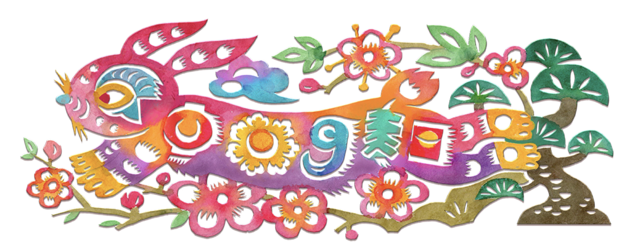
Dynamic logos are flexible, modern logos whose elements change depending on what the brand wants to convey for a particular use case. Google is probably the most famous example of this with its Google Doodles. Dynamic logos can be static, animated, or interactive.
Google puts all three types to work in their Google Doodles series. The only thing that generally remains the same in each Doodle is that the brand name “Google” is featured in some way. Everything else about the logo can change.
For most brands, the Google approach may not be a good fit – especially ones just trying to get established. It could be confusing for potential customers to see multiple iterations of your brand’s logo in drastically different styles.
Keep in mind that Google does not apply this same type of flexibility across all uses of its logo. The Google Doodle is specifically used on the Google Search landing page. Elsewhere, they stick to their official wordmark and brand mark.
If you want to create a dynamic logo, you might think more along the lines of MTV.
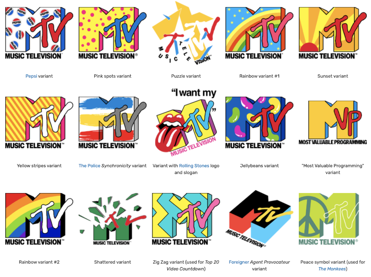
In the majority of use cases, MTV uses the same logo shape, but applies different color variations and sometimes even includes co-branding with other companies. The logo is still clearly recognizable as MTV, but the variation in color and pattern can help viewers associate MTV with other concepts, ideology, and brands to evoke different emotions and continually re-engage viewers.
Emblems

The term “emblem” refers to a logo design that uses letters and imagery to create an integrated, singular logo. Emblems often look like badges or crests. You see this type of design most often with sports teams, universities, and automotive companies, but plenty of other businesses use emblems as their logos. Companies like Starbucks, Warner Bros., and Stella Artois all have emblem logos.
Letterforms

Letterforms use the first letter, or sometimes the initials, of a brand to create a simple brand mark. While letterforms are usually simpler than a monogram logo, a letterform can also be a monogram, like the above pictured New York Yankees letterform/monogram.
Lettermarks/monograms

Lettermark or monogram logos use the company’s initials or acronym to create all or part of the logo. Often the letters overlap to form a pattern or may be inset on a background.
Monograms were first used in ancient Greece as identifiers on coins, marking what city the coin was issued by. They were later used as signatures by those with wealth and power and by artists and craftsmen.
Monogram logos have a long history and are often used by fashion and beauty brands to convey an element of sophistication and tradition. But monograms are not exclusively used by these industries. Just about every category of business has made use of monograms. They’re a space-efficient and time-tested way to create a logo, and are suitable for almost any company.
Mascot logos

Mascot logos make use of iconic characters that represent a brand. Lacoste’s alligator, Cheetos’ Chester Cheetah, Reddit’s stylized alien Snoo, KFC’s Colonel Sanders, and Wendy’s mascot, Wendy Thomas, are all famous examples of mascots used as part of a corporate logo.
Mascots can highlight a brand personality, and make it more casual and relatable. You can also use them in creative ways in your advertising. But using a mascot in a logo can be tricky as it can be easy to outgrow your mascot (see: Ronald McDonald) but difficult to remove them from the minds of the public.
So you’ll want to carefully consider your mascot and make sure it’s on-brand and scalable with the direction you intend on growing your business.
Seven tips for designing an effective logo
Your logo is often the first interaction a customer has with your business. We’ve already established it should be memorable, recognizable, and represent your brand identity, but there are some proven best practices for logo design that you’ll want to consider when choosing a logo.
Just because your logo is eye-catching and unique, that doesn’t always equate to good design. Even some of the biggest brands out there have had some questionable logo launches that led to negative media attention.
Some businesses go by the old adage of “any publicity is good publicity.” However, unless your brand is intentionally controversial, you’ll want to adhere to a few tried-and-true design tips to avoid ending up on a blog post about the worst logo designs of all time.
Keep it simple
You may have heard the saying “less is more” – a phrase coined by Minimalist architect Ludwig Mies van der Rohe in 1947. It gets thrown around a lot in corporate jargon and can sometimes be used as an excuse for low-effort design work. But the principle of “less is more” is not to keep things plain and boring.
It’s a philosophy that values function as well as aesthetic. Ultimately, the goal is to use as few elements as are necessary to convey the intended message and supply the required function, while simultaneously creating an aesthetically-pleasing appearance.
This principle is very important in logo design because you want your design to be easy for the viewer to understand. You should be able to place it on backgrounds with different colors and textures, configure it for different spaces and aspect ratios, and use it in a variety of sizes without it becoming confusing or messy.
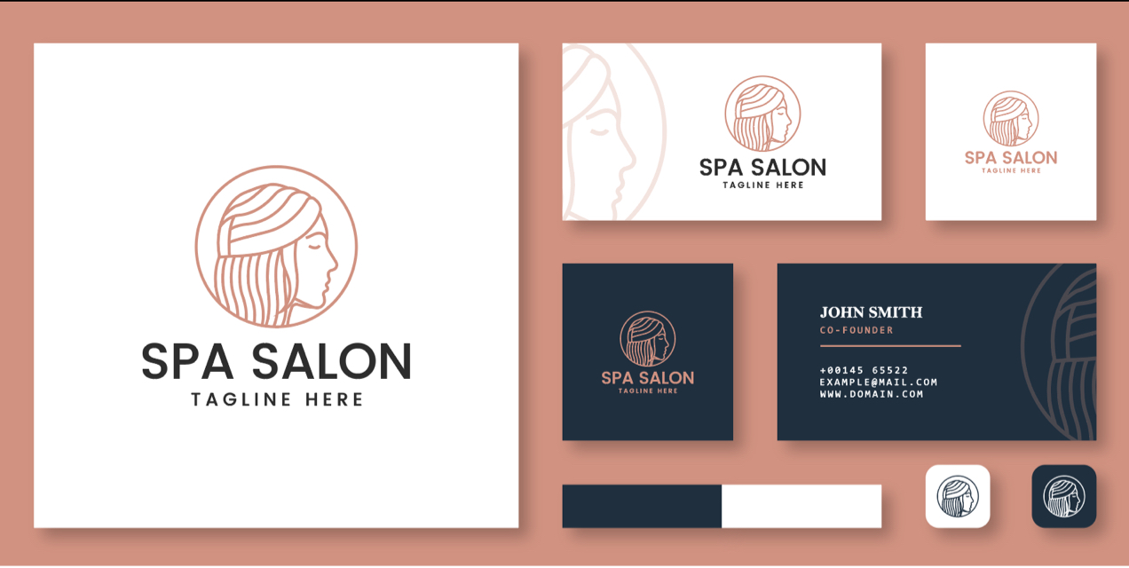
This philosophy doesn’t mean that you have to go with a minimalist logo design, either. It can be applied to any style of logo – modern, traditional, vintage, or any new trendy design style.
Use a style that reflects your brand and your target audience
If your company makes vintage or old-fashioned items, you might want to go with a retro-inspired logo design that hearkens back to the era your brand represents.
For instance, Big Chill appliances use a vintage-styled typographic logo that evokes vintage appliance emblems from the 1930s-1960s.
Trader Joe’s logo has a 1960s tiki art vibe, and Ben and Jerry’s has a fun and playful 1970s feel that fits with their brand personality. Altoids’ serif font logo with a gold embossed effect around the edges gives it a timeless and traditional look.
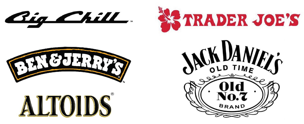
Jack Daniels whiskey has not substantially changed their brand logo since 1947 and it still looks very similar to its pre-Prohibition era logo. Unlike brands like Levi Strauss that massively changed their brand identities over time, Jack Daniels has only made small updates to their logo over the years, reminding consumers of the brand’s long history.
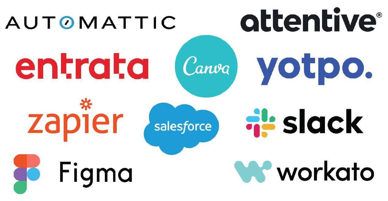
If your company sells software as a service (SaaS), offers technology-based products, or prefers a logo that’s clean, uncomplicated, and modern, you might want something more minimalist. The following companies all use modern, minimalist designs.
Some of them include logo marks, some are purely type-based and use unique letterforms to convey their brand, and others have a badge or emblem-style appearance.
If your ecommerce shop is geared toward niche demographics, you’ll want to select a logo that will resonate with that audience. Whether it’s organic food, toys, comic books, women’s apparel, or hunting gear, you can achieve an effective, genre-targeted logo without straying into the territory of childish and cheesy.
Some examples of niche audience logos include Walt’s Comic Shop, Nelson Rare Books, KiwiCo, and Chewy.

Walt’s Comic Shop makes use of a mascot-style design but uses simplified lines and a two-color palette along with a clean, sans-serif font. It’s fun and references the industry, but it’s not too cartoonish and the typography and graphic elements work well both together and separately.
Nelson Rare Books uses an intricate illuminated initial in their logo, like what you might find in the beginning of a chapter of an antique book. In contrast to the decorated serif initial, they use a clean, wide sans-serif font in all uppercase letters for their company name. This provides visual balance and expresses the nature of their brand’s identity as both a seller of rare and antique books, and a shop that uses modern technology and organizational systems.
KiwiCo delivers science and art kits for children as a subscription service. They’ve chosen a modern, clean logo, but kept it a little playful with its kiwi mascot and chunky serif font. Keeping the logo more generic allows them to grow their brand in different directions without having to redesign the logo when they do so.
Chewy is a pet supply delivery service. You’ll note that their logo does not include any image elements and is only type-based. They’ve used a rounded sans-serif type treatment that is jumbled, lending it a playfulness that we associate with pets.
Don’t use clip art
If you think you can just pick a logo out off a free clip art site – think again. Ok, technically you can use clip art if you want, but chances are lots of other businesses have already used it. People may recognize it and confuse it with another business’ logo or it may simply give an amateur appearance.
Also, not all clip art is in the public domain. Just because you find it on the internet doesn’t mean that it’s free to use. You don’t want to end up the subject of a lawsuit!
This doesn’t mean you can’t use a pre-designed graphic as part of your logo. There are royalty-free stock image marketplaces like iStock Photo and Creative Market, where you can find higher-quality, pre-made graphic elements for your logos or entirely-designed logos where all you need to do is replace the placeholder in the design with your company name.

If you do use a pre-designed element in your logo, keep in mind that other people may be using that exact same element in theirs as well. Also make sure you’re using the correct license for your intended purpose. Some stock image sites have different types of licenses you can purchase for different purposes, such as web, print, and editorial use.
Avoid overused and cliché images and fonts
Doing a search for “worst logo fonts” and “worst logo designs” should give you some ideas of what to avoid. But you should also take the time to make sure your image elements and typography are not being used by other companies. Not only will this help avoid brand confusion, it will also push you toward a more creative and original design that you can be proud of.
It’s not always the wrong choice to use a common symbol or image in your logo design when it’s relevant to your industry. Veterinary logos are a great example of this. How many veterinarians use some combination of either a dog or cat, a paw print, a medical + symbol, and a heart?
Probably most of them. But that doesn’t mean you’re banned from using that type of imagery – it’s just means it’s a lot more challenging to come up with something unique while using common themes.
Here are some great examples of common logo image choices done well:

For Aurora Veterinary Hospital, the designer employed a limited palette with a somewhat abstract representation of a dog… or maybe it’s a cat. It’s just vague enough to represent both animals. It’s cute without being cartoonish. It’s clean, modern, and easy to read while also being a unique design and interpretation of the common theme of dog and cat in veterinary logo design.
Advanced Veterinary Care Center’s logo is very creative, hinting at a cat’s tail and using the typical medical + symbol to create the shape of the letter A for “Advanced.” It’s a more corporate-feeling mark while still speaking to the industry they represent. It’s a very different interpretation than Aurora Veterinary Hospital’s logo. It’s much more abstract and minimalist while still using common themes.
Choose fonts for your logo that are not overly stylized and avoid cliché system fonts like Comic Sans, Papyrus, Brush Script, Curlz, or Party. Research logos of other brands in your industry to see what’s already out there. If you see a particular new font trending, you’ll likely want to avoid it as, eventually, people will notice and start to grow tired of seeing it.
Creating your own font, or modifying a font’s appearance significantly to suit your brand identity, can be a good way to create a unique and effective logo. However, if graphic design and typography are not something you have a background in, you’ll want to read up on basic typographic principles before you start working on creating custom fonts or modifying existing ones.
Don’t go overboard on color or visual effects
Try to limit yourself to one to four colors. If your logo calls for more than four colors, try to keep the colors to a single graphic element within the logo.
For instance, the NBC logo uses a rainbow theme on their peacock mark, but their text is in black. Each element is easy to read on its own. The solid colors and minimal number of shapes keep the peacock element readable despite using a rainbow of colors.
However, if you start adding different colors to each letter, the logo begins to lose impact. Going further by applying rainbow gradients, drop shadows, and glow effects, it starts to look pretty chaotic. It’s certainly unique, but it’s pretty painful to look at.

Make sure your design is easily readable in all applications
For an ecommerce store, you’ll definitely want to make sure that your logo looks great and is easily readable on your website, especially on mobile. But you’ll also want to make sure it looks good in print, can translate well to both horizontal and vertical layouts, and includes color variations for different background colors and textures.
Don’t squish or distort the proportions of your logo to fit a particular space. You can rearrange your logo elements or make your logo larger or smaller while maintaining its aspect ratio, but stretching or squishing your logo will make it more difficult to read and feel less professional.
Use a vector-based design program to create your logo
There are two different types of images that you can create using design software – vector and raster. Vector images are created based on mathematical formulas that allow them to scale without losing clarity or becoming distorted.
Raster images, on the other hand, are made of a fixed number of pixels. Once you scale your image down, you can’t scale it back up again without losing image quality or distorting the image in some way.
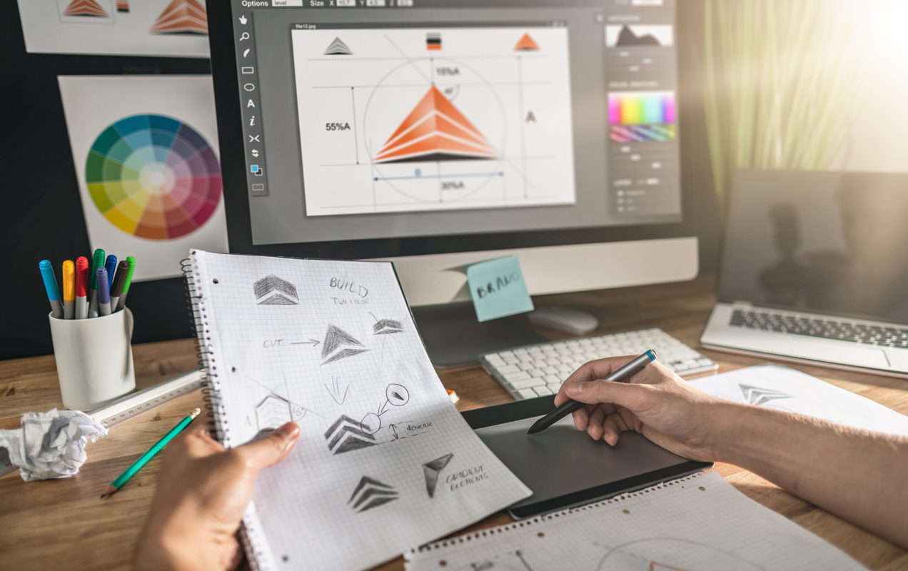
Since your logo may be used in a variety of contexts and sizes across your marketing materials, you’ll want to make sure that your logo can scale without losing quality. Using a vector format makes editing your logo later much easier and helps to preserve the image quality regardless of how many times you downsize or upsize your logo.
You should also save versions of your logo in multiple vector (ai, pdf, eps) file formats as well as export both high-resolution raster files (png, tiff, jpg) and lower resolution web-optimized files like webp.
Want to know more about logo file types? The Mean Creative has a handy cheat sheet.
Logo design software
Looking for the right software to create an awesome logo? With so many options out there, it can be tough to know where to start. If you already have some graphic design experience, you might want to use a desktop or online design software that gives you complete freedom to create your company logo.
If you don’t have a design background, you might want to choose an online automated logo creation software. Even if you don’t come up with something that’s exactly what you’re looking for, it could be a good starting point if you end up hiring a graphic designer.
If your generated logo is close to what you want, but still needs a few tweaks, you could save money by giving your freelance logo designer something that’s 90% where you want it to be but just needs a few minor adjustments.
Desktop and online design software options
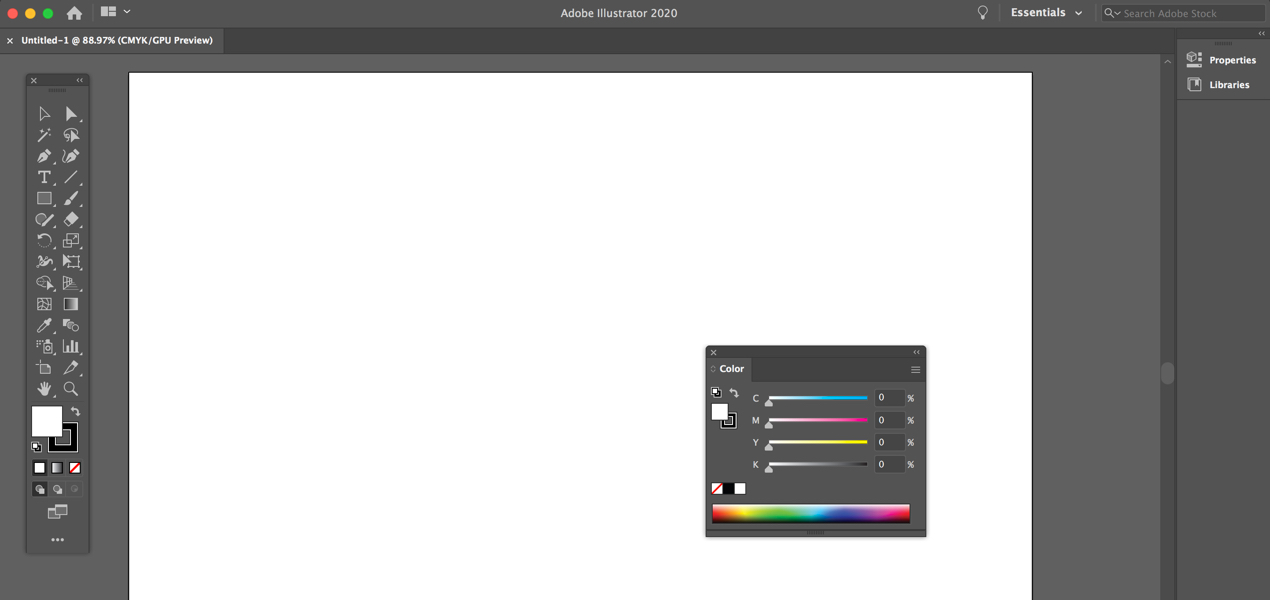
Adobe Illustrator
- Pros: Illustrator is an industry leader in vector design software. Desktop and iPad/Surface Pro versions are available and it’s feature-rich.
- Cons: Illustrator uses a subscription-only software model, which means you’ll have an ongoing monthly cost. There can be a high learning curve, so it may be suitable only for people who plan to do a lot of graphic design work.
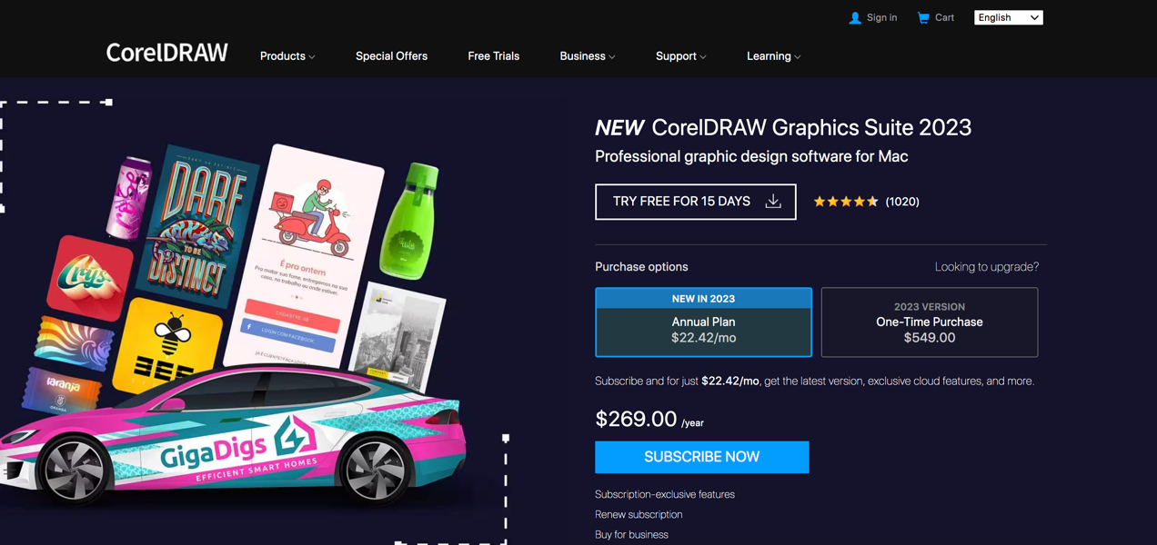
CorelDraw
- Pros: It offers a one-time purchase option in addition to an available subscription plan. There’s also a less expensive Corel Vector online software with a free 15-day trial.
- Cons: The one-time purchase price is over $500 and the online Vector software is subscription only. Like Illustrator, the learning curve can be a little daunting for beginners. Also, the CorelDraw iPad app has an average of 1 ½ star rating on the Apple App Store.
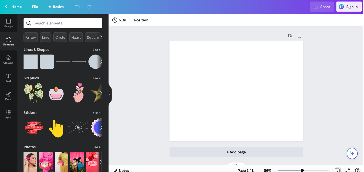
Canva
- Pros: Canva includes a free account option so you can create a logo and other designs at no cost. Canva also has a logo generator if you find you’re not happy with your own design efforts. Canva is an incredibly popular simplified design software for both non-designers and creative pros, so you can rest assured it’s well-supported with ongoing updates and additional new features. It also offers freemium access to some stock images from Getty and other stock content providers.
- Cons: Premium content and features are gated for users with different levels of paid accounts. The software is online-only. The search feature for stock photos, especially, is a little clunky and it can be difficult to find exactly what you are looking for.
Vectr
- Pros: Vectr is a free, simple vector design software that’s pretty easy to learn.
- Cons: It’s online only and is perhaps too simple, depending on what kind of design work you want to do. It also runs ads within the software, which can be annoying.
Online logo creators
In addition to Canva’s logo creation option that we mentioned earlier, there’s also online software that focuses exclusively on automated logo creation.
Looka and Smashing Logo both provide low cost automated logo creation services. It’s free to create as many logos as you want, but if you want to download the vector files and brand packages, you’ll need to pay for one of their premium tiers.
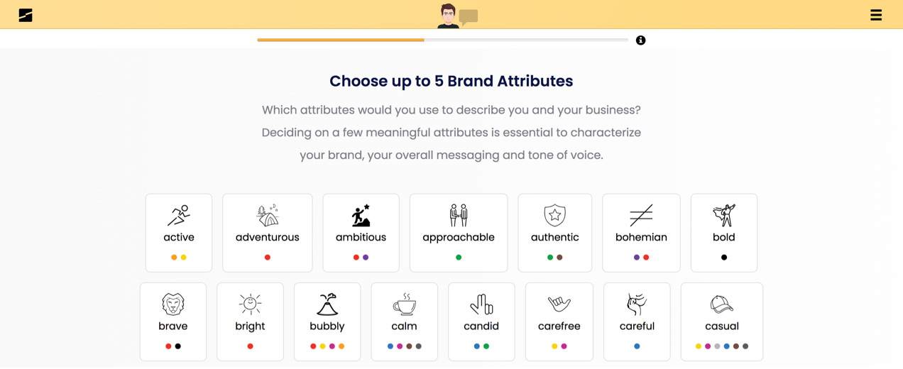
Online logo creation software can be a great way to find a logo that will do the job with minimal cost, but you’re not necessarily guaranteed to get exactly the logo you want. Since these two platforms are free to experiment with, they may at least help you think about design direction, consider what you do and don’t want, and take that design to a graphic designer or agency as a starting point.
Outsourcing logo design
Not interested in designing your own logo or endlessly generating iterations in a logo creation program? Sometimes it’s just best to hire a professional from the get-go.
Hiring a freelance logo designer or agency to create your logo can be a wise investment in your brand’s future. Professional designers will bring fresh perspectives that you might not have otherwise considered and will be able to handle generating all the necessary design versions and file types.
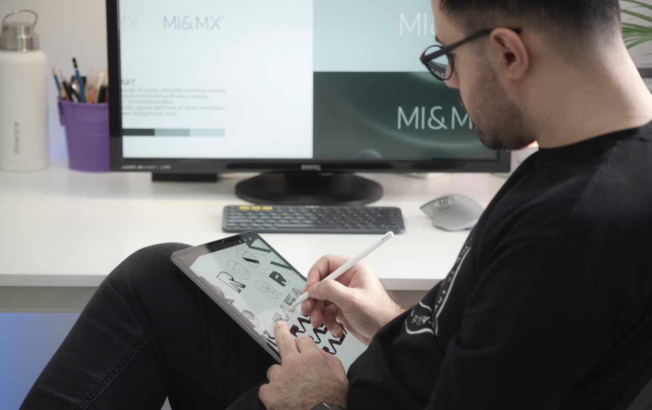
However, it’s also important to be aware of the potential risks when outsourcing your logo design work. You want to make sure to choose a designer with experience designing logos for brands in your industry, positive reviews from other clients, and who can work within your budget.
Some people have good success finding freelance designers through online marketplaces like Fiverr and Upwork. Other people prefer to work with someone who is local or has been referred to them by a friend, colleague, or local chamber of commerce. All of these are perfectly acceptable avenues to pursue when looking for a designer to work with.
As a client, you’ll also need to make sure you’re ready to work with a designer. You’ll want to do some research on logos you like, think about what you want to achieve with your logo, and be able to clearly communicate your needs.
Designers work best when given both clear parameters and some creative flexibility for their designs. If you’re too rigid in what you want your design to look like or if you’re too vague, it can result in a logo that doesn’t meet your expectations.
Ultimately, creating your logo with your graphic designer is a dialogue, and you may go back and forth a few times on sketches before you arrive at a design that’s just right.
Put your logo to work
Now that you have some logo design tips to refer to, it’s time to get creating and put your logo to work. Research other logos. Come up with a brand color scheme and general aesthetic concept.
Then, decide whether you want to create your logo yourself, use a logo creation software, or hire a professional designer. Once you have a logo you like, make sure you have all the right file types for web and print and start implementing it across your website, social media, marketing channels, and products.
It’s also a good idea to review your logo carefully and run it past some trusted sources for feedback before you go live. Remember, your logo is a visual representation of your company. You may not get a consensus on whether or not your preferred logo is a good design, but you can at least prevent any glaring problems that would land it on blog posts about the worst logo designs of all time.
Logo design may seem daunting, but with careful planning, research, and the right designer or design tools, you can create a beautiful, impactful logo that represents your brand and inspires trust and loyalty in your customers.
