It began as a celebration. In 1925, the same decade that gave us The Great Gatsby, the affordable car, the first film with sound, the term “graphic design” and (most importantly) a little cocktail known as the mimosa, the Parisian art community gathered together for an influential exhibition of art.
On display was everything from metalwork pieces to fully designed rooms, all in the new modern mode. The attendees included over 16 million art enthusiasts from around the world. The goal was to celebrate and legitimize the “decorative arts” to the public and press. The result was the establishment of one of history’s most enduring stylistic movements: Art Deco.
Over the years, Art Deco has found expression in every medium, from graphic design to furniture to the digital worlds of video games. Although its heyday is long past, the movement left behind a number of monuments to its reign, most notably in architectural feats that dot many skylines around the world, that continue to make it a part of our everyday lives. For designers who want to infuse their projects with a grandeur to match the Chrysler building, Art Deco is a style you won’t want to miss. Read on to understand what the Art Deco movement is all about and what you can learn from it for your own designs.
The characteristics of Art Deco design
—
Like many stylistic movements, the characteristics of Art Deco design, many of which predated the coining of the official moniker in 1925, were birthed out of the historical context of the era.
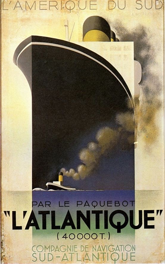
The early 1900s was coming off the heels of the Industrial Age. This meant that mechanical engineering was no longer the dominant force, allowing design to take center stage. The train you chose to travel in had less to do with the horsepower of its engine and more to do with the opulence of its cabins. Manufacturers competed with one another by making these new modern conveniences more luxurious and striking. This led people to associate mechanical marvels with extravagance and class—the Titanic is the most obvious example.
At the same time, other artistic movements of the period were laying the groundwork for the stylistic direction of Art Deco. The movement borrowed Cubism’s bold abstraction and rectilinear shapes and Futurism’s vision for the heights of civilization, which brought rampant and unapologetic decoration to the style.
Each of these factors distilled Art Deco design into a number of recognizable stylistic characteristics:
- Symmetry
- Layered shapes
- Intricate line art
- Rectilinear geometry
- Aerodynamic curves
- Metallic colors like gold and chrome
By itself, this list can feel arbitrary and perhaps applicable to any number of other art styles. The most important qualities that determine whether a design is truly Art Deco are much more abstract. Think theatricality and excess; an ambitious optimism for the modern world and its future.
We will explore these qualities to better understand how they are typically expressed in Art Deco design.
Theatre and lighting motifs
—
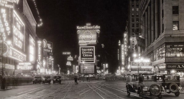
Art Deco is above all a bold style, shamelessly drawing attention to itself. In that sense, it mirrors the jubilant spirit of its time—revelry in the face of Prohibition. Back then, new modern conveniences such as the electric light bulb transformed major cities into flashy spectacles themselves, with Times Square in New York leading the way as a cultural hub of theatre, music and electrified ad space.
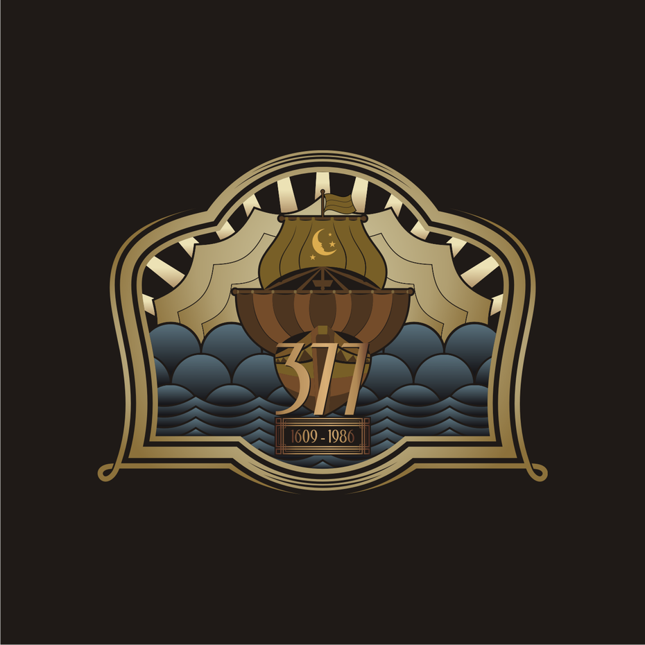
Often, Art Deco design mirrors this spectacle through size, contrast and adventurous ornamentation. In a more literal interpretation, triangular shapes, tapering up from the bottom outward, are often used in Art Deco designs to mimic stage lights. Or these triangles can be pushed outwards as sunbursts, the design literally radiating like a beacon. The important thing is that the ending design is no chorus line extra but a starlet in its own right.


Symmetrical geometry and modern line art
—
In the 1925 exhibition that birthed Art Deco, the showcased pieces had to adhere to just one guideline: they had to be modern. Modernity has always been the principal concern of Art Deco design.
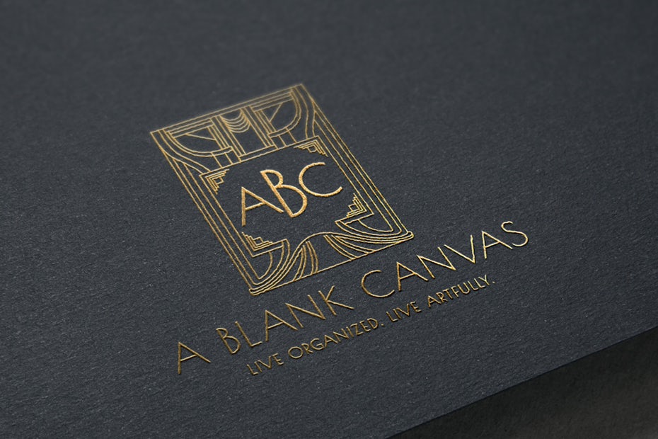
Artists typically express the abstract concept of “modern” with geometry. While nature tends to be more curvy and organic, man-made architecture is precise and mathematical. Lines are the building blocks of blueprints, of the skyscrapers which were new in those days and cropping up all over the urban world. As a result, the city—the epicenter of modern life—was expressed in sharp, nested lines reaching up, up, up.
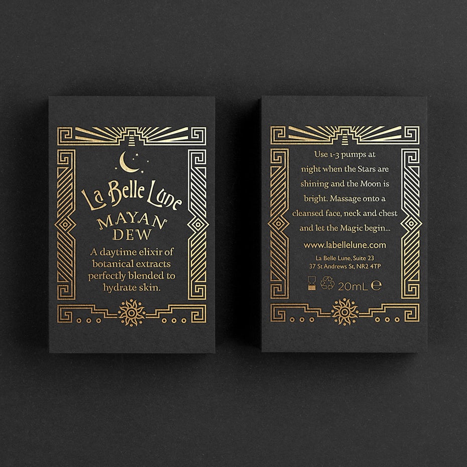
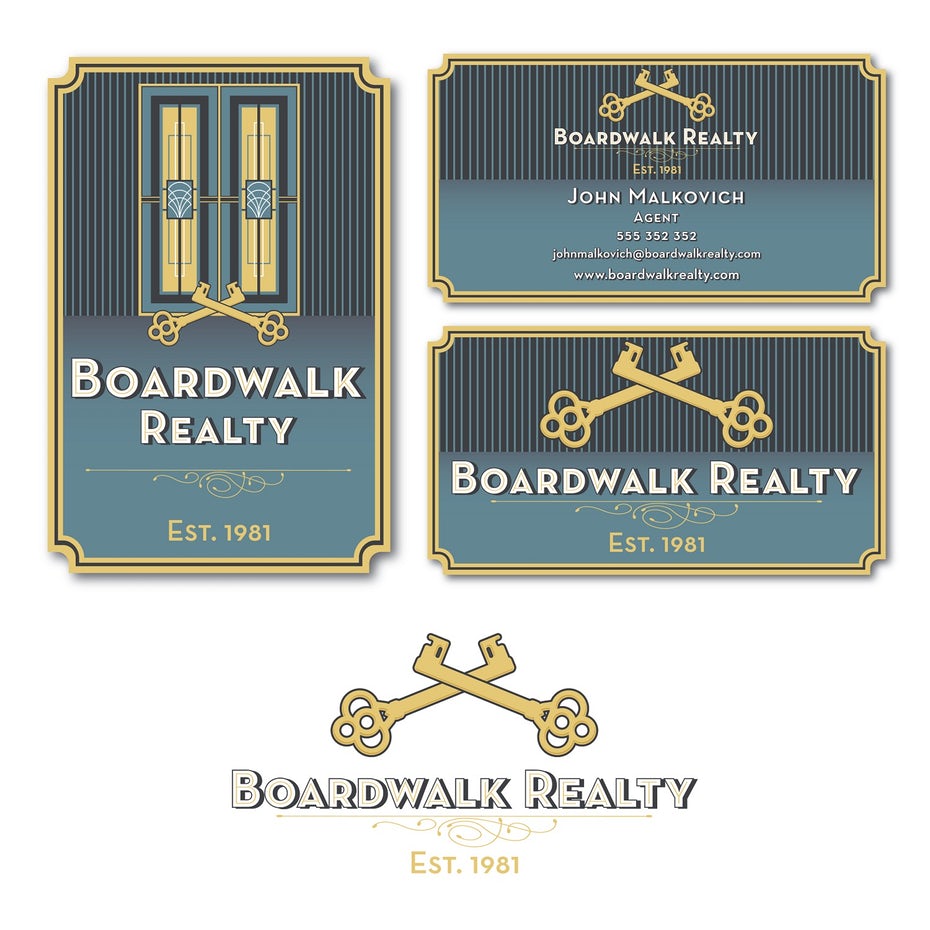
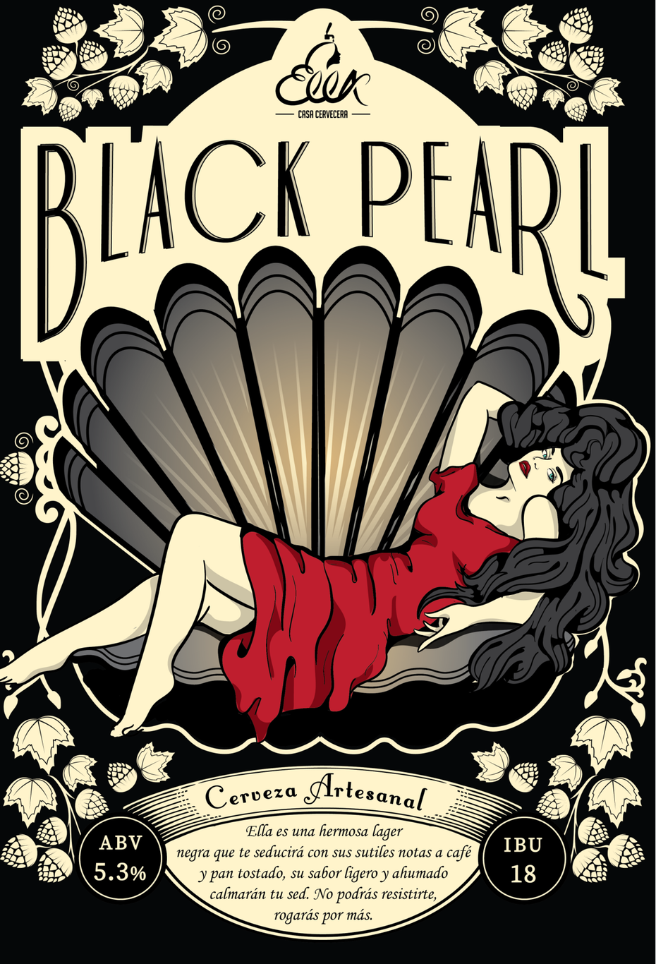
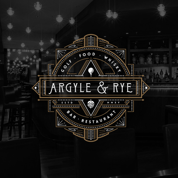
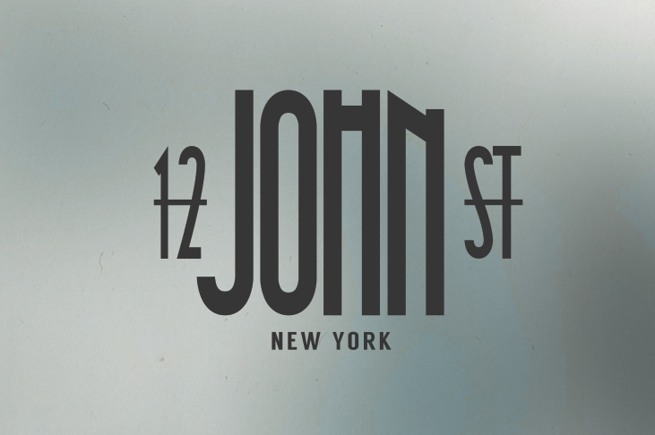
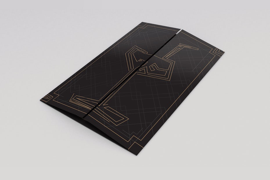
Lines in Art Deco design often appear as mechanically intricate as the gears in a clock while symmetry makes the composition feel as stable as the tallest building. This can be especially useful for ornamenting rectangular designs, such as packaging or business cards. Here, Art Deco line art acts as a frame. Use a chrome or gold finish to give it that flashy, machine-inspired flair.

Motion and aerodynamic curves
—
As mentioned earlier, rounded shapes are typically associated with the static elements of nature such as trees and hills, but Art Deco designers used curves to represent motion.
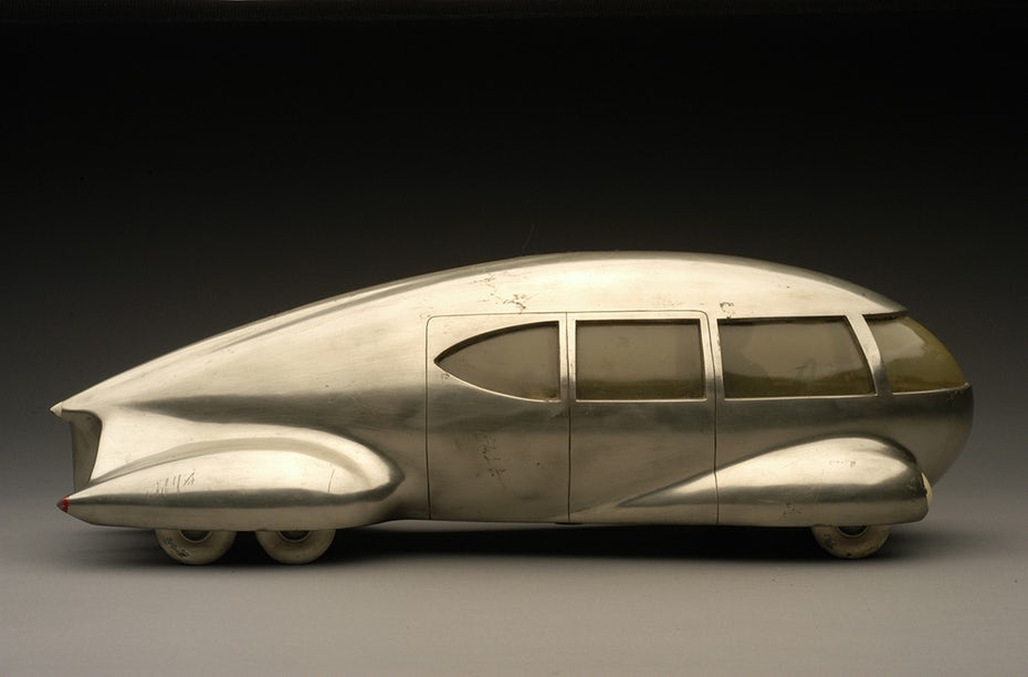
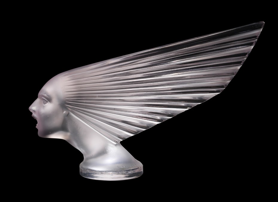
The 20s and 30s were all about movement. Not only was the urban cityscape growing rapidly, modes of transportation had changed overnight from horse-and-buggy to planes, trains and automobiles. As a result, whether you were one of the thousands arriving to the city on the latest locomotive or you were racing across town in a cab to catch the latest party, there was a sense that city life was moving fast. This led artists and designers to represent forward motion with zeppelin-like, aerodynamic curves and to exaggerate the features of the modern machine, giving it a futuristic look.
From a purely aesthetic standpoint, circles also provide great contrast to harsher geometric shapes, which is why a lot of Art Deco typography mixes both hard lines with exaggerated curves. Designers can also make use of rigid lines by slanting them to imply motion.


Ancient Egyptian influences
—

In addition to engineering and industrial advancements, the early 1900s saw a number of archaeological breakthroughs in ancient Egypt, culminating in the discovery of King Tut’s tomb in 1922. The resulting media and cultural craze that ensued was dubbed Egyptomania, and it touched film (“The Mummy” and “Cleopatra”), fashion (the loose dresses and headbands worn by flappers) and architecture (The Washington Monument obelisk).
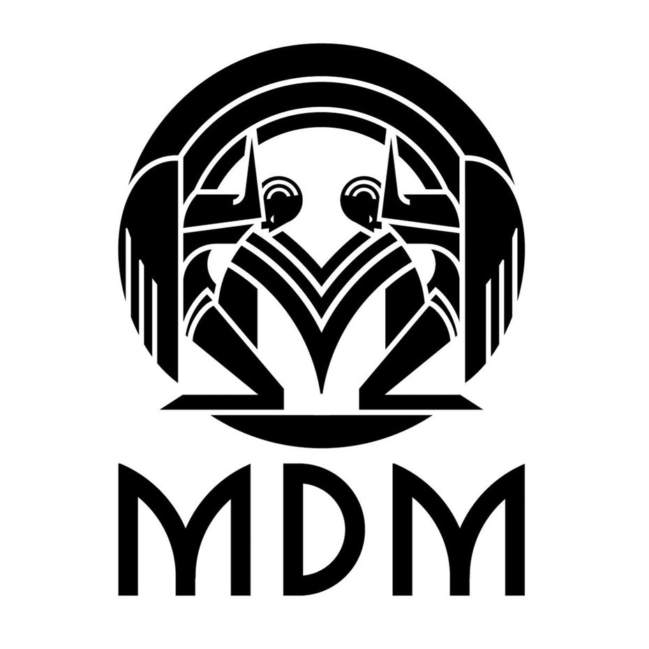
Although it might seem like ancient history would be worlds apart from the machine-inspired look that Art Deco was often going for, Bronze Age Egyptians had a lot in common with the city dwellers of the 1920s. Namely, their obsession with monumental architecture, the sacredness of their material possessions and the flashy extravagance of their fashion. As a result, much of Art Deco tends to have an Egyptian-inspired look based on pyramidic shapes, fanning reeds and stylized wings.
Propaganda posters and chiseled illustration
—
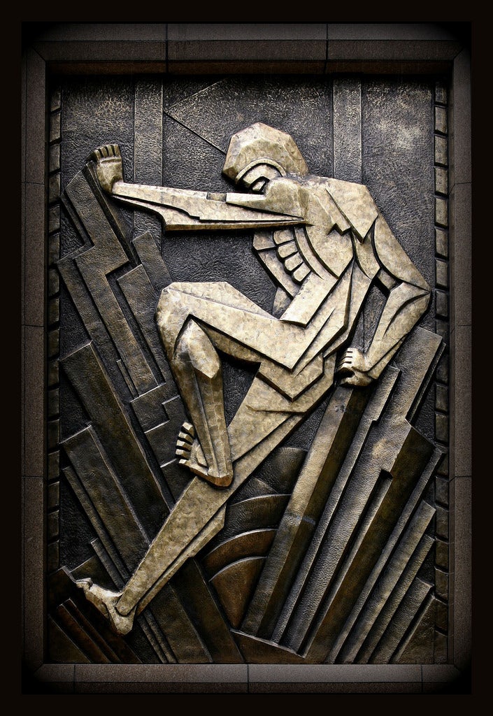
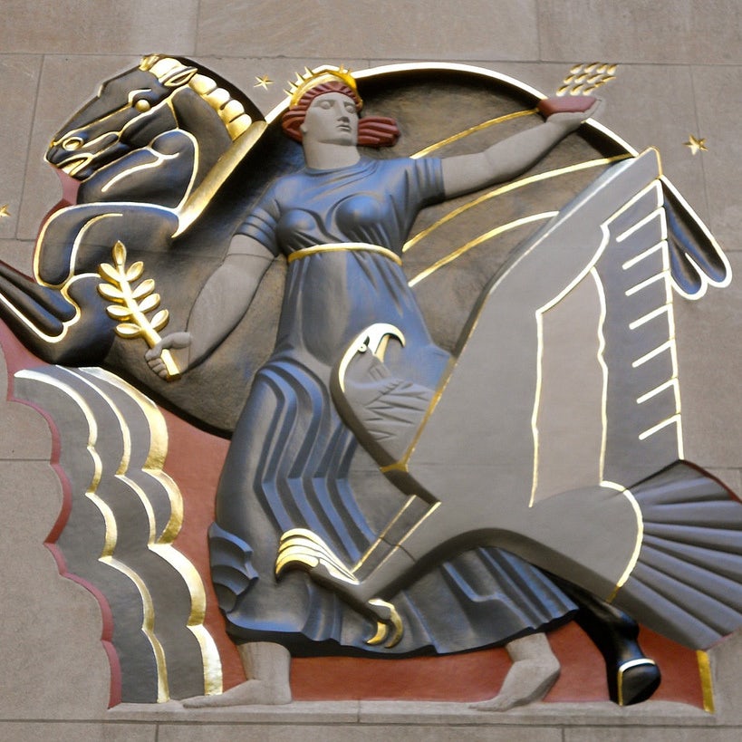
In tandem with the revival of Ancient Egyptian art, many artists of the Art Deco period were inspired to reimagine the religious iconography of classical art through the lens of urban life, with skyscrapers acting as the temples of the modern age. While Renaissance artists were largely concerned with photorealistic depictions of the Bible and Greek mythology, the invention of the camera and the motion picture meant that fine art no longer had to be literal. As such, old world friezes and statues were reimagined through Art Deco style with layered chiseling and musculature drawn in sharp, angular lines.
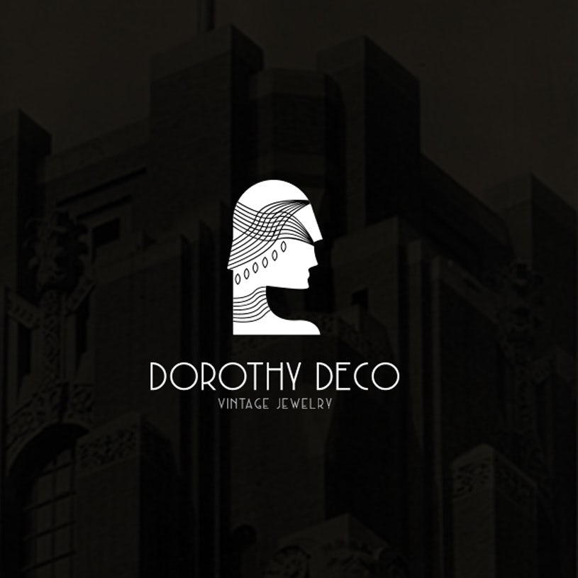
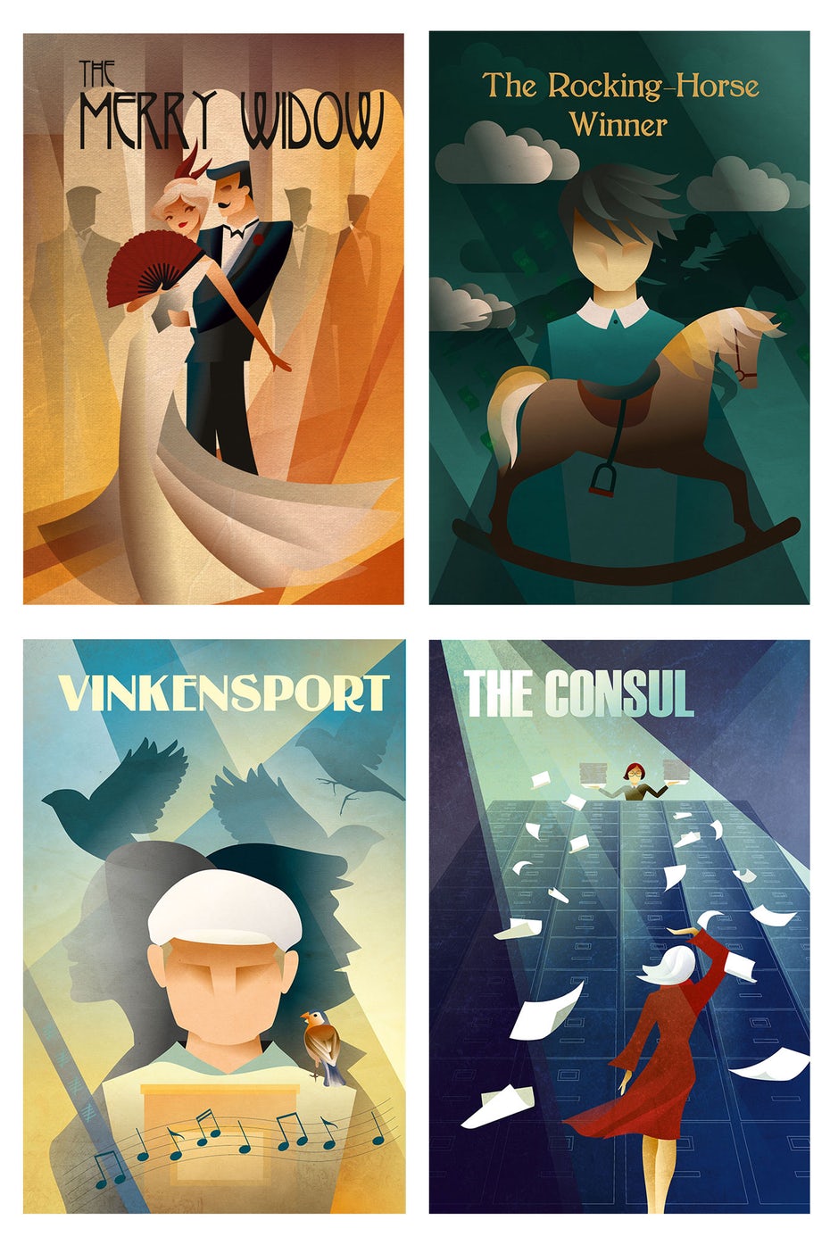
This revival inspired Art Deco painting and illustration, where figures are stylized in the mode of mythic reliefs, hieroglyphics and the historical figures chiseled on everyday coins. The effect was to equate the subject of the poster with divinity—fitting for a time period that witnessed the birth of celebrity. Though this often had propagandist overtones, designers today can repurpose this aesthetic more benevolently through mostly two-dimensional illustrations that have flat colors, subtle shading and hard lines to create a layered appearance.


Decades later, Art Deco design endures
—
Like so many design movements, the era of Art Deco was eventually supplanted by its opposite. With the onset of World War II and the rations that followed, stylistic trends tended towards the utilitarian and the sparse. Our current era, focused on interactive design and easy usability, sometimes feels even more minimalist. Art Deco is the century’s swan song of extravagance and bold design. One last hurrah for indulgent decoration.
It is interesting that Art Deco continues to find expression in design today considering that it is very much a style of its time. Whenever you see an Art Deco piece, you can’t help thinking immediately of the 1920s and 30s. You can’t help hearing the clinking of champagne glasses, the roaring of jazz horns and the crowded laughter of pearl-clad socialites. You can’t help wondering about a future that might have been, if not for the shadows of economic depression and world war. Maybe what makes Art Deco so enduring is not just the boldness of its style but the joie de vivre it manages to encapsulate.

