Whether you’re just starting an ecommerce business or considering a rebrand, one of the most…
8 email features to add for a great customer experience

Question: how are your store’s emails improving the experience of your customers?
If it’s difficult for you to answer this question, that’s okay. We tend to think of the emails we send to customers as final steps in a sales process, or necessary interactions that keep new orders coming in. But these messages can — and should be — much more than that.
With the right features, every email you send to your customers can lead to a happier, stress-free experience. Order receipts can increase trust, shipping notifications can solve problems, and even marketing messages can add a sense of delight.
Let’s take a look at some of the features you should have in your store’s emails, and how they can make your customers feel great about buying from you.
Design features for beautiful — and well-functioning — messages
One of the first pieces of advice you’ll hear when you start actively sending email is “send beautiful emails.” But beauty isn’t as important as functionality — graphics and fonts don’t mean much if the email won’t work in a customer’s client of choice.
Here are the design features you should prioritize when creating your messages, from receipts to new marketing campaigns.
Compatibility with all devices and clients
When you first start creating emails for your store, you’ll likely test them a few times to be certain you have everything right — the spelling, the graphics, and their overall look and feel. One other thing you should test: how they work in different email clients.
Your order receipts might look great on a big monitor, but that doesn’t mean they’ll properly scale down to a mobile device’s smaller screen. And your monthly marketing mailer might look beautiful in Gmail, but some of the code may be incompatible with Outlook.
This is why testing is so important. You should test all of your emails on as many clients and devices as possible to be sure that:
- Your messages aren’t too long on smaller screens,
- The images you’re using display properly in different clients, and
- Your template(s) and custom code is compatible with the different clients or browsers your customers use to view your emails.
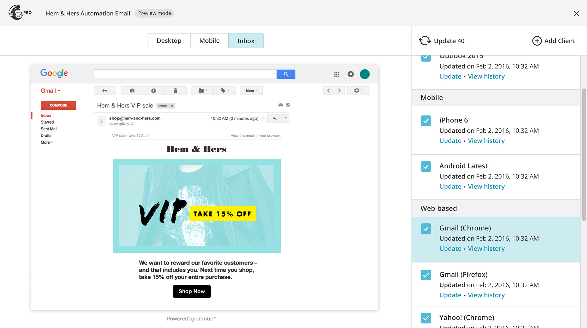
If you’re using (or plan to use) MailChimp to compose and send your marketing messages, you might find Inbox Preview useful. This feature allows you to preview your email in more than 40 different email clients and browsers, so you never have to worry about sending something that works in one place but not in another.
Plain text and “view online” options for maximum accessibility
As we discussed in a recent post, everyone accesses the internet and its many offerings differently. Email isn’t exempt from this: some of your customers won’t be able to view your images or use a traditional client to read your messages.
There are a few ways that you can make your emails more accessible, but for starters, you’ll at least want to include a plain text version. Plain text emails, which exclude all code and images, can be read on any device or screen and with the use of technology like a screen reader.
The good news: nearly all email tools will automatically generate a plain text version of any HTML-based messages for you. But you still might want to have a look at these messages to ensure they’re easy to read, have appropriate line breaks, and so on.

Another feature that’s usually automatically added (but shouldn’t be overlooked): the option to view your messages in a browser. This link allows shoppers to view your messages properly if an image doesn’t load or their email client misbehaves, despite all your testing.
Make your “view online” link prominent — the top left or right corner is typically the best place for it — and you’ll see far fewer shoppers complaining that they can’t read your messages or view those images you spent so long putting together.
Content features that make your messages stand out
After design, the content of your emails is the second most important thing you should be focusing on. Content is what your customers will spend the most time looking at… and by that, we hope we mean “not very much time at all.”
These are the features we recommend for emails that get read, get clicks, and ultimately lead to happy customers.
A clear, straightforward subject line
Last week, in preparation for Black Friday deals, I set up my smartwatch to alert me about new emails I received. This didn’t just keep my wrist buzzing almost nonstop — it also gave me an incredible appreciation of eCommerce businesses that write straightforward subject lines.
On small screens and even in some email clients, a long or meandering subject line can do real harm to your chance of getting your message read. If a recipient can’t tell at a glance why your email is important, they’re more likely to skip it.
A few tips for getting to the point faster:
- Aim to answer the question of “why should I open this?” or “what’s inside?”
- Challenge yourself to use as few words as possible (as long as your message is clear)
- Experiment with adding call-outs like “NEW:” or “[SALE]” at the very start of your subjects, so recipients can tell at a glance what you’re sending and why
- If you’re already testing your emails, test your subject lines at the same time — if it’s cut off on your device, shorten it!
The addition of your unique “brand voice” — in each and every message
Customers take notice of the way you communicate. If you spend time and energy on your marketing messages but leave your order notification emails untouched, they might make the assumption that you only care about personalizing their experience up until the point that you have their money.
Every single one of your emails should have a personalized and consistent “voice” in it, whether that email is used to confirm an order or offer a discount. This is the same “voice” that should be present in your product descriptions, in your social media messages, and so on — essentially, the voice of your brand, as if it were one human being talking to another.
It isn’t at all sensible to add that voice to one email and not another. Even the smallest, fastest touches and notifications represent you and how much (or little…!) you care about your customers. Putting in the effort to personalize these touches shows consistency, but it also shows thoughtfulness.

By taking just a few minutes to ensure that each one of your store’s transactional emails are personalized in the same way as all your other communication, you’ll be sending the message to shoppers that you care about their experience. You’ll also ensure that your brand “voice” reaches further, and doesn’t simply stop speaking when a customer leaves your store.
Outbound links from your emails
Have you given much thought to what you’re linking to from your emails? Certainly you have links to tracking information, perhaps your homepage, but how else are you making your emails useful?
Here are a few link-related features we suggest adding in.
Links that support your email’s primary message
If you send an email about a holiday sale, it’s a given that there’ll be a link for shoppers to follow — either to a custom landing page or your store’s homepage. You want them to buy something, after all.
But what about transactional emails, like those for new or recently shipped orders? Do you have links in these messages for customers to follow? And what exactly are you linking to when you contact shoppers about new products, services, or other updates?
Each of your emails should have a clear message, followed by a link where the recipient can read more if they choose. This rule should apply for every email you send.
For example, a shipping notification email’s message would be that the order has shipped, while the link would be to the tracking number. A “we have new products!” email would contain that message, followed by at least one direct link to said product(s). (Don’t make shoppers hunt for something themselves!)
For each email you create or edit, think about where a customer will be able to click and go to find supporting information. If that information is missing, you could see more frustrated customers and a higher number of support requests.
A link that takes you directly to customer support
Speaking of support requests, any email you send to a customer could create a need for help.
If you send a shipping notification, they might realize they’ve mistyped their address. Or if they receive a promotional email, they might have a question for you about one of the products you’re promoting, or the sale you’re running.
Make it easier for these customers to get the help they need by adding a direct link to get in touch with you in your message — either in the template itself (say, a link to a contact form in the footer) or by adding a manual link in the body of the email.
Alternately, you can encourage customers to reply directly to the emails you send with questions, which may be even easier. Just make sure you’re sending your emails from an address that works and you’ll be monitoring — otherwise this option won’t help anyone.
Features that will bring your shoppers delight
There’s a lot to be said about sheer customer delight — that feeling someone gets when they open a box, try on the perfect outfit, or find the perfect fit to the product-shaped hole in their life.
Email might not seem like a workable channel for delight, but there are a few things you can add to those mundane messages to make even your most stoic shoppers smile.
Simple but pleasant graphics
No one likes reading a wall of text. Even short messages tend to seem boring without some kind of decoration attached.
Adding simple illustrations or photos to your emails can break up the text and give your shoppers something to look at. This could be as simple as using an online editor like Pixlr to place some text saying “thanks for your order!” atop a photo of some of your products, and adding that to one of your email templates.
You could also try simple text-based graphics that add a bit of delight to otherwise mundane experiences. I’m particularly fond of this one from Old Navy:

One thing to keep in mind: depending on your email template, you may also be including thumbnails of products ordered or other images like your logo. Keep your file sizes low so these images load quickly, especially for those on mobile devices or with slower connections.
Little surprises, like coupons or rewards (just because)
Around different holidays, your customers probably expect a 15% discount or free shipping on their products. But there’s something to be said about an email arriving with a surprise coupon or a gift just for them because they spent $100 in the past year.

Think about occasionally sending your shoppers emails with gifts or offers that deviate from the normal holiday schedule — it’s a fast and easy way to delight them, not to mention potentially personalize their shopping experience.
A few ideas:
- Celebrate your store’s own special events, like your anniversary, 1,000th sale, and so on, and send emails with treats on these days
- Send $5 off coupons to re-engage shoppers who haven’t purchased in a while, “just because” — it’s a nice way to bring them back!
- Using an extension like Follow Ups, automatically send shoppers who purchased during a specific time or sale an email thanking them and giving them a special treat
- If you’re tracking which customers have spent the most, send them a personalized message thanking them for their business plus a gift certificate or other discount (maybe a free product of their choice?) — this can be done quickly and even on a repeated basis with MailChimp’s automation options!
With these features, your emails will make every customer interaction feel special
There you have it — our top email features for improved customer experiences.
As a final word of advice, if you’re just starting out with your WooCommerce store, don’t feel pressured to implement all these features at once. You’re probably going to find that customers care more about getting critical information than beautiful emails. Also, you might have things more pressing than email to handle first, so work at a steady pace and set priorities.
Have any questions for us about how to get these features into your store’s emails? Or thoughts for us about additional features that are just as important as subject lines, graphics, and little treats? Give us a shout in the comments, we’d love your feedback.
Read original article at Source link >
[wpseo_map width=”100%” height=”300″ zoom=”-1″ map_style=”roadmap” scrollable=”0″ draggable=”1″ show_route=”0″ show_state=”1″ show_url=”0″] [wpseo_address hide_address=”1″ show_state=”1″ show_country=”1″ show_phone=”1″ show_phone_2=”0″ show_fax=”0″ show_email=”1″ show_url=”1″ show_logo=”0″ show_opening_hours=”1″]Related Articles