
Were you just commissioned to create a brand guide and you have no idea where to start? It’s okay, we’ve all been there. Just take a deep breath, grab a cup of coffee or tea (or wine) and get ready to find out everything you need to know about creating the raddest brand guide in Illustrator!
First things first, what is a brand guide? It’s a document that captures a brand’s essence. It defines its personality, style and tone and it represents how the brand communicates. A brand guide should be clear, easy to understand and highly visual.
I believe what differentiates a rad brand guide from a brand guide that is merely okay is the fact that you don’t have to read a single word in order to understand the brand. An effective brand guide tells you everything you need to know about it using imagery and colors.
In this tutorial we will guide you through the following steps:
- Research
- Setting up your document
- Cover
- Contents
- About
- Master logo
- Secondary logo
- Logo variations
- Logo usage
- Typography
- Color
- Brand application
- Designer contact
- Glossary
- Finishing touches
- Saving your file
Let’s get to it then!
1. Research
—
The first and most important step in creating a brand guide is research. You should start by writing down everything that comes to mind about the brand: style, tone, adjectives, related objects, colors or even actions. Think of the brand as a person: what would he or she be like?
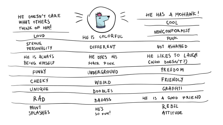
Don’t try to make a pretty, presentation-like page for this, just let your ideas flow. It really helps to have the brand’s logo in front of you as you do this and write down everything related—and I mean everything, even if it sounds or seems unimportant at first.
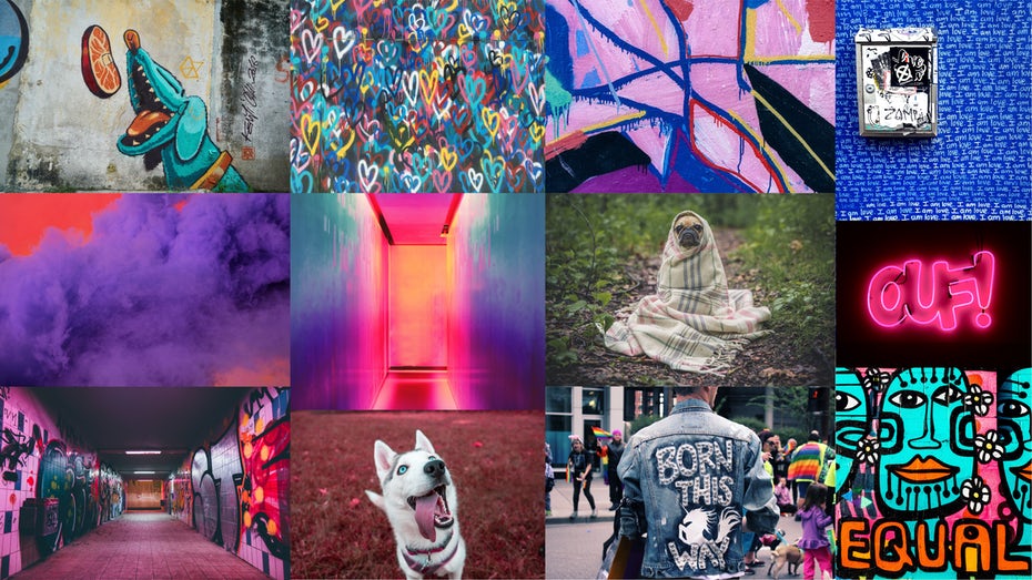
Once you feel like you’ve noted everything about it, you can now use these keywords to look for images that reflect the brand’s image. If you have no idea where to look for these images, here’s a list of the best sites.
2. Setting up your document
—
Now that you have everything you need, let’s start designing!
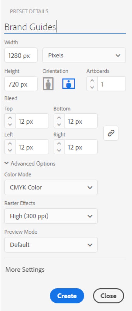
- Open Illustrator and create a new file, entering your desired page size and orientation (I will use 1280x720px in landscape mode for this tutorial).
- Set the bleed to 12px (or ask your printer about what sizes they work with, it may vary slightly), the Raster Effects to 300 ppi and the color mode to CMYK.
- Enter your desired number of artboards (you can add new ones or remove them later, too), name your document and click Create.
Next, you have to create the layout grid using guides.
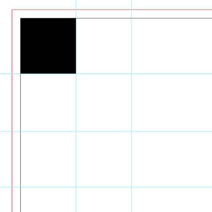
- Create a rectangle sized 20x20mm and place it to your page’s edge.
- Hit ctrl+R to make the rulers visible, click it and drag to create your guide.
- Place the guides to the inner sides of your rectangle.
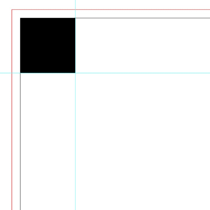
- Move the rectangle to the lower left side of your artboard and place the guides there too.
- Make sure your guides are unlocked (to do this click View > Guides > Unlock Guides), select the two horizontal guides and copy them.
- Click on the next artboard and hit Shift+Ctrl+V to paste them to the new artboard in the same place.
- Repeat this with all the artboards.
- Rename your layer containing the guides ‘Guides’, drag the rectangle out from your artboard (but don’t delete it, you might need it again for measuring) and lock the layer.
In the following steps, make sure you click on the next artboard and create a new layer for each chapter! This way you will be able to keep things organized, making your workflow easier and faster.
3. Cover
—
Remember all those pretty photos you previously gathered?
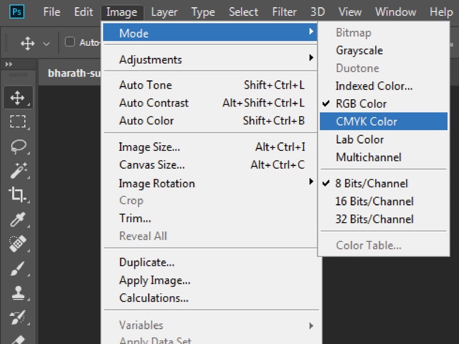
- After you choose the one you think is best for the brand guide’s cover, open it in Photoshop.
- Then convert it to CMYK color mode and save it as a .psd file.
- Go back to your Illustrator document and create a new layer. Name it ‘Cover’ (how creative, right?).
- Click on the first artboard and place the .psd image using the shortcut Shift+Ctrl+P or File > Place.
- Resize and position the image on the page.
- You can use Clipping Masks if you need to. (if you are not sure how those work, this article on Clipping Masks will help you get started.)
It’s very important that the image fills in the bleed area, too!
Think about what you want the cover to contain. Obviously, the brand’s logo needs to be part of it. Import and place it wherever it feels right to you. The title is pretty important too, so type that in or letter it yourself (as I did in this case). And there you go, the base of your cover is done.
Leave it as is and once all the pages are done we will see if we can make it more fun and interesting.
4. Contents page
—
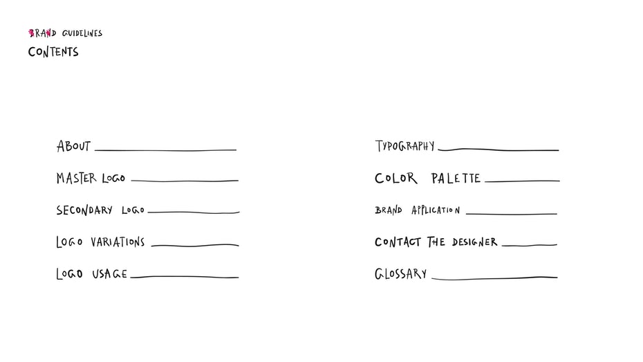
This is probably the easiest page.
Just write down the chapter titles in separate rows and leave empty spaces for their corresponding page numbers—you never know how long a chapter will be.
By this point you will realize that you need a header for each page’s title. Fortunately, you kept that rectangle you created in the second step.
- Unlock the first layer, create two more guides using that rectangle and lock it back.
- Go to the cover layer, copy the title, click back to the contents’ layer and paste it. Resize it to fit into the header.
- Under it type your current page’s title and arrange them as you wish.
Your page should now look something like this:
Leave it as is and let’s move on!
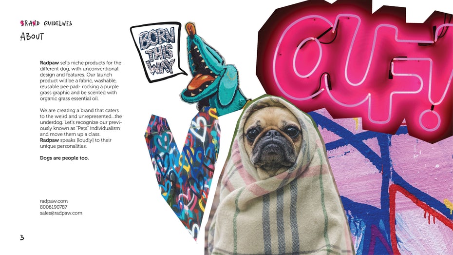
5. About page
—
Start the page by copying the header from the contents layer to your new layer, called About Page (you can come up with more creative layer names). Just remember to hold down Shift+Ctrl+V to paste in place.
If you don’t have it already, ask your client for the business info that should go here.
Now just let your imagination run wild and use the previously gathered photos. Don’t forget to convert them to CMYK color mode in Photoshop.
You can crop them, cut them, make a collage of them—but keep the brand’s style in mind. Now place the photos, type in the info, add the page number (this is the 3rd page) and arrange them on the artboard.
6. The master logo
—
Paste the header on the new layer. Add the page number, place the master logo on the artboard and note down a few of the logo’s main characteristics to emphasize them.
7. Secondary logo
—
This page is optional, as not every brand will have a secondary logo. If it does, just repeat the steps from the master logo.
8. Logo variations
—
Click on the next artboard, paste the header (guides and title) on the new layer and add the page number.
The logo variations include the logo’s color and format (vertical or horizontal). After you’ve gathered or created all variations, you have to arrange them on the page. Make sure you include both the master logo and the secondary logo. If you think there is something that the future guidelines users will have to pay extra attention to, you can always leave a note on the page.
9. Logo usage
—
This chapter will define the minimum and maximum sizes the logo can be used in. This will prevent using the logo in such small sizes that it loses readability and becomes just an ink spot on a paper or an ugly pixel on a screen.
In this case I will use a minimum width of 25mm for the vertical logo format. As for the horizontal format, I will keep the vertical’s proportions, giving it a minimum width of 43mm.
Obviously, because this doggo logo is so rad, I will not have a defined maximum size.
You also have to define the minimum space that the logo needs around it. If you have text or other elements too close to the logo, you risk losing its charm, essence and again, readability. This space will help the logo breathe, keeping it clean.
For this logo I will use the differ from the slogan as a measurement. (You can use whatever you think is appropriate: an element from the logo, another word or just define a specific size).
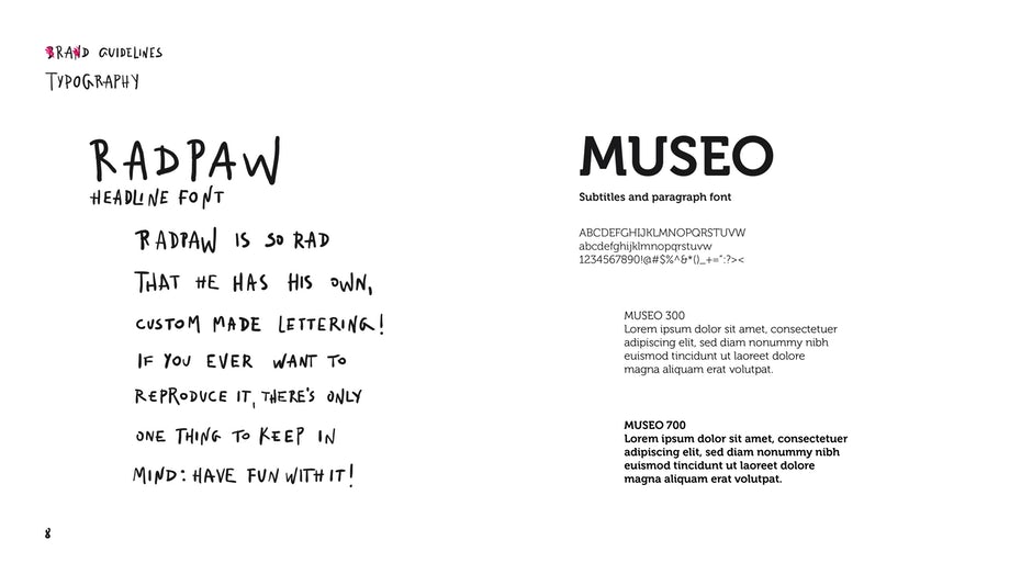
10. Typography
—
I didn’t mention it in the previous chapter because I wouldn’t want to sound like a broken record, but please don’t forget to click on the next artboard, paste the header (guides and title) on the new layer and add the page number.
This page presents the fonts that should be used for the brand. In this case I used my own (messy) handwriting to write the brand’s title in the logo, so I went with the same style for the headlines too. If you choose to do the same, just mention that you used a custom made lettering for it—this makes you really cool, apparently!
Obviously, you will need another font for text paragraphs. When you chose it make sure it’s readable and never use script.
Once you picked a font, type out the whole alphabet as well as all the numbers and punctuation marks using that specific font. Also, add a small text paragraph using the same font—for this I suggest you use Lorem Ipsum text (what is that, you ask? It’s placeholder text, with absolutely no meaning at all).
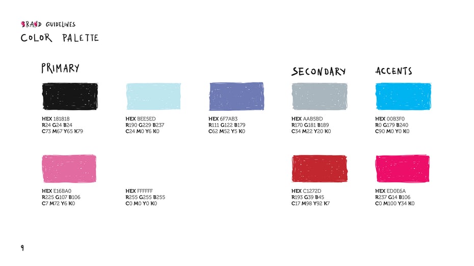
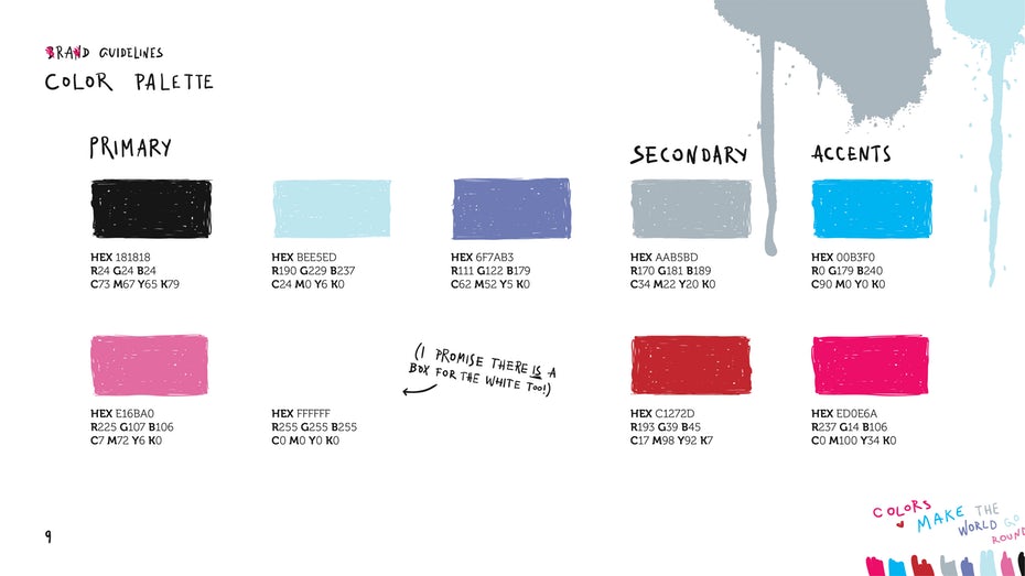
11. Color palette
—
This is my personal favorite part (I really love colors and playing with them).
Here you should mention and present the primary colors of the brand. Include the ones that the logo uses, plus the blacks and whites, the secondary colors (in this case these are the colors from the secondary logo), and the accent colors—this is optional, it’s not necessary to have a separate category for these too, but you know, I’m a color fan so why not?
If you have trouble finding the proper colors for the brand, maybe this article on color meanings will help you. After you’ve decided on what colors are best suited, nicely arrange boxes or dots or splashes or whatever works best for the brand’s style to present the colors and add their corresponding color codes (HEX, RGB and CMYK). If you don’t know what these letters mean, I suggest you take a look at this article on color modes.
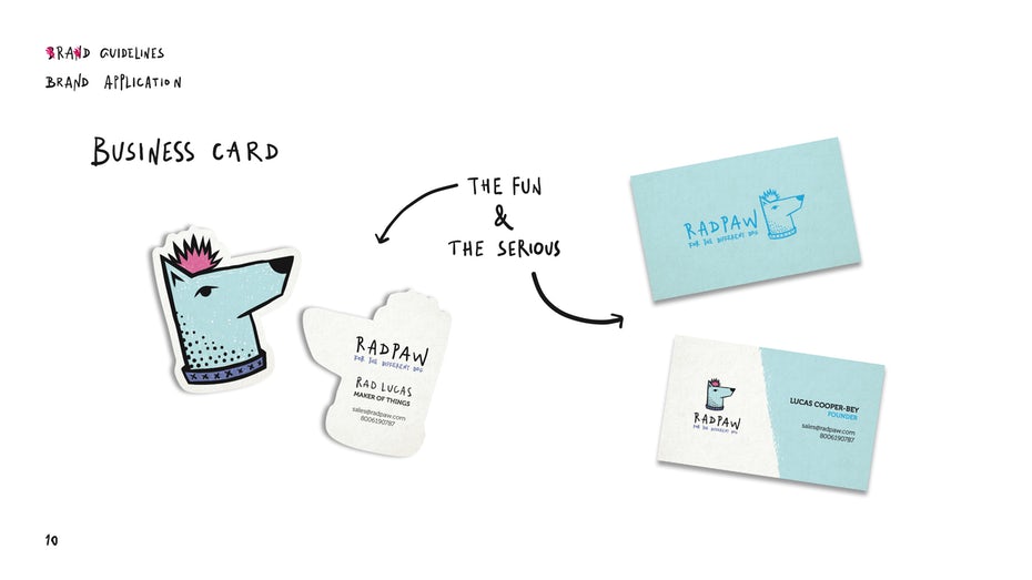
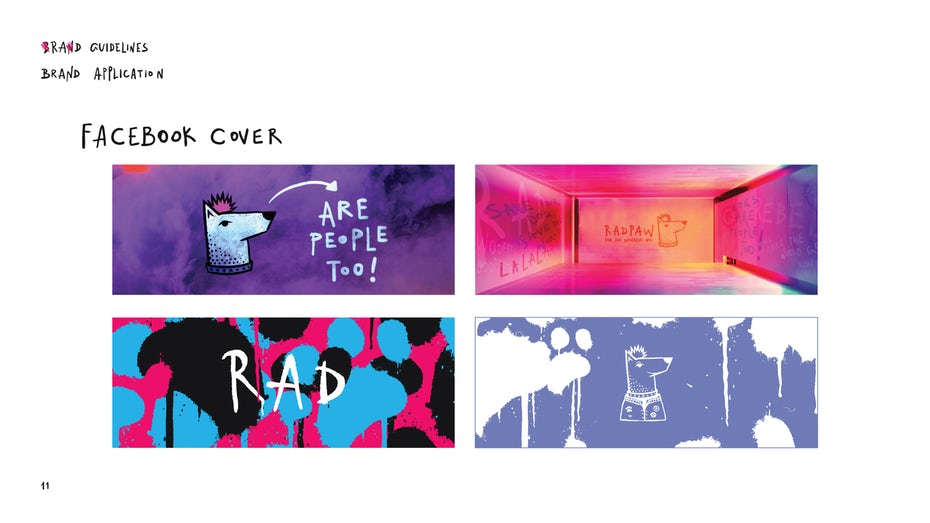
12. Brand Application
—
In this chapter you present the brand’s stationary documents and social media materials (if there are any).
Simply arrange them nicely on the page and you’re done.
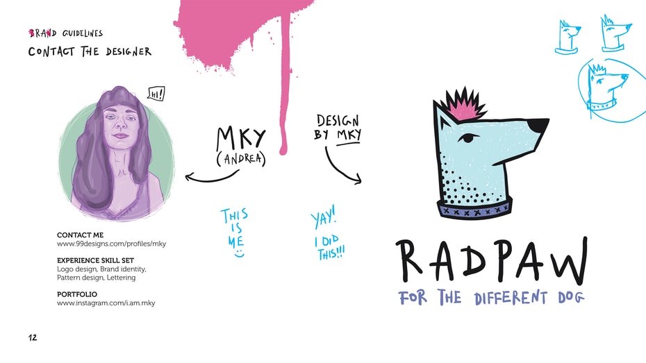
13. Contact the designer
—
This page is all about you! Add your photo, some contact info and, of course, your rad logo design.
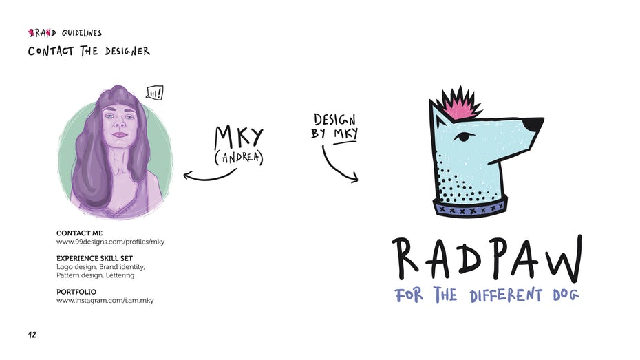
If this guide is to be used digitally, make sure all links work.
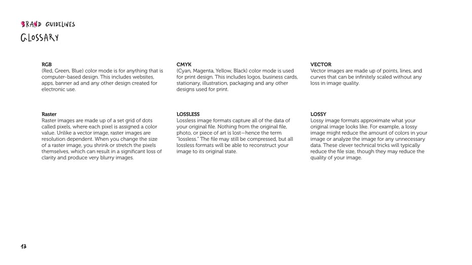
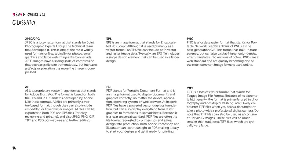
14. Glossary
—
Most likely your non-designer client will have no idea what all the design terms you used in your brand guide mean. CMYK, vector, EPS, AI, RGB—there are tons of terms that might sound like gibberish to a layman. So create a glossary to explain everything your client needs to know about these terms.
15. Adding personality to the pages & finishing touches
—
I know I said the colors page was my favorite, but this step is pretty fun too. After you’ve finished arranging all the elements and infos on each page you might want to jump back to the beginning of the document and make it as cool as possible.
Because this brand is a fun and nonconformist one, the client and I agreed that it should have a wicked, messy and punk image, so I had complete freedom to let myself go crazy. You should, obviously, discuss this with your client, but basically just follow your instincts and don’t overthink it.
Also, here is where you will have to add the page numbers to the Contents page, don’t forget that.
While you can totally get weird with this, you still have to follow some minor rules. For example, on your Logo Variations page make sure you don’t add too many things, to avoid it looking crowded. You still want to have the primary focus on the logos.
But on the Colors page or Designer Contact page, for example, you can add tons of fun elements like color splashes. After all, colors make the world go round, and the Designer Contact page is all about you!
16. Saving your file
—
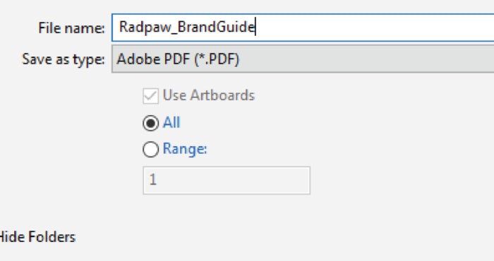
Now that your document is all done and ready to present, you’re going to have to save it so that you can send it over to your client or printer.
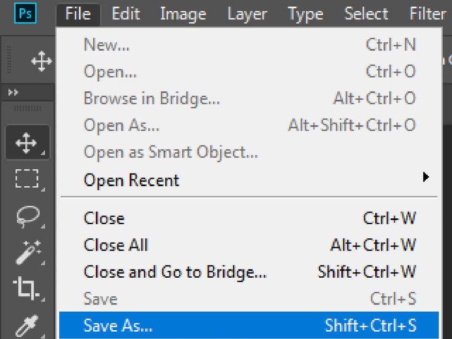
- For this go to File > Save As, select Adobe PDF from the dropdown menu and mark All to save the whole document as one PDF file.
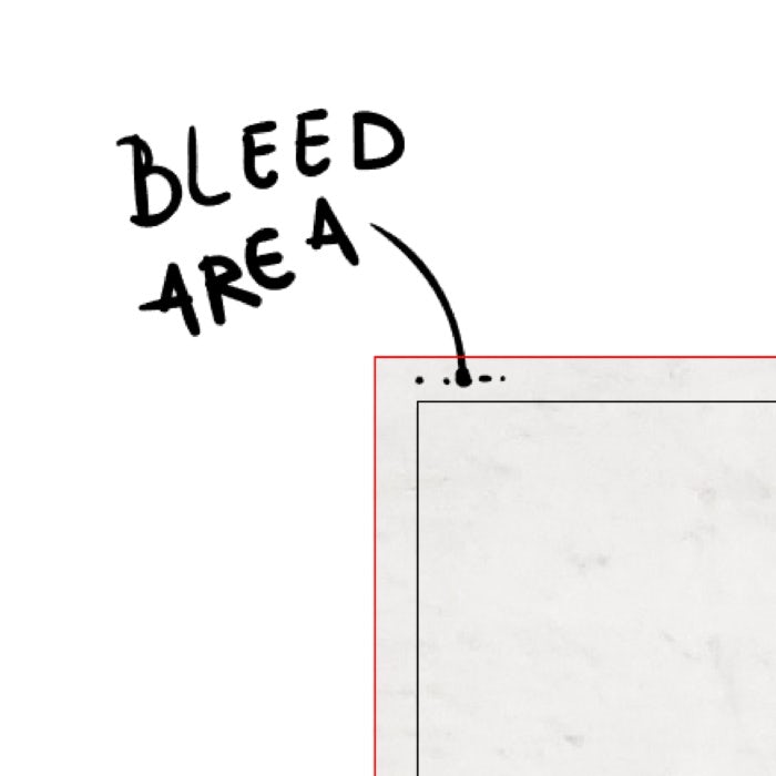
- Then, on the window that will pop up go to Marks and Bleeds and use the document bleed setting with the trim marks.
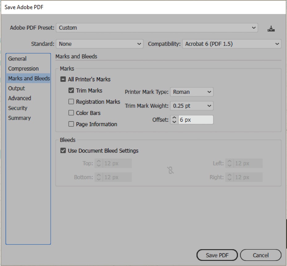
- Hit save and your pages should look like this:
Notice those little lines on the edges? That’s where the pages will be trimmed and what we needed the bleed for.
However, if your client needs the brand guide for digital use too, there are just a few little adjustments to make.
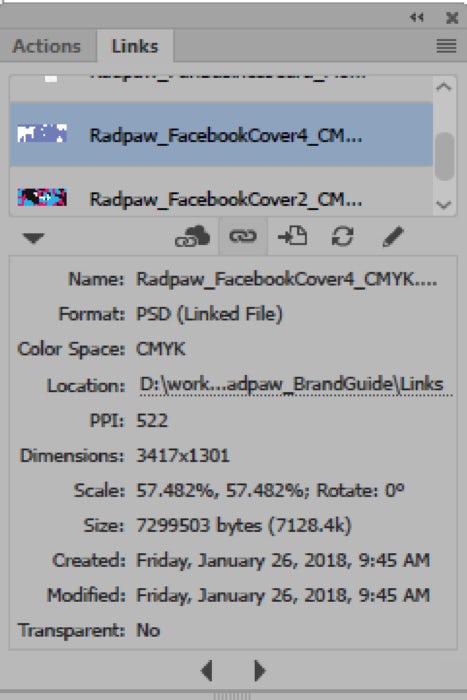
- Go to File > Document Setup and remove the bleed (just type 0).
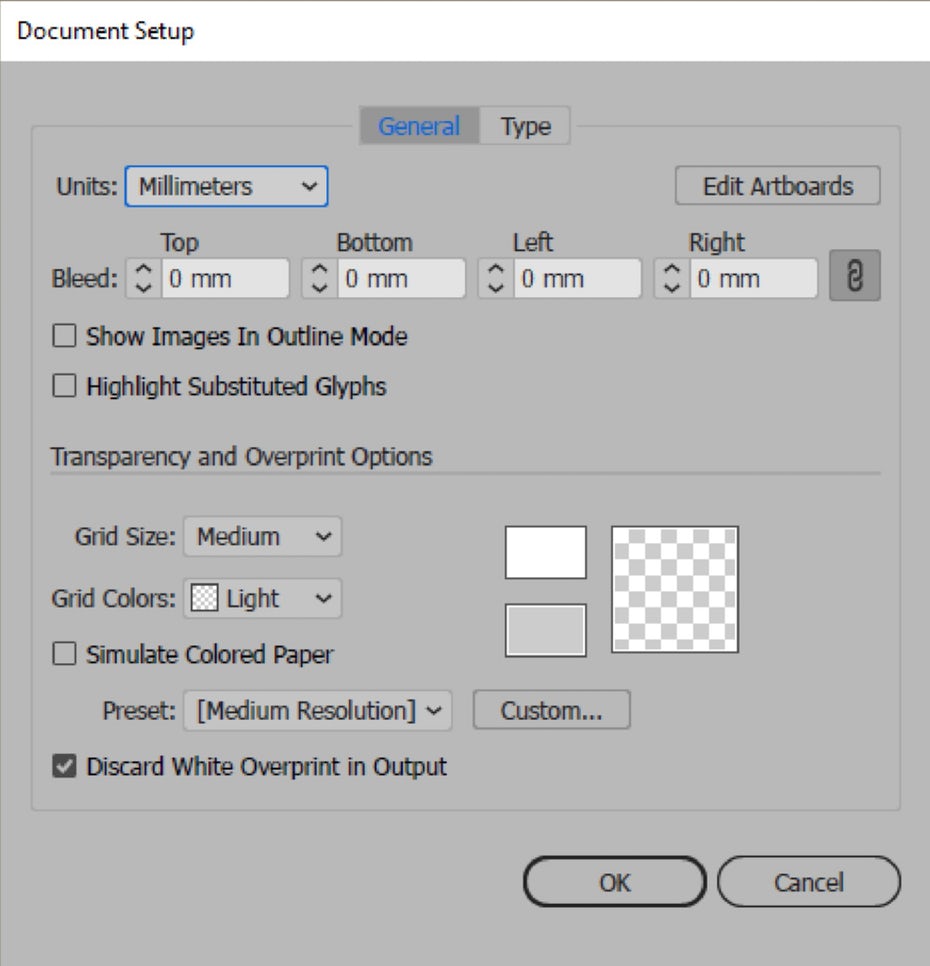
- Go to File > Document Color Mode and select RGB color.
Now you will have to change the CMYK images to RGB images. For this you will have to go to your links panel (Window > Links) and relink each image that uses the CMYK color mode.
- Then simply save it as a PDF file as explained in the previous step—note that you don’t have to set any Bleed related settings this time.
Alternatively, if you are going to send the editable file to your client, you will have to include a package of the images used, otherwise your client won’t be able view the file properly—both for the printable and digital files.
To do this you go to File > Package, select where to save it and click Package. This will create a folder with all the links used, so don’t forget to send that too.
17. Conclusion
—
If you are reading this sentence, I want you to know that I am very proud of you, because you made it to the end of the tutorial. Congrats!
You now know the basic steps for creating your own rad brand guidelines. However, tutorials won’t make you a master, you have to actually get your hands dirty, experiment, fail, fail some more and then succeed. Remember, practice makes perfect!
Any questions? Let us know in the comments below!
—
This article was written by Andrea Stan (aka Mky on 99designs), a freelance graphic designer from Romania with a focus on logo design and a love for lettering and doodling patterns. The top three things she couldn’t live without are plants, sunshine and (loud) music.


