From circles to squares to complex patterns, geometric shapes are a popular logo style not only for their mathematical precision but for the range of emotion they can express. Squares and rectangles feel solid and stable. In contrast, a circular or oval logo can give a brand an unrestrained, eternal feel.
Geometric logos often go beyond these basic shapes to tell more nuanced brand stories. Geometric shapes have been present in art for centuries. Ancient designers understood how geometric shapes and patterns can provide a visual depiction of the mathematical principles that comprise our world and used them to communicate big ideas about science, art, religion and humanity.
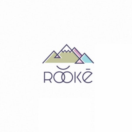
With so much subtlety and history behind geometric designs, it can be hard to know where to start when turning to this style for your own branding. That’s why we’ve rounded up these examples of geometric logos to point you in the right direction.
Simple geometric shapes
—
A logo doesn’t have to be complex to tell a brand’s full story. In fact, a well-crafted geometric logo does just the opposite: it summarizes a brand’s entire identity in a succinct image—eliminating excess illustrative detail in favor of flat lines and color.
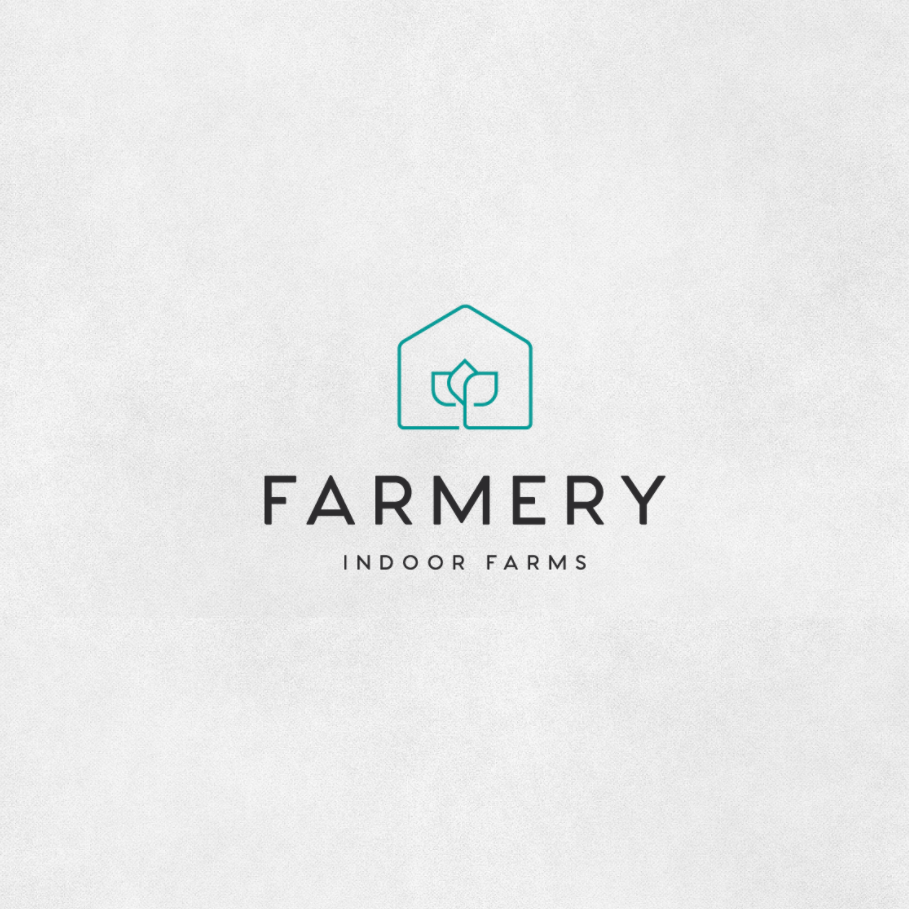
Farmery’s logo, for example, consists of one continuous line that creates the shapes of both barn and crop. This quickly conveys what the company does and a feeling of freshness and nature at the same time.
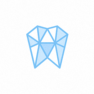
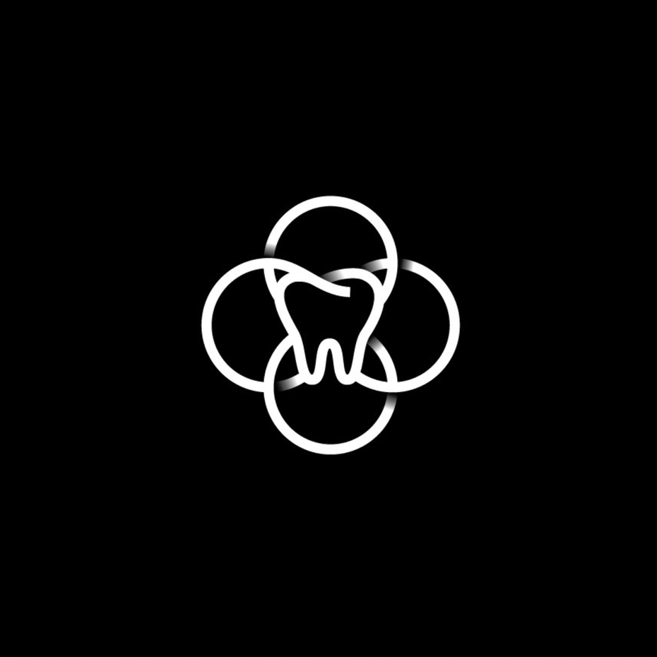
A geometric shape can make an object’s implied texture explicit. Your teeth aren’t perfectly smooth, they’ve got bumps and angles and indents from a lifetime of chewing and biting and cavity repairs. Take a look at how the Hard Teeth logo uses a collection of geometric shapes to show all the dimensions of a tooth.
Modern and millennial
—
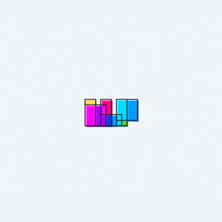
Companies and groups that target younger demographics use geometric shapes to show that they’re minimalist and daring, devoid of the frills and intricate designs of older brands. Geometric shapes are also reminiscent of computers and technology—the abstract, digital world—considering that precise line-work contrasts with natural, organic shapes, and this resonates with younger, tech-savvy audiences.
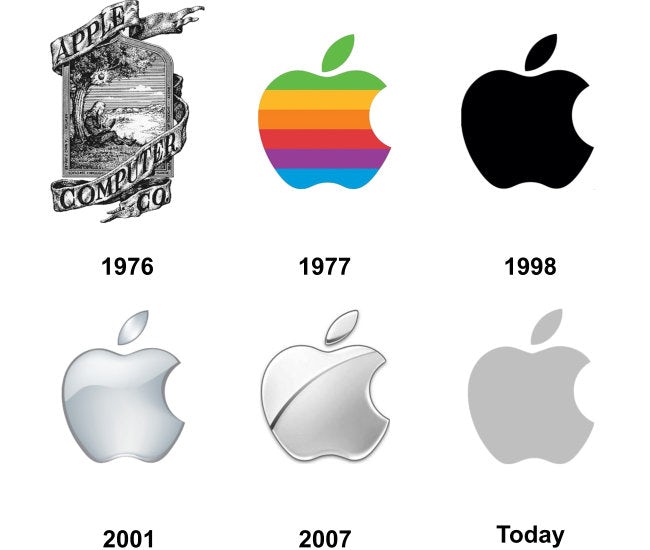
A company doesn’t have to be new to adopt this strategy. Compare Apple’s current logo with its original logo to see what I mean:
Geometric logos feel modern because they use the same abstract shapes we see in modern art and feel digital because of their mathematical structure. If you’re looking to create a sleek and hi-tech impression, consider this style of design for your brand.
Vintage and retro geometric logos
—
Geometric shapes can make a logo look modern for now, or they can make a logo look modern for a time gone by, evoking a nostalgic, retro futuristic feel. Think about Tron and the vaporwave aesthetic. They definitely feel like they belong in the 1980s—specifically, an 1980s depiction of the future. This kind of imagery can work really well for a company that wants to use nostalgia in a specific way, like a vintage electronics dealer or a consignment store that focuses on a specific style of clothing.
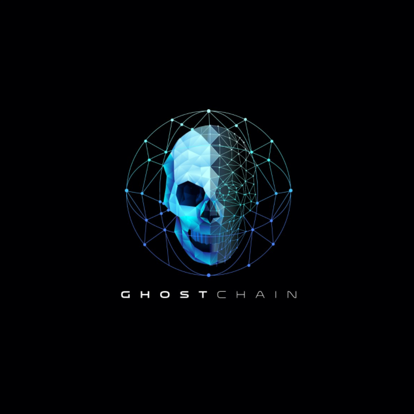
Geometric shapes as constructs
—
A brand is much more than the sum of its parts, and the right logo can show how those pieces come together. Geometric shapes lend themselves well to the idea of construction. They don’t have to be squares to do this, either. As long as they fit together, different shapes can be used like a lego masterpiece.
Building block imagery isn’t just for construction companies, though. Any group that wants to make the connections it builds part of its brand can benefit from this style of design, like a tutoring group that helps students build the skills they need to earn high grades or a physical therapist who works with patients to build muscle tone and strength.

Symmetrical and balanced geometry
—
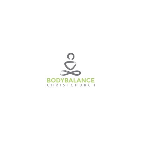
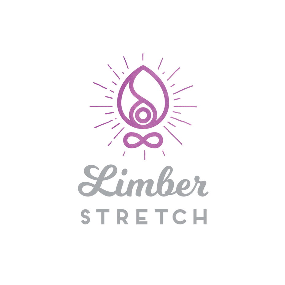
Companies focused on health, movement and mindfulness can communicate these qualities with a symmetrical geometric logo. When the sides of a logo mirror each other, it evokes a sense of comfort and trust in the viewer. Symmetrical designs are comforting for our brains because they feel familiar. They feel balanced and safe. They feel like they were purposely constructed to put us at ease.
Aside from the obvious companies that would want this type of logo, like health food manufacturers and yoga studios, any company that wants to underscore a sense of “fair and square” can use a geometric logo to communicate this quality. An insurance provider, a legal advocacy group, or a relationship counselor are all professionals who can benefit from using a symmetrical geometric logo.
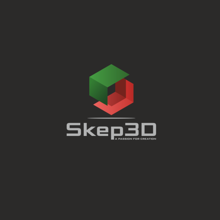
3D geometric logos
—
Because geometric logos are made up of planes, selective shading opens them up to the illusion of multiple dimensions. While color helps, even monochromatic geometry can be quite detailed with highlighted and shadowed planes.
For a company that literally works in 3D, like a 3D printing company or a 3D artist, a geometric logo can be a clever way to evoke that with flat vectors. Companies work in multiple dimensions on a more metaphorical level—like holistic healthcare providers and law firms with multiple practice areas—can also use 3D geometry to show how their different services converge to provide a comprehensive client experience.
Geometric logos have lots of faces
—
A geometric logo can accomplish a whole list of goals for a company. No matter what your company does, if you want to showcase qualities that are strong, precise and reliable, consider a geometric design.


