Your logo is your hardest-working brand asset. It’s your public face, tasked with showing and telling the world who you are, what you do and whom you’re for. That’s a lot to fit into one image, so clever designers often use “secret compartments” to communicate everything—and create mesmerizing logos with hidden meanings.
Below, we’ve gathered some great logos with hidden meanings to show you the different ways to turn a seemingly straightforward logo into the visual equivalent of a hollowed-out book that contains a treasure map. Make sure you look twice, because sometimes your first glance doesn’t tell the whole story.
Why you’d want a logo with a hidden meaning
—
Let’s be real here, logos with hidden images just look cool! And sometimes, that cool factor is all you need to decide a logo with a hidden meaning is the way to go. But that’s not the only reason brands choose these kinds of logos.
Some use hidden messages within their logos to create an air of exclusivity. Finding the hidden image makes viewers feel like they’ve unlocked something that not everybody can find, which makes them part of the brand’s “in-crowd.”
For other brands like Baskin Robbins, layering multiple images is the smart way to fit extra information, even subtly.
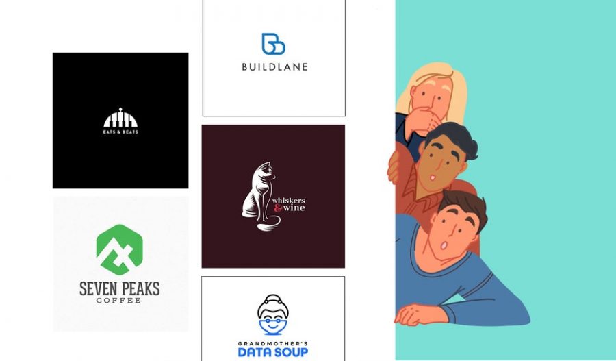
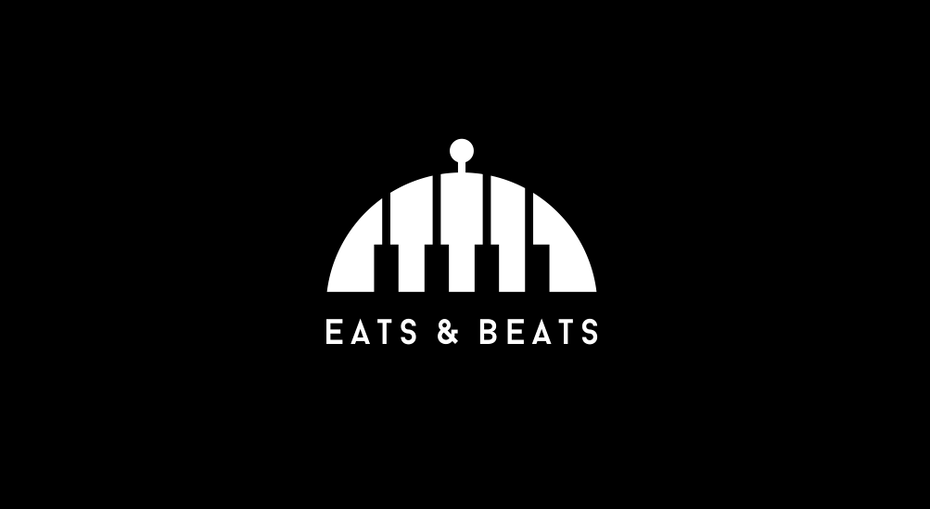
Similarly, some brands use logos with hidden meanings to tie distinct areas of their businesses together. In their design for Eats and Beats, -Alya- cleverly combines a plate cover with piano keys to show how the company combines good food and good music.
For logos that play so heavily on visuals, it’s better for you to see what we mean with your own eyes. Let’s take a look at the different types of logos with hidden meaning.
Logos with subliminal messages
—
You’re probably familiar with the concept of subliminal messages, which advertisers (and, according to sci-fi movies, governments and nefarious characters) work into images and jingles to relay messages to viewers’ unconscious minds.
Subliminal messaging isn’t a conspiracy theory, it’s a marketing strategy that’s been proven to work. And it’s not just useful for marketing—a 2008 study found that when briefly exposed to the Apple logo versus the IBM logo, participants had more creative and innovative ideas when answering the control question.
Logos with hidden meanings work the same way. Let’s say you’re a restaurant focused on healthy, plant-based meals that don’t immediately read as plant-based. You could design a logo that puts veggies front and center, or you could go with one that subtly works vegetables into the letters of your name, like your chef subtly works them into burgers and pasta dishes.
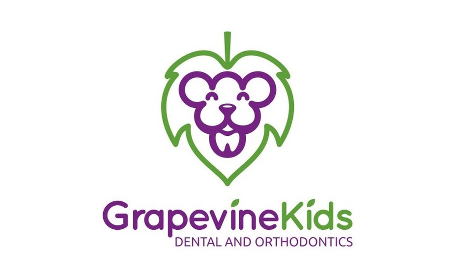
Or if you’re Grapevine Kids Dental and Orthodontics, you want a logo that’s disarming and takes kids’ anxiety out of going to the dentist… but doesn’t completely ignore what you do. The right logo for you might feature a friendly lion as its focal point, but with a small tooth worked into the lion’s chin to remind viewers that you’re a dentistry practice.
Logos with hidden meanings (that aren’t so hidden anymore)
—
You’ve seen logos with hidden meanings lots of times before. And with the famous ones, you probably already know what those hidden meanings are. The most well-known example of a logo with a “secret” component is probably the FedEx logo.
Amazon is another brand whose logo works subtle messaging into its subtext. At first glance, it’s an underlined wordmark. But pay attention to where the underline starts and where it ends: A to Z. Now, take a look at its shape – it looks like a smile, doesn’t it?
Logos that use insider information
—
In some logos, the hidden message is an in-joke for certain audiences. To everyone outside those audiences, the logo still works, but it might just look like an abstract design or another familiar image.
One popular example of this is the Vaio logo, which pairs an analog wave with a 1 and a 0 to represent how the company brings analog and digital technologies together.
This also works well as a signal to certain communities. For most people, Alfa Romeo’s logo looks like a typical mishmash of symbols; but people from the company’s home town of Milan recognize not one but two historical emblems of the city.
Working a hidden meaning into your logo is also a way to think outside the box and use images that other brands in your industry don’t use. Let’s say you’re a coffee shop. Your logo might include…a cup of coffee? A coffee bean? A mug?
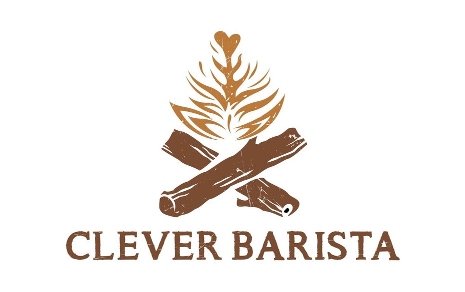
They’re all solid choices, but they’re also the same exact choices every other coffee shop makes for their logos. So how do you differentiate your brand? When Clever Barista faced this conundrum, SNSTR delivered a logo that says “warmth” by combining latte art with a bonfire—but you really appreciate the logo, you need to be familiar with latte art.
Look twice, see two different images
—
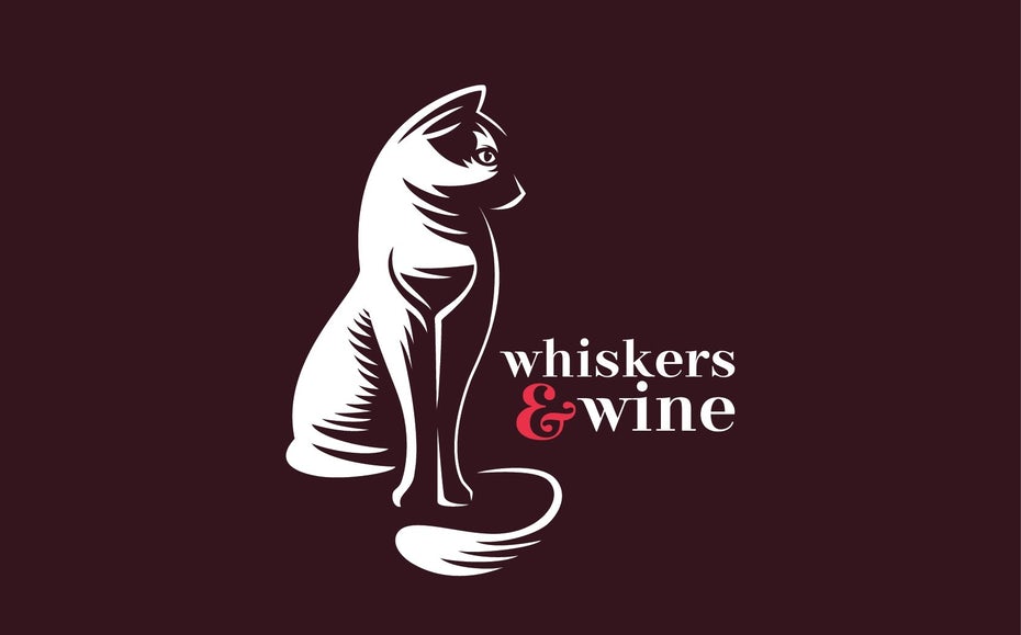
In some logos, the multi-layered design is less for a hidden meaning and more for aesthetics. Take Desideratum’s design for Whiskers & Wine, a bar and nightclub. In the logo, an image of a cat—the “whiskers” mentioned in the bar’s name—is the focal point. But look closely at the cat’s chest and you’ll see both words in the bar’s name are represented in its logo.
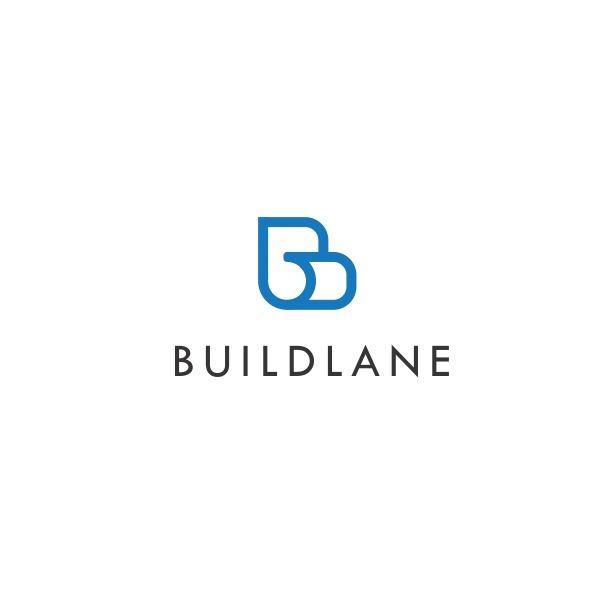
In her design for Buildlane, -Alya- created a very simple image that’s actually two different things. On the one hand it forms the letters B and L, the company’s initials. On the other hand we can see a curled sheet of paper, just like the ones the company’s clients, interior designers, use in their work every day.
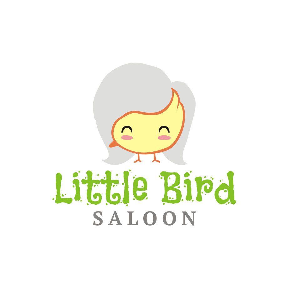
When Wiell designed a logo for Little Bird Saloon, he combined two cute images, a grazing bird and a delighted young woman, to create a multi-faceted image. This image also demonstrates that in a dual-meaning logo, the two images don’t necessarily have to be realistic—when you’re viewing the logo as a young woman, she has an unexplained orange spike hanging off the left side of her face. When you view it as the bird, the bird has a second face on its rear. Yet neither detracts from the image; we know exactly what it is in both instances.

Finding Easter eggs in logos
—
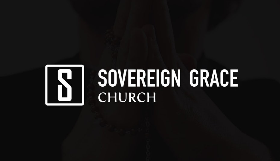
First coined in 1979, the term Easter egg initially referred to a hidden message in the Atari game Adventure. It evolved to refer to all messages that developers left for tech-savvy players in games, then for niche audiences in films and TV shows. Now, it can refer to any little callout that isn’t immediately obvious to everyone who sees it. Like the cross in Terry Bogard’s design for Sovereign Grace Church.
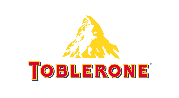
One famous logo with an Easter egg is the Toblerone logo, which has an image of a bear in the negative space on the mountain. The bear is a nod to Bern, Switzerland, also known as the City of Bears (and home of Toblerone).
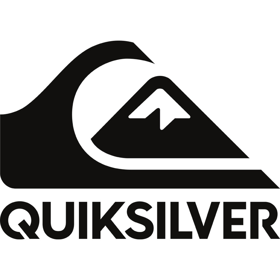
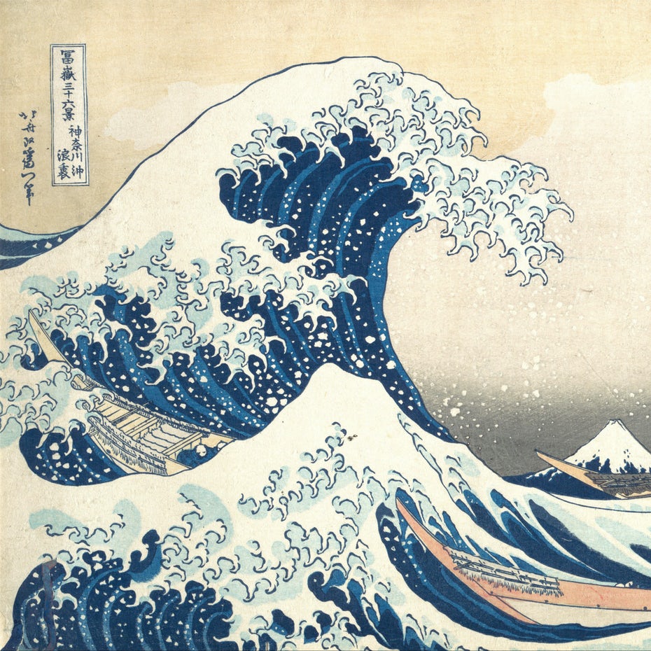
Another Easter egg logo that a lot of people don’t initially realize is the Quiksilver logo. The surf-and-snowboarding brand’s logo is a stylized take on The Great Wave Off Kanagawa, a famous ukiyo-e woodprint by Hokusai.
Later when Quiksilver launched their women’s brand Roxy, they mirrored their logo, then tilted both halves upward to create a heart.
Look beyond the letters
—
You don’t need to add multiple layers or Easter eggs to create logos with hidden meaning. You can simply use what’s already there, like the letters in the brand’s name. Tostitos does this with the small party scene in the middle of their wordmark: two friends sharing chips.
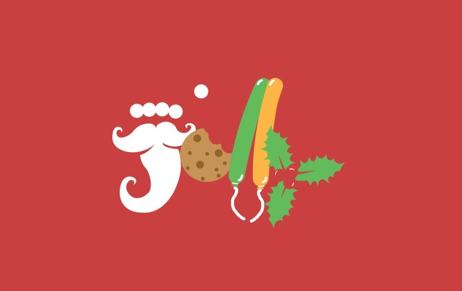
Sometimes, an image isn’t embedded within a wordmark—it is the wordmark. That’s what S.C.C. did when he built the logo for Jolly out of all the things that make Christmas, well, jolly.
Drawing with shapes and colors
—
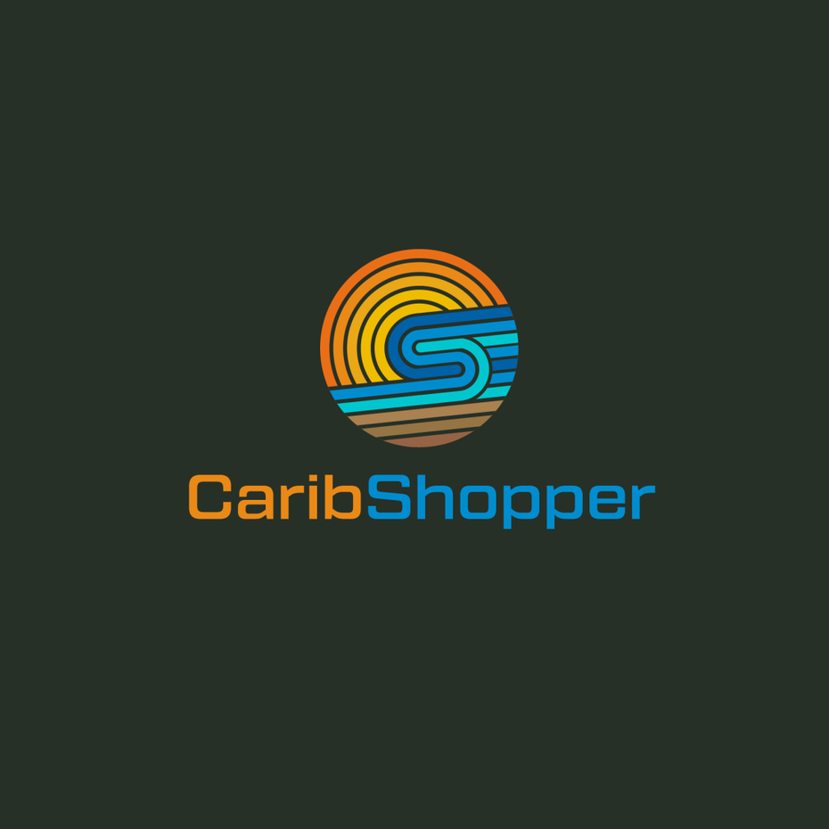
One of the best tips for creating logos with hidden meaning: work with your brand’s shapes and colors. In their logo design for CaribShopper, Arthean drew a wave crashing against a sandy beach. But you can only see it in the full-color version of the logo. In the monochrome version, it looks like a fingerprint.
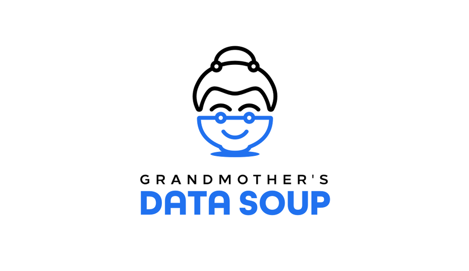
Similarly, onripus’s logo for Grandmother’s Data Soup would only look like a woman’s face if it was all one color—the hidden image is only clear because the bowl is depicted in blue.
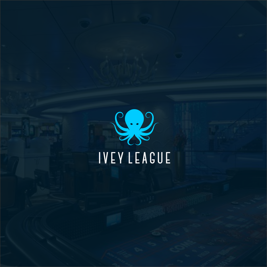
In some logos, the hidden meaning isn’t highlighted—it’s just there, right in the negative space. Many, like the logo ks_projekt created for Ivey League, play with negative space to cue what industry they’re in. Not only does the octopus draw on the concept of playing multiple hands of poker simultaneously, but the logo also works in a tiny, spade-shaped reference to the game.
Ready to design your own genius-level logo?
—
Logos with hidden meanings are not only clever and entertaining, they also make your audience feel like they’re part of a club and give them the pleasure of having solved a little puzzle. They work especially well if you want your logo to express several things at once. A logo that contains a hidden message makes people take a second glance and remember it.
Looking to hide a few extras in your logo? Browse our platform to find a designer who’s got the same eye for Easter eggs and hidden messages as you.
Want to learn more about logo design? Check out our in-depth guide on how to design a logo.


