Building a new construction company from scratch? You need an effective logo. Rebranding your existing company? You need a better logo. Either way, you don’t have to do it alone! We’re here to help you find inspiration with the construction logo ideas we’ve curated here.
A well-crafted construction logo communicates that your company is the right one for the job. When clients are shopping for the right contractor for their project, they’re looking at a lot of logos and getting a lot of estimates, quotes and ideas. When they see your logo, it should tell them that you know what you’re doing—which will lead to the consultation call where you can really hammer your promise home.
What makes a good construction logo?
—
To understand what makes a good construction logo, think about what clients expect from construction contractors. Having a structure built, renovated, updated or even just giving it routine maintenance is a big, expensive project that involves technical considerations and specialized skills the client usually doesn’t have. In a contractor-client relationship, the contractor has a whole lot of power. The client has to be able to trust the contractor, so you must inspire that trust.
Your clients trust you to:
- Complete their projects without going over budget
- Complete their projects on time
- Meet their expectations for the project
- Comply with local building codes
- Complete their projects without complications
- Run a safe job site
- Deliver well-built structures that last
As the face of your brand, your logo needs to reinforce all these qualities and more.
Want a solid logo for your construction business? Work with our talented designers to make it happen.
Every good construction logo inspires trust in its brand’s ability to deliver what the client needs, but how a brand does this depends on the type of clientele it’s after. As a construction professional, you’re no stranger to niching down. A good logo for your company is one that makes a sincere connection with clients searching for work in your niche.
If you’re a roofer whose bread and butter is mid-tier commercial buildings, the right kind of logo for you is going to look a lot different from the ideal logo for a tile installer who creates custom kitchen and bathroom designs for homeowners on the wealthy side of town. But all construction logos, even the most aesthetically different ones, must communicate trust.
Solid ideas for construction logos
—
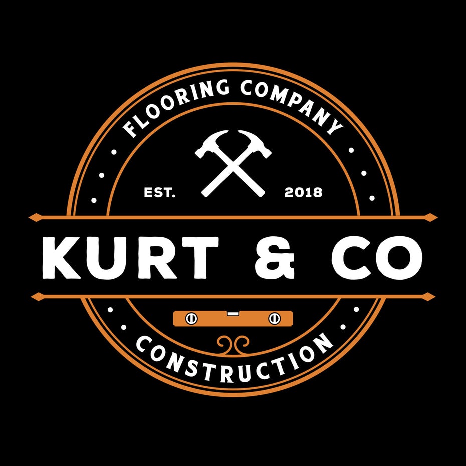
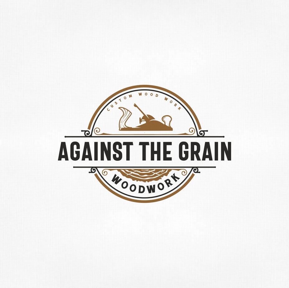
Good, old-fashioned quality
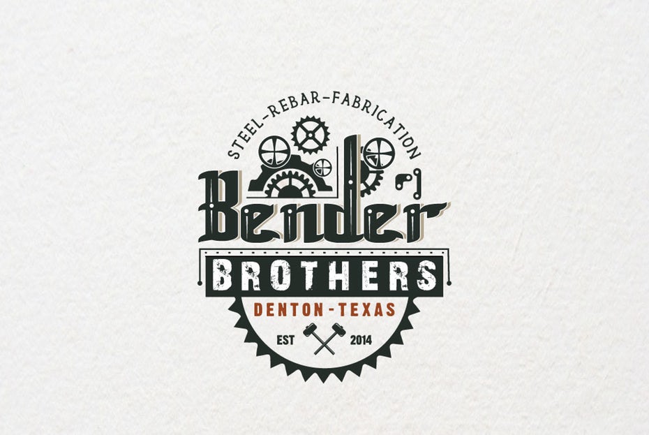
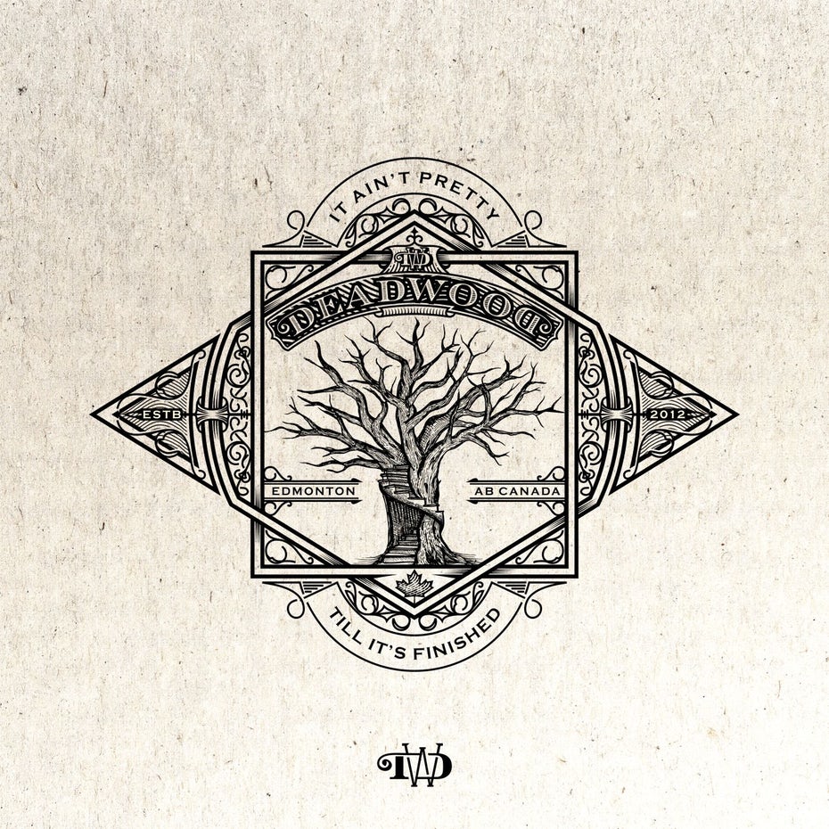
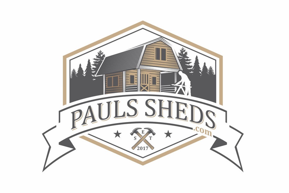
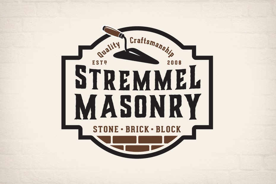
In some industries, there’s no wrong way to do something. In construction, there is. Whether your industry uses time-honed techniques or you’re on the cutting edge and innovating every year, using an old-fashioned logo evokes nostalgia for the “good old days,” when things were built to last. Show the world that your brand maintains old-fashioned values like hard work, honesty and fairness by using a vintage logo.
These logos work particularly great for companies that specialize in preserving old buildings and creating new buildings that have a classic, timeless feel—or buildings purposely created to feel like they were yanked out of an earlier era.
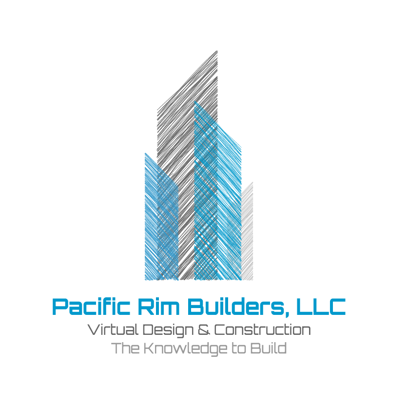
Made to be modern
Conversely, a modern construction logo communicates that you use the latest advances in your field and that you use these modern technologies to better serve your clients. Use a modern construction logo if your style is, well, modern—or if you find ways to work modern technologies and conveniences into older structures. A few specific construction fields that do great with modern logos are solar panel installers, green architects and builders tasked with revitalizing town centers with new luxury apartments. If you’re an innovator, a modern logo is for you.
You’ll notice a lot of modern logos are abstract. With some of these, you can’t even tell they’re construction logos. Although they’re not saying “construction” explicitly, pay attention to what they are saying about their brands with color, shape and font choices.
What you see is what you get
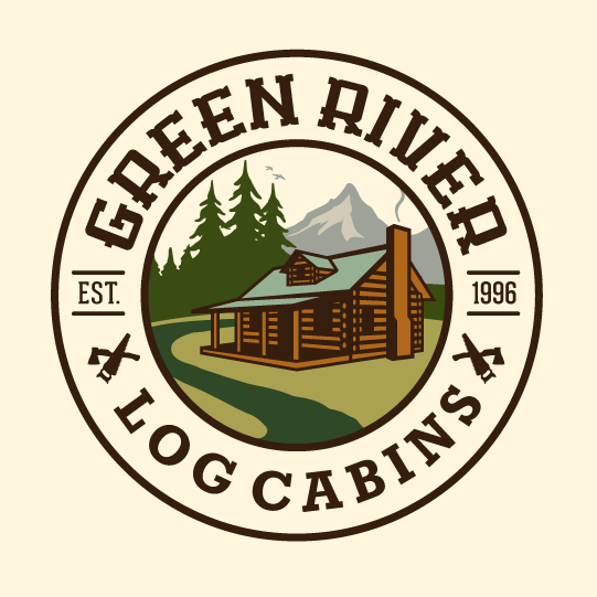
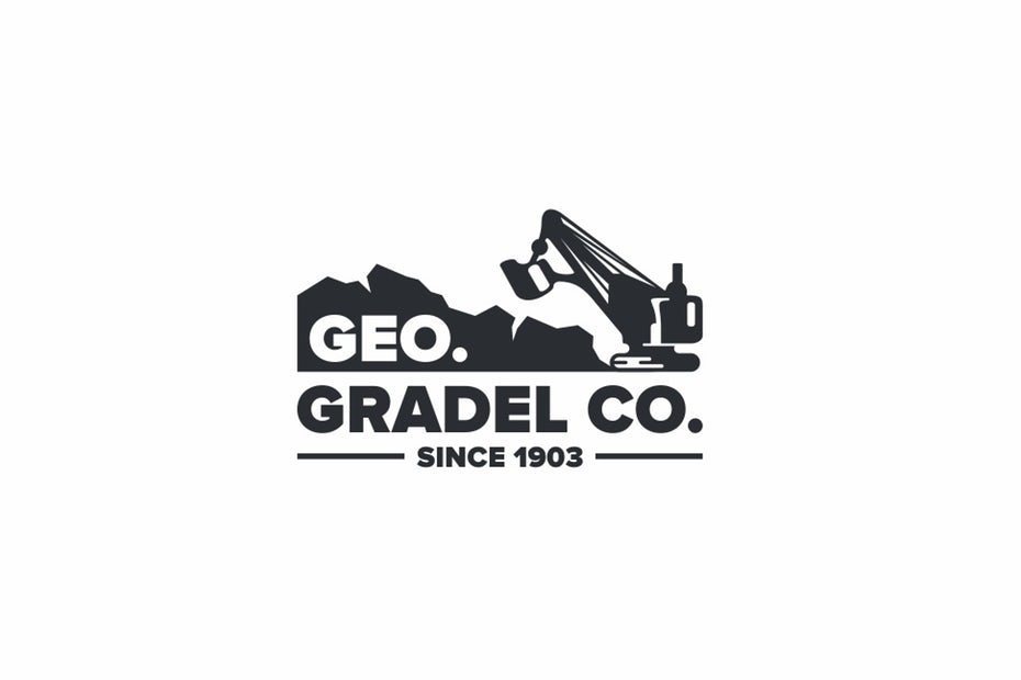
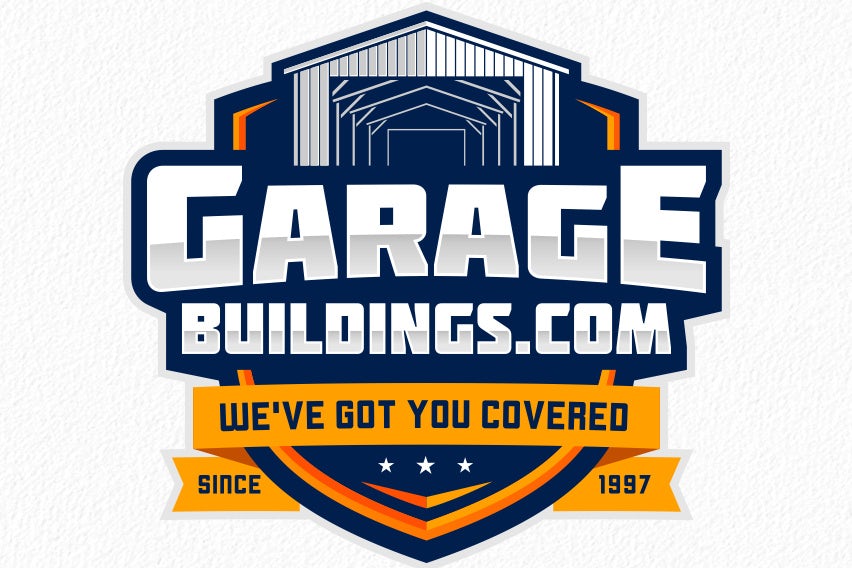
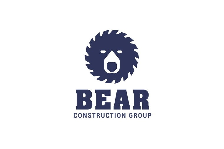
There’s nothing wrong with being literal. Sometimes, the best logo for your company is one that just straight-up shows what you do.
There are a couple ways to do this. Your logo can be a fully fleshed-out scene showing all the details about what your company does, or it can use a single object or a minimalist representation of what you do to get the point across. Hyper-focused logos like these are ideal for companies that do one thing, and do that one thing fantastically. These logos leave no room for imagination or assumptions, they just tell the world precisely what you do.
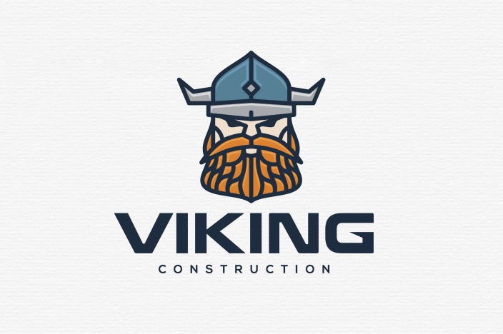
The face of the company
Construction can feel like a cold industry. Your day-to-day work is between your hands and your equipment and a job well done is one that delivers what the client asked for with little interruption to their schedule. Lots of construction professionals do their jobs well, so how can you avoid getting lost in the sea of logos that communicate just that?
By giving yours a literal face. When your brand has a face, it’s easier for clients to connect with it. It feels more personable, more approachable, which is exactly what you want if you’ve built your brand on collaboration with the client.
If you build it, it’ll be fun
Let’s face it, building stuff is fun. If it wasn’t, Legos wouldn’t be so popular. So why not have some fun with your logo? You can be professional and take your work seriously and still have fun with it—and demonstrate that with your logo. Offbeat, fun construction logos work really well for smaller companies and companies that specialize in creative, somewhat “out there” work. This might be a custom pool installer or a floor installer who creates interesting spaces with poured epoxy floors in fun colors. If you’ve got a narrow niche, a clever logo can be the hyperfocused laser you use to let prospective clients know “I’m here, and I’ve got the skills to handle your super-specific project.”
The fundamentals of logo design
—
Creating a construction logo without any prior experience can be daunting. So let’s take a look at the foundational principles of logo design.
Logo design is a specialized field within graphic design. It requires an understanding of aesthetics, branding and marketing, composition, typography and color theory along with the artistic skill to bring them all together in a way that works. In our free online guide, How to design a logo, we dive deeper into all the elements that go into effective logo design. For a quicker understanding of logo development, here are the key points:
Design for your brand. There isn’t one singular “best” type of logo to use. The best logo for your company is one that flawlessly communicates your brand. Think about Home Depot’s logo and how it communicates the niche Home Depot fills and the goods it provides. Now, think of how differently Home Depot would be perceived if it used the same font and color choices as Taco Bell.
It’d be telling a pretty different story, right?
Before you’re ready to start designing a logo, you have to nail down your brand identity.
Are you a conservative builder who prides themselves on classic styles, or are you a future-focused brand that builds LEED certified houses? Your answers to questions like these will guide your design choices, particularly your choice in color palette, shapes and letters.
Colors, shapes and letters. Every color evokes a different mood, as does every shape. For example, a black logo feels sophisticated while a mostly brown one feels dependable. A star-shaped logo feels fun and quirky, while a triangle feels focused.
The same is true of your font choices. A courier-style font looks old-school, while a bold, all-caps font is ready for action. Every design decision reflects on your brand, so make strategic choices as you build your brand from the ground up.
How to get a construction logo
—
As we explained in our guide on Comparing the best ways to get a logo designed, you have four primary ways of getting your logo.
- DIY logo maker. Using entry-level design software, you design a logo yourself with basic computer tools and templates.
- Hire a design agency. You outsource the entire process of creating your logo to an agency’s team of specialists.
- Work with a freelancer. You work with an individual logo designer to create your logo, benefiting from a professional’s skills without the cost of an agency.
- Commission a design contest. You provide general guidelines about what you need in a logo, then multiple designers from around the world submit samples based on these instructions. Then, you choose the one that you like best and work directly with its designer to reach a final image.
When should you use a DIY logo maker? Only under extreme circumstances, like when you’ve got a budget of almost nothing. Your logo is your brand’s calling card and if it’s not designed by a professional, it might not be as effective as it could be.
That doesn’t mean you have to spend your whole month’s budget on logo design. Take a look at our Logo design cost guide to get a better sense of what your different logo design options cost.
Design contests are popular because they leverage multiple designers’ creativity. Think of it like bidding for a contract—each designer who enters a contest provides a unique interpretation of the contest host’s brief, giving the contest host many different logo options to choose from. Design contests are ideal for business owners who aren’t 100% sure what they want their logos to look like, because when you see all the designers’ submissions side-by-side, you can rule out looks you’re not fond of and use the ones you like as a starting point for the perfect logo. With a design contest, you only pay for the design you choose as your winner.
If you don’t need help hashing out ideas, you’re probably better off working directly with a freelancer. You can browse designers’ portfolios to find the one who speaks your same style language, then work with them to get the exact logo your brand needs.
Are you ready to get a rock-solid construction logo?
—
No matter what industry you’re in, a great logo shows everybody—your clients and your competition—that your company is an industry heavyweight. Settling for an okay logo leaves money on the table, so make the investment your company deserves by having a professional logo designed. We’re here to guide you through every step of the process, from determining who you are as a brand to connecting you with the designer who can illustrate your brand perfectly.


