You’re in the pharmaceutical industry because you believe in empowering your customers with resources to help them feel happy and healthy. Whether it’s western medicine or natural healing methods, you’re a problem-solver, and you need the right tools to tell people who you are as a business.
So how can you make a lasting impression in the pharmaceutical industry? It all starts with a great logo. A logo prescribes your customers with information on your personality and your purpose. This is your chance to say, “this is who we are and what we’re all about.” Below we’ve collected some amazing drugstore and pharmacy logos to inspire you.
What makes a good pharmacy logo?
—
Let’s get this out in the open: you sell drugs.
It’s true. But for marketing purposes, a pharmacy or drugstore doesn’t have to be so blatantly obvious about what it’s selling. Think about the angular, heart-shaped icon in the CVS logo. This icon has widespread recognition and simultaneously references health and happiness, but does it contain a red cross? And is it pill-shaped? No and no.
Get creative with your pharmaceutical logo—it’s going to show up everywhere, so it needs to be good.
From vials and jars to signage and print materials, a pharmaceutical logo certainly makes the rounds. And given its widespread presence, now is the time to be spot-on with the statement that you make about who you are as a brand.
Amazing ideas for pharmacy logos
—
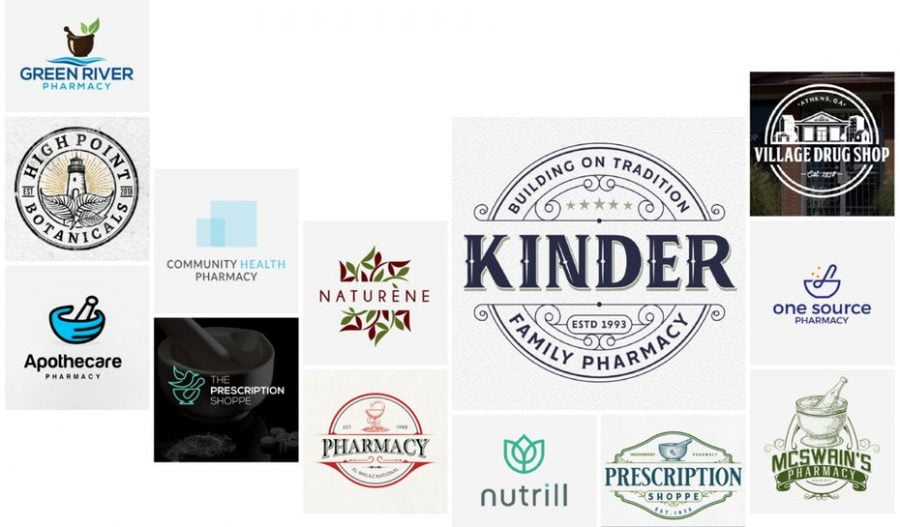
Mortar-and-pestle pharmacy logos
The mortar and the pestle: they’re an iconic depiction of your industry which can be worked into pretty much any logo style, ranging from sleek and modern to old-timey and nostalgic. Think about ways to make this new and exciting while still making it your own. After all, there’s something incredibly strategic about incorporating this imagery into a logo. It gives a nod to the past but somehow still feels fresh.
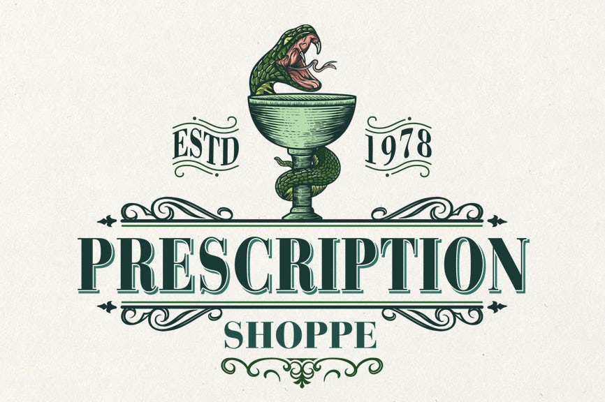
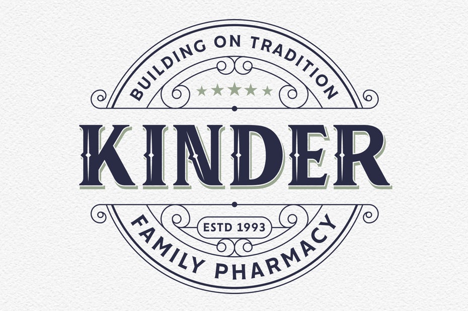
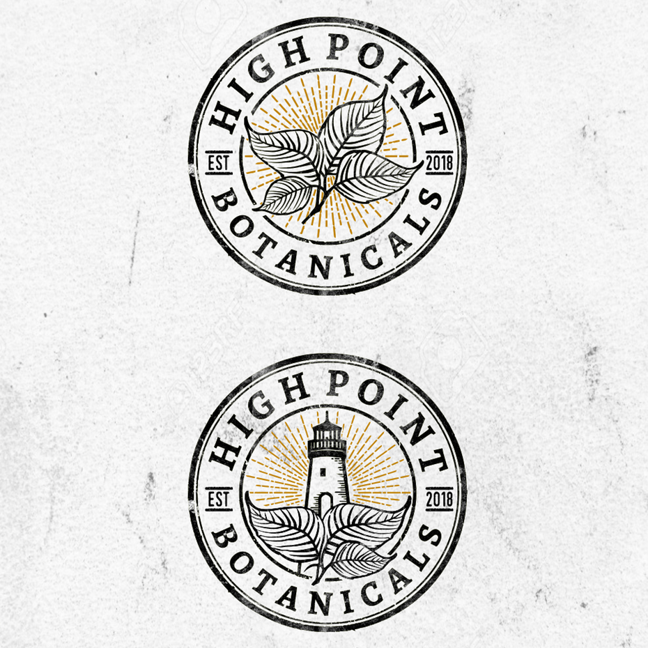
Vintage-inspired pharmacy logos
You’re looking to make your mark in an industry that—in some capacity—has been around for centuries. Embrace the long-standing history of your field with a logo that has a vintage vibe. Achieve this aesthetic with serif fonts, scroll-style shapes and an “established” date. There’s something charming and quaint about this style, eh?
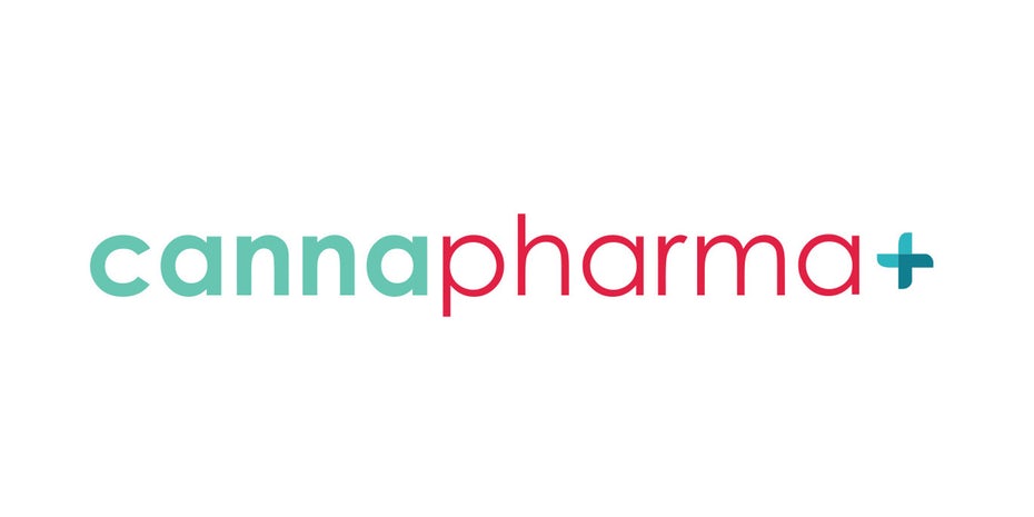
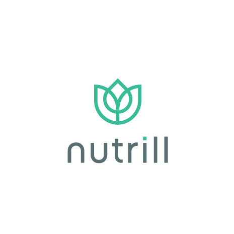
Minimalist pharmacy logos
It’s plain and simple: you know who you are, so there’s no reason to add fluorescent neon lights to your logo. In fact, some of the most successful logos are the ones that don’t go over the top. Think clean lines, sans-serif fonts and no more than two colors in your color palette. After all, at the end of the day, you’re a pharmacy—not a nightclub.
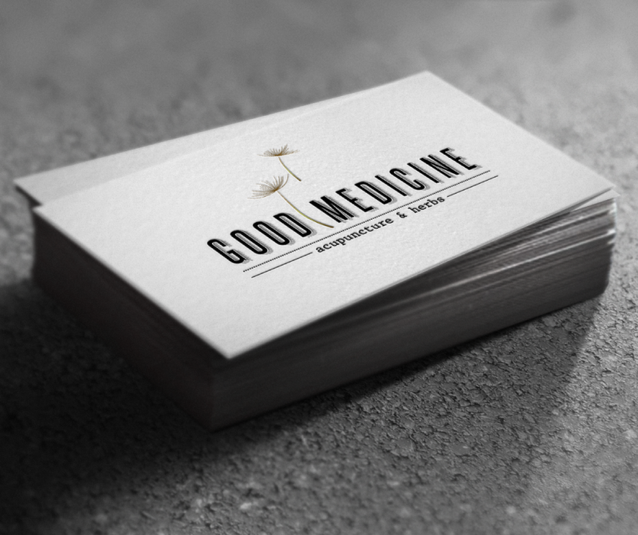
Earthy pharmacy logos
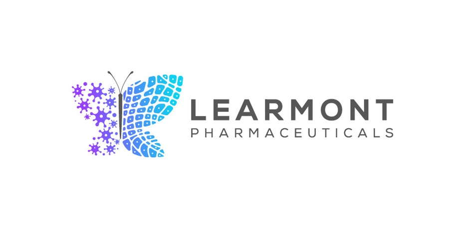
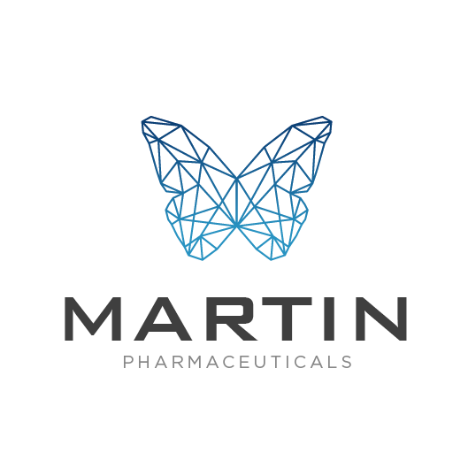
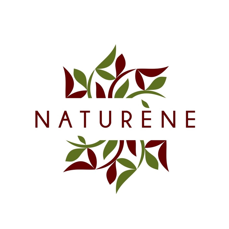
While it’s important to focus on business goals and how they relate to your logo, you shouldn’t lose sight of what your customers are looking for. In the case of a pharmacy, the customers are ultimately searching for well-being and healing. Keep things peaceful by incorporating an earthy element into your logo, such as plants, butterflies or other references to nature. A delicate color palette can also infuse the logo with the perfect dose of serenity.
The fundamentals of logo design
—
Logo design can be intimidating if you’re coming into it without experience or background knowledge. Here we’ll give you a crash course in logo design (think of it as our own little wellness check).
Logo design is a nuanced specialization of graphic design that encompasses aesthetics, branding & marketing, composition, color theory, typography and artistic skill. We go into greater detail in our free guide, How to design a logo, but here we’ll summarize some essential aspects to consider.
Design for your brand. There’s not one “best type of logo”—the most successful logos are the ones that best represent their brand. The aggressive red and garish typography of the Coca Cola logo suit the brand well, but those same design choices would hurt more relaxed brands like a yoga studio or massage parlor.
So before anything else, you have to consider what kind of brand you want to be—your “brand identity.” Who are you as a pharmacy and as a business? Are you an approachable, everyday brand or an upscale brand? Are you laid-back or professional? The answers to these questions will guide your design choices, especially the colors, shapes and letters.
Colors, shapes and letters. Each different color and shape represents different emotions—for example, logos with excessive black seem more sophisticated (and at times edgy), while logos with a lot of circles seem more lighthearted. Likewise, that extends to font choice, such a formal serifs vs. casual sans-serif. Every design decision reflects on your brand, so build your brand identity from the ground up with strategic choices.
How to get a logo
—
As we explained in a previous guide, How to create a logo: Comparing the best ways to get a logo designed, a business has four main options for getting a logo. Let’s recap:
- Logo maker (DIY). With the help of a logo maker or other entry-level design software, you can create a logo from scratch.
- Hire a design agency. Leave it to the experts and hand off all logo design duties to a design agency. The downside: extra talent comes at an extra cost.
- Work with a freelancer. You can find a freelance designer to design your logo for you.
- Commission a design contest. In a design contest, you explain what you want in a briefing, including visual preferences and business goals. Designers from near and far can contribute samples based on your briefing. From there, you pick the one you like best and start revisions. You only pay for the one sample you choose.
DIY methods are only advisable under extreme circumstances, like if you have next to nothing in your budget. Your logo is an asset too important to skimp on, and considering how complicated logo design is, if it’s not designed by a professional, it may not be as effective as it could be.
Really, it’s a decision of both cost and preference. If your only concern is price, check out our Logo design cost guide for more details.
The strongest advantage of logo design contests—and the reason they’re very popular—is that it leverages the creativity of multiple designers who offer different ideas and perspectives to choose from. If you’re still unsure what style and look is right for you, a contest has the benefit of experimentation—you may not know what logo design best suits you until you see some creative drafts from several designers.
If you already know what style and look you’re going for, your best bet is going to be working directly with a freelancer. To find the right freelancer, start by browsing designer portfolios to discover the best match in terms of style. Then, work with the freelancer to get exactly what you’re looking for.
Are you ready to get an uplifting pharmacy logo?
—
A great pharmacy logo holds all of the active ingredients for prosperity. It tells customers who you are, gives them a familiar icon to reference and helps your brand stand out in a crowd. Think of logo acquisition as a vitamin or natural supplement: it’s good for you, and if it’s high quality, it’ll keep building in your business’ system of success. So go ahead, put forth time, effort and thought into getting the right logo. And hey, take your vitamins, too.


