Whether you’re just starting an ecommerce business or considering a rebrand, one of the most…
Designing the “Freddie High Five” Animation for Facebook Ads
The Freddie high five is, in our humble opinion, one of the most satisfying pieces of the MailChimp experience.
You’ve spent hours crafting the perfect email and segmenting the audience just right, and you’re finally ready to send. Freddie’s hand hovers over the big red button, nervously shaking. You click send, hold your breath, and….

It makes you feel good. You keep clicking it; he keeps high-fiving. (Not here, this is just an example. You have to send an email to get the full experience.)
The “delightful” experience
People love to use the term “delightful” to describe this type of thing, as in “You have to make your user experience delightful.”
It’s always a little weird when a word that’s used mostly as a superlative becomes a buzzword. What we really mean when we say “make it delightful” is to remember that you’re designing for people. We try not to go overboard including our personality in the app, but we find that it’s the little things like the high five that keep our users engaged and excited—and help MailChimp feel more human.
The response from our users seems to back this up:
Confession: Whenever I send a newsletter via @MailChimp, I always give my little monkey-dude a high-five at the end. pic.twitter.com/RCNdni8pZe
— Stacy Gail (@Stacy_Gail_) February 12, 2017
Dear @MailChimp. I love your "High Fives!" after the newsletter is sent #mademyday
— Catrina Dummermuth (@cdumme) December 15, 2016
Still charmed every time I get a high five (or multiple high fives if you keep at it) from @Mailchimp. That chimp is supportive. pic.twitter.com/nPjdO3xOAW
— Michelle O'Mirth (@gobsmackd) November 11, 2016
So when we added the ability to create Facebook Ads through MailChimp, we wanted to include a similar “ready to launch” animation to celebrate successfully submitting an ad that people would love as much as they love the Freddie high five. No pressure!
The process
On the MailChimp Design team, the first guideline when kicking off any new project is: Step away from the computer.
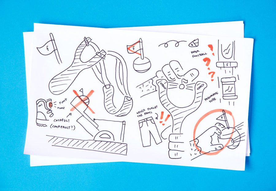
The computer is a pretty lousy brainstorming tool. If you start a project pushing pixels, you’ll likely find yourself in an inescapable loop constrained by your knowledge of software. Instead, we grab pens and big sheets of paper and start writing words down. For this project, words like “mouse trap,” “Rube Goldberg machine,” “pneumatic mail tube” and “slingshot” appeared. After the word vomit phase, we chose 5 or 10 words we felt good about. Then began the ugly sketching.
The exact opposite of starting with a computer, ugly sketching lets you dump a bunch of ideas onto a page without judgment or precision. The hardest part of this step is getting past the fact they’re, well, ugly. But once you realize that people care more about the content of the idea than the straightness of your lines, you can let loose and generate a mountain of ideas in a short timeframe. In the spirit of some of that non-judgmental sharing, here’s a smattering of sketches we put together during brainstorming.
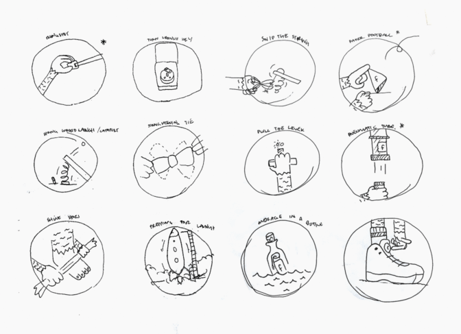
From here, we reviewed the designs as a team and picked out the ones that made us laugh or felt the most interesting. Then we jumped into Illustrator to create a few options, refined, and shared again. Ultimately, we chose the slingshot, the pump shoe, and the tube. We put together tighter versions of each and shared with the team.
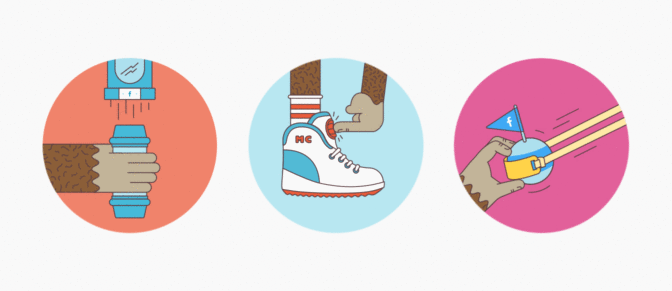
From there, it was just a matter of choosing an option, deciding what step 2 would look like, and animating.
The pump shoe was fun, but lacked any real ties to submitting something. The pneumatic tube was a bit off-kilter (in a good way), but ultimately the slingshot won out.
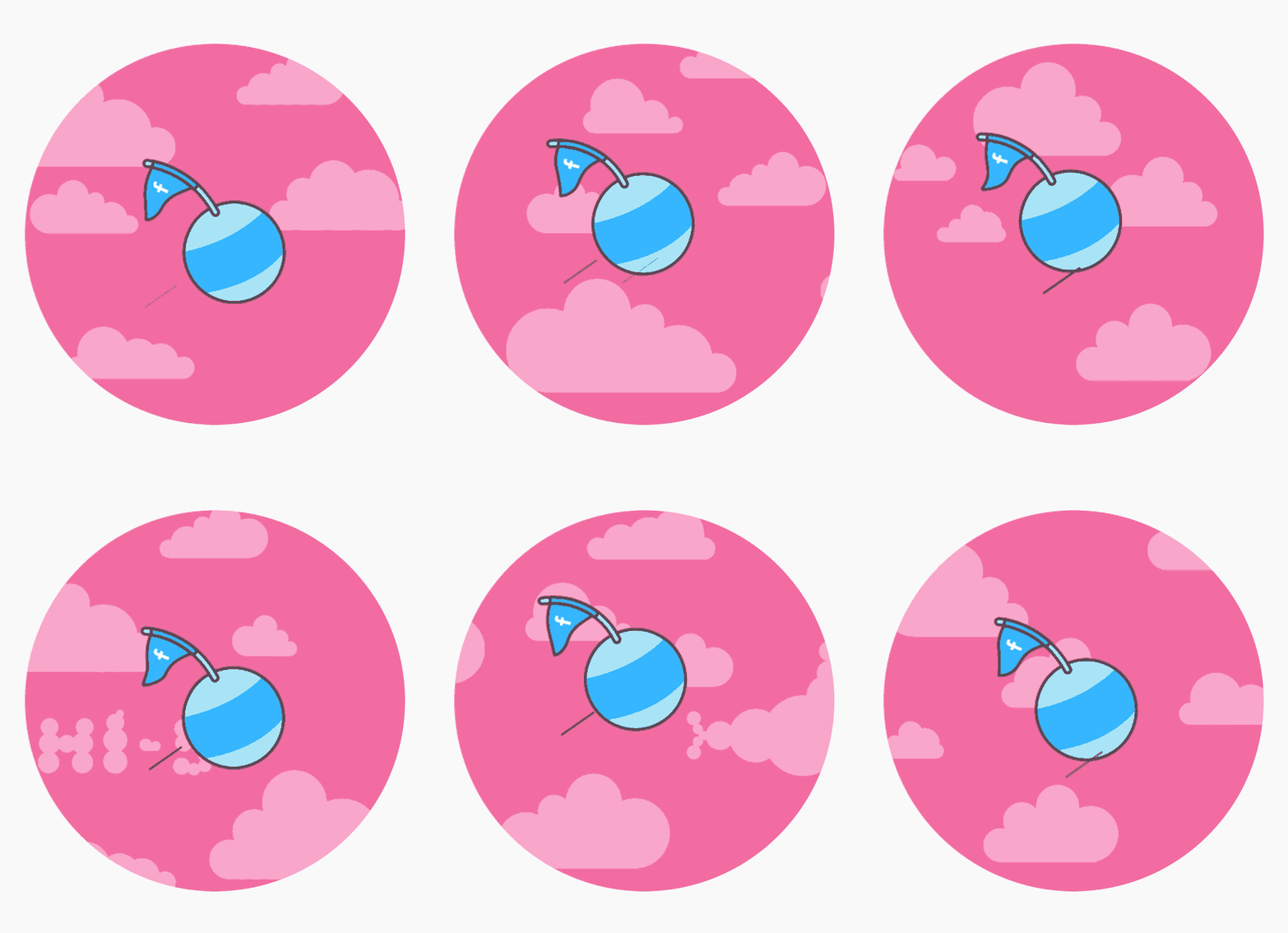
Apart from being fun and relatable, we felt like it communicated the “launch and wait” feeling that comes with setting up a Facebook ad. Unlike sending an email (which is immediate), Facebook ads appear over time. The step-2 animation hints at that, with the ball flying on a loop through the clouds.
The result
After a lot of tweaking (and some much-needed advice from Linda, our resident animation expert), both animations are now live and in the wild!

The whole process took a couple of weeks, which may seem like a lot of time to dedicate to something as simple as an in-app animation. For us, though, it’s details like this that remind our users who we are, and that we’re all humans (or, in some cases, simians).
Original article written by Chase >


